Opentoonz: Vector sub tab should highlight the chosen tab
Issue Summary
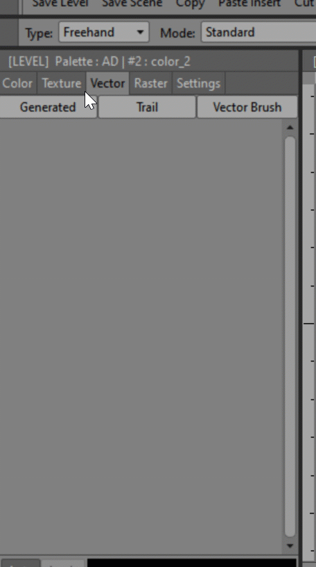
It may be just my own perception, but I find that the editor style panel in the vector part with the generator trail vector brushes tabs should rather highlight the chosen tabs and not the opposite. It would be easier to see which one is active.
The colors textures vectors rasters tabs just above, for example, work this way. This is the case with almost all the panels such as a palette or stop motion.
Screenshot or Video Reference
this might not be enough obvious in the gif
Steps to Reproduce
Expected Results
Vector sub tab should highlight the chosen tab
Actual Results
System Information
- OpenToonz Version:
- Operating System:
- CPU:
- Memory:
- Graphics Card:
- Graphics Tablet:
 openanim
All 4 comments
The Generated, Trail & Vector Brushes boxes aren't tabs. They're buttons to show/hide those collections. So they can't highlight which is selected.
 DarrenTAnims
on 2 Apr 2020
DarrenTAnims
on 2 Apr 2020
@DarrenTAnims is right. They are buttons and the reason they get darker instead of highlighted is that they are in the pressed state when that part is visible.
 jeremybullock
on 4 Apr 2020
jeremybullock
on 4 Apr 2020
I understand the confusion though. . .
It would take a custom stylesheet change for that part to fix.
jeremybullock
on 4 Apr 2020
Closing as the tabs are working as designed.
Agree that some improvement would be ideal in the future.
 RodneyBaker
on 11 Apr 2020
RodneyBaker
on 11 Apr 2020
Related issues
 konero
·
5Comments
konero
·
5Comments
 blurymind
·
4Comments
blurymind
·
4Comments
 Cosmicdrawer
·
3Comments
Cosmicdrawer
·
3Comments
 gab3d
·
4Comments
gab3d
·
4Comments
 digitallysane
·
5Comments
digitallysane
·
5Comments
Most helpful comment
@DarrenTAnims is right. They are buttons and the reason they get darker instead of highlighted is that they are in the pressed state when that part is visible.