Openstreetmap-carto: Move allotments to some kind of green
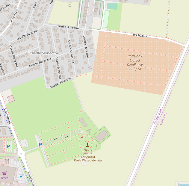
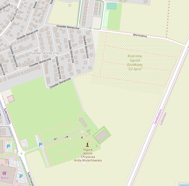
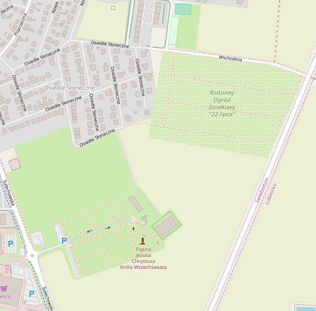
Currently allotments are dark orange with white dots. We have just changed farmland color to a shade of green, because it makes sense to have all the vegetation areas in green. Allotments are also closely related to vegetation, so I think some kind of green is needed.
Initial proposition using grass/garden background and using farmland background with dark dots like in garden - they are probably too close to them, so it's just a starting point:
Before
Garden/grass background

Farmland background with garden dots
 kocio-pl
All 108 comments
sent from a phone
On 24. Sep 2018, at 00:33, kocio-pl notifications@github.com wrote:
Currently allotments are dark orange with white dots. We have just changed farmland color to a shade of green, because it makes sense to have all the vegetation areas in green.
It is a decision whether to show the differences in non-built landuse prominently or whether to make them look more or less the same, and depending on this decision it makes sense or not.
 dieterdreist
on 24 Sep 2018
dieterdreist
on 24 Sep 2018
Difference between farmland, garden or forest is prominent in my opinion, yet they all fit into vegetation and use shades of green. Using dark orange makes allotments closer to sand for example or built-up landuses (but more intense).
kocio-pl
on 24 Sep 2018
If I understand correctly, allotments are community-owned land which is
used for family vegetable gardens?
So it is a type of intensively-used farmland with small plots, usually
growing annual crops.
I believe option 3, “Farmland background with garden dots”, works well for
this situation. It is similar in use to “farmland” (which usually means
“cultivated annual cropland”, because orchards have their own tag).
The regular dot pattern suggests small patches of different crops, which
gives the right idea, if I correctly understand these to be “community
(vegetable) gardens” in the American sense
Joseph
On Mon, Sep 24, 2018 at 7:50 AM kocio-pl notifications@github.com wrote:
Difference between farmland, garden or forest is prominent in my opinion,
yet they all fit into vegetation and use shades of green. Using dark orange
makes it closer to sand for example or built-up landuses (but more intense).—
You are receiving this because you are subscribed to this thread.
Reply to this email directly, view it on GitHub
https://github.com/gravitystorm/openstreetmap-carto/issues/3411#issuecomment-423853963,
or mute the thread
https://github.com/notifications/unsubscribe-auth/AoxshBO83tRfJUJDGSFcq1CJ6KOnsfWXks5ueBAhgaJpZM4W16Qr
.
 jeisenbe
on 24 Sep 2018
jeisenbe
on 24 Sep 2018
They are individual parcels of gardening for vegetables, fruits or flowers:
https://wiki.openstreetmap.org/wiki/Tag:landuse%3Dallotments#Description
kocio-pl
on 24 Sep 2018
Is there something else that you're planning on using this colour for? I don't see a big need for making a change - especially as your examples there are too close to other colours.
It would be great to have an image with all of the green colours together, showing grass, meadow, park etc. as I can't visualise what colours are currently used in osm-carto.
 boothym
on 24 Sep 2018
boothym
on 24 Sep 2018
I have no such plan, but in such a big and complicated project it's hard to live with arbitrary choices. It's always better to have some system and we're slowly doing such changes. For example I had no idea that changing playground color will make space for ice rink in the future (see https://github.com/gravitystorm/openstreetmap-carto/pull/3330#issuecomment-410964974), but it made sense to make it green (as other leisure objects) rather than blue (see https://github.com/gravitystorm/openstreetmap-carto/pull/2249#issuecomment-236279370).
kocio-pl
on 24 Sep 2018
@kocio-pl I like farmland colour with garden dots. It would match planned amenity areas colour (https://github.com/gravitystorm/openstreetmap-carto/issues/1991#issuecomment-423797757), as allotments are partly an amenity areas and partly natural landcover areas. Do I see properly that there is no outline for allotment area? I think it should be used the same as amenity areas have it.
Yesterday I started playing with leisure=parkcolour, because I see it quite "crappy" in compare with the rest of osm-carto palette. I noticed that there is many of green shades used for areas which might be not covered by plants (at least not fully), so I think we should avoid adding more green to map.
- landuse=cemetery
- tourism=campsite/ caravansite
- leisure=playground/ fitness_station/ dog_park
- leisure=pitch
- leisure=golf_course, miniature_golf
Notice also that in eg. Poland allotments often has no gardens, but just little houses with small grass areas around, so it's not obvious for me that they are always kind of garden, what gives the reason to avoid green shade here.
@boothym see: https://wiki.openstreetmap.org/wiki/AreasTab
PS. I just noticed that you called new colour of farmland "shade of green". It's not green, it's yellow! ;)
 Tomasz-W
on 24 Sep 2018
Tomasz-W
on 24 Sep 2018
How intensively the allotment is used for growing vegetable depends a lot.
In urban environments they are often used as a recreational environment for the family, where they have a patch of grass to play/sit on, some flower and veggie beds, and a hut to spend the weekend in.
With the tendency to organic food, there are now also other initiatives where regular farmland is sliced up, cultivated for vegetables only by individuals from the nearby city, but managed (e.g. irrigated, ploughed) by the farmer who rents them out.
 polarbearing
on 24 Sep 2018
polarbearing
on 24 Sep 2018
2018-09-24 0:59 GMT+02:00 jeisenbe notifications@github.com:
If I understand correctly, allotments are community-owned land which is
used for family vegetable gardens?
the tag doesn't make assumptions about the ownership of the land
>
So it is a type of intensively-used farmland with small plots, usually
growing annual crops.
it may be in some instances (and producing food for proper consumption was
the leading idea at the end of the 19th century when they were invented),
in the cases I know, nowadays it is more a kind groups of residential
gardens not directly attached to a dwelling.
You can typically find them in bigger cities where they often occupy
"remaining" land, which is not suitable for building houses (too small, too
close to railways, etc.), or which is a temporary usage of the land until
it get built up, an it might in some cases also be perfectly usable land
purposefully set aside for this kind of landuse.
dieterdreist
on 24 Sep 2018
Re “in Poland allotments often has no gardens, but just little houses with
small grass areas around”
Is this correct use of this tag?
On Mon, Sep 24, 2018 at 3:48 PM Tomasz Wójcik notifications@github.com
wrote:
@kocio-pl https://github.com/kocio-pl I like farmland colour with
garden dots. It would match planned amenity areas colour (#1991
https://github.com/gravitystorm/openstreetmap-carto/issues/1991), as
allotments are partly an amenity areas and partly natural landcover areas.Yesterday I started playing with leisure=parkcolour, because I see it
quite "crappy" in compare with the rest of osm-carto palette. I noticed
that there is many of green shades used for areas which might be not
covered by plants, so I think we should avoid adding more green to map.
- landuse=cemetery
- tourism=campsite/ caravansite
- leisure=playground/ fitness_station/ dog_park
- leisure=pitch
- leisure=golf_course, miniature_golf
Notice also that in Poland allotments often has no gardens, but just
little houses with small grass areas around, so it's not obvious for me
that they are always kind of garden, what gives the reason to avoid green
shade here.@boothym https://github.com/boothym see:
https://wiki.openstreetmap.org/wiki/AreasTab—
You are receiving this because you commented.
Reply to this email directly, view it on GitHub
https://github.com/gravitystorm/openstreetmap-carto/issues/3411#issuecomment-423888264,
or mute the thread
https://github.com/notifications/unsubscribe-auth/AoxshFrkIcveiB3gdwcRiWCNE9xyDE2hks5ueIBLgaJpZM4W16Qr
.
jeisenbe
on 24 Sep 2018
2018-09-24 9:51 GMT+02:00 jeisenbe notifications@github.com:
Re “in Poland allotments often has no gardens, but just little houses with
small grass areas around”Is this correct use of this tag?
if you consider the "small grass areas" a garden, then probably yes. Small
houses (cabins/huts) are typical for allotment gardens, usually every plot
has one (storage of tools, a room to sit, maybe even sleep sometimes
(formally it is often forbidden to sleep there).
Here's an example picture how these often look like in Germany:
https://www.germanpulse.com/wp-content/uploads/2011/09/Schrebergarten2.jpg
Cheers,
Martin
dieterdreist
on 24 Sep 2018
"Allotments are also closely related to vegetation" but also it is a recreational area and often temporary or permanent (e.g. in the summer) residence. "Using dark orange makes allotments closer to" residential area. Current representation of this area in my opinion is very accurate.
Edit:
Also orange is closer to commercial or retail (which are reddish), but not to residential area (which is gray).
The color of the residental area by the years has changed. okay. Maybe now time to allmonts.
 Slawek234
on 24 Sep 2018
Slawek234
on 24 Sep 2018
I feel it's not this way. It's always about some kind of vegetation, but the residential role is restricted ("not for permanent residential purposes"). Also orange is closer to commercial or retail (which are reddish), but not to residential area (which is gray).
kocio-pl
on 24 Sep 2018
I've got to say I am very confused by the different use of
landuse=allotments in central Europe vs Britain vs North America.
Over in America the landuse=allotments tag is used for community
vegetable gardens which have separate plots for each person or family.
(leisure=garden with garden=community is an option, but isn't commonly
used)
The wiki page seems to be based on British usage of the term,
including that the land is not owned by each family, and it is used
for growing vegetables and flowers:
"In allotment gardens, the parcels are cultivated individually,
contrary to community gardens where the entire area is tended
collectively by a group of people. The individual size of a parcel
typically suits the needs of a family, and often the plots include a
shed for tools and shelter, and sometimes a hut for seasonal or
weekend accommodation. The individual gardeners are organised in an
allotment association which leases the land from the owner who may be
a public, private or ecclesiastical entity, provided that it is only
used for gardening (i.e. growing vegetables, fruits and flowers), but
not for permanent residential purposes."
So, it seems like the original purpose of this landuse was for
small-scale farming.
On 9/24/18, kocio-pl notifications@github.com wrote:
I feel it's not this way. It's always about some kind of vegetation, but the
residential role is restricted ("not for permanent residential purposes").
Also orange is closer to commercial or retail (which are reddish), but not
about residential (which is gray).--
You are receiving this because you commented.
Reply to this email directly or view it on GitHub:
https://github.com/gravitystorm/openstreetmap-carto/issues/3411#issuecomment-423952779
jeisenbe
on 24 Sep 2018
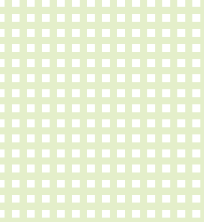
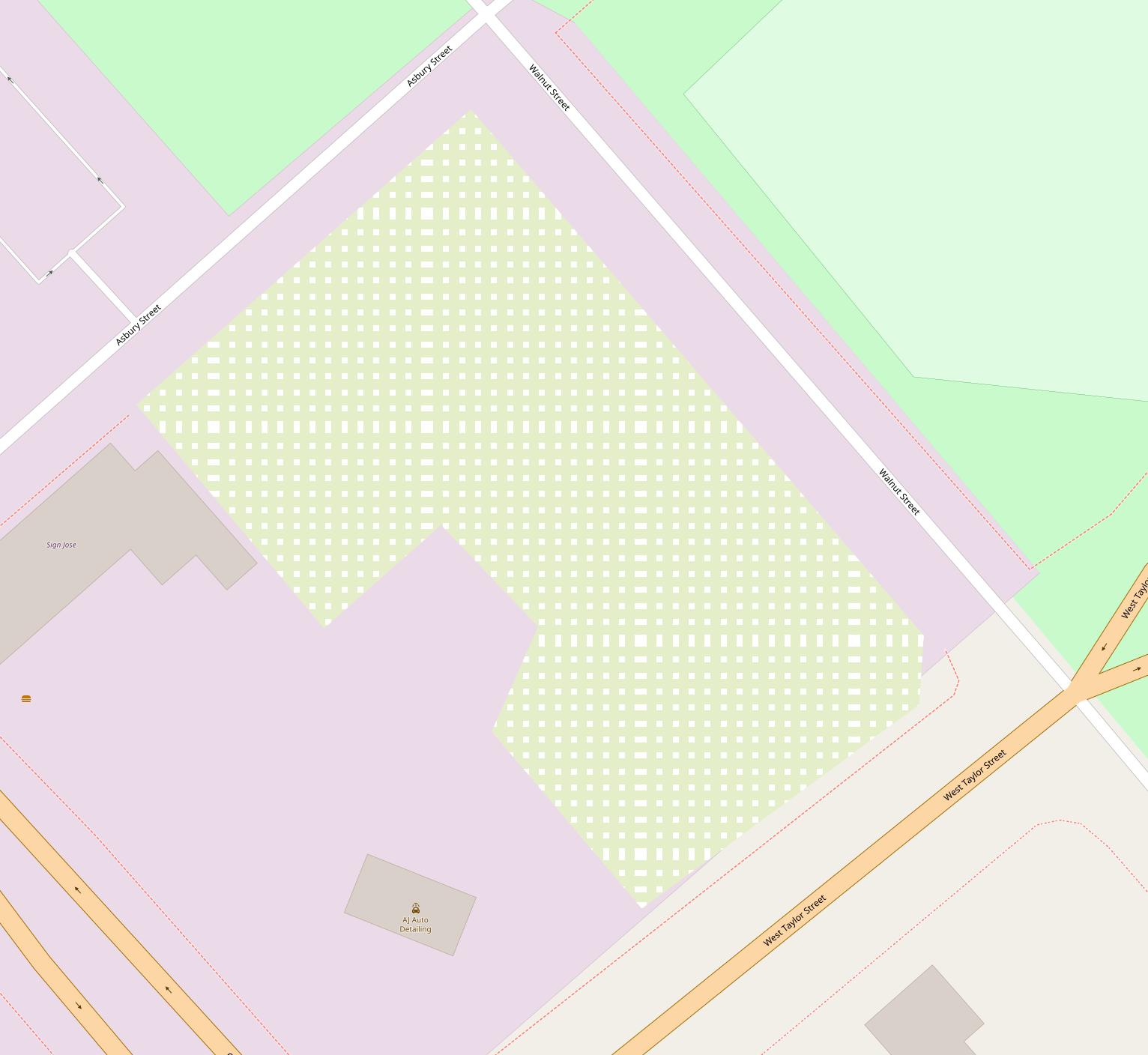
Because it can be similar to farmland and garden, I've made another proposition with 50% mix of both colors:
kocio-pl
on 25 Sep 2018
Less aggressive dots (0.5 opacity) and only 30% of grass to make it look a bit more different than garden:
kocio-pl
on 25 Sep 2018
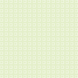
@kocio-pl Can you make version with 50% colour mix and 0.5 opacity dots?
Tomasz-W
on 25 Sep 2018
Sure:
kocio-pl
on 25 Sep 2018
How does that compare to other pattern-usage in this category? Orchard and garden comes to mind. We need to be able to distinguish them.
polarbearing
on 26 Sep 2018
Sure. Are there any places where allotments and orchards or gardens are close to each other? In the meantime we can look at https://wiki.openstreetmap.org/wiki/AreasTab examples:
30% garden/farmland mix

garden

plant nursery

orchard

vineyard
kocio-pl
on 27 Sep 2018
30% mix with 0.5 opacity orchard dots:

kocio-pl
on 27 Sep 2018
Close to each other (garden and 30% allotments)
kocio-pl
on 27 Sep 2018
Thanks for pointing me to that page, and to @geozeisig for maintaining it.
The allotments need to be recognised in particular when none of the others are nearby, and for this purpose I feel all proposals above are too similar to them.
IIRC a while ago we changed allotments from diagonal hatching to the white dots. I would like to preserve some specific element, as they are not just one particular agricultural crop, they have that recreational value.
Ideas:
- white dots (as current) on one of the green tones (might be too weak?)
- some other pattern? diagonal hatching again, or a white square grid, or a pattern of square outline symbols?
polarbearing
on 27 Sep 2018
I think dots opacity is not needed - 30% mix with orchard dots (this is the same pattern as currently, but black instead of white - footpaths are better visible):
kocio-pl
on 27 Sep 2018
There are more patterns available in new version of @imagico pattern generator, like rings for example:
kocio-pl
on 27 Sep 2018
@kocio-pl Please upload some test renderings comparing 50% mix with 30% mix (both with orchard pattern) on mid-zoom levels. I would like to see espessialy how would it look in 2 cases: surounded by farmlands and surrounded by some green areas. I think it's important to rate possible colours in these situations.
Tomasz-W
on 27 Sep 2018
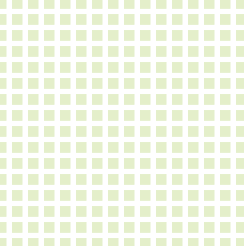
White rings on E4EFCA (imagico ring 6 thick dist 15)

White squares 8 on E4EFCA (dist 15)
White square rings 8 on E4EFCA (dist 15)
polarbearing
on 27 Sep 2018
Squares are interesting, as it looks like kind of plots. Could you share this image, so I could test rendering?
kocio-pl
on 27 Sep 2018
The rings are from imagico's generator, with custom symbol as below, distance 15, not fine tuned yet. The filled squares are on of the existing square symbols, but you could also play with the fill= below.
<svg width="20" height="20">
  <rect width="8" height="8" stroke-width="1" stroke="white"  fill="none" />
</svg>
I like the square patterns! That makes me think of the little square or
rectangular plots in a vegetable or flower garden
On Thu, Sep 27, 2018 at 4:34 PM polarbearing notifications@github.com
wrote:
The rings are from imagico's generator, with custom symbol as below,
distance 15, not fine tuned yet. The filled squares are on of the existing
square symbols, but you could also play with the fill= below.—
You are receiving this because you commented.
Reply to this email directly, view it on GitHub
https://github.com/gravitystorm/openstreetmap-carto/issues/3411#issuecomment-424989047,
or mute the thread
https://github.com/notifications/unsubscribe-auth/AoxshEx2xr9-nUKis4ulrBZC5K94ugjiks5ufH-NgaJpZM4W16Qr
.
jeisenbe
on 27 Sep 2018
Thanks. Here is the idea inverted, coloured squares in a white grid:
E4EFCA_square_10_in_16er_grid
E4EFCA_square_12_in_16er_grid
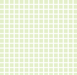
polarbearing
on 27 Sep 2018
Seeing these square and ring proposals in context should be very interesting.
 turnsole80
on 29 Sep 2018
turnsole80
on 29 Sep 2018
Could someone prepare the real pattern files for testing rendering? I know it's not a rocket science, but I have limited time, so it would help me a lot. Or maybe @Adamant36 might try doing it?
kocio-pl
on 29 Sep 2018
I'm going to be pretty busy with other things the next few weeks. So I don't know how much time I'll have to test stuff. If someone wants to get it moving though by preparing the pattern files, I might be able to do some test renderings at some point if no one else does.
 Adamant36
on 30 Sep 2018
Adamant36
on 30 Sep 2018
@kocio-pl Is this just an Inkscape work or it's someway more complicated? If just an Inkscape, I can take care of it.
Tomasz-W
on 30 Sep 2018
Pattern generator makes them and it's easy to automate it.
kocio-pl
on 30 Sep 2018
If we go for one of the grids, we could either arrange the square symbol (which is a one-liner, sample above) as a pattern, or check if mapnik has a simpler method for achieving this.
polarbearing
on 30 Sep 2018
I was just screwing around with @imagico's tool and I was able to get something similar to @polarbearing's patterns, but the save link wouldn't work for some reason. @Tomasz-W I think if you screw around with it for a minute you can figure it out. Just follow the instructions down to the sixth bullet point and you should be good to go. The left pane shows the pattern and the right shows it rendered. Also, on symbol definition you scroll down like 10 to the black square, push square in point generation, then push render in the rendering pane. That should do it. Maybe you can get it to save. Since I couldn't.
Adamant36
on 30 Sep 2018
@kocio-pl I did distance=20 to keep more of choosen grass+farmland mix colour. If there is something wrong or you want something different, just tag me.
https://gist.github.com/Tomasz-W/6d1bfe66abbc1fa5176a25f4ce8c2318
Tomasz-W
on 30 Sep 2018
@Tomasz-W, random test at different zoom levels. It doesn't seem to hold the pattern at different zoom levels and looks kind of weird at closer levels. I'm not to sure why or if there is something in the code for patterns that is doing it. Maybe you could tweak things a little in the file somehow or @kocio-pl can shed some light on it.
z16
z17
z18
z19
z20
Adamant36
on 30 Sep 2018
ok that's smaller squares.
Anyway they need to be synced with tile boundaries, as the examples show an artefact where tile join.
Looking at the gist, it shows a full tile or similar. We probably just need a pattern symbol with one white square, at least that's I remember other patterns worked.
polarbearing
on 30 Sep 2018
I guess this might be quite simple problem. Pattern files should be based on 256 px matrix (more complex/random ones) or 32 px matrix (regular ones). Allotment pattern (which is a regular one) should be calculated from the ground up in such way, that it repeats after 32 px in both directions. Not all the sizes and distances will work from technical point of view, even if they look nicer on a single tile.
kocio-pl
on 16 Oct 2018
I would go with 30% mix with dark or light orchard dots. Maybe with some visible outline as allotmens are closed areas.
Tomasz-W
on 14 Nov 2018
While the jsdot pattern generator creates svg files, we need to convert these to png prior to using.
For a regular square pattern it is important to set distance to a power of two: eg 4, 8, 16, 32, so that it will repeat properly, and also use pixel-align to render the pattern, eg:
http://www.imagico.de/map/jsdotpattern.php#x,256,jdp6894;g,30,32,32;s,jdp33742;s,jdp81637;rx,250,2,32,32;s,jdp28824;s,jdp59702;s,jdp91550;s,jdp27774;rx,250,2,64,64;rd,1,0,0,tree%20pair,1,5,5,0,jdp52898,6b8d5e,add19e;
Here are some example png files to try, made with small squares; I convert from the svg output. I'd suggest trying each with a couple different backgrounds and seeing what works best.
PNGs square patterns Zip
SVG files for reference:
SVGs-square-patterns.zip
eg: try a background of #E4EFCA (suggested above), #def6c0 (campsite), #eef0d5 (farmland) and #f2efe9 (land color) for the darker patterns (orchard and built-up, maybe grass and residential)
Try #aedfa3 (orchard), #cdebb0 (grass/garden), #e0dfdf (residential), or #d0d0d0 (built-up) as the background for the light patterns (campsite, farmland, land color, E4EFCA)
My preference would be to use an existing color for the background, so that we don't add another new green to the code; we should also avoid campsite def6c0 as the background because we are discussing eliminating this, unless we want to reuse it for a type of grass. But it would be fine to use a brand new color like E4EFCA for the pattern file color.
Examples:
Orchard color pattern on farmland background

Farmland on orchard/vineyard

Grass/garden on farmland

Built-up on grass/garden

jeisenbe
on 27 Nov 2018
@jeisenbe, thanks for the info. If you want to give it a try, feel free to. Its a little out of my area of expertise anyway.
Adamant36
on 27 Nov 2018
I guess background should be probably different than other greens (30% mix of grass and farmland worked good for me; I like color set in https://github.com/gravitystorm/openstreetmap-carto/issues/3411#issuecomment-425712688), but it needs testing, of course.
kocio-pl
on 27 Nov 2018
There are two problems with #E4EFCA for the background
1) It is a light color, so only white or a near-white color would work for a lighter pattern color.
- However, it would work fine against a darker color, like orchard/vineyard
2) It is a new shade of green, but quite similar to the color used for campsites, and also fairly close to farmland, grass and leisure - This means there are less options for adjusting these other colors in the future
- It would probably be necessary to eliminate the campsite fill color - though this may be a good idea
- I was about to try using the campsite color for grasslands and meadows to distinguish them from landuse=grass and gardens, but this might not be a good idea if the allotment background is similar.
But here are some more PNG screenshots showing some options with E4EFCA as the background or pattern color, and also some with larger squares:
E4EFCA on grass, small squares:

White on E4EFCA, small squares:

Farmland on grass, large squares:

Orchard on E4EFCA:

E4EFCA pattern on orchard:

E4EFCA on grass:

Grass on E4EFCA:

jeisenbe
on 27 Nov 2018
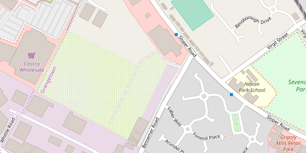
Test images in Wales, UK
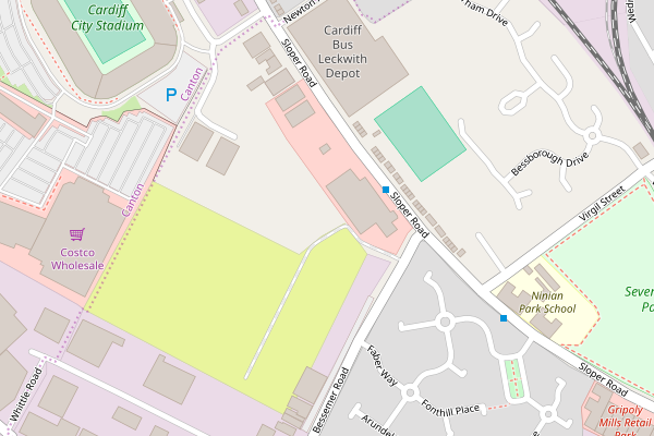
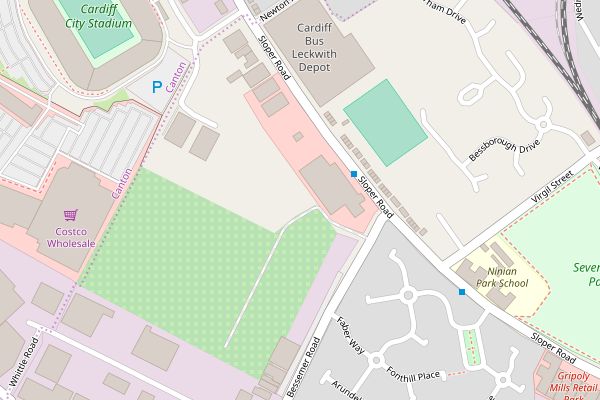
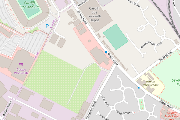
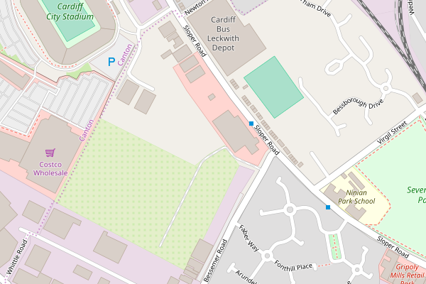
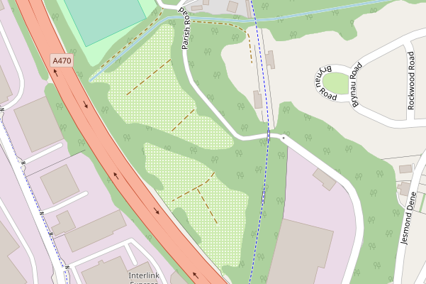
Cardiff Stadium - allotments near commercial, retail and stadium
https://www.openstreetmap.org/#map=16/51.4703/-3.1945
z16 Before
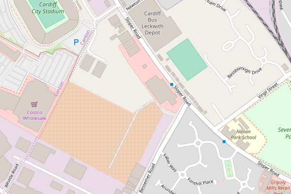
White squares on #E4EFCA
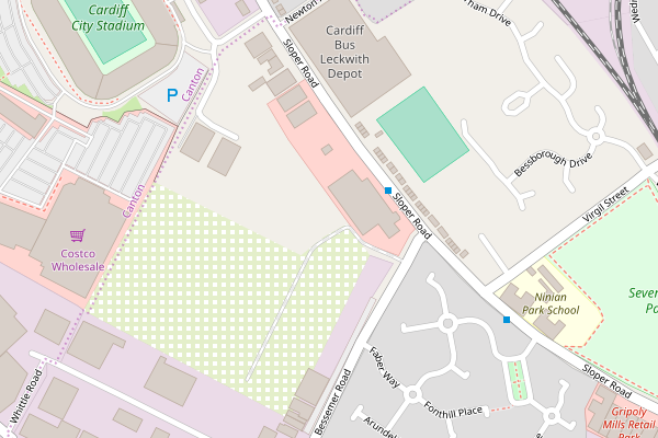
Garden/grass color squares on #E4EFCA

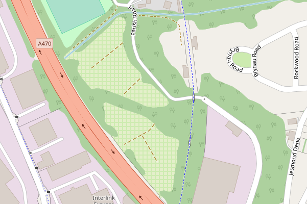
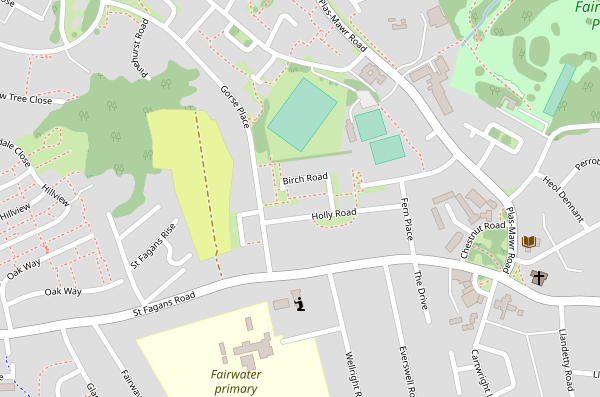
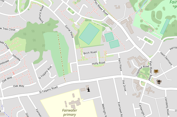
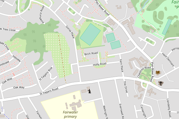
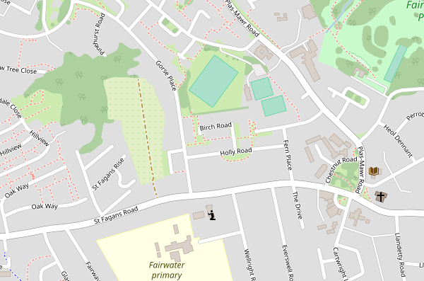
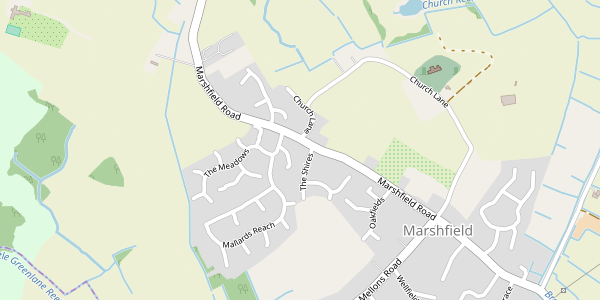
Fairwater, Wales - allotments in a residential area
https://www.openstreetmap.org/#map=16/51.4903/-3.2406
z16 Before
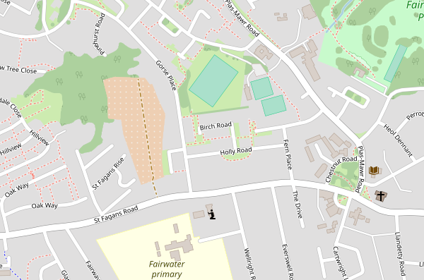
White squares on #E4EFCA
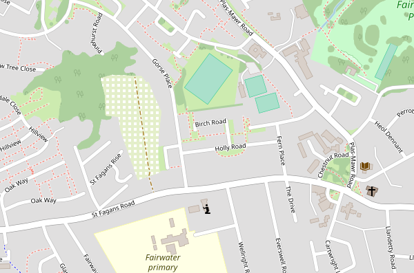
Garden/grass color squares on #E4EFCA

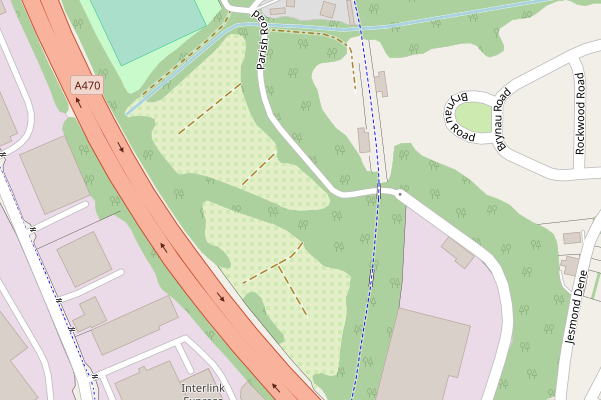
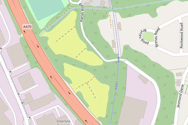
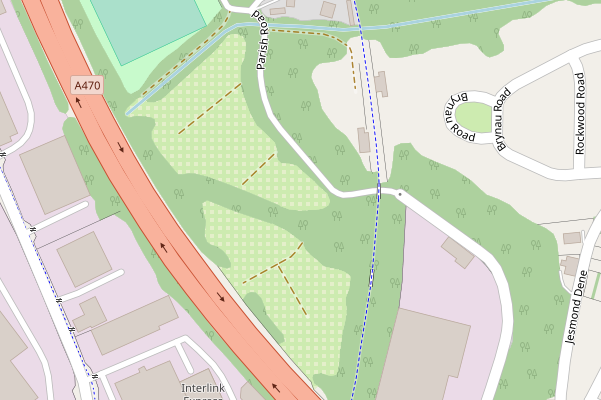
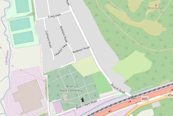
Allotments in Woods, by a highway
https://www.openstreetmap.org/#map=17/51.54547/-3.26141
z17 Before
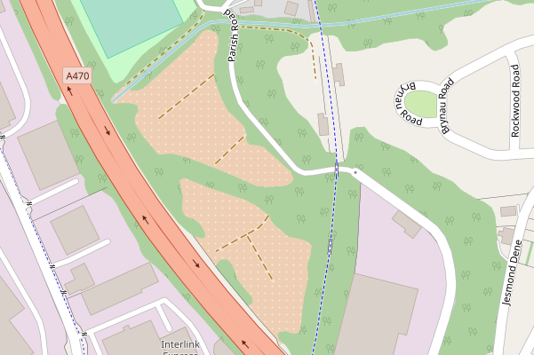
White squares on #E4EFCA

Garden/grass color squares on #E4EFCA
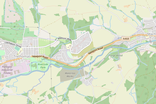
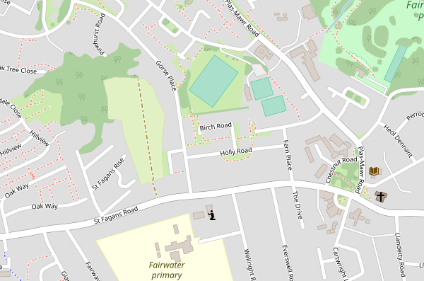
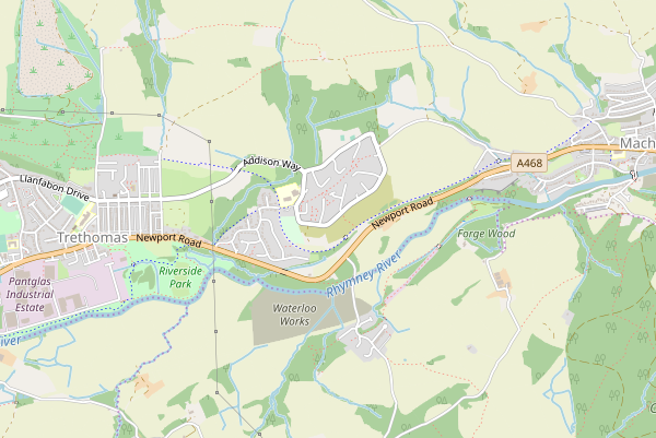
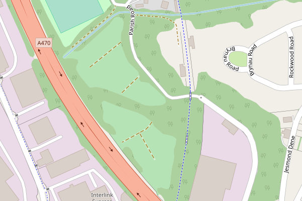
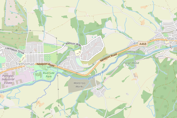
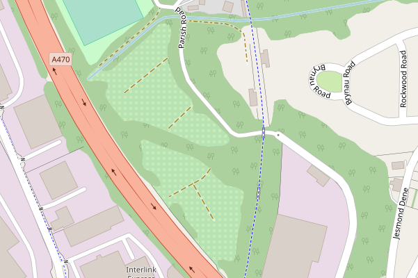
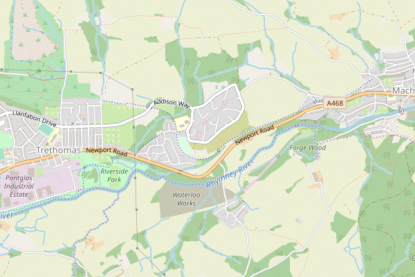
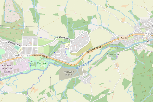
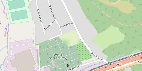
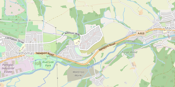
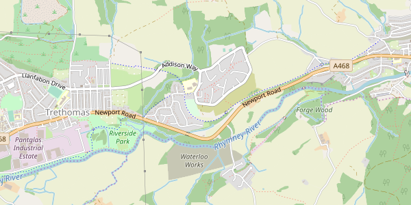
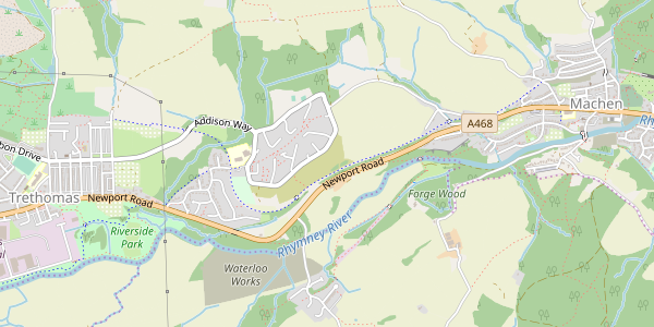
Trethomas, Wales - low zoom z14
Multiple small allotments visible, next to grass, scrub, leisure, residential etc.
https://www.openstreetmap.org/#map=14/51.5907/-3.1511
z14 Before
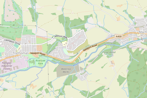
White squares on #E4EFCA
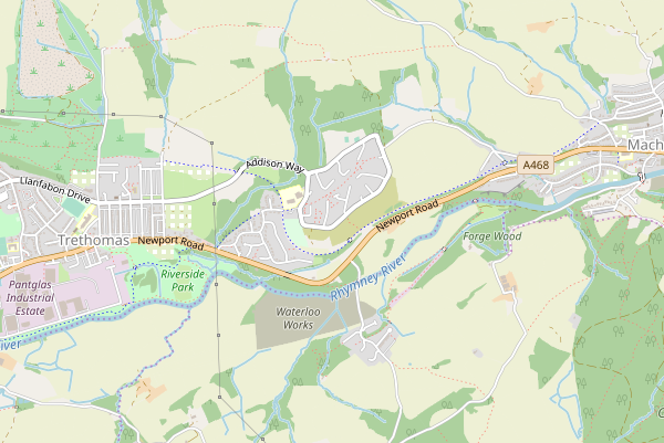
Garden/grass color squares on #E4EFCA

I think the last image shows that we couldn't use bigger squares. The pattern is just visible in these small areas at z14.
The white squares look rather bright against woods / forest and other dark backgrounds.
jeisenbe
on 27 Nov 2018
Quite sane output, garden/grass color squares on #E4EFCA is better probably.
Could you test some other green instead of a pattern? I think this is expected (and even desired!) that the allotments will be less visible, since any green instead of orange will be less visible, so we know these are another green areas, however I'm curious what would it look like if we wouldn't need to use a pattern (which is unlikely, given that this idea makes sense and we have many green areas).
kocio-pl
on 27 Nov 2018
Those squares are definetely too big, we need some delicate pattern added on a #E4EFCA .
Tomasz-W
on 27 Nov 2018
@Tomasz-W, do you think the squares are too far apart or too big?
We have to use a pattern that fits in 64*64 pixels, so that limits the possible distance between the center of squares to 4, 8 or 16, as long as we use a regular grid for the pattern.
The renderings above have 44 pixel squares, spaced 8 pixels apart. I can try 22 pixel squares on a 44 pixel grid, or 33 pixel squares in an 8 pixel grid.
I also have some renderings with 6x6 pixel squares on 8 pixel spacing, which gives a different effect, similar to @polarbearing's idea:
- Test 6*6 pixel squares #E4EFCA, on background of garden/grass colour #cdebb0


jeisenbe
on 27 Nov 2018
@kocio-pl, I have not been able to find a new colour that would be distinct enough from the other greens yet would still look harmonious with the other landcover colours. The best we could do would be to reuse or slightly modify an existing green.
I intend to change the scrub colour, and move golf to an outline or leisure, so this would make #b5e3b5 available. However, it's rather similar to orchards and vineyards, so I don't know if it will work without a pattern, but we can do a few test images.
We are also discussing removing the fill from campsites (and using a border or leisure colour instead). If this is done, we can use a similar colour for allotments, however, it would still be quite close to grass/garden colour. Campsite is #def6c0. The other colour we have been trying, #E4EFCA, is similar but a little too close to current farmland.
Looking at Lch values, it looks like #e1f1c4 would be in between these two colour, and it is far enough away from grass and farmland to be distinct, but just barely. I can try this one.
But I think that at a pattern would be needed. We can reuse the current dots if none of the squares look right.
jeisenbe
on 27 Nov 2018
New hash pattern also looks good for me, probably the best of all efforts. It should look OK also for allotments with paths (red dots), which is a quite usual case.
kocio-pl
on 27 Nov 2018
Hash? As in '#' hash mark or in minced meat? Anyway for the small squares, those with two green tones work better for me than those with white, thanks.
removing the fill from campsites
Yes campsites are in the accommodation scheme and should become the blue outline as proposed in the outline coordination. Then they don't need a generic fill anymore.
polarbearing
on 28 Nov 2018
Hash? As in '#' hash mark or in minced meat?
"Yes" and "probably yes", English is not always comfortable for me. :smile: I meant the last example.
kocio-pl
on 28 Nov 2018
4a. Here's #e1f1c4 - Lch(93,24,123) - midway between farmland and garden/grass.
It doesn't work well.
It's ok at z16 and z17, with an outline:
But hard to distinguish from grass at first glance:

And at z15 or z14 it's even harder (no outlines for farmland or allotments at this level):
4b. Test #e9f59d - Lch(94,45,113)
I tried a more saturated color, but with a more yellow hue, to make it less similar to grass. It's a little less harmonious with the natural landuse colors, but more distinct. The greater saturation also makes it somewhat similar to the man-made greens (pitch, leisure, park).
More distinct from grass/garden green:
Near urban landuse:
In forest; high contrast
It's more distinct at lower zoom levels, z15 and z14:
jeisenbe
on 28 Nov 2018
Thanks for testing! Yellow is too far from green (and close to the beach). So, this way or another, we need a pattern for allotments. And #e1f1c4 might be used as a base for the pattern - this way it can be seen as different both by color and the pattern, whatever is better visible.
kocio-pl
on 28 Nov 2018
If we change borders to gray, we could use a purple outline for tourist or
accommodation areas, or both. Better than blue which could look like some
water feature.
polarbearing wrote:
Yes campsites are in the accommodation scheme and should become the blue
outline as proposed in the outline coordination. Then they don't need a
generic fill anymore.
jeisenbe
on 28 Nov 2018
This is the other option without a pattern, though it seems we agree that a pattern is best.
5. Golf colour (and current scrub), #b5e3b5 - Lch(86,29,143)
- Requires planned change of scrub to c8d7ab or similar, and change of golf to leisure-color or an outline.
- Has the advantage of being similar to park, pitch and leisure - more bluish - green hue, suggesting human landuse rather than natural vegetation.
- Disadvantage of being similar to orchard/vineyard
- Streams and small ponds do not show up well on this colour, but I have yet to find a stream or pond in an area of allotments in the Azores or Wales.
Visible at low zoom:

Distinct from farmland

Distinct from grass
But similar to orchard without a pattern:
And rather dark, like forest (and orchards), while allotments have low vegetation (I believe?)
6. Garden/grass colour pattern on #b5e3b5
Here is a pattern of 4pixel squares on the same background. This is improved, but there are still some issues about the level of lightness and shade compared to farmland and grass; it's still more similar to orchard.
z14
z15
With orchard and graveyard
With forest
With residential and grass
Urban area
jeisenbe
on 28 Nov 2018
This pattern is too dark, too close to the trees (golf is also too dark). Allotments are mostly about low vegetation, so they should be closer to the grass.
kocio-pl
on 28 Nov 2018
7. #E4EFCA 4 pixel squares on background of garden/grass colour #cdebb0
This is similar to test 3., but with smaller, 4 pixel squares, which shows more garden color, and looks like squares rather than a pattern of vertical and horizontal lines. It's the inverse of test 2.
Urban
Forest
Residential near grass
Low zoom, rural
jeisenbe
on 28 Nov 2018
Ok, so no more tests with golf color, we will keep with the farmland/grass mix (#E4EFCA) as the main color. It sounds like @kocio-pl liked test 3..
We could also try reversing this, with grass/garden 6px squares and #E4EFCA for the 2 pixel grid lines.
@Tomasz-W thought that the 4pixel squares were too large in test 2 and therefore also in test 7.
I tried 2 pixel squares on a 4 pixel grid (so there were 2 pixels around each square). This looks nice at low resolution, but is too subtle for high resolution screens. So here is a test with 3 pixel squares, 8 pixels apart.
Test 8. with #E4EFCA background with garden/grass color 3pixel squares, 8 pixels apart:
- I've also added a 0.5 pixel outline in garden/grass color, to help distinguish allotments from farmland
- EDIT: _I see that the pattern did not get fully pixel-aligned, so it looks like fuzzy 3 pixel circles rather than sharp squares._
Urban
Residential
By orchard and graveyard
z14 Rural
z15 Farmland
jeisenbe
on 28 Nov 2018
Test 9. Grass/garden 6px squares on #E4EFCA background "grid"
- This is the inverse of test 3.
Urban

Residential

Orchard, graveyard and grass

z15 Farmland
z14 Rural

jeisenbe
on 28 Nov 2018
I like #E4EFCA background the most, and I consider grass/ white small squares or current allotment dots on it as the best solution.
Tomasz-W
on 28 Nov 2018
Previously I failed to make a good pattern with a 2 pixel square on a 4 pixel grid, but I think I've solved the problem. Here is a 2x2 pixel square pattern on a garden-green background. I believe this works quite well; the pattern is quite small so there is no problem at lower zoom levels, the color is similar to gardens but the pattern is distinct, and at z13 and lower when the pattern is dropped, it looks like other gardens and areas of grass.
We could also do a PR right away if the background is garden green rather than E4EFCA, because we would not need to change campsites first.
10. White 2 pixel squares at 75% opacity on garden green #cdebb0
Residential
Forest
Orchard, grass and graveyard
Farmland z15

Rural z14

With service and track roads
I'll try this same idea with the E4EFCA background in a bit, for comparison.
jeisenbe
on 29 Nov 2018
11. Green orchard/nursery (#aedfa3) 2 pixel square pattern on #E4EFCA background
This also looks quite nice, though this would again require fixing campsites first.
Residential
Orchard, grass and graveyard
Farmland z15
Rural z14
Track roads and woods

FYI, I tried garden/grass 2pixel squares on this background, and it was too low contrast for the pattern to be clearly seen.
jeisenbe
on 29 Nov 2018
Could you also test some allotments with footways and paths?
kocio-pl
on 29 Nov 2018
Believe it or not, I couldn’t find any in Wales or the Azores with paths,
though Inhave shown examples with tracks. Can you point me to a good
location, preferably one that will not be too big of a download?
On Thu, Nov 29, 2018 at 9:42 PM kocio-pl notifications@github.com wrote:
Could you also test some allotments with footways and paths?
—
You are receiving this because you were mentioned.
Reply to this email directly, view it on GitHub
https://github.com/gravitystorm/openstreetmap-carto/issues/3411#issuecomment-442819964,
or mute the thread
https://github.com/notifications/unsubscribe-auth/AoxshODpq23YK4yitmXjJrOYpeEOZJ0iks5uz9Y2gaJpZM4W16Qr
.
jeisenbe
on 29 Nov 2018
I usually test in Warsaw (my hometown) - http://download.geofabrik.de/europe/poland/mazowieckie.html
If 100 MB is too much for you, you might simply export from the main OSM.org page area like this one:
https://www.openstreetmap.org/#map=16/52.1933/21.0354
or this one:
https://www.openstreetmap.org/#map=16/52.2367/21.0693
kocio-pl
on 29 Nov 2018
I like 10, since it's similar to 3, but more subtle (so even smaller area will be easier to recognize). In general they look like crossing lines and this is very distinct from dot patterns we used till now, while for example 11 looks like dots, which is of course different than the orchard, but why not use something better (and crossing lines have nice real life reference).
kocio-pl
on 29 Nov 2018
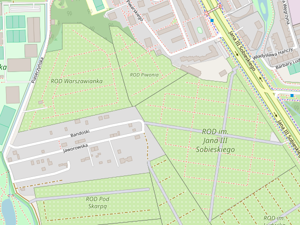
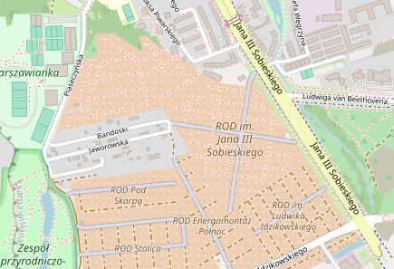
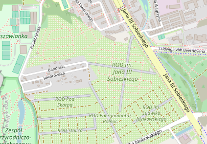
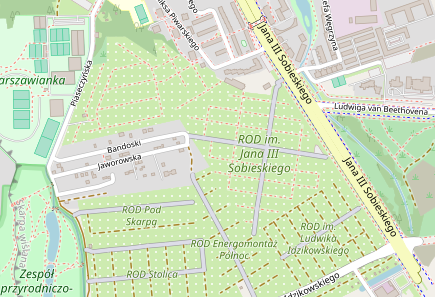
Here's Warsaw, where there is an area of big allotments with footpaths and track roads
https://www.openstreetmap.org/#map=15/52.1948/21.0346
I've added a 12th option with the 2pixel squares on garden green, but spaced 8 pixels apart instead of 8, just for comparison. This is quite similar to the current allotments pattern but in green. I agree that option 10 is best.
Warsaw z16
- Current master:

10) White 2 pixel squares at 75% opacity on a 4 pixel grid in garden green #cdebb0
12) White 2 pixel squares at 75% on an 8 pixel grid
Test 12 is very Christmas-y, with the red dashes on green with white dots. This is more evidence for the need to reconsider the current footway rendering.
Warsaw z15
- Current master:
10) White 2 pixel squares at 75% opacity on a 4 pixel grid in garden green #cdebb0
12) White 2 pixel squares at 75% on an 8 pixel grid
I think 10 is probably the best option. Does anyone want to see some of the other patterns again?
jeisenbe
on 30 Nov 2018
Thanks for testing all the cases, I'm happy with 10.
kocio-pl
on 30 Nov 2018
I would like to see:
- "10" compared side by side with grass and garden areas
- "11" -> 50%/ 75% dot opacity on #E4EFCA background
Tomasz-W
on 30 Nov 2018
@Tomasz-W wrote:
I would like to see
10...
11 -> 50%/75% dot opacity on #E4EFCA background
I want to make sure I understand your second request.
Do you want the dots to be lighter (close to white), or darker than the background in E4EFCA?
- I've already made test images with lighter dots, but I thought it looked too washed-out.
Do you want them to be spaced farther apart, like the most recent test (This was supposed to be numbered 12, but Github switched it to 11, so helpful) https://github.com/gravitystorm/openstreetmap-carto/issues/3411#issuecomment-443063916 or closer together like "11" in this comment: https://github.com/gravitystorm/openstreetmap-carto/issues/3411#issuecomment-442818603
I'll show some more with 10) soon.
jeisenbe
on 30 Nov 2018
@jeisenbe Lighter than #E4EFCA, they could be a little bit denser.
Tomasz-W
on 30 Nov 2018
More with:
10: White 2 pixel squares at 75% opacity on a 4 pixel grid in garden green
Flamengos, Azores Islands
http://www.openstreetmap.org/#map=15/38.55036/-28.65888
z15 - Small patches of allotments with many other green features (orchards, gardens, grass etc)
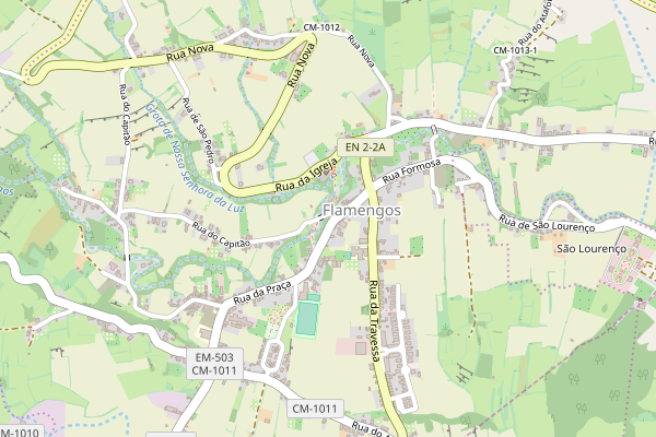
z16 - Small areas of Allotments, garden, orchard, plant nursery, grass,

z17 - Allotments next to farmland, near botanic garden and orchards
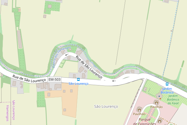
Allotments next to grass/meadow (in center)
Allotments on mid-right, garden on left by church
jeisenbe
on 30 Nov 2018
Allotments with gardens and grass
10: White 2 pixel squares at 75% opacity on a 4 pixel grid in garden green
_Glauchau, Germany: allotments next to grass_

It was difficult to find allotments immediately adjacent to gardens
_Northern Ireland: allotments by residential gardens_

Allotments between an area of grass and an area of garden

jeisenbe
on 30 Nov 2018
Number 13:) #E4EFCA background with white 2 pixel squares at 75% opacity on an 8 pixel grid
- As requested by @Tomasz-W
Residential, next to gardens
Village, near scrub, wood, grass and farms

Rural area, near grass and farms:
jeisenbe
on 30 Nov 2018
Lastly, Number 14: #E4EFCA background with white 2 pixel squares at 75% opacity on 4 pixel grid
@Tomasz-W
Urban z16
Rural z14
Village, near scrub, wood, grass and farms
jeisenbe
on 30 Nov 2018
Do we have agreement on version 10) for a PR?
Eg: https://github.com/gravitystorm/openstreetmap-carto/issues/3411#issuecomment-443203388
https://github.com/gravitystorm/openstreetmap-carto/issues/3411#issuecomment-443192445
https://github.com/gravitystorm/openstreetmap-carto/issues/3411#issuecomment-442807940
This will make allotment gardens more similar to other gardens, especially at low zoom levels, but distinct enough at mid to high zoom levels.
jeisenbe
on 2 Dec 2018
My favourites are:
- @kocio-pl ogiginal version (https://github.com/gravitystorm/openstreetmap-carto/issues/3411#issuecomment-424425965)
- @jeisenbe v13 (https://github.com/gravitystorm/openstreetmap-carto/issues/3411#issuecomment-443210120)
Tomasz-W
on 2 Dec 2018
I still like 10. The pattern is substantially different than anything else and is meaningful.
kocio-pl
on 2 Dec 2018
I'd prefer 10 over 13.
polarbearing
on 2 Dec 2018
OK, I've made a PR with version 10:
https://github.com/gravitystorm/openstreetmap-carto/pull/3548
jeisenbe
on 3 Dec 2018
Struggling to see the purpose of this amendment. The outcome is a bit too much like garden. 'Before' is best option.
 DaveF63
on 29 Dec 2018
DaveF63
on 29 Dec 2018
Dave, I am struggling to find your constructive contributions during the 3 months of discussing this matter. Please note however that the finally chosen pattern is in the PR #3548, not here in the top post.
Certain similarity to garden is intentional, since the contributors here indeed consider both features similar. The white-square pattern makes the rendering however distinct enough to distinguish them.
polarbearing
on 29 Dec 2018
@polarbearing - dismissing critique because it was not brought up at the right time according to some opinion is not a good idea. @DaveF63 stating his view here now is completely fine.
 imagico
on 29 Dec 2018
imagico
on 29 Dec 2018
Dave,
The idea was that allotments are a type of garden in the broadest sense of
garden as a place where plants are cultivated for human enjoyment. So we
wanted to use a shade of green to show that it is a vegetation related
feature.
We tried some options similar to farmland and grass, but could not find a
color that was easy to distinguish from grass areas and farmland at lower
zoom levels. We also considered using the orchard/vineyard background.
The we settled on the garden background color but with a distinctive
pattern, as seen now
However, @imagico recently suggested a different color scheme on his
branch, with allotments in a less saturated green, perhaps more on the
blue-green side. This is an option that we did not consider.
http://blog.imagico.de/more-on-vegetation-rendering-in-openstreetmap-maps/
I can show some test images with this color, if it isn’t too similar to the
new scrub color, if others are interested.
On Sat, Dec 29, 2018 at 11:29 PM DaveF63 notifications@github.com wrote:
Struggling to see the purpose of this amendment. The outcome is a bit too
much like garden. 'Before' is best option.—
You are receiving this because you were mentioned.
Reply to this email directly, view it on GitHub
https://github.com/gravitystorm/openstreetmap-carto/issues/3411#issuecomment-450496765,
or mute the thread
https://github.com/notifications/unsubscribe-auth/AoxshB3kwylUhb_6bZB4-xWZPo6IGzlfks5u93w8gaJpZM4W16Qr
.
jeisenbe
on 5 Jan 2019
Sure, I'm interested in seeing test rendering, it might help to distinguish them earlier. Thanks for checking it!
kocio-pl
on 5 Jan 2019
I'd like to see especially:
- how does it look when it's close to the cemetery?
- how would it look with our pattern?
kocio-pl
on 6 Jan 2019
It works well!
The color that @imagico used for allotments is #c9e1bf, which is closes to our current scrub color, but with Δ of 7 it's ok. On his branch the scrub color is a little more saturated, which increases the difference to over 10, just as distinctive as the differences between other green colors currently. #c9e1bf is fairly far from cemetery/graveyard color (aacbaf), which is much darker. The next closest color after scrub is golf (#b5e3b5) but this is Δ 10, which is enough. Then forest and grass are about Δ 12.
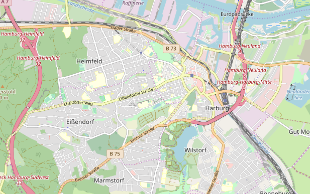
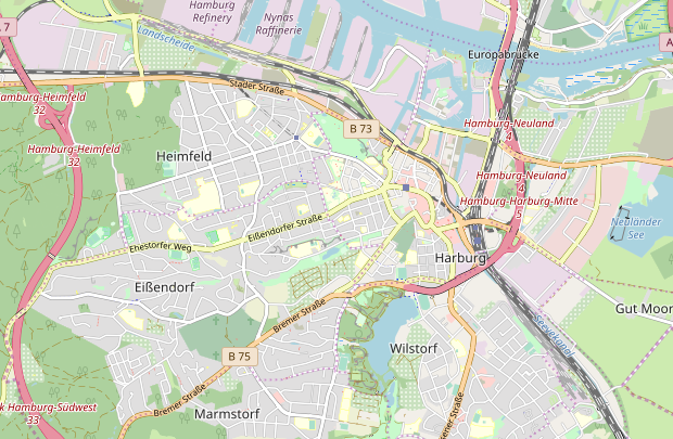
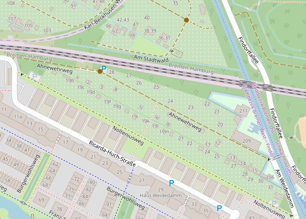
Harburg, near Hamburg, Germany - cemeteries, parks, leisure, forest are visible
(There are small patches of scrub in the industrial port area on the left, and by the motorway on the right)
https://www.openstreetmap.org/#map=13/53.4628/9.9847
z13 Current #cdebb0 - same as garden / grass

z13 New color #c9e1bf with pattern
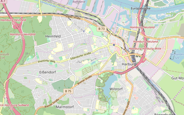
Example at z13 without the pattern, useful to consider if we stop fading colors at z12:
#c9e1bf no pattern
Rural area near farmland, farmyards, orchard, scrub, meadow etc.
https://www.openstreetmap.org/#map=14/53.4933/10.0788
z14 #c9e1bf with pattern
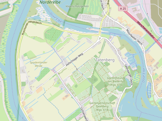
(I previously tried to find a color similar to this when we were testing, but I failed to find one that would not be too close to golf, scrub, parks or orchard. This one looks just right. Thanks, @imagico)
jeisenbe
on 6 Jan 2019
Pattern makes it more noticeable. Could you also try adding the outline?
kocio-pl
on 6 Jan 2019
What about lighter (half-transparent) pattern?
Tomasz-W
on 6 Jan 2019
Second option. This is with the previous dot pattern with this color:
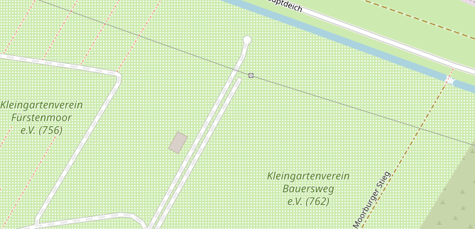
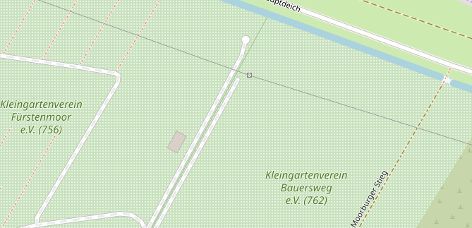
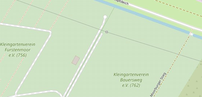
z13 Harburg #c9e1bf with former dots pattern

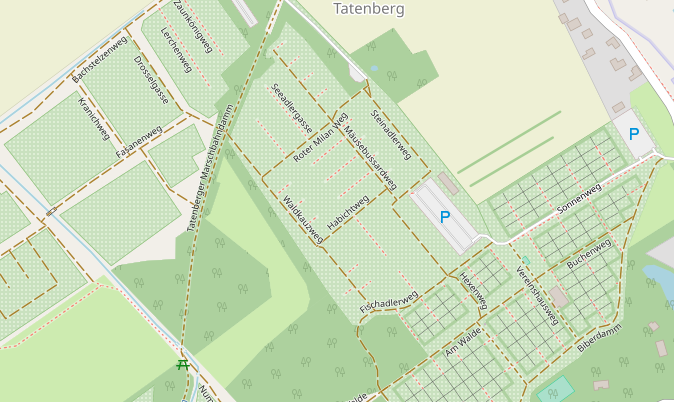
z14 Tatenburg #c9e1bf with dots

jeisenbe
on 6 Jan 2019
What about lighter (half-transparent) pattern?
Good idea, I agree that the pattern color needs adjusting. I just used the current pattern file for the most recent pictures. Here's a subtler version, with 50% opacity.
Third option with less prominent pattern (50% opacity) for testing only - would need a new pattern file)
z13 harburg

z14 tatenberg
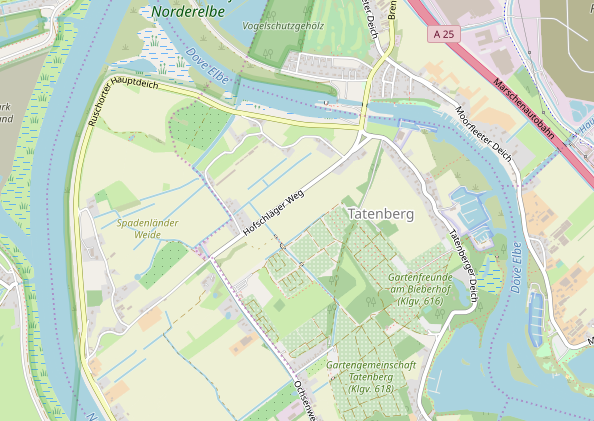
Fourth option (75% opacity for testing) - intermediate
z13
z14

Could you also try adding the outline?
Farmland and farmyard have outlines starting at z16, so that's the zoom level I've used here, and I've tried to darken the fill color by a similar amount. It does help show the border between two adjacent named allotments:
https://www.openstreetmap.org/#map=17/53.47358/9.94350
z17 Master - Harburg allotments
With outline (and 75% opacity of pattern)
With outline (50% opacity pattern)
https://www.openstreetmap.org/#map=16/53.4910/10.0811
z16 Master - Tatenberg allotments
With outline (and 75% opacity pattern)
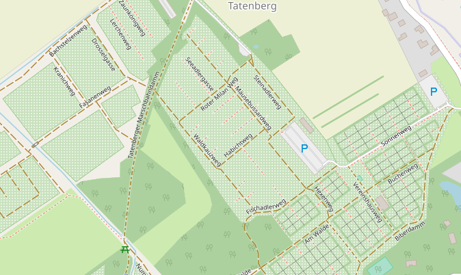
With outline (50% opacity pattern)
jeisenbe
on 6 Jan 2019
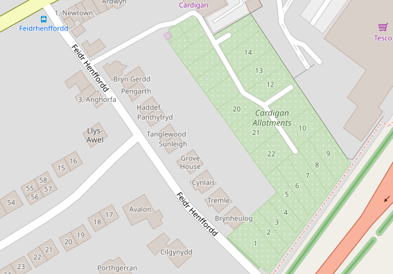
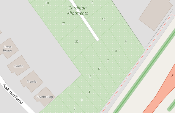
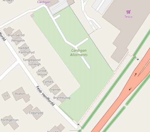
Here's some test with the addition of plot outlines and ref numbers for plots.
I've had some trouble finding allotments=plot with ref=* - there are plenty in Germany, but not in the cities that I've downloaded, and this is the only location in all of Wales with ref:
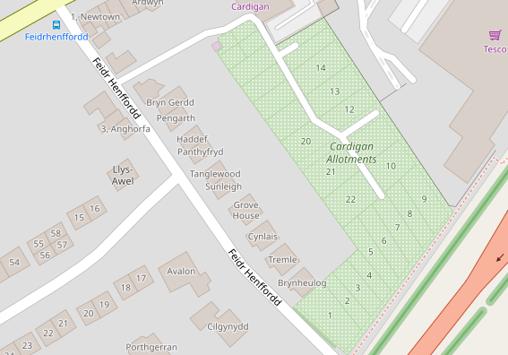
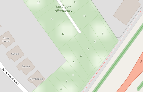
_Cardigan, Wales_ https://www.openstreetmap.org/#map=18/52.08803/-4.64677
z18 - Ref numbers, plot and landuse outlines, 75% opacity pattern with #c9e1bf

z19

With numbers only (and current colors, no borders) - for comparison
z18

z19

jeisenbe
on 7 Jan 2019
75% pattern + new colour is nice, but proposed outline is too strong.
Tomasz-W
on 7 Jan 2019
Here's slightly thinner and lighter borders (I've changed the landuse=allotments border from 0.7 to 0.5 and the plot border from 0.5 to 0.3, while both are 15% darken than the fill instead of 20% darker)
z18 squares at 75% opacity
z19
With dot pattern:
Here's slightly thinner and lighter borders (I've changed the landuse=allotments border from 0.7 to 0.5 and the plot border from 0.5 to 0.3, while both are 15% darken than the fill instead of 20% darker)
z18 squares at 75% opacity
z19
With dot pattern:
z18 dots
z19 dots
Cardigan, Wales https://www.openstreetmap.org/#map=18/52.08803/-4.64677
jeisenbe
on 7 Jan 2019
In general I like the proposition very much. The color is substantially different, so it should not look a like a grass even on medium zoom levels (this was the weakness of our solution), which would be good enough when we started. But now I like squares pattern more, since it is more meaningful than just dots and even easier to recognize.
So squares at 75% opacity with thinner and lighter borders are great for me. Feel free to tune it more if you feel it could be even better.
kocio-pl
on 7 Jan 2019
@jeisenbe Can you test '75%' version with outline values from e.g. landuse=farmland? I think it's still too strong.
Tomasz-W
on 7 Jan 2019
Can you test '75%' version with outline values from e.g. landuse=farmland? I think it's still too strong.
The outline above is supposed to be similar relative darkness as farmland outline, and the width is 0.5 on both.
Here's a slightly lighter color for the outline: the new allotments fill, darkened 10%. I think it is too faint to be seen between two different areas of allotments, especially when the lines are vertical or horizontal like in this first picture
Bremen, Germany: https://www.openstreetmap.org/#map=16/53.1070/8.8134
Dots with 20% darker outline so you can see it:
Compared to squares with 10% darkened outline:
It's ok when the allotments are up against blank areas, but there's really no need for an outline in this case:
Offsetting the outline into the polygon would help some: (offset -0.5 pixels, darkened 10%)

But 15% darkened is better visible:

jeisenbe
on 8 Jan 2019
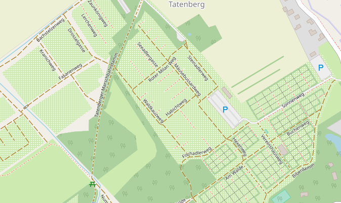
Looking around Bremen and Hamburg, I've realized that we should have tested areas of allotments with buildings. We previously tested areas with paths and tracks only, but most allotments in German-speaking countries have small shacks, or cabins, or even small houses. This looks bad at z14 and z15 with the current strong squares pattern:
_Bremen, Germany:_ https://www.openstreetmap.org/#map=16/53.1070/8.8134
Small squares (2px on 4px grid), as in current pattern, 0.75 opacity:
z17 (with 15% darkened border, -0.5 line-offset)
z16
z15

z14
Dots pattern (previous allotments pattern)
z17

z16

z15

z14

2px squares on 8px grid
- _This still uses the small squares, but spaces them twice as far apart, like the previous dots_
z17
z16
z15
- I believe this would also work, but the dots are a little less obtrusive
jeisenbe
on 8 Jan 2019
With so busy places current solution looks much better than a proposed one, especially on midzoom, no matter what pattern. I believe they are just well mapped, because in Poland it's the same in reality, buildings are just not drawn in many cases.
I'm not sure what to do with that problem.
kocio-pl
on 8 Jan 2019
“current solution looks much better than a proposed one, especially on
midzoom, no matter what pattern”
I don’t understand. Which looks better?
On Tue, Jan 8, 2019 at 11:12 AM kocio-pl notifications@github.com wrote:
With so busy places current solution looks much better than a proposed
one, especially on midzoom, no matter what pattern. I believe they are just
well mapped, because in Poland it's the same in reality, buildings are just
not drawn in many cases.I'm not sure what to do with that problem.
—
You are receiving this because you were mentioned.
Reply to this email directly, view it on GitHub
https://github.com/gravitystorm/openstreetmap-carto/issues/3411#issuecomment-452150104,
or mute the thread
https://github.com/notifications/unsubscribe-auth/AoxshM76i72kQz0whhDU5qPKoXQsnSoqks5vA_6jgaJpZM4W16Qr
.
jeisenbe
on 8 Jan 2019
What we have now looks better for me than new proposed color when there are so many buildings.
kocio-pl
on 8 Jan 2019
Ok.
I think that the current pattern can interfere with identifying the shapes
of small buildings.
The new color is has less contrast with the color of buildings and tracks,
but that’s not a problem by itself; residential areas are even closer to
the building color.
But the combination of the lower contrast from the new color, plus the
visiual “noise” from the squares, makes it hard to see building shapes.
Going back to the dot pattern makes the background less “busy”, and the
geometry of buildings and roads is easier to see, even with the new color,
in my estimation.
On Tue, Jan 8, 2019 at 12:25 PM kocio-pl notifications@github.com wrote:
What we have now looks better for me than new proposed color when there
are so many buildings.—
You are receiving this because you were mentioned.
Reply to this email directly, view it on GitHub
https://github.com/gravitystorm/openstreetmap-carto/issues/3411#issuecomment-452162493,
or mute the thread
https://github.com/notifications/unsubscribe-auth/AoxshJnzvUsFWeZZdkZY3NgKjuHjMR8Pks5vBA-kgaJpZM4W16Qr
.
jeisenbe
on 8 Jan 2019
I would miss this nice pattern, but everything is acceptable for me here.
kocio-pl
on 8 Jan 2019
I prefer squares pattern over dots one.
Tomasz-W
on 8 Jan 2019
Related issues
boothym
·
5Comments
 d3netxer
·
4Comments
d3netxer
·
4Comments
 manfredbrandl
·
5Comments
manfredbrandl
·
5Comments
 jengelh
·
4Comments
jengelh
·
4Comments
 wielandb
·
3Comments
wielandb
·
3Comments
Most helpful comment
Because it can be similar to farmland and garden, I've made another proposition with 50% mix of both colors: