Openstreetmap-carto: Add special icon for shop=kitchen
https://wiki.openstreetmap.org/wiki/Tag:shop=kitchen
7k uses
A simplified version of something like https://thenounproject.com/search/?q=kitchen&i=132481 might work, but I haven't tested it yet.
 lakedistrictOSM
All 20 comments
 I've tested it and it doesn't really work :(
lakedistrictOSM
on 3 Jul 2018
What about shop=houseware icon re-use?
https://github.com/gravitystorm/openstreetmap-carto/blob/master/symbols/shop/houseware.svg
 Tomasz-W
on 3 Jul 2018
Tomasz-W
on 3 Jul 2018
What about shop=houseware icon re-use?
Best not because shop=kitchen sells actual kitchens, not just kitchenware.
lakedistrictOSM
on 3 Jul 2018
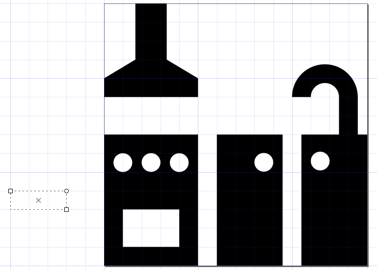
Icon proposals:
1) 
2) 
Tomasz-W
on 5 Jul 2018
@Tomasz-W Both are good, but might be too detailed. Is it possible to remove the cooker hood so that the units can be made taller? Just the cooker and a single unit with a tap might be more clear.
Otherwise 1 is better.
lakedistrictOSM
on 5 Jul 2018
Without cooker hood it would be less intuitive. Updated version with higher units:

Tomasz-W
on 6 Jul 2018
Tomasz-W
on 11 Jul 2018
I've tested this and I think it is recognizable as a kitchen:
z19:
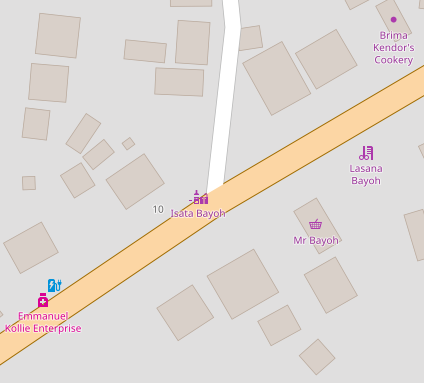
and z18 at another location:
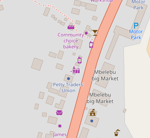
But I don't know where the minus left to the icon comes from, I don't find any mistakes in my code ...
 Karthoo
on 12 Jul 2018
Karthoo
on 12 Jul 2018
Looks like there was a problem with the SVG icon:
I've corrected it here if you want to update your code: https://gist.github.com/lakedistrictOSM/52498aedb02a0c7246d836435dbcd33e
lakedistrictOSM
on 12 Jul 2018
Sorry for this left white shape, my bad.
I'm still not sure is a special icon needed here. On the one hand 7k uses is quite a lot, but on the other it's not a common-needed feature, and usually a dot is enough for these. @kocio-pl What do you think?
Tomasz-W
on 12 Jul 2018
I'm not sure.
 kocio-pl
on 12 Jul 2018
kocio-pl
on 12 Jul 2018
First of all thanks for the icon proposal. I think it’s a little bit difficult to recognize at the scale that we use here in openstreetmap-carto, but nice work anyway.
Indeed 7 000 usages is yet considerable. But in the last time we have added really a lot of icons for features usually between 1 000 and 10 000 usages. And while it’s relevant to show them on a general-purpose map (that’s what openstreetmap-carto is), when you have too many different icons, the map becomes difficult to read without making a study of the legend (which we even don’t have at the moment). Even as regular contributor, I find icons on the map that are not obvious for me and where I have to search the meaning for. For an occasional user that will be more difficult. As shops do show up anyway (with the generic “dot” icon) they are available on the map, which reduces the incentive for wrong tagging (tagging for the renderer for making it show up). Therefore, I think specialized shops can better stay with the dot icon.
 sommerluk
on 12 Jul 2018
sommerluk
on 12 Jul 2018
So maybe we should just close this issue without adding new icon.
kocio-pl
on 13 Jul 2018
Unless there's an icon that we could reuse if any are suitable?
We have icons for shops with much lower uses which could also be classed as specialised like bag and dairy.
lakedistrictOSM
on 13 Jul 2018
Well, as our database is still getting biger and bigger, at this state I think we should't look just at no. of uses, because some object can be present worldwide and have a lot of uses but at the other hand - it's not like "Hey, let's go buy some kitchen" and someone is looking through the map for a kitchen icon but more like "Ok, I'm going to Paradise Kitchens" after internet searching and looking through the map for a shop name. A dot is enough for this.
For comparsion we have just ~500 of ski jumping hills in the database, but they are very rare by theirs nature, and because they are quite a charecteriscic objects, I still would like to see them with special icon.
We should discuss about every case separately, not automatically add special icon for every 1k+ feature and reject for every 1k- feature.
PS. @sommerluk Can you point out which icons are not obvious for you? Maybe I can fix them :)
Tomasz-W
on 13 Jul 2018
specific icons are both, an incentive for some people to map with greater
detail / more specifically and they give a feedback about "correctness",
while for map consumers they can help for orientation and recognizing the
situation on the ground on their map (also when the icon is not about
something they are interested in) . This is especially true for landmarks
(like museums, churches, monuments and memorials, towers) but varies across
scales (a tower can usually be seen from far away, supermarkets or bridges
are typically very recognizable when you pass them even at higher speeds, a
memorial, playground or news agent can help orienting yourself at street
scale making them "micro landmarks").
IMHO the aim of this style is more showing the variety and richness of our
data (show case) than being actual useful for a specific shopping usecase
(you will have to zoom in so far to see things that you will usually have
to use a search function because "browsing the map" in search for the thing
would be too tedious.
 dieterdreist
on 13 Jul 2018
dieterdreist
on 13 Jul 2018
@kocio-pl I propose to close this issue due to https://github.com/gravitystorm/openstreetmap-carto/issues/3290#issuecomment-404637972 and https://github.com/gravitystorm/openstreetmap-carto/issues/3290#issuecomment-404759312 . We should avoid icons which could be unclear or confusing.
Tomasz-W
on 22 Jul 2018
@Tomasz-W Whats the verdict on this? If it should be closed because its unclear and shouldn't be worked on can you mark it as canceled or something on your list of "code needed" items please?
 Adamant36
on 23 Aug 2018
Adamant36
on 23 Aug 2018
I think it should be closed, because it's not so important feature and the icon is quite hard to read, but I don't have a possibility to closing issues. @kocio-pl What do you think?
Tomasz-W
on 23 Aug 2018
Ok, I will close it now, until some better icon idea will appear.
kocio-pl
on 23 Aug 2018
Related issues
 FTno
·
4Comments
FTno
·
4Comments
 MarkusStue
·
4Comments
MarkusStue
·
4Comments
 d3netxer
·
4Comments
d3netxer
·
4Comments
 Phyks
·
3Comments
Phyks
·
3Comments
 HolgerJeromin
·
3Comments
HolgerJeromin
·
3Comments
Most helpful comment
First of all thanks for the icon proposal. I think it’s a little bit difficult to recognize at the scale that we use here in openstreetmap-carto, but nice work anyway.
Indeed 7 000 usages is yet considerable. But in the last time we have added really a lot of icons for features usually between 1 000 and 10 000 usages. And while it’s relevant to show them on a general-purpose map (that’s what openstreetmap-carto is), when you have too many different icons, the map becomes difficult to read without making a study of the legend (which we even don’t have at the moment). Even as regular contributor, I find icons on the map that are not obvious for me and where I have to search the meaning for. For an occasional user that will be more difficult. As shops do show up anyway (with the generic “dot” icon) they are available on the map, which reduces the incentive for wrong tagging (tagging for the renderer for making it show up). Therefore, I think specialized shops can better stay with the dot icon.