Openstreetmap-carto: Parking too prominent
Parking is currently rendered too prominent. Compare for example the following renderings.
Before:

After (possible):

In the 'before' rendering, the parking is rendered more prominently than the buildings (including the supermarket). Can we tone down the rendering? Light gray like in the possible 'after' might be going too far, but do we have any other options?
 matthijsmelissen
All 31 comments
Lighter yellow might work:

The color is still not very intuitive to me, it doesn't immediately scream 'parking'.
matthijsmelissen
on 24 Oct 2017
Thanks, looks to me like a real issue worth taking care of. Lighter yellow might be similar to social amenities however. Another possibility would be something based on garages area.
 kocio-pl
on 24 Oct 2017
kocio-pl
on 24 Oct 2017
it doesn't immediately scream 'parking'.
Well, that's very good IMO. I don't like any objects to "scream" if they are not of special importance by design (like military area or health related features). Parkings are currently too prominent because of two properties:
- very intensive color for area (second to reds probably), especially if this area is big,
- quite big letter with a color which is also intensive (strong blue is very visible on land features).
My initial idea was to push the letters down a bit (#2171), but maybe we could do the other way around and left the "P" markers as they are, but instead make area color neutral, just to see the shape.
I feel that gray is good: if you're looking for a parking, you can still easily spot them, and the real shape and size is perfectly visible once you choose which one you're interested in. "Transportation gray" would make things unified (as in #2763).
Dropping yellow would also work for visibility of secondary roads ("After" rendering shows it clearly) and probably social amenities too.
kocio-pl
on 24 Oct 2017
Examples of parking area colored like aerodrome:
Parking near LaGuardia airport (New York):
Before

After

Parking on LaGuardia airport (New York):
Before

After

kocio-pl
on 27 Oct 2017
Examples of parking area colored like garages:
Warsaw:
Before

After

Parking near LaGuardia airport (New York):

Parking on LaGuardia airport (New York):

kocio-pl
on 27 Oct 2017
Some hints for rendering parking space:
- parking area, no restriction (e.g. public) = yellow
- parking space, access permission (e.g. customers) = yellow with hatch
- parking space, private or no access = pale (same as garages)
 printmaps
on 29 Oct 2017
printmaps
on 29 Oct 2017
I don't see any problem with current parkings colour. Current yellow with "P" letter is intuitive, and parking borders are visible good. Parkings with restricted access are rendered with lighter "P", and for me, it's enough to distinguish them.
Changing it to almost unvisible kind of pale brown colour, will make parkings hard to see.
 Tomasz-W
on 29 Oct 2017
Tomasz-W
on 29 Oct 2017
Changing it to almost unvisible kind of pale brown colour, will make parkings hard to see.
"Too prominent" means "too easy to see (=at the expense of other elements)", but making them less prominent does not mean they will be "hard to see". The letter "P" is still easily visible, so it's still easy to see the parking location, just not the shape.
kocio-pl
on 29 Oct 2017
Gray parking areas would become invisible on landuse=residential and other gray areas.
 matkoniecz
on 2 Nov 2017
matkoniecz
on 2 Nov 2017
Well, it depends on the size - the bigger it is the more visible it became, which is very good. I like the original proposition (#eeeeee), because it's bright enough, yet parkings stop being more important than buildings, roads and societal areas as it is currently (which I find to be just ridiculous).
No landuse:
Before

After

Residential with buildings - good contrast for big parking, at the same time small parking don't "scream":
Before

After

Before

After

Big and small parking on commercial with buildings:
Before

After

Near secondary roads:
Before

After

kocio-pl
on 4 Nov 2017
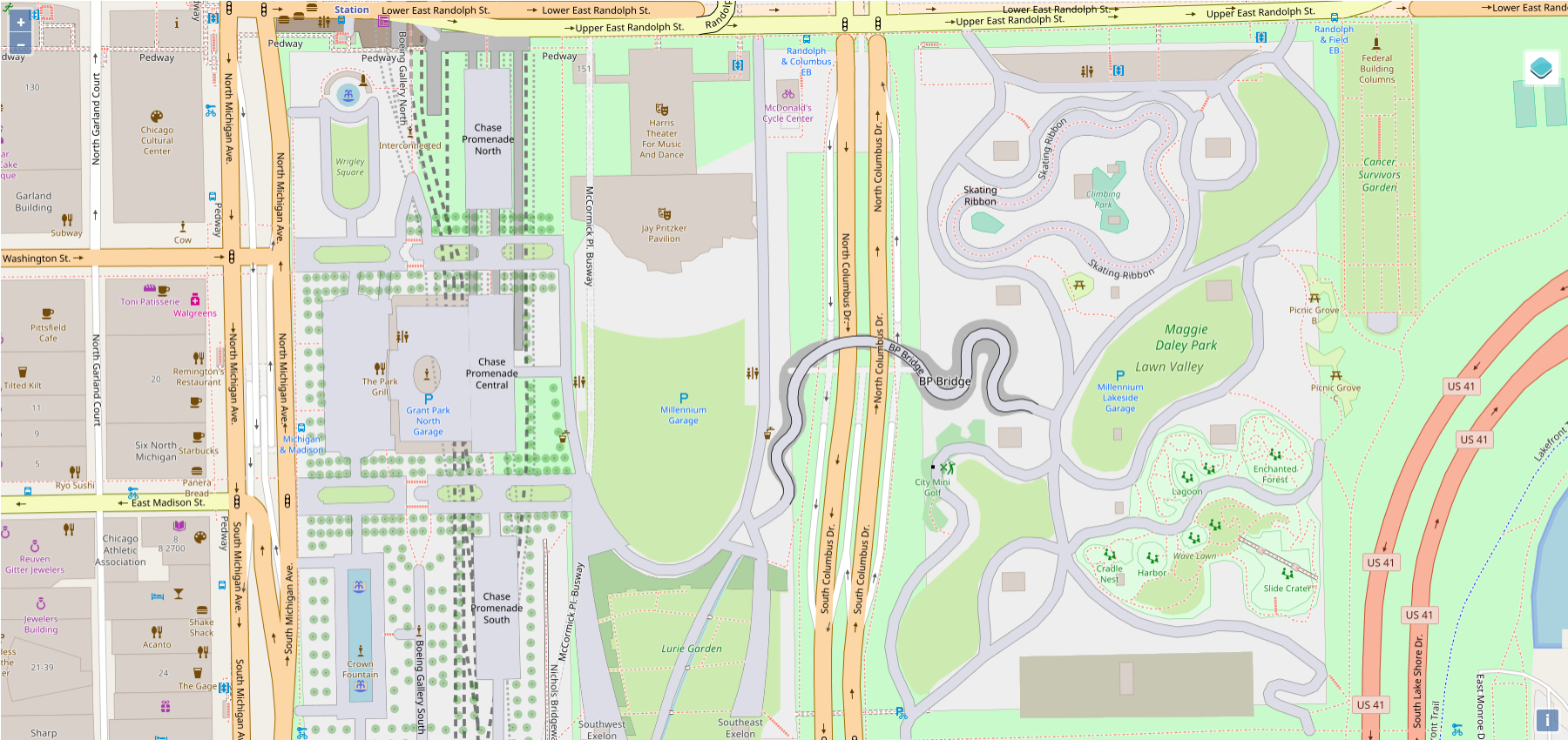
Another example illustrating that it's a real problem and that big parkings are still visible with gray area - east side of Chicago:
Before

After

Before

After

kocio-pl
on 4 Nov 2017
Will you change amenity=bicycle_parking areas too for consistency?
eg http://www.openstreetmap.org/way/419572766 @ z19

 lakedistrictOSM
on 8 Nov 2017
lakedistrictOSM
on 8 Nov 2017
The same color is used for all the parking types:
kocio-pl
on 8 Nov 2017
Another case when parking is too visible - big underground facilities in yellow make park look like a beach probably:
http://www.openstreetmap.org/way/230629285#map=18/41.88262/-87.62070

UPDATE: This is how it looks after the color change - I still think if we should change the rendering for underground parkings (hide the landcover, hide the P or show it with a ^ above?):
https://tile.iosb.fraunhofer.de//#map=17/41.8827/-87.6214/3
In the end the most important thing to show in such cases is the parking entrance: #2875.
kocio-pl
on 21 Nov 2017
@Tomasz-W Maybe P combined with the down arrow on the bottom could work for underground parking? It could be simple and readable, I hope. What do you think?
kocio-pl
on 21 Sep 2018
What about "P" under horizontal line? "P" with arrow is planned for https://github.com/gravitystorm/openstreetmap-carto/pull/2875
Tomasz-W
on 21 Sep 2018
Could you check both? I meant lower part of the letter to be an arrow, not two elements with smaller P, like in parking entry.
kocio-pl
on 21 Sep 2018
Ok, I'll try.
Btw. I think underground parking areas should be hidden the same as we hid underground platforms, I don't see a reason for showing them as they are covered by another elements (see the example above), so parking shape is invisible or hard readable anyway.
Edit: Or maybe some dashed outline without filling simillar to 3rd test rendering there: https://github.com/gravitystorm/openstreetmap-carto/issues/2475#issuecomment-371912685
Tomasz-W
on 21 Sep 2018
Yes, my current idea is to hide all the areas (better than yellow, but still strange and misleading), but leave the mark on lower zoom level and show entries on higher zoom. I guess this would be enough and we don't have to remove the mark.
kocio-pl
on 21 Sep 2018


 Tomasz-W
on 21 Sep 2018
Tomasz-W
on 21 Sep 2018
Comparison of example with 3 underground parkings in Chicago on z17:
Before (well, the icon is v3...)

After (3 versions)


kocio-pl
on 21 Sep 2018
What about bigger triangle on v3, like the whole width and probably P letter cut a bit on the bottom to make it fit?
kocio-pl
on 21 Sep 2018

 Tomasz-W
on 21 Sep 2018
Tomasz-W
on 21 Sep 2018
@kocio-pl Is possible to use dashed parking outline there (without filling)? Can you try it?
PS. At this point I think it would be better if you will open new issue for underground parkings, because working on something in closed ticker which was about something different always makes discussion more complitated.
Tomasz-W
on 22 Sep 2018
I don't think the outline is good, it will be hard to know what is it. I will open new ticket once I get some time, I have too many things currently.
kocio-pl
on 22 Sep 2018
My 2 cents: why not a roof over the "P" like this one
 jragusa
on 23 Sep 2018
jragusa
on 23 Sep 2018
Because it would fit rather parkings under bulding=roof(eg. https://ecofriend.com/wp-content/uploads/2012/08/vanguard-1_DRCPI_7071.jpg) than underground ones ;)
Tomasz-W
on 23 Sep 2018
Not just in building=roof but also parking=multi_storey; but indeed not underground.
 polarbearing
on 23 Sep 2018
polarbearing
on 23 Sep 2018
I've made v6 simply by making v5 wide for the whole matrix:
v4

v5

v6

kocio-pl
on 23 Sep 2018
I vote for v5.
Tomasz-W
on 24 Sep 2018
Please continue further discussion about underground parkings in https://github.com/gravitystorm/openstreetmap-carto/issues/3506.
Tomasz-W
on 10 Nov 2018
Related issues
 boothym
·
5Comments
boothym
·
5Comments
 manfredbrandl
·
5Comments
manfredbrandl
·
5Comments
 d1g
·
4Comments
matkoniecz
·
5Comments
lakedistrictOSM
·
3Comments
d1g
·
4Comments
matkoniecz
·
5Comments
lakedistrictOSM
·
3Comments
Most helpful comment
I vote for v5.