Openstreetmap-carto: show names of aerialways
http://overpass-turbo.eu/s/bfz - aerialways with names
 matkoniecz
All 19 comments
Great idea, the only problem is from which zoom level to start it and how big letter size should we use.
 kocio-pl
on 3 Sep 2015
kocio-pl
on 3 Sep 2015
This was removed a while ago, best to know why.
 yvecai
on 3 Sep 2015
yvecai
on 3 Sep 2015
Great idea, the only problem is from which zoom level to start it and how big letter size should we use.
1:50k, the first real topographic map scale, close to Z13/14. Many aerialways are at least one, or a couple of kilometres long. At 1:50k, this means at least 2 cm labelling space along the line, and in most cases more, which should be sufficient to place labels.
 mboeringa
on 3 Sep 2015
mboeringa
on 3 Sep 2015
@yvecai
This was removed a while ago, best to know why.
There was catch-all rendering - all name tags were rendered (including names on misspelled objects and names that were not deserving rendering).
matkoniecz
on 3 Sep 2015
I'm willing to fix this, but first a question: a naive option could be to render the name as it is rendered for railways, because railways and aeroways are related in that they are mechanized means of transport, based on a steel way. Would that be OK? I ask now because that would mean, IMO, including aeroways in railways-text-name code, so I prefer not messing with such a piece of code before having some opinions.
 Penegal
on 13 Mar 2018
Penegal
on 13 Mar 2018
I think this is a valid solution.
kocio-pl
on 13 Mar 2018
Would this way do it?

Penegal
on 14 Mar 2018
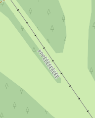
Looks OK based on this examples - but maybe names should be a bit closer (or not, it may require testing with tall characters).
matkoniecz
on 14 Mar 2018
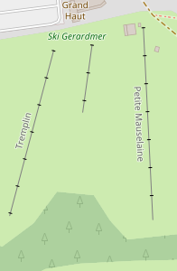
'Petite Mauselaine' looks upside down, is there a way to write it bottom to top?
Le 14 mars 2018 19:15:38 GMT+01:00, Mateusz Konieczny notifications@github.com a écrit :
Looks OK based on this examples - but maybe names should be a bit
closer (or not, it may require testing with tall characters).--
You are receiving this because you were mentioned.
Reply to this email directly or view it on GitHub:
https://github.com/gravitystorm/openstreetmap-carto/issues/1807#issuecomment-373123579
Yves
yvecai
on 14 Mar 2018
@yvecai: it is not fully upside down, but slightly left to right; the problem is the orientation of the aerialway, almost north-south.
@matkoniecz: I'll try closer and taller characters.
Penegal
on 14 Mar 2018
Mateusz meant probably testing fake names with tallest characters possible with certain font size, like ÈÈÈÈÈÈÈÈ or ÉÉÉÉÉÉÉ.
kocio-pl
on 14 Mar 2018
@Penegal , I had the same issue on opensnowmap with icons on aerialways, but worse: it looks really ugly to have a gondola upside-down.
I solved it by reversing the ways depending on orientation.
          (SELECT
             type, name,
            (CASE
                WHEN st_x(st_startpoint(geometry)) < st_x(st_endpoint(geometry))
                THEN geometry
                ELSE st_reverse(geometry)
            END) as geometry
          FROM
            osm_aerialways
          ) as data
Mateusz meant probably testing fake names with tallest characters possible with certain font size, like ÈÈÈÈÈÈÈÈ or ÉÉÉÉÉÉÉ.
Yes, I meant this. Sorry for confusion.
matkoniecz
on 14 Mar 2018
I had the same issue on opensnowmap with icons on aerialways, but worse: it looks really ugly to have a gondola upside-down.
I don't think they're aiming for gondolas on the map here... Let that be a unique feature of OpenSnowMap.
I personally don't have much of a problem with the reversed text, but I can understand some people would want them all to be in the same direction.
mboeringa
on 14 Mar 2018
@mboeringa Sure, I was giving an example that could also apply to the text orientation. Agreed this is not a major problem.
Yves
yvecai
on 15 Mar 2018
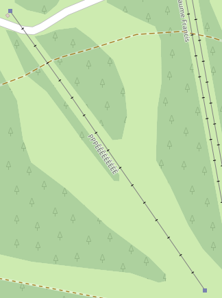
Here you are:
With text-dy decreased of 2px:
Penegal
on 16 Mar 2018
With text-dy decreased of 2px:
The label still fits and it looks better, so I vote for this version.
kocio-pl
on 16 Mar 2018
As long as it fits it is clearly preferable. Hmm, maybe it would be even better with name on aerialway, without text-dy? (feel free to ignore this idea).
matkoniecz
on 16 Mar 2018
Without text-dy:
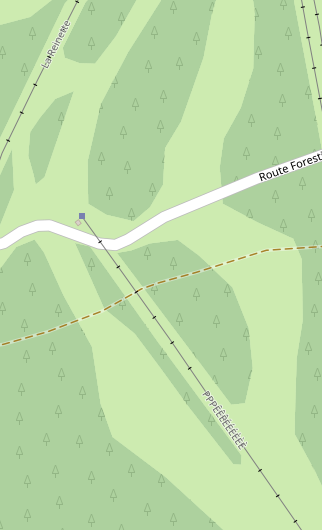
It decreases readability IMO; I think I should go with the previous text-dy value.
Penegal
on 19 Mar 2018
Related issues
 HolgerJeromin
·
3Comments
HolgerJeromin
·
3Comments
 boothym
·
5Comments
boothym
·
5Comments
 Tomasz-W
·
4Comments
Tomasz-W
·
4Comments
 manfredbrandl
·
5Comments
manfredbrandl
·
5Comments
 FTno
·
4Comments
FTno
·
4Comments