Openshot-qt: UI Enhancement: Property Parameter Colors
OpenShot v2.4.1
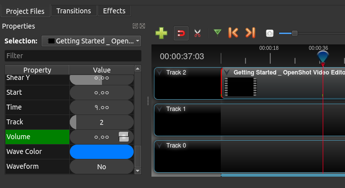
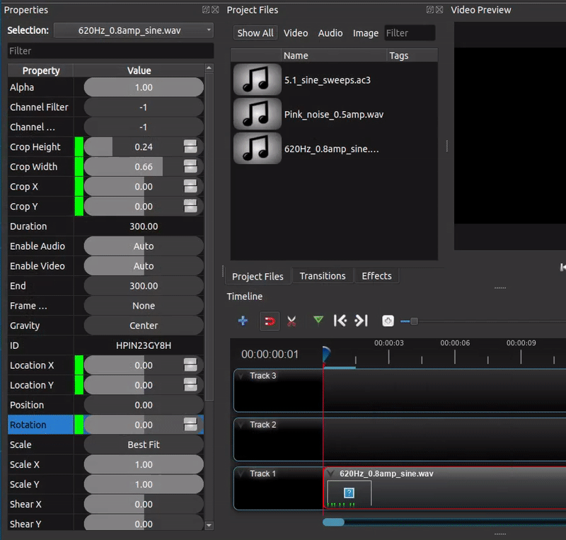
Currently, OpenShot uses Green Color for parameters in the 'properties' tab to indicate that they have been keyframed. Like so:
And blue color for parameters that are being interpolated:
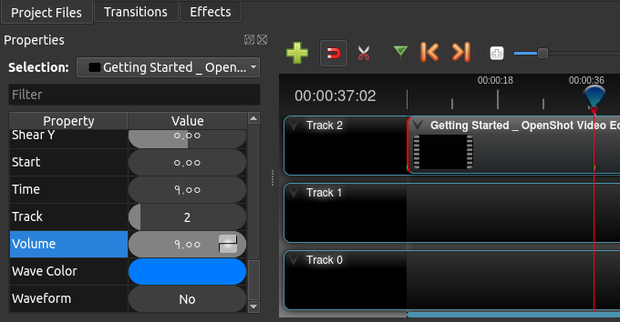
But, OpenShot also uses blue color to denote selection. That leads to this confusion:
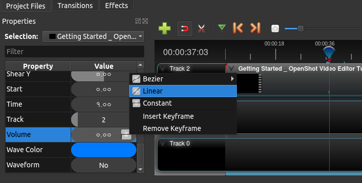
While the user is in the keyframe, trying to change the curve (or the value) of the parameter, it looks blue which is a bit confusing. It would be nice if this could be fixed.
An idea would be to use colors with transparency to denote selection. So that when a parameter is selected, the green (for keyframe) or blue (for interpolation) will show through. Implementing something similar should greatly improve the user experience.
With much love for OpenShot. :)
 peanutbutterandcrackers
All 15 comments
@DylanC, @ferdnyc, @N33WN - Do you have any suggestions regarding this? I think this improvement will be quite useful for the keyframe-savvy users who do a lot of parameter tweaking in order to edit the videos, along with #876.
peanutbutterandcrackers
on 9 Mar 2018
So, I took a few minutes to look over the code regarding the background color of the properties.
What it appears to be, if I'm seeing the same thing as you're describing, is that when you right-click on the keyframe value to adjust the curve, OpenShot no longer believes that the property, during that frame, is a keyframe.
I've been able to determine this so far by just inserting a Volume keyframe, using the arrow keys to move 1 frame left (Volume turns blue) and then right (returning to they Volume keyframe, which turns green), then right-clicking on the Volume property to bring up the context menu, which turn the green background blue (as described above), hit escape to get out of the context menu, and the Volume property, which should be green because it is the keyframe, remains blue. I can move a frame left or right and come back and the Volume keyframe is still blue.
If you search for the word "highlight" in the windows/models/properties_model.py file, like you can see here: https://github.com/OpenShot/openshot-qt/blob/master/src/windows/models/properties_model.py#L608 , you can see that if keyframe... (or some variation thereof) is used to set the background color to green. Otherwise, the blue "interpolated" background color is used. This leads me to believe that the keyframe variable is being set to a false value when the context menu is activated.
That's all I have time to dig into for now, but at least it's a start!
 N3WWN
on 9 Mar 2018
N3WWN
on 9 Mar 2018
@N3WWN - Thank you for digging that up. Also, I have written you an email. Please do take a look at it. It's regarding OpenShot. A message from Morpheus. Kinda'. :)
peanutbutterandcrackers
on 10 Mar 2018
Yeah, I see the issue, and it's as @peanutbutterandcrackers says: The blue coloring, in this case, also indicates selection.
An important point is that the keyframe is never _lost_, and in fact it's (arguably) never misdisplayed. When you right-click on a Properties row, you also select that row (which is correct), so it turns blue. After you exit the context menu, the row is _still_ selected, so it stays blue even if you scrub through the video. Which means you can no longer see the keyframe highlight. But if you left-click on a different Properties row, then the row is no longer selected so the green color returns.
The way you can tell selection apart from interpolation (and this is admittedly kind of silly), is by the text color. An interpolated-frame indicator is white-on-blue. The selected row is black-on-blue.
I have two suggestions on how this would be dealt with, and they're in no way mutually exclusive:
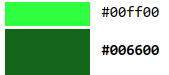
- Use a different color for interpolated values than for selection highlighting, that's a no-brainer. The interpolated frames could be highlighted purple, for instance. Or maybe use a (very noticeably) different shade of green, like the difference between
#0f0and#060.
- Don't use row-highlighting to indicate frame value status, since it's also used for selection. The indicator for keyframe vs. interpolated could be shown as a narrow rectangle between the value and the label, for instance. Then it wouldn't be obscured by the selection highlighting. So, something perhaps like this.
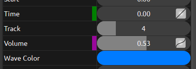
That would indicate that the current frame is a keyframe for Time but an interpolated frame for Volume, and selecting either row wouldn't hide any of that information.
 ferdnyc
on 12 Mar 2018
ferdnyc
on 12 Mar 2018
@ferdnyc - I'm not sure which one of the two I like better. That is a neat solution. As long as the keyframes and interpolated values can be identified as being so, even when it is selected, I'd be happy with it. :)
Do you do UIs, too?
peanutbutterandcrackers
on 12 Mar 2018
I'm not sure which one of the two I like better.
Well, again, I advocate for _both_.
Do you do UIs, too?
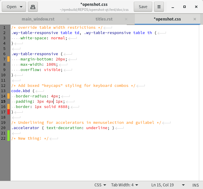
Nope, but I've been using them my whole life. :smile: I'm sure I ripped this off from some other software, though I can't think which at the moment. It's actually not far off from the edge-of-page indicators that most document and text editors use to track changes.
For instance, here's gedit, indicating where in openshot.css I've added, deleted, or changed lines, compared to the most recent commit.
ferdnyc
on 12 Mar 2018
Hmm... I see. I think setting selection color to one with transparency should also be done. So that the bottom color can be seen through the selection color...
peanutbutterandcrackers
on 12 Mar 2018
I'm a huge fan of # 2 (the color blocks between the name and value), regardless of whether the colors are changed for interpolation and highlighting (# 1). 😁
Is # 1 necessary if # 2 is implemented? Having both sounds good, and is probably the best possible solution, but I think # 2 itself resolves the problem, right?
N3WWN
on 12 Mar 2018
Well, my # 2 example _does_ also change the color (from blue to purple), so it incorporates # 1 implicitly. I think the color-change still worth doing, because if the interpolated-value indicators are blue, then they'll still be pretty hard to spot on a selected row even if they are visible alongside the highlight.
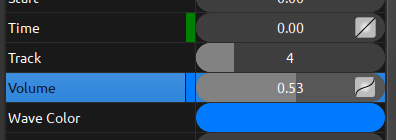
It's the difference between this (# 2 without # 1):
And this (# 2 + # 1):
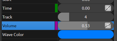
Besides, having blue mean two different things is just needlessly confusing.
ferdnyc
on 12 Mar 2018
Thank you so much for submitting an issue to help improve OpenShot Video Editor. We are sorry about this, but this particular issue has gone unnoticed for quite some time. To help keep the OpenShot GitHub Issue Tracker organized and focused, we must ensure that every issue is correctly labelled and triaged, to get the proper attention.
This issue will be closed, as it meets the following criteria:
- No activity in the past 180 days
- No one is assigned to this issue
We'd like to ask you to help us out and determine whether this issue should be reopened.
- If this issue is reporting a bug, please can you attempt to reproduce on the latest daily build to help us to understand whether the bug still needs our attention.
- If this issue is proposing a new feature, please can you verify whether the feature proposal is still relevant.
Thanks again for your help!
![stale[bot] picture](https://avatars3.githubusercontent.com/in/1724?v=4&s=40) stale[bot]
on 28 Oct 2020
stale[bot]
on 28 Oct 2020
@ferdnyc Since it appears that you have the code already working, is this something that is possible to submit for inclusion in a near-future release? I'm not married to either # 1 or # 2, and either is an improvement, so whichever you prefer would be great! Thanks!
N3WWN
on 28 Oct 2020
@N3WWN ISTR that I _did_ have code at least partially working, once long ago. But, honestly, it's been so long since I last looked at that, I don't even know where it is or how much of it worked.
IIRC, _here_ I was faking it: the "screenshots" above were almost certainly just GIMP mockups. But I do recall posting an animated GIF demonstrating an actual implementation of this idea... only, now I can't even find that _post_ (or the gif), never mind the code for it.
I was hoping finding the post would jog my memory about the code.
Anyone spotted it lately? (That post, the code, _my mind_... take your pick. I've lost them all, it seems.)
ferdnyc
on 28 Oct 2020
Ah! I thought it was a working implementation that just never got merged.
N3WWN
on 28 Oct 2020
@N3WWN That's the thing, though, there is one! It's how I made this!
(...I did find the GIF.) I remember it being incomplete and having some outstanding issues, though, so I never took it as far as an actual PR.
Hmm, the file modification date is 2019-08-03, maybe that will help...
ferdnyc
on 28 Oct 2020
I did find the code. It's both from 2.4.4 and just generally a mess, but... I'm playing with it.
ferdnyc
on 2 Nov 2020
Related issues
 Sefran007
·
3Comments
Sefran007
·
3Comments
 malinga91
·
3Comments
malinga91
·
3Comments
 ghost
·
3Comments
ghost
·
3Comments
 lukashajek78
·
3Comments
lukashajek78
·
3Comments
 Obed9
·
3Comments
Obed9
·
3Comments