Openrefine: Our documentation needs some design tweaks
Our Docusaurus install (https://docs.openrefine.org/) needs some customization. Guides and tools are here:
https://v2.docusaurus.io/docs/styling-layout
My preferences:
- more negative space, especially above a new section header (margin-top of 60-80px would be great)
- more space between the sections in the TOC sidebar, perhaps less space between the h3-equivalent list items
- slightly bigger header sizes
- images should be centred within the article
- text inside infoboxes should be the same colour as the rest of the text (i.e. black in normal mode, white in dark mode)
- better colours for the infoboxes, within the limits of accessible contrasts (and taking light/dark modes into account)
Please share your own preferences!
Describe the solution you'd like
For infoboxes, it appears they're very sparingly used in other docs, and almost nobody is using more than one kind. So, we might want to follow their example and pick only one type to use for everything. Colour-wise, something desaturated works for me. Nothing so bold that you eyes go to that information first, to the detriment of the rest of the text.
A few examples:
- Clutch (docusaurus) has very pale blue boxes with off-black text and colourful fill on the icon. I'm a big fan of these. No dark mode version to critique though.
https://clutch.sh/docs/getting-started/docker
Vector (docusaurus) is using caution infoboxes with the same background colour as their code boxes, but with a yellow stripe and an emphasized icon. I really like this as well.
https://vector.dev/docs/setup/installation/package-managers/nix
Infobox in blue: https://vector.dev/docs/setup/configuration/
Alert box in red: https://vector.dev/docs/reference/sources/dockerMicrosoft uses a purple (in dark mode) for its note boxes that I quite like - less intrusive without being too pastel or faded. In light mode it's a lavender that I'm ambivalent about.
https://docs.microsoft.com/en-us/powershell/scripting/install/migrating-from-windows-powershell-51-to-powershell-7?view=powershell-7ComponentKit (docusaurus) is using a red-pink combo that I think is terrible.
https://componentkit.org/docs/actions
 allanaaa
All 11 comments
Another idea: using a dedicated style to refer to UI text (such as menu items). This could be done with inline <span> tags which would be styled appropriately.
 wetneb
on 17 Aug 2020
wetneb
on 17 Aug 2020
It seems we're leaning towards the Vector-style of a coloured stripe instead of a full infobox fill. Their code will also teach us how to do light/dark mode boxes.
allanaaa
on 17 Aug 2020
So, the to-do list as agreed:
<span>or other styles to designate
- UI menu items and options
- GREL functions
- one infobox styled in the spirit of Vector's docusaurus install (or maybe two: a generic one and a caution / troubleshooting one)
- more negative space, especially above a new section header (margin-top of 60-80px would be great)
- more space between the sections in the TOC sidebar, perhaps less space between the h3-equivalent list items
- slightly bigger header sizes
- images should be centred within the article
allanaaa
on 25 Aug 2020
Hello, I would like to work on this issue. Can you please assign this issue to me?
 sjathin
on 7 Sep 2020
sjathin
on 7 Sep 2020
That would be great, thanks!
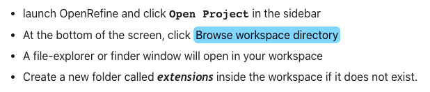
This could be a good page to demo things on - there are two infoboxes on there, some code, a few images, and I think some menu items or other buttons ("Browse workspace directory" and etc) that you could try to style to make them distinctive.
https://docs.openrefine.org/manual/installing/
allanaaa
on 7 Sep 2020
@allanaaa I have a few questions:
More negative space, especially above a new section header: Is it the space above each H2 header, for instance in https://docs.openrefine.org/manual/installing/ page, space above -- System requirements, Installing or upgrading, Increasing memory allocation, Installing extensions?
Slightly bigger header sizes - is it for all the headers H1, H2, H3 ? or any header in particular?
Few ideas for styling the UI menu items and options,
a. Similar to styling as used for webapp\extensions, but with a blue background.
b. Changing the font just for the menu items.
Thanks
sjathin
on 8 Sep 2020
I would increase the space above H2s and H3s. Maybe a small increase above H3s and a bigger space for H2s. But if you try it on the H3s and it looks bad, feel free to remove it.
I would do all headers in use, which I think is up to H4. I find H4s in particular quite hard to see, e.g. https://docs.openrefine.org/manual/installing/#compatible-operating-system
I think option A sounds like it could be good! I don't like to change up fonts, but I'd be interested in seeing some examples.
allanaaa
on 8 Sep 2020
Yes, the blue background gives a distinct style especially in the dark mode, I have attached a screenshot, please let me know which would be better.
sjathin
on 9 Sep 2020
I like the blue-background span. Thoughts, @wetneb @thadguidry @ostephens?
allanaaa
on 9 Sep 2020
I suggest we should keep our documentation more formal and without many design tweaks. The blue background span or the border fill are really taking away the look of the page and diverting the complete attention to themselves. Seeing it as an Official Documentation of OpenRefine, it doesn't look nice to have span background fills.
If we want to highlight any UI related part we can use tooltips with slight underlining as used by Kubernetes or RedHat documentation.
What I would rather suggest is to have a nice landing page with documentation explorer as in the docs for Mozilla dev tools, firefox or any other product.
Moreover, IMO, we need some documentation guidelines, going through the documentation I have seen capital letter appearing for words in the middle of a sentence or use of grammatical punctuations.
These are my opinions, ultimately being a community-driven project we need to consider more opinions concerning the style tweaks.
/cc @wetneb @ostephens @thadguidry
 kushthedude
on 10 Sep 2020
kushthedude
on 10 Sep 2020
Yes we have already removed the blue background in the corresponding PR #3178 - the discussion is happening there.
wetneb
on 11 Sep 2020
Related issues
 lapoisse
·
3Comments
lapoisse
·
3Comments
 ettorerizza
·
3Comments
ettorerizza
·
3Comments
 antoine2711
·
3Comments
ettorerizza
·
4Comments
wetneb
·
3Comments
antoine2711
·
3Comments
ettorerizza
·
4Comments
wetneb
·
3Comments
Most helpful comment
It seems we're leaning towards the Vector-style of a coloured stripe instead of a full infobox fill. Their code will also teach us how to do light/dark mode boxes.