Openrct2: Shortcut keys window improvements
I had a few ideas for usability improvements to the shortcut keys window. Your mileage may vary, discussion is welcome.
[ ] _Right click entry to clear shortcut_
Currently there is no way (that I know of) to clear shortcut keys other than overwriting it with another key. Right clicking the shortcut entry to clear it seems appropriate, the tooltip could be updated to reflect this.[ ] _Add confirmation window to 'reset keys' button_
The button currently resets all of your shortcut keys without warning, AFAIK it is common practice to require confirmation for stuff like that.[ ] _Add shortcut keys window to options toolbar dropdown_
Giving the shortcuts window its own entry in the dropdown (below 'options' perhaps) would increase its visibility and make editing shortcuts during gameplay more convenient.[x] _Reorder shortcuts and add dividers_
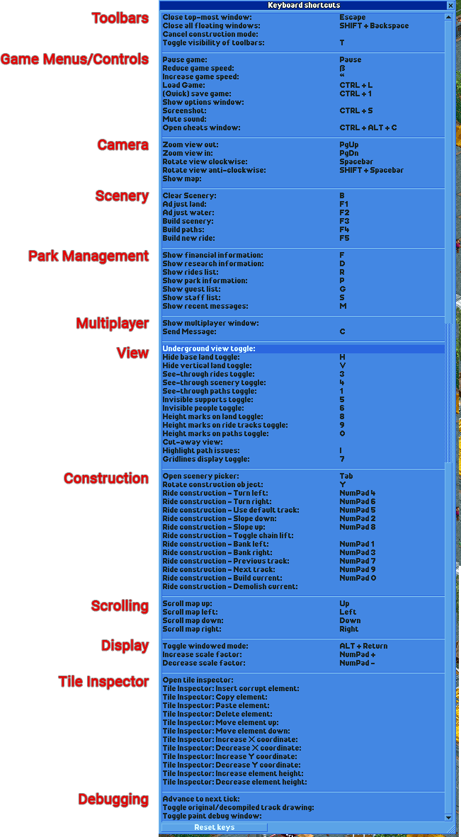
Half of the shortcuts are in an arbitrary order, to make the window easier to read it could do with some reorganizing, preferably with lines to divide categories if at all possible. This seems like the most logical order to me, mostly based on the order of the top toolbar (much of the list is currently already sorted that way):
Close top-most
Close all
Cancel construction mode
Toggle visibility of toolbars
----------
Pause
Game speed -
Game speed +
Load game
Save game
Options
Screenshot
Mute
Cheats
----------
Zoom -
zoom +
Rotate clockwise
Rotate counterclockwise
Show map
----------
Clear scenery
Adjust land
Adjust water
Build scenery
Build paths
Build ride
----------
Financial
Research
Rides
Park
Guest
Staff
Recent messages
----------
Multiplayer window
Send message
----------
Underground view
Base land
Vertical faces
See through rides
See through scenery
See through paths
Invisible supports
Invisible people
Height marks on land
Height marks on ride tracks
Height marks on paths
Cut-away view
Highlight path issues
Gridlines display toggle
----------
Open scenery picker
Rotate construction object
Ride construction: ...
----------
Scroll map ...
----------
Toggle windowed mode
Scale factor -
Scale factor +
----------
Open tile inspector
Tile inspector: ...
----------
Advance to next tick
Track drawing options
Paint debug
 Umdlye
All 18 comments
I think these are all good suggestions.
Reordering the shortcuts listed is long overdue, indeed. However, currently, this order is linked to internal shortcut order, which is in turn linked to the way key bindings are stored. The current file format is a naive binary format, so to prevent people from losing their assigned key bindings every time we add a new one, we can only _append_ them, for now.
I'd like to see this changed, but for me it hinges on #9088.
 AaronVanGeffen
on 4 Apr 2020
AaronVanGeffen
on 4 Apr 2020
7875 is the open issue for making the hotkeys file JSON, just linking that here.
Umdlye
on 4 Apr 2020
Maybe the shortcuts can still be _stored_ in the order they're in now, but be displayed to the user in a different order?
 ocalhoun6
on 4 Apr 2020
ocalhoun6
on 4 Apr 2020
Of course, but there is only so much we can do in a day. PRs are welcome.
AaronVanGeffen
on 4 Apr 2020
I don't think right-clicking to clear a shortcut is very user-friendly. I can think of two alternatives:
- When you click a shortcut and the window appears telling you to press a new key, you can click a button on that window to clear it.
- Every list item also has a clear button next to it.
While option 2 might be clearer than 1, a widget like that isn't used anywhere in the interface, which makes it less "RCT-like" and it's probably also hard to implement.
 Gymnasiast
on 5 Apr 2020
Gymnasiast
on 5 Apr 2020
For what it's worth, I've started work on decoupling the shortcut list from the implementation order: #11231
AaronVanGeffen
on 5 Apr 2020
I've noticed the window has some string overlap in some languages. This is due to the following line:
STR_2781 :{STRINGID}:{MOVE_X}{255}{STRINGID}
Of course, language files are free to change the MOVE_X parameter. However, this fixed X-coordinate limits the use of space when resizing the window.
I would therefore like to propose to move the horizontal jump to the window itself, thereby making it possible to:
A) ellipsise (cut off) the string and
B) make more use of horizontal space when the window is resized
Any thoughts on this?
AaronVanGeffen
on 5 Apr 2020
Sounds good to me, but with https://github.com/OpenRCT2/OpenRCT2/pull/10953 in mind, are you sure what you're letting yourself in for? :P
Gymnasiast
on 5 Apr 2020
Sounds good to me, but with https://github.com/OpenRCT2/OpenRCT2/pull/10953 in mind, are you sure what you're letting yourself in for? :P
Fortunately, there shouldn’t be any format-specific widths at work here. 😅
AaronVanGeffen
on 5 Apr 2020
With #11231 in, that's one item off the list at least.
I don't think shortcuts are important enough to warrant an item in one of the main toolbar dropdowns. However, thinking about making the screen more easily accessible… Why don't we add a shortcut for opening the shortcut window? Perhaps we could even default such a shortcut to ?. (I think / is in use, but shift + / would work, perhaps. Unfortunately, this won't be logical for all keyboard lay-outs.)
AaronVanGeffen
on 23 Apr 2020
@Umdlye thank you for bringing this up.
Further to https://github.com/OpenRCT2/OpenRCT2/pull/11231, I would suggest to replace the separators with bounding boxes and headings, like they are present in many places:
Heading suggestions:
Where I would change:
Build PathsandBuild New Ridego to "Construction"Open Scenery Pickergoes to "Scenery"- All of "Scrolling" can be merged with "Camera"
 Richard-L
on 24 Apr 2020
Richard-L
on 24 Apr 2020
Wouldn't it be kind of weird to have bounding boxes inside a scroll bar section?
ocalhoun6
on 24 Apr 2020
Why do you think so?
The bounding boxes signal groups. Scrolling is necessitated when vertical resolution doesn't suffice.
Richard-L
on 24 Apr 2020
It's a different kind of widget entirely. We can talk about adding headers, but I don't see us adding boxes.
AaronVanGeffen
on 24 Apr 2020
Why don't we just convert the window into a tabbed window. Each group to a new tab.
 duncanspumpkin
on 24 Apr 2020
duncanspumpkin
on 24 Apr 2020
Hmm, I think that would have some disadvantages. The current list allows for very quick reference, just by scrolling. I would prefer to keep that.
AaronVanGeffen
on 24 Apr 2020
I agree since it's necessary to have an overview of all used keys.
Would you consider two/three columns instead of one?
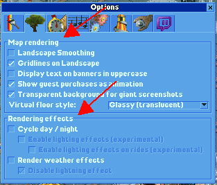
I honestly still think boxes would make sense. Logically they are the same to me as the reference image I posted from settings.
Richard-L
on 24 Apr 2020
Boxes would be very time consuming to make work. They can't be easily done.
duncanspumpkin
on 24 Apr 2020
Related issues
 mrtnptrs
·
3Comments
mrtnptrs
·
3Comments
 qwertychouskie
·
3Comments
qwertychouskie
·
3Comments
 Xaroth
·
3Comments
Xaroth
·
3Comments
 Ionaru
·
3Comments
Ionaru
·
3Comments
 wildgoosespeeder
·
3Comments
wildgoosespeeder
·
3Comments
Most helpful comment
I don't think right-clicking to clear a shortcut is very user-friendly. I can think of two alternatives:
While option 2 might be clearer than 1, a widget like that isn't used anywhere in the interface, which makes it less "RCT-like" and it's probably also hard to implement.