Openra: Show contents of selection in a dedicated panel
This is a feature in many RTS and is very useful to quickly and accurately assert a unit composition (for squads or an army) and also to easily count all units of a single kind (e.g. harvesters). It would bring benefits to both players and spectators.
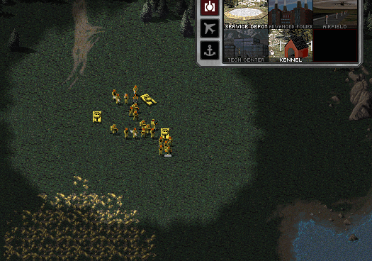
I have made a quick mockup of what this could look like:

The bottom right corner of the screen (or just below the sidebar) seems like a suitable position for such a widget. Or it can be placed in a tab on the sidebar (like in CNC3).

 dragunoff
All 22 comments
I really like this idea.
As for placement: I think it would be neat if this could be integrated into the sidebar. Not as a tab in the production section, but as a separate section just below and flush with the production section. It would have borders and other chrome consistent with the rest of the sidebar.
I don't know if this fits within the scope, but I think it would be really nice if we can also combine this with a proper GUI for control groups. So you would have a row (or column or double row, whatever fits best) of buttons labelled 1-9 alongside the unit selection panel in the sidebar. These could be individually selected or deselected to add or subtract the contents of the control groups to your current selection. Or perhaps make them act like tabs so you can cycle between different control groups and see their contents in the selection panel while keeping your current ad-hoc selection in a 10th tab.
 tovl
on 15 Jun 2019
tovl
on 15 Jun 2019
Where would the perf text go?
 GraionDilach
on 15 Jun 2019
GraionDilach
on 15 Jun 2019
>
As for placement: I think it would be neat if this could be integrated into the sidebar. Not as a tab in the production section, but as a separate section just below and flush with the production section. It would have borders and other chrome consistent with the rest of the sidebar.
I plan to make this a versatile widget that can be placed in different spots so the icons can be layed out from a different origin corner (top-left, bottom-right, etc.). The general problem with adding new UI is the limited screen real estate. A tab would conserve more space but I'm not against having it flush with the production sidebar. A mockup or a quick prototype should reveal what works.
>
I don't know if this fits within the scope, but I think it would be really nice if we can also combine this with a proper GUI for control groups. So you would have a row (or column or double row, whatever fits best) of buttons labelled 1-9 alongside the unit selection panel in the sidebar. These could be individually selected or deselected to add or subtract the contents of the control groups to your current selection. Or perhaps make them act like tabs so you can cycle between different control groups and see their contents in the selection panel while keeping your current ad-hoc selection in a 10th tab.
@tovl Selection group GUI was briefly discussed in #3954 and I'd like to keep it out of scope here. While it does have some overlap with the selection contents ultimately I think it's a separate piece of UI.
Where would the perf text go?
@GraionDilach If we decide to put this new widget in the bottom right corner, then the perf text should give way because it's less important (it's not used 99% of the time). It can be moved above the command bar (next to the perf graph if that's visible) or left of the sidebar.
dragunoff
on 20 Jun 2019
I have made a proof of concept and it was well received by players on discord so I'll keep working on that (WIP branch: https://github.com/dragunoff/OpenRA/tree/feature/selection-contents). However there are some things that I stumbled upon that need to be resolved for this feature to work:
- Currently only buildable actors have icons. Icons should be added to
Selectabletrait as well or extracted in their own trait. Adding it toSelectablewould allow a different icon for selection vs production which mods may want (that's how it is in some RTS - StarCraft and Tzar for example). - A default selection icon should be provided because many selectable actors in the core mods don't have icons (e.g. civilians, tech structures). Or we should omit them from the selection palette entirely.
dragunoff
on 20 Jun 2019
Think we should sort the icons in a similar fashion as i have in #16709
 teinarss
on 20 Jun 2019
teinarss
on 20 Jun 2019
Think we should sort the icons in a similar fashion as i have in #16709
Yeah, that was number 3 on my list of things to figure out :-) The order of icons - should it follow the order set in Buildable (order by build queue and then by build palette order) or should we add a new field to Selectable?
dragunoff
on 20 Jun 2019
Where would the perf text go?
@GraionDilach If we decide to put this new widget in the bottom right corner, then the perf text should give way because it's less important (it's not used 99% of the time). It can be moved above the command bar (next to the perf graph if that's visible) or left of the sidebar.
Shift the graph further above then and put the text between the commandbar and the graph then. Left of the sidebar is annoying and wastes too much vertical space due to bleaking into the center of the screen and taking away attention with it's constant changing then.
I don't really agree with the reasoning (the debug text is the sole meaningful measurement between all kind of mods - graph can easily be thrown off in TS already due to the sheer amount of batching required just alone of the amount of graphics used - and is able to pinpoint laggers if they are lagging due to CPU bottleneck or due to a GPU bottleneck, which means it'll be always more important and useful than some kind of QoL improvement) but meh.
TS's xxicon.shp copied to/knocked off in RA and TD could resolve the issue with the lacking cameos.
GraionDilach
on 20 Jun 2019
>
I don't really agree with the reasoning (the debug text is the sole meaningful measurement between all kind of mods - graph can easily be thrown off in TS already due to the sheer amount of batching required just alone of the amount of graphics used - and is able to pinpoint laggers if they are lagging due to CPU bottleneck or due to a GPU bottleneck, which means it'll be always more important and useful than some kind of QoL improvement) but meh.
Thanks for the insight @GraionDilach! I was perhaps too quick to dismiss the perf text as I don't use it myself. I will keep it mind when further developing this UI.
TS's xxicon.shp copied to/knocked off in RA and TD could resolve the issue with the lacking cameos.
Thanks, I will look into that.
dragunoff
on 20 Jun 2019
My preference is also to make this a sidebar tab, which avoids the perf text problem completely.
 pchote
on 20 Jun 2019
pchote
on 20 Jun 2019
Selection palette in sidebar tab
A few thoughts:
- The button icon is just a placeholder, a proper icon should be added. I think the icon should stand out visually from the production icons (like in CNC3).
- I think the tab should auto-activate when the player makes a selection. We'd need a way to track that...
- The crome logic is a bit of mess... a lot of bugs with background update and as you can see in the gif, the selection palette shows a conyard for a moment
- Adding this as a tab to TD would be difficult as the new UI has no room for more buttons. We'd have to extend the UI or just add this palette as a floating panel (like in the mockups).
dragunoff
on 23 Jun 2019
Regardless of the form this takes, I wanted to mention I'm really excited for this.
This will make more intricate plays a lot easier/feasible. I'm already thinking of the new strategies/micromanagement this makes possible.
For example, loading rocket soldiers into a chinook will be a lot easier.
 Orb370
on 29 Jun 2019
Orb370
on 29 Jun 2019
Selecting with hotkeys
I played with the idea of assigning hotkeys to selection palette slots (just like production hotkeys). It works quite well IMO. If the palette is in a tab along with production the same hotkeys can be reused.
dragunoff
on 1 Jul 2019
Tbh, switching your selected sidebar on selection sounds a bit invasive. (I am not alone there, see Discord.) I think it might be better if it didn't do it automatically but just had a hotkey to switch the views instead. (Or we display it outside again, which gives us both benefits.)
 abcdefg30
on 1 Jul 2019
abcdefg30
on 1 Jul 2019
Display it outside would be best imo and have other hotkeys than the normal production.
Not sure if having subgroups similar to Warcraft 3 https://youtu.be/3vSV-sMX4f8?t=260 would be something to look into.
teinarss
on 1 Jul 2019
I believe it should be separated from the production tabs (too invasive if auto-switched) and always visible (it's for micro-intensive operations). You may also want this as an observer to see the distribution of units.
 ubitux
on 21 Jul 2019
ubitux
on 21 Jul 2019
Separating it from the sidebar would mean that we couldn't use the slot hotkeys to refine selection. Having it as part of the sidebar for players has no impact on whether/how it is implemented for spectators.
pchote
on 24 Jul 2019
For spectators it also should support mixed selections for multiple players. But I think I'll wait a bit to see how #16821 unfolds as that would make layout a lot easier.
Regarding hotkeys - I'm thinking about dropping the slot hotkeys for this widget and instead implementing a single hotkey that cycles through the classes in a selection (similar to the feature in the Warcraft 3 video linked above: https://github.com/OpenRA/OpenRA/issues/16687#issuecomment-507253022). This requires some changes in ISelection to add support for foreground and background selection - I'll file a separate issue for this idea as it can be implemented independently.
While slot hotkeys do work they may not be that useful because there is no fixed mapping between slot and class as it depends on the current selection. Also if the widget is in not in the production tab then a new set of hotkey would have to be introduced.
dragunoff
on 24 Jul 2019
If this feature is intended to be used for forcing Blizzardbastardization of the engine, then this needs to be an opt-in feature modders should be able to opt-out from.
Not having the options to meddle with unit selection is not always a limit, but could be a gameplay design point. OpenRA does not try to force every UI feature of the engine into every game.
GraionDilach
on 17 Aug 2019
Not having the options to meddle with unit selection is not always a limit, but could be a gameplay design point. OpenRA does not try to force every UI feature of the engine into every game.
Agreed. This is a widget so if modders don't want it they can simply remove it from the chrome yaml.
Selection palettes are a feature of many RTS, not just Blizzard's titles, and this proposal is based on the 3rd generation CNC games from where OpenRA has already borrowed a lot of ideas.
This does bring up the larger conversation of OpenRA as a generic RTS engine -- should such features be included in the engine or should this be mod territory (with the engine only providing the necessary grounds)?
dragunoff
on 18 Aug 2019
16951 is a feature which depends on the mere existence of this widget. The 3rd generation of C&C games are based on backtracking from Generals, which was much closer to a Blizzardcraft in almost every principle than the preceding C&Cs.
I see no issues with this being incorporated the engine, because it is indeed widespread in the genre. However there should be options to have this disabled. Both the D2k and the TS mod should omit this feature and followups for accuracy.
GraionDilach
on 18 Aug 2019
16951 is a feature which depends on the mere existence of this widget.
@GraionDilach Why do you think so? I think that feature is independent, it is only enhanced by the selection palette.
dragunoff
on 18 Aug 2019
The foreground-background selections are hard to see/track within the ingame view and would be assumed as a visual bug if one's unaware of the feature itself. It's not that self-explanatory, compared to the simplicity and straightforwardness of the standard C&C UI.
GraionDilach
on 18 Aug 2019
Related issues
 dnqbob
·
3Comments
dnqbob
·
3Comments
 Hammerfest
·
4Comments
Hammerfest
·
4Comments
 JustSomeDev1
·
4Comments
JustSomeDev1
·
4Comments
 FRenzy-OpenRA
·
3Comments
FRenzy-OpenRA
·
3Comments
 MlemandPurrs
·
4Comments
MlemandPurrs
·
4Comments
Most helpful comment
Display it outside would be best imo and have other hotkeys than the normal production.
Not sure if having subgroups similar to Warcraft 3 https://youtu.be/3vSV-sMX4f8?t=260 would be something to look into.