Openra: Update target line and rally point rendering
This issue is for discussion split from #16549.
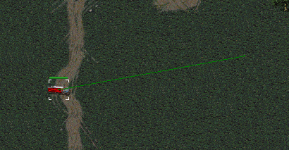
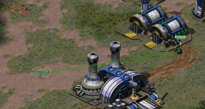
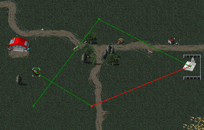
OpenRA currently uses a single-width line with square end caps for both unit targets and rallypoints:
Rally points use the player's color, and target lines use the following colors:
- Move: Green
- Attack: Red
- AttackMove: Red
- Guard: Yellow
- Chronotank-shift: LawnGreen
- Harvester move to harvest: Green
- Harvester move to unload: Green
- Harvester move while docking: Green
- Carryall move to pickup/unload: Green
- Supply truck move to donate cash/experience: Yellow
- Engineer move to capture: Red
- Engineer move to repair: Yellow
The general idea being:
- Offensive actions are red
- Defensive actions are yellow
- Other actions are green
These lines are too thin to be easily seen at high resolutions, so we should consider how we can update and improve the visibility and perhaps modernize the style.
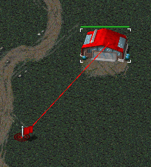
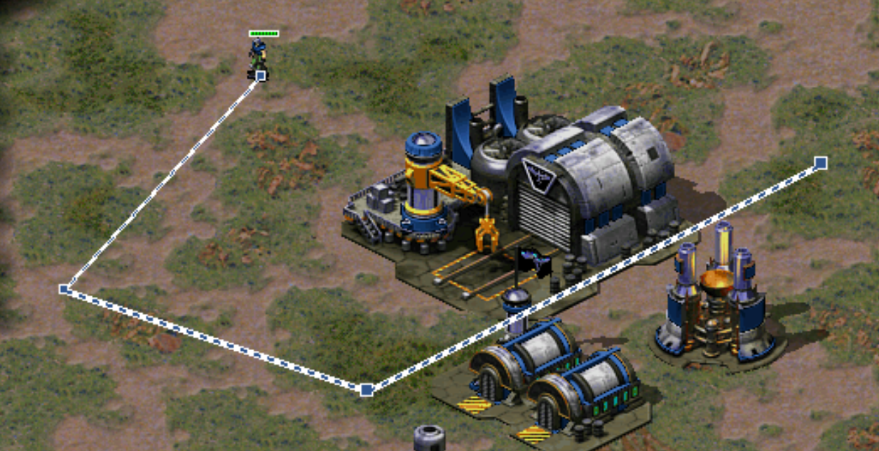
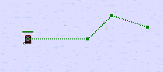
For reference, Tiberian Sun and RA2 used dashed lines in the player color (without end caps) for rally points:

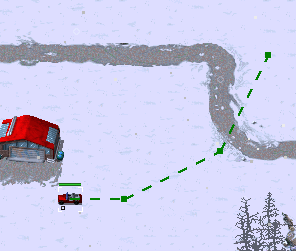
And single-width lines with end caps for units:
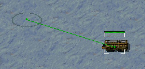
(our current target lines were based on these).
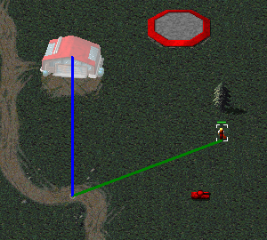
RA2 used a different style for the lines when waypoint mode is active (equivalent to our shift-queueing, but modal):
Oddly, all lines are drawn in the player color, and note that the currently active line is drawn thinner than the queued lines.
 pchote
All 30 comments
16549 proposes changing the unit target line (but not rallypoints) to a 3px wide line without end caps, with new color assignments:
- Harvester move to harvest: Red
- Harvester move to unload: Blue
- Harvester move while docking: Green (unchanged)
- Carryall move to pickup/unload: Blue
- Supply truck move to donate cash/experience: Blue
- Engineer move to repair: Blue
The general idea being (I think):
- Offensive (expanded to include harvesting) actions are red
- Regular movement is green
- Other actions are blue
pchote
on 29 May 2019
IMO the 3px line is too thick, and would much prefer a 2px line with 3px end markers:
Rally points should match the line thickness, and we could perhaps think about making them dashed too. We could perhaps consider removing the rallypoint flag indicator considering that we are planning to focus on improving our game mode support in hopefully Next + 1.
I would also prefer to keep the yellow = defensive convention at least for engineers - I don't have a strong objection to using blue for supply trucks and harvesters. I find the shade of blue to be painfully unreadable, however, and think this needs to move more towards cyan.
I think it would be interesting to experiment with supporting dashed red/green lines to indicate attack-move, but this may end up being visually awful and cause problems for color-blind players.
pchote
on 29 May 2019
Responding to a now deleted comment:
These lines are just too thick, maybe making them dotted would help
pchote
on 29 May 2019
I think it would be interesting to experiment with supporting dashed red/green lines to indicate attack-move, but this may end up being visually awful and cause problems for color-blind players.
After reconsidering, the accessibility concern should IMO not block good ideas like to use a color concept for the order categories. I think the concept with another blue color makes sense, but I prefer an unobtrusive design with 2 colors more that does not displace the ingame artwork more than required, which is most important for me. Colorblind support should be a long term goal.
The dotted lines look very nice, the more examples the better! I would also welcome a different line style for production waypoints since I sometimes forget whether I have set a way point or given a move order.
 ghost
on 30 May 2019
ghost
on 30 May 2019
These lines are too thin to be easily seen at high resolutions
At the same time, lots of lines (i.e. controlling a huge infantry force) make the lines occupy pretty much half of the screen on move/attack orders, as the lines are opaque. Dotted style will certainly help, but only so much. Mass lines should definitely be checked on impacting visibility when proceeding with this.
 netnazgul
on 30 May 2019
netnazgul
on 30 May 2019
Dotted lines looks very good! Could also try it with shadows as in the RA2 image.
 teinarss
on 30 May 2019
teinarss
on 30 May 2019
We could perhaps consider removing the rallypoint flag indicator considering that we are planning to focus on improving our game mode support in hopefully Next + 1.
All these years I felt that the flag indicator was a really good polish compared to the WW methods, because some color combinations blended the target line into the ground. Considering that ORA player colors are less restrictive than WW, I don't feel even a generalization movement would worth the loss of said polish.
 GraionDilach
on 30 May 2019
GraionDilach
on 30 May 2019
Just for the record: The lack of endcaps was an oversight. (Also, 2px lines with 3px endcaps looks good.)
You also forget to mention what I think is the most important color change: AttackMove to yellow and Guard stays yellow.
The idea is that it is important when queueing orders to be able to distinguish AttackMove from both Move and Attack, especially if we do not render the target lines for the attack part of AttackMove. Since Guard is really just a variant of AttackMove and is already yellow it made sense to make them the same color. (I'm not a fan of dashed red/green because I think it would just look too busy.)
Also, with respect to color-blindness, I think we can easily change the specific hues of red/green/yellow/blue to be more distinguishable from eachother with deuteranomaly. Moving away from pure red/green/blue would probably be more comfortable to the eyes for the rest of us as well.
 tovl
on 30 May 2019
tovl
on 30 May 2019
The screenshot above is a bit misleading as to the quality of the visuals of the dotted lines. They really don't look very good when used with moving units, groups of units, or moving groups of units.
pchote
on 31 May 2019
A gif would help. Tbf the current lines also don't look good on groups of units
 Punsho
on 1 Jun 2019
Punsho
on 1 Jun 2019
[21:55:34] | <Mesacer_> pchote have you pushed the dotted rallpoints?
[21:55:44] | <pchote> i have a branch called target-lines
[21:55:59] | <pchote> i figured someone would ask so just pushed it
[22:03:18] | <Mesacer_> i agree with you on your comment
[22:03:44] | <Mesacer_> a bit too much distraction
[22:03:45] | <pchote> yeah, its a shame
[22:03:54] | <pchote> see the comment in the code about using b - offset
[22:04:03] | <pchote> it helps a bit, but looks weirder
[22:04:35] | <pchote> e.g. when you have a group of infantry moving to the same cell
teinarss
on 1 Jun 2019
I feel like before we get pathfinding done so units aren't just directed to one cell like in Tiberian Sun & RA2, we won't be able to use dotted nor dashed lines fully. What could work for the current system is all queued lines being dotted and the action in progress being a full line. Also dots for production rally lines
Punsho
on 1 Jun 2019
Well, that dotted gif above still looks better than the current implementation - at least it creates a "semi-transparent" feel for the lines, so it doesn't obstruct the view as much as solid lines do.
netnazgul
on 2 Jun 2019
Er... IMO dotted/dashed lines for immediate orders look bad - it's rather jarring. I suggest to stick with solid lines - 2px with 3px cap seem to be OK.
Dotted lines for waypoints (every order after the first one) seem reasonable.
For rally points I think that the flag icon at the end should not be removed (I get behind what @GraionDilach said).
I'm not sure about the colors but I agree that it should be an intuitive system with sufficient contrast.
 dragunoff
on 3 Jun 2019
dragunoff
on 3 Jun 2019
I have updated my test target-lines branch to base it on #16549 and enable the dotted lines for queued orders only.
This looks a lot better, but the proof of concept will need further refinement if we do want to move forward with this idea.
pchote
on 8 Jun 2019
I think the dotted lines for queued orders look good. On the one hand it is useful that you now see if a unit is already executing an order, because the dotted lines also appear when the unit has to finish its current move, but on the other hand this adds some visual noise - not sure what to think about it.
Preview of the current target-lines branch:
ghost
on 8 Jun 2019
the dotted lines also appear when the unit has to finish its current move
the proof of concept will need further refinement if we do want to move forward with this idea.
:wink:
pchote
on 8 Jun 2019
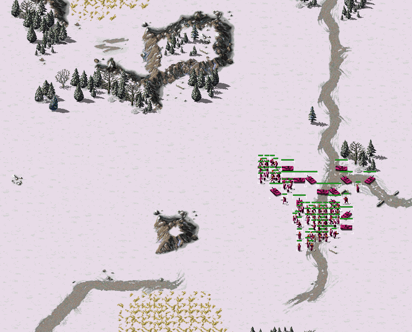
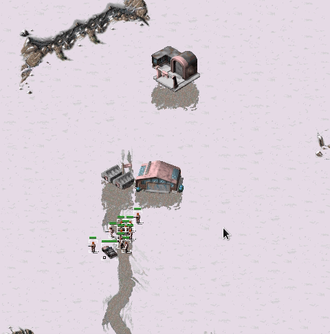
One of the reasons I'm concerned with thicker target lines:
You can't see most of the units at all when issuing an order. Spamming the orders obviously makes it worse.
netnazgul
on 16 Jun 2019
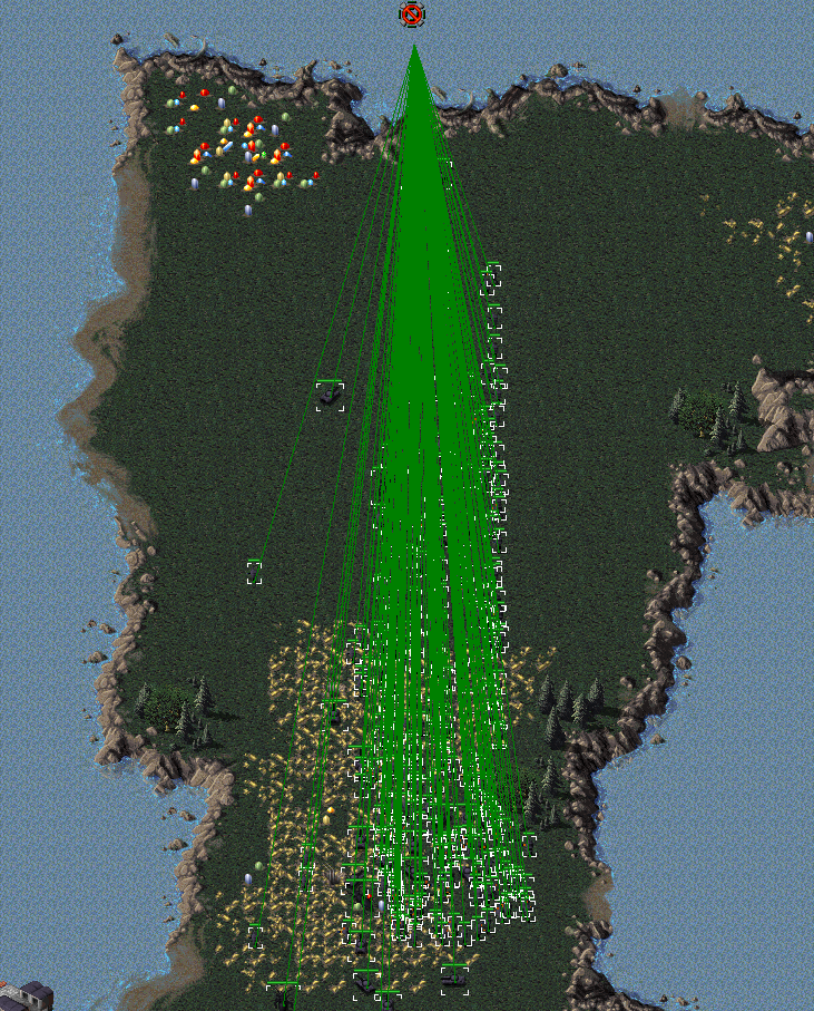
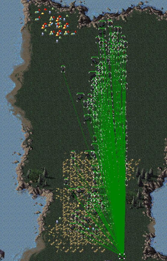
Well, those screenshots clearly show that this is already a problem with thin target lines, so not having thick target lines doesn't solve that issue.
Looking at how other games do it: In Supreme Commander issuing an order to a group of units renders only one target line (a very thick one) starting at the center of mass of the units. The target lines are also semi-transparent so any units in between are not obscured. Seems to me like two good ideas.
tovl
on 16 Jun 2019
TS/RA2/etc would be better precedent here than supcom.
pchote
on 16 Jun 2019
It's a game that is most well know for having tons of units and having a great UI. We would be foolish not to take lessons from it. Also, that's not an argument against any of the actual solutions proposed.
tovl
on 16 Jun 2019
Well, those screenshots clearly show that this is already a problem with thin target lines, so not having thick target lines doesn't solve that issue.
But it would make it worse. What about this idea: We show the target lines only when the player is queuing orders with shift or is pressing the ALT key and otherwise don't show them. Other successful RTS (and RA) didn't show any target lines at all. IMO we can mitigate the hard to solve visual issues of mass target lines and get more freedom for the design of the new features if we hide them when giving orders / selecting units (gets us also closer to the original). If people really need them, their purpose to indicate where the unit is going could also be solved by showing only some kind of indicator at the target location, but without a line.
ghost
on 16 Jun 2019
That is something worth considering. C&C3 also only showed target lines when queueing orders.
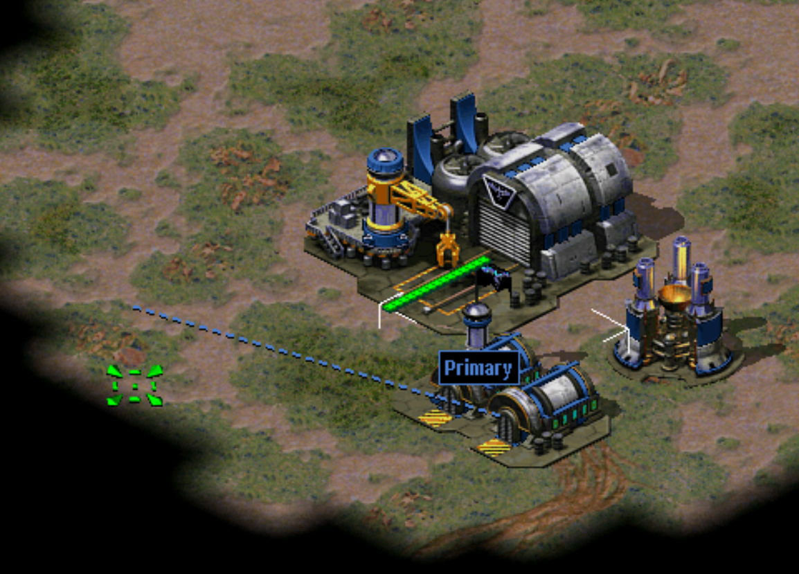
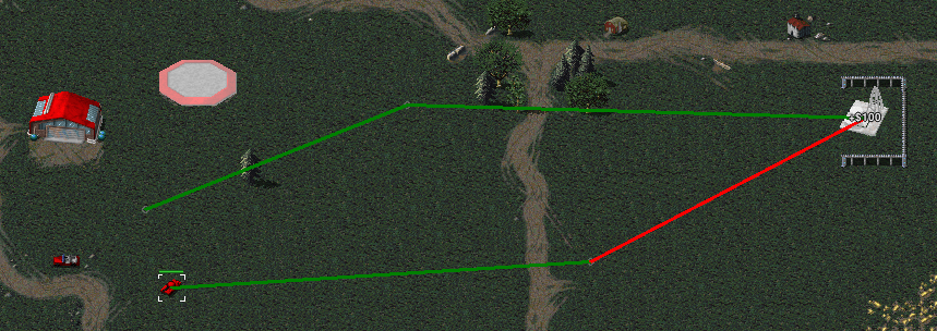
Another thing to note is that in Tiberian Sun waypoint lines and rallypoint lines where rendered below units (but above buildings). This can be seen in the third screenshot of the OP. C&C3 does something similar but renders the lines below buildings as well. I think either rendering the lines below actors (like C&C3) or making them transparent (Like SupCom) would be the way to go to solve the issue of units being obscured by target lines.
That alone would of course not solve the issue of many target lines merging into a solid block of color. For a relatively small number of lines this could be mitigated a bit by having a border of a different color. Many games do this (including RA2 for waypoints) but this makes at least a three pixel width necessary.
For a very large number of units (like in the screenshots by netnazgul above) this would still be a visual mess. The only plausible way to solve this completely is to actually reduce the number of target lines drawn, which is why I pointed to SupCom here. Also note that C&C3 already goes halfway in this because infantry are organized in squads which only get one target line each.
tovl
on 16 Jun 2019
Perhaps we should consider adding waypoint support to rally points (see #15371).
dragunoff
on 2 Aug 2019
Well, those screenshots clearly show that this is already a problem with thin target lines, so not having thick target lines doesn't solve that issue.
Having thick target lines certainly makes it worse though. And I'm still to see the valid reason to make them thicker?.. Is it really a problem on high resolutions?
netnazgul
on 5 Aug 2019
Another thing that could be added is visualisation of queued deploy orders
Punsho
on 10 Aug 2019
Having some games on the new devtest build, waypoint lines aren't as obstructive as they were due to the new "shown only in waypoint mode" option. Then again, line thickness doesn't really change or enhance the experience at least at 1080p, only stands out in gen1 mods as something non-native cause 1px lines felt like they were to be in the original and 2px+ aren't.
netnazgul
on 10 Aug 2019
:+1: to restoring thinner lines.
 abcdefg30
on 10 Aug 2019
abcdefg30
on 10 Aug 2019
@netnazgul you make a good point about the thick lines not looking native with the lo-res graphics in gen1 mods. Visibility is still a problem with a moderately sized 1440p monitor (or higher) though, but this is also true for the sidebar and other UI elements. Let's just hope something like #10382 gets implemented soon then.
tovl
on 10 Aug 2019
Related issues
 MlemandPurrs
·
4Comments
MlemandPurrs
·
4Comments
 cookgreen
·
3Comments
cookgreen
·
3Comments
 drunsinn
·
4Comments
drunsinn
·
4Comments
 Hammerfest
·
4Comments
Hammerfest
·
4Comments
 TheMightyAltroll
·
3Comments
TheMightyAltroll
·
3Comments
Most helpful comment
Having thick target lines certainly makes it worse though. And I'm still to see the valid reason to make them thicker?.. Is it really a problem on high resolutions?