Openlibrary: Button Text "Check Availability" overflows
Evidence / Screenshot (if possible)
Relevant URL?
Steps to Reproduce
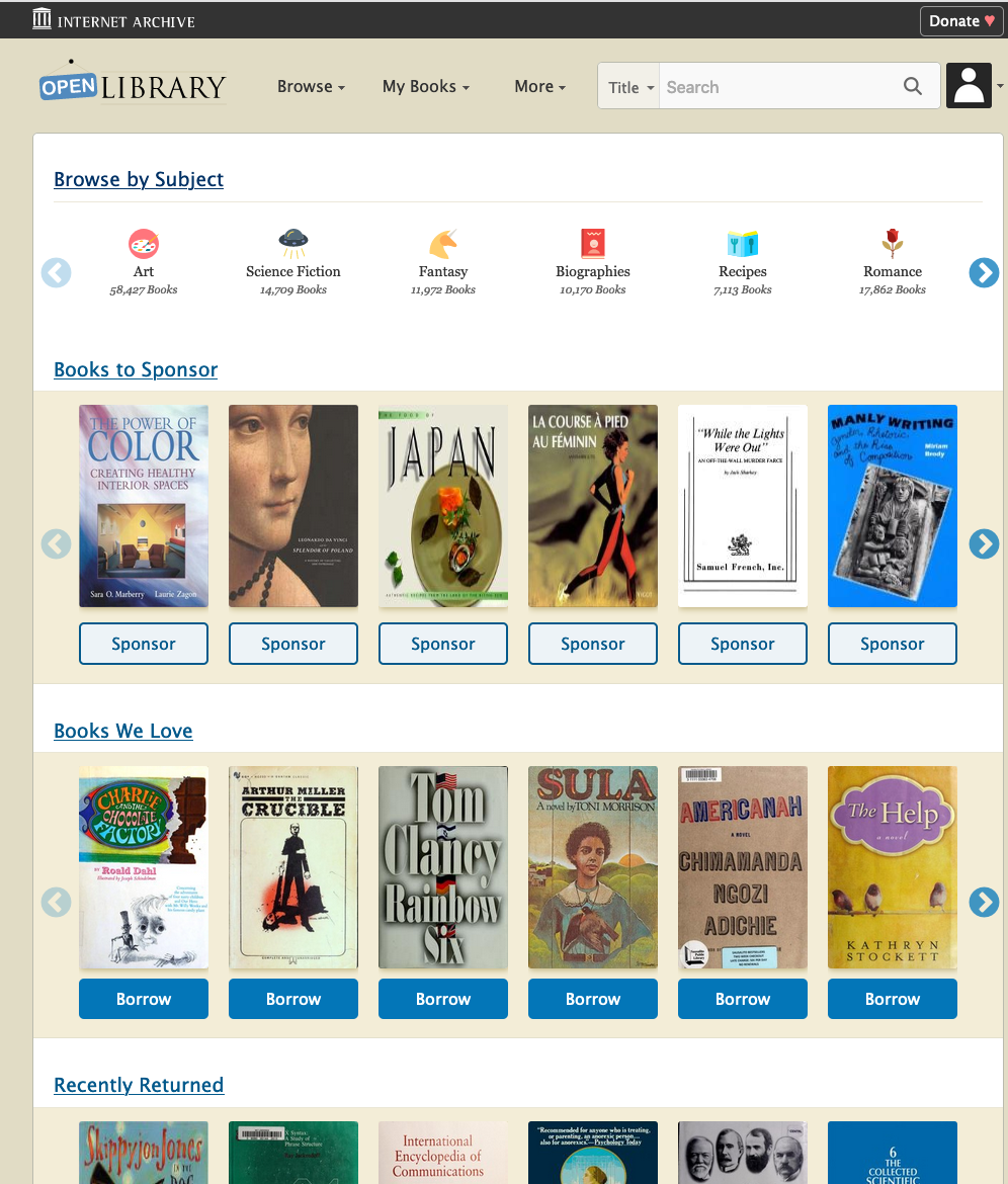
- Go to https://openlibrary.org
- Try the website at the width of 1519px
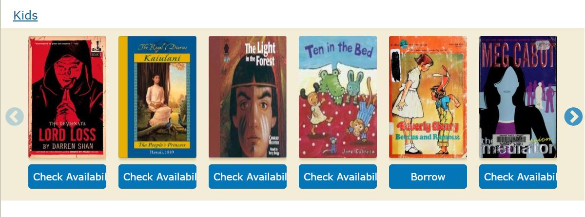
here is the image
Details
- Logged in (Y/N)? N
- Browser type/version? Microsoft Edge
- Operating system? Windows 10
- Environment (prod/dev/local)? prod
Proposal & Constraints
It is a frontend related issue, following are the two ways to resolve this
1) By making the text smaller or removing padding
2) Set a min-width of the button(cta-btn--available) to be 150px and one can increase the width of the container "test-body-mobile" by giving a media query
Related files
Stakeholders
First time writing an issue in this repo so don't know who to tag as a stakeholder
 ArunTeltia
All 12 comments
@ArunTeltia According to me the issue is for width 1200px onwards and its "Check Availability" button.
I would like to work on this issue.
 Yashs911
on 14 Oct 2020
Yashs911
on 14 Oct 2020
@ArunTeltia before 1199px only 5 books are there in a row and after 1200px its 6 books per row so I guess changing the font-size might help in solving this issue.
Yashs911
on 14 Oct 2020
I think the same I want to work on the issue If it's not the problem with you after this get accepted :D
What I think is we have to set the min-width of the button and we can change the media query from 1200 to 1400px for 6 books
Or
we can increase the container width from 80% to 90% it will resolve the issue
ArunTeltia
on 14 Oct 2020
@ArunTeltia If you want you can work on this issue.
Yashs911
on 14 Oct 2020
Thank you @ArunTeltia and @Yashs911 -- there are plenty of issue!
Since @ArunTeltia opened this one, I'd love to give them a chance to submit a PR for the solution. I'm noticing you commenting on other issues, @Yashs911 and am happy to help you find a good one and work with you to get a PR approved!
 mekarpeles
on 16 Oct 2020
mekarpeles
on 16 Oct 2020
@jamesachamp, @cdrini, @jdlrobson, & @koderjoker should all be able to offer feedback on the approach or PR :)
I'm tagging @jamesachamp as I believe they will be a great point-person / mentor for this issue.
Jim, if you decide you'd rather not be lead, please let me know and I'll be super happy to jump in :)
mekarpeles
on 16 Oct 2020
I'm happy to help!
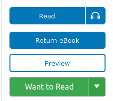
I think that changing the font size of the cta buttons will cause the visual style of some components to be inconsistent. For example, if we lower the font size of all cta buttons, it makes the text in the dropper on a book page look a bit too large:
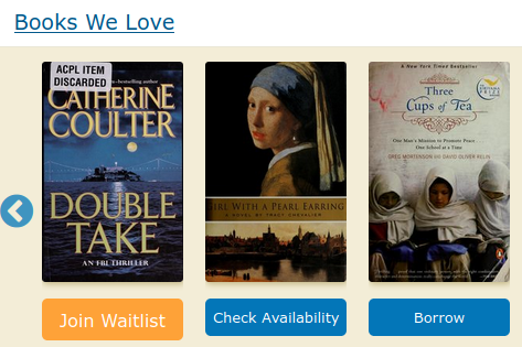
Changing only the font size of only cta-btn--available buttons can also lead to buttons of varying sized in a single carousel:
By default, our carousels display 6 books on screens larger than 1200px. Would anyone be opposed to lowering the default number to 5? This would increase the width of the book components and allow the button to grow to accommodate longer strings.
 jamesachamp
on 16 Oct 2020
jamesachamp
on 16 Oct 2020
Yes that will be better we can make a media query for 1500px such that it will show 6 books in a row and for 1200px to 1500px 5 books will be suffice
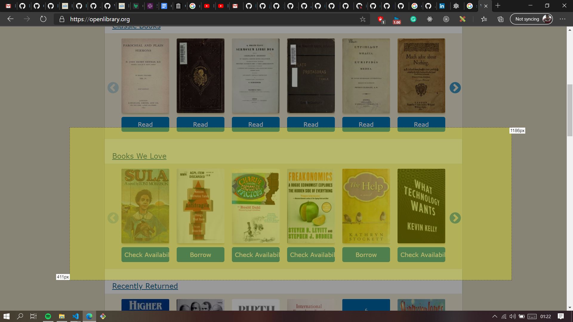
I also gave an idea of making the container(test-body-mobile) bigger, I think that can also be considered
As shown in the picture we can make the container this big
Please let me know your thoughts @jamesachamp
ArunTeltia
on 16 Oct 2020
I agree with @jdlrobson that reducing the markup seems like a viable option; Changing it to "Check" sounds good to me :+1:
Make sure to do a search throughout the codebase for "Check Availability"; we'll have to make updates to the i18n files as well.
 cdrini
on 19 Oct 2020
cdrini
on 19 Oct 2020
I can't replicate this bug using the description steps. Did we fix this by other means?
 jdlrobson
on 9 Jan 2021
jdlrobson
on 9 Jan 2021
@jdlrobson I guess the Check Availability option was removed
Yashs911
on 9 Jan 2021
Yes I think of the same @Yashs911 I i will close this issue with this comment
ArunTeltia
on 9 Jan 2021
Related issues
 nemobis
·
5Comments
nemobis
·
5Comments
 Pratyush1197
·
3Comments
Yashs911
·
5Comments
Pratyush1197
·
3Comments
Yashs911
·
5Comments
 cclauss
·
3Comments
cclauss
·
3Comments
 BrittanyBunk
·
4Comments
BrittanyBunk
·
4Comments