Openlibrary: Add book titles to carousels (Vote)
Is your feature request related to a problem? Please describe.
Should we add titles beneath our carousels? Especially when a book has a non-descript bookcover, it's difficult to tell what the book is.
Examples

Stakeholders
Stakeholders: @jdlrobson, @koderjoker, @hornc, @charstarstars, @seabelis
 mekarpeles
All 12 comments
How will we deal with long titles/authors? I expect this will need some kind of fixed height to work. e.g. ...
 jdlrobson
on 23 Apr 2019
jdlrobson
on 23 Apr 2019
@jdlrobson Can't the alt text be set to the full title and author, and then rendered by a browser as hovertext or read aloud?
 LeadSongDog
on 23 Apr 2019
LeadSongDog
on 23 Apr 2019
@LeadSongDog I don't think this is a viable option for mobile users.
@jdlrobson not sure yet, one proposal was removing the read buttons to make room for title / author.
mekarpeles
on 23 Apr 2019
The read buttons are a little repetitive. This would reduce visual clutter
but we'd still need to truncate or shrink longer titles to retain the fixed
card format.
On Wed, Apr 24, 2019, 4:04 AM Michael E. Karpeles notifications@github.com
wrote:
@LeadSongDog https://github.com/LeadSongDog I don't think this is a
viable option for mobile users.@jdlrobson https://github.com/jdlrobson not sure yet, one proposal was
removing the read buttons to make room for title / author.—
You are receiving this because you were mentioned.
Reply to this email directly, view it on GitHub
https://github.com/internetarchive/openlibrary/issues/2084#issuecomment-485953700,
or mute the thread
https://github.com/notifications/unsubscribe-auth/AABEKEAL2GI7DIIA7WQO26LPR5TUZANCNFSM4HHT7AWA
.
jdlrobson
on 24 Apr 2019
@mekarpeles Agree it only mostly helps accessibility on desktops and screenreaders, but it does not degrade the mobile rendering either.
{revised 12/12/2019}:
Turns out there are numerous TTS apps for both iOS and Android:
http://dyslexiahelp.umich.edu/tools/software-assistive-technology/text-to-speech-readers
https://www.techrepublic.com/article/4-text-to-speech-apps-that-will-read-online-articles-to-you/
https://apps.apple.com/ca/app/speechify-text-to-speech/id1209815023
https://play.google.com/store/apps/details?id=com.hyperionics.avar&hl=en
https://www.quora.com/How-do-you-read-aloud-text-in-Chrome-for-Android-using-TTS
LeadSongDog
on 24 Apr 2019
I'd try to keep titles to 2 or 3 lines; maybe have a character count limit followed by ... when exceeded? Perhaps the year is not necessary.
 seabelis
on 24 Apr 2019
seabelis
on 24 Apr 2019
Related: #496 #837 #841 #1005 #2368
Discussions on these issues identified several problems ancillary to their main thrust that never got their own issues.
@mekarpeles I like your idea of showing a title below the cover. It is a useful way to make alt-text more normalized, not requiring a hover action to display it. It is also good for low-bandwidth usage where images are expensive or blocked. For mobile usage, perhaps the alt-text could crawl through a one-line window below a (static) cover image, as on cable news?
LeadSongDog
on 11 Oct 2019
Would it be possible to do something like this, not auto-scrolling (and not circles), but displaying a central image with details and borrow link? We shouldn't rely on covers to provide the title as plenty of legit covers don't have one, but I think it may look cluttered to show so much information all at once. http://demo7.dnngo.net/20047/en-us/sliders/contentslider.aspx
Or maybe some kind of mouseover action: http://demo7.dnngo.net/20047/en-us/sliders/carousel.aspx
seabelis
on 21 Oct 2019
Is there a decision here? #2368 has been reopened, but if we want to add titles per this task it doesn't make sense to invest time in that ticket.
jdlrobson
on 10 Dec 2019
@mekarpeles your setup duplicates a lot - which makes it harder to read (but no worry: I have a solution for simplicity) @cdrini @leadsongdog this is a recurring issue (and I thought I provided my input in the past to #2368 especially, but I don't see it on github - maybe slack?), so here's my thoughts:
- Main site: the selection for book covers should have the title and author clearly visible, preferably with a picture that visually describes what the book's about and differentiates it from other editions
- Mobile: have the cover image and when a person taps it, it'd display (as an overlay over the cover, making the cover go opaque in the back behind): the 1) title, 2) read/borrow button, 3) details button.
Vision:
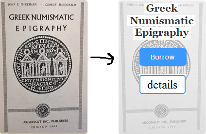
It's clear to see that the first cover shows exactly what's going on with the title, imaging, and even the author (although that's smaller), the 2nd cover is what I'd imagine for mobile (it would be more centered than what's shown here, but I'm too lazy to redo it - just pretend for now :)).
 BrittanyBunk
on 27 Dec 2019
BrittanyBunk
on 27 Dec 2019
Overdrive's approach omits subtitles and if the title is longer than one line, uses ... .
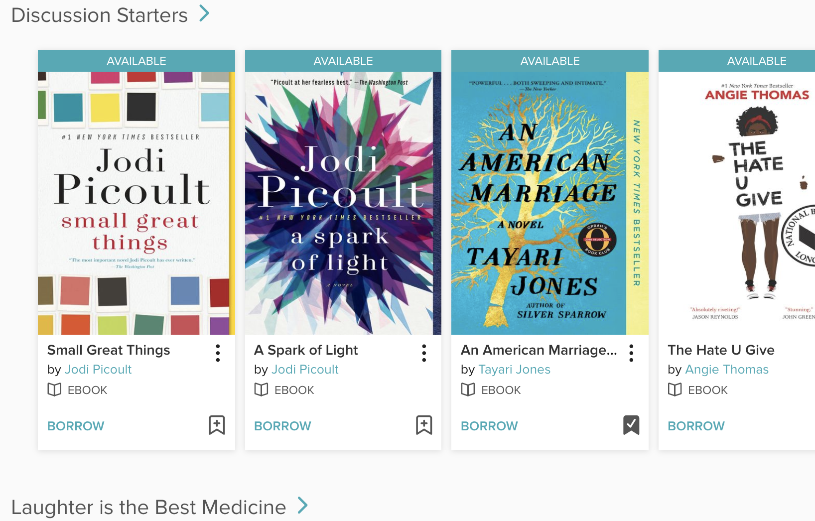
No significant difference on mobile; just fewer items displayed on carousel.
seabelis
on 4 Feb 2020
Although to me, there's too much added with Overdrive (which is why I tend not to use it much), they do use titles, which I do think is important. Plus, it has the 'borrow' button. One thing that is interesting and not really noticeable, but important in the picture is the bookmark icon. I think that's kind of cool and wouldn't be too much to add in.
BrittanyBunk
on 4 Feb 2020
Related issues
jdlrobson
·
5Comments
 Yashs911
·
5Comments
Yashs911
·
5Comments
 cdrini
·
4Comments
cdrini
·
4Comments
 cclauss
·
3Comments
BrittanyBunk
·
5Comments
cclauss
·
3Comments
BrittanyBunk
·
5Comments
Most helpful comment
@jdlrobson Can't the alt text be set to the full title and author, and then rendered by a browser as hovertext or read aloud?