Openlibrary: Editions component on mobile
On mobile visit http://openlibrary.org/works/OL15203543W/Meistersinger_von_Nürnberg
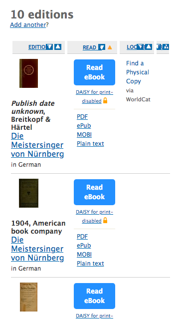
The interface is very cramped.
Using media queries I think this could be improved to look like this:
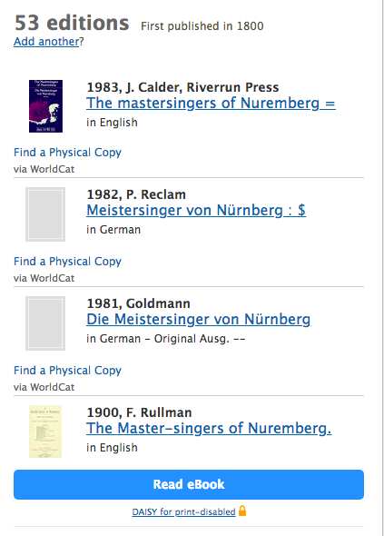
With PDF links:
CSS should live in styles/components/editions.less
 jdlrobson
All 16 comments
Help from an actual designer would be appreciated here!
jdlrobson
on 12 Oct 2018
I can help out with this @jdlrobson
The main issue is that since some of them have these buttons and some don't, the interface looks cluttered on mobile.
 dylsteck
on 16 Oct 2018
dylsteck
on 16 Oct 2018
I also wonder if a carousel would make sense here.... it would look nicer on both desktop and mobile. Tables are not great ways to display information across different mediums.
jdlrobson
on 16 Oct 2018
Either a carousel or a re-formatted table would be fine. The only issue with a carousel is click-ability on mobile. I will explore both options
dylsteck
on 16 Oct 2018
@dylsteck any news to report ? I'd like to fix this and several other things early next year!
jdlrobson
on 15 Dec 2018
@jdlrobson could I take on this issue?
 koderjoker
on 5 Feb 2019
koderjoker
on 5 Feb 2019
@koderjoker right now it's not clear what we want to build. I'd like to see some mocks of the design before jumping into solution mode!
jdlrobson
on 6 Feb 2019
On the other hand we could also take silence as meaning my initial mocks are okay in which case you can have a go. I suspect having a working prototype here would be very useful!
jdlrobson
on 6 Feb 2019
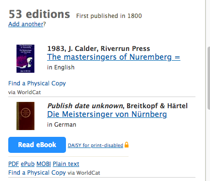
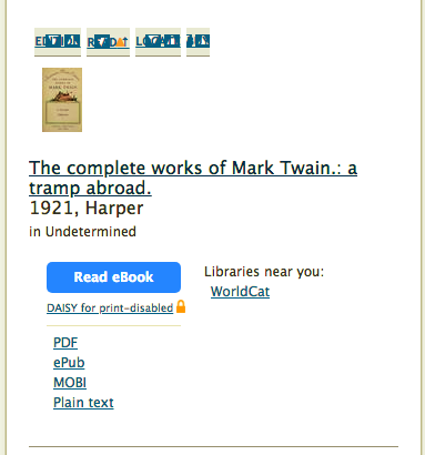
@jdlrobson after reformatting the interface for mobiles to something like this.
should we replace the table header with a dropdown menu on top to allow users to select whether they want to sort on the basis of title, availability etc?
Also, after editing I partly feel that we should now use flexbox instead of a table.
koderjoker
on 9 Feb 2019
I think as a first pass we can hide the table header in mobile. Your design looks great!
Let's think about sorting separately. Yes we will probably need JavaScript and some kind of dropdown but what you've got so far is already a massive improvement!
jdlrobson
on 10 Feb 2019
@jdlrobson Due to using a table for layout and overlapping of various styles, trying to make the edition component responsive is using far too much css than it should and is getting messy in its approach.
For the sake of simpler css, I think that instead of going forward with the table design we should replace the table layout with flexbox.
koderjoker
on 17 Feb 2019
I think it makes sense to retain the table HTML as semantically this is a table (not to mention the table column sorting feature)
On mobile screens we are currently defaulting to making table elemets display block by the method described here:
https://css-tricks.com/responsive-data-tables/
Can you share the CSS you have now? Two sets of eyes might help identify opportunities to simplify it!
jdlrobson
on 17 Feb 2019
Sure, I'll send a pr for the same! 😄
koderjoker
on 17 Feb 2019
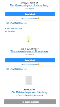
That looks good, @koderjoker ! Would it be possible to develop something a little closer to @jdlrobson 's prototype? The current proposal takes up a LOT of vertical space rather unnecessarily. Coming up with some user stories about who exactly this section is for would make designing it easier. What do you think a user is looking for when they come to this section of the page? How can we make what they're looking for easier to find? How does that change when they're on mobile? But I think this is good progress nonetheless! Also don't be afraid to play around with something more radical; I don't think the current desktop version is particularly well designed :P Like maybe we can have a drop down to contain that extra download information? Etc.
 cdrini
on 18 Feb 2019
cdrini
on 18 Feb 2019
Sure @cdrini, I'll think this over and give it another shot! 🙂
koderjoker
on 18 Feb 2019
This looks really good to me. While I agree completely with @cdrini about the vertical space and improving this experience, I think what we have so far is clearly superior to what's currently in production (remember it looks like this: :-)) and I'd be willing to merge what we have now on the understanding we'll continue to iterate on it. I leave that decision up to others, but I've removed the WIP tag to encourage that conversation!
jdlrobson
on 2 Mar 2019
Related issues
 skylerbunny
·
4Comments
jdlrobson
·
5Comments
cdrini
·
5Comments
jdlrobson
·
5Comments
skylerbunny
·
4Comments
jdlrobson
·
5Comments
cdrini
·
5Comments
jdlrobson
·
5Comments
 BrittanyBunk
·
5Comments
BrittanyBunk
·
5Comments