Hi @eclipse
My name is Ulises or TJ if you like,
i'm a graphic designer and I contribute to cool projects (open source) like this one!
if this is something that you're looking forward to, I'll gladly upload some logo proposals
I'll look forward for your reply, cheers!
TJ.
 tjulises
All 9 comments
We are willing to look, but no guarantee we will accept what is proposed. We did get some logo proposals around the time the project was created, but didn't like any of them enough to use them.
 pshipton
on 2 Jun 2018
pshipton
on 2 Jun 2018
Yes, I understand! before proceeding, I'd also like to ask some questions (towards the logo-making) @pshipton
What's the name that should be displayed on the logo, If there should be any.
How would you describe this project,
what is it intended to do?
What would you like this logo to transmit?
this little details are going to help me transmit what it's supposed to.
I'll look forward for your reply, cheers!
tjulises
on 2 Jun 2018
There's a regular community call on Wednesday's at 11 AM EST run using zoom. If you're able to attend we could discuss on the call in a high bandwidth format and hopefully get some broader community feedback.
 DanHeidinga
on 2 Jun 2018
DanHeidinga
on 2 Jun 2018
Hello @pshipton @DanHeidinga ,
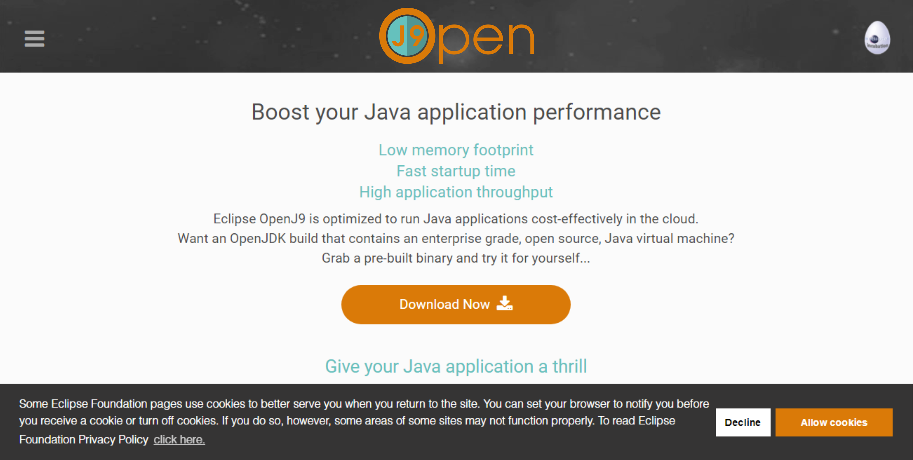
I've made my first proposal, this is what I came up with,
This is a mock up of how it would look on your site
tjulises
on 6 Jun 2018
@pshipton @DanHeidinga Hiii
tjulises
on 11 Jun 2018
Others, including all the committers on the project are free to comment as well. In my opinion, it doesn't seem like enough of a difference over the existing logo to consider making a change. We could just change the colors of the existing logo if we wanted to match the website colors.
pshipton
on 11 Jun 2018
Disclaimer - this is my own personal opinion
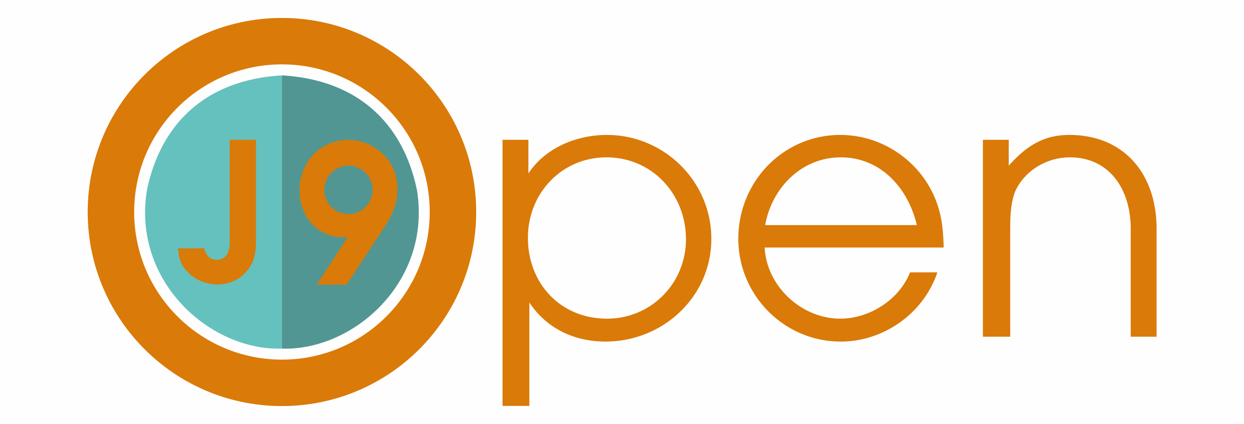
Thank you for the suggested logo. However, I find it misleading - when I saw it, it read like "J9 Open", rather than "OpenJ9".
 pdbain-ibm
on 11 Jun 2018
pdbain-ibm
on 11 Jun 2018
Personally I like it, the colors are pleasing together, and the typeface is nicer than the current one. I read it as OpenJ9, but maybe that's because that's what I was looking for. I don't know how someone without prior exposure would tend to read it.
Nitpicks: the "e" doesn't line up with itself and the curve of the "n" is a bit off where it meets the vertical line.
 ymanton
on 11 Jun 2018
ymanton
on 11 Jun 2018
Closing as the current logo has been in place for quite a while now.
 dsouzai
on 29 Oct 2019
dsouzai
on 29 Oct 2019
Related issues
DanHeidinga
·
4Comments
 xliang6
·
3Comments
xliang6
·
3Comments
 JamesKingdon
·
5Comments
JamesKingdon
·
5Comments
 hrstoyanov
·
4Comments
hrstoyanov
·
4Comments
 BillOgden
·
6Comments
BillOgden
·
6Comments
Most helpful comment
Hello @pshipton @DanHeidinga ,


I've made my first proposal, this is what I came up with,
This is a mock up of how it would look on your site