Openfoodnetwork: white space on "Display as" row (on products/new)
Description
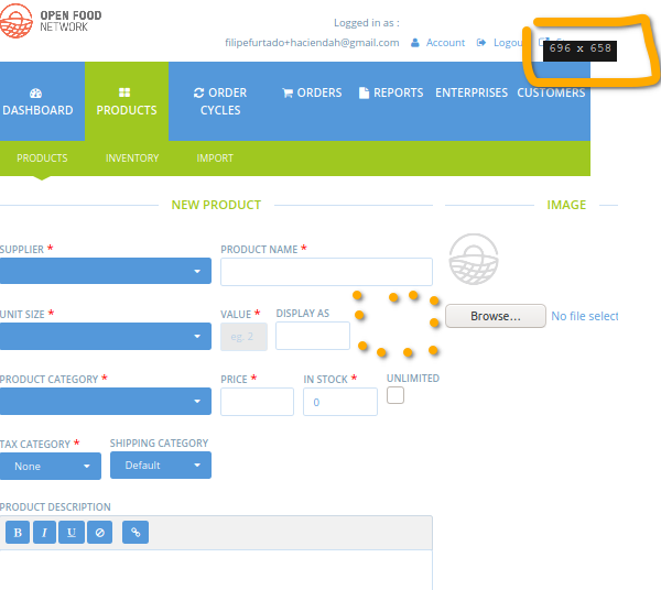
A white space on "Display as" row (on products/new) was spotted when testing #6788.
Steps to Reproduce
- visit /admin/products/new
Animated Gif/Screenshot

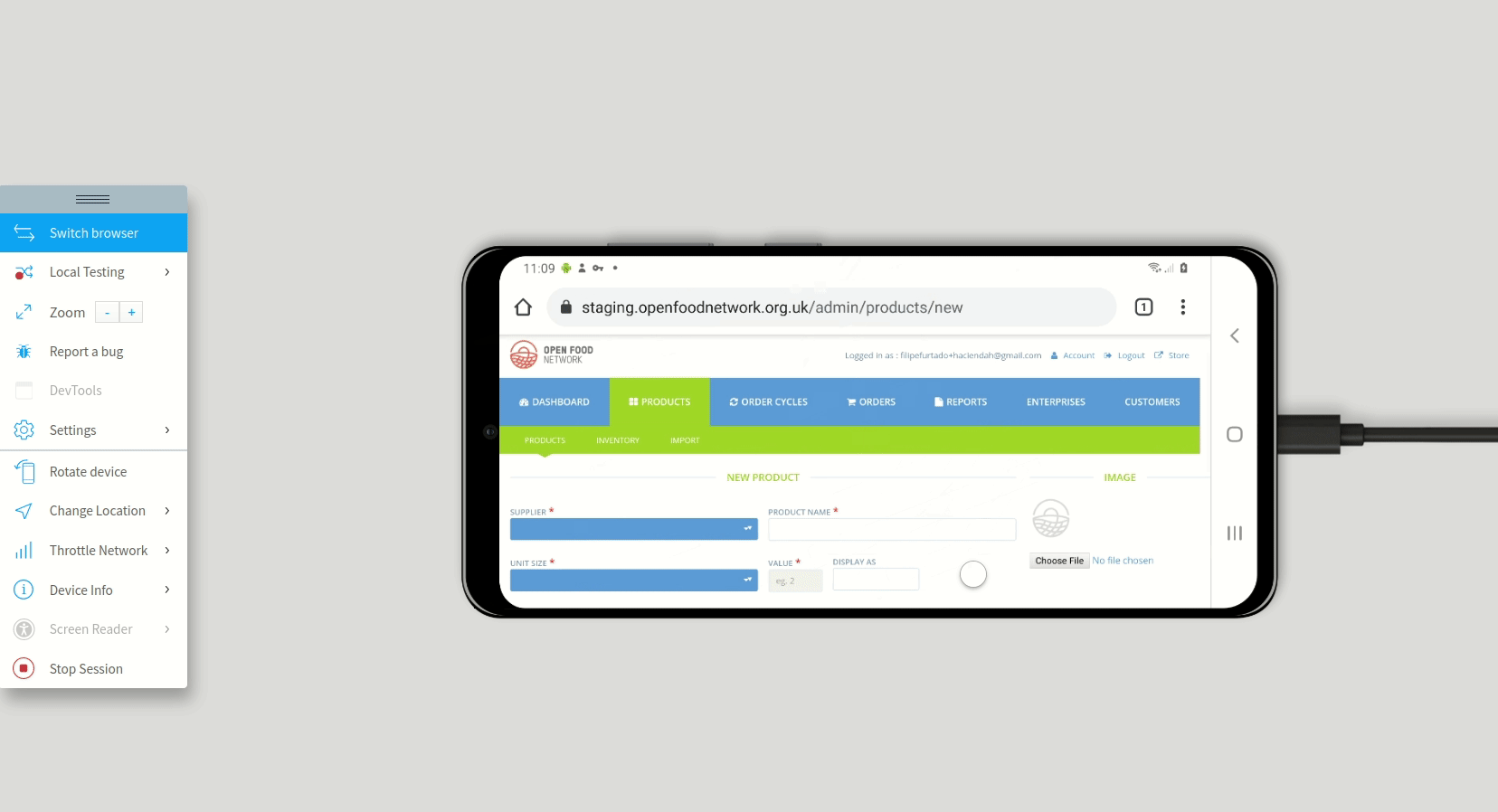
Also seen on narrower windows:
and Mobile:
Workaround
Severity
s5
Your Environment
- Version used: v3.4.6
- Browser name and version: Across browsers and devices
 filipefurtad0
All 6 comments
The thing is I'm not sure what to put in this white space. If the work on unit prices goes into the admin as well this space will be used.
Do we have an idea how to do it? ping @jibees
 RachL
on 2 Feb 2021
RachL
on 2 Feb 2021
I'm sorry, I though I was clear when creating the PR https://github.com/openfoodfoundation/openfoodnetwork/pull/6788#issue-565280820
Actually, there's a space after "Display as" to let the space available for "Unit Name" field as you can see here:

However It should be possible to hide this space when the field is not present (can be useful on small screen).
 jibees
on 2 Feb 2021
jibees
on 2 Feb 2021
Thank you for stressing this out @jibees .
While testing it, it felt like a regression to me, especially in mobile.
Also, this concerns potentially mandatory fields - I realize I should have been more explicit about this, on my "description" in this issue, sorry for that.
However It should be possible to hide this space when the field is not present (can be useful on small screen).
I totally agree with the solution you propose, if you find this feasible.
But if it is temporary and we are fine with this, we can as well choose to close this issue. What do you think @RachL @jibees ?
filipefurtad0
on 3 Feb 2021
I'm a bit concerned we are starting to consider mobile in the back office. If so there is a lot to take into account and I feel this space is not the main priority? But that's really only my opinion. Given you have some time @jibees I let you decide what you think is best.
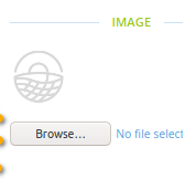
Also - but this will need another issue. What stroke my eye was that the image placeholder is not centered anymore:
FYI, how the page looked before:

RachL
on 3 Feb 2021
I'm a bit concerned we are starting to consider mobile in the back office. If so there is a lot to take into account and I feel this space is not the main priority? But that's really only my opinion.
I totally agree, but let's start there, no? It should not take that long.
We need a global reflexion on how we handle mobile/small screen devices cases. I think we should be able to have such a things : https://tailwindcomponents.com/component/form-grid
jibees
on 3 Feb 2021
@RachL @filipefurtad0 Sorry, I was totally confused: I thought that these two fields (Display As and Unit Names) could exist at the same time, next to each other. In fact, they are never displayed at the same time.... So sorry. 😊
jibees
on 3 Feb 2021
Related issues
 sauloperez
·
3Comments
sauloperez
·
3Comments
 sstead
·
4Comments
sstead
·
4Comments
 Matt-Yorkley
·
3Comments
RachL
·
3Comments
Matt-Yorkley
·
3Comments
RachL
·
3Comments
 shen-sat
·
3Comments
shen-sat
·
3Comments
Most helpful comment
I'm a bit concerned we are starting to consider mobile in the back office. If so there is a lot to take into account and I feel this space is not the main priority? But that's really only my opinion. Given you have some time @jibees I let you decide what you think is best.
Also - but this will need another issue. What stroke my eye was that the image placeholder is not centered anymore:
FYI, how the page looked before: