Openfoodnetwork: Taxonomies - Sorting entries in a taxonomy is broken
Description
In taxonomies, if you edit a taxonomy and try to sort the entries ((they are called taxons internally)) with drag and drop, apparently the actions work but if you refresh the page, the order of the entries goes back to what it was before the change.
Expected Behavior
The order set with drag and drop actions should remain.
Actual Behavior
It's not possible to change the order of the entries in a taxonomy.
Steps to Reproduce
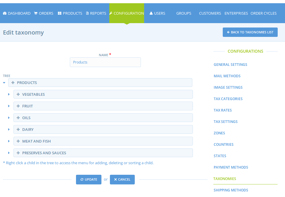
Admin > Configuration > Taxonomies and see that the sorting of taxonomies is broken.
Context
Severity
S3? - a feature is broken and there is no workaround but the "sorting of product categories" is a very unimportant feature
Your Environment
Local
- Version used: latest master
- Browser name and version: chrome 69
- Operating System and version (desktop or mobile): macos highsierra
Possible Fix
I believe there's something in the management/updating of the spree_taxons.position DB field. I couldnt find the solution quickly...
Meanwhile, If #2945 gets done, this issues would include reverting the alphabetical order and using the order defined by the user in the taxonomies screen.
 luisramos0
All 30 comments
I think this is a good first issue if you have experience with the tech stack but are new to OFN.
luisramos0
on 30 Oct 2018
Hi, I'm happy to take this issue as my first one!
 YanhanLyu
on 14 Nov 2018
YanhanLyu
on 14 Nov 2018
Go ahead @YanhanLyu !
 sigmundpetersen
on 14 Nov 2018
sigmundpetersen
on 14 Nov 2018
Welcome @YanhanLyu 😄
Looking forward to seeing your first PR come through the team for review!
 daniellemoorhead
on 14 Nov 2018
daniellemoorhead
on 14 Nov 2018
Regarding the ordering of taxons, are these taxons in the sample data supposed to be alphabetically ordered when we visit this view?
 haseleyi
on 7 Dec 2018
haseleyi
on 7 Dec 2018
no, they should probably be in creation order as you start.
the point of this issue is that you should be able to sort them with drag and drop.
luisramos0
on 8 Dec 2018
Sounds good thanks! Just to understand how the current code works for context, where does the alphabetical sorting kick in? I created new taxonomies and children therein and wasn't able to find it. I ask because we're currently ordering by the taxon's name property, but if that works, then ordering by the position property sounds promising.
haseleyi
on 10 Dec 2018
I think the alphabetic sorting relates to the dropdown in new/edit product, c.f. #2945 #2946
And not this main Taxonomy page
sigmundpetersen
on 10 Dec 2018
yes, correct @sigmundpetersen
luisramos0
on 11 Dec 2018
Something I don't understand though, the alphabetical order is just "temporary" solution right ? Then we want the taxonomy to appear in the new product dropdown in the order of creation in the configuration panel. Do we agree on that ? That's all the point of enabling to reorganize the taxonomies ;-) Maybe I didn't follow the whole discussion so forget me if I'm questioning things already discussed.
 myriamboure
on 11 Dec 2018
myriamboure
on 11 Dec 2018
@haseleyi this is where categories are sorted alphabetically:
https://github.com/openfoodfoundation/openfoodnetwork/pull/2946/files#diff-a4cf1ce3a963317af4147eb7a2f36992L5
yes @myriamboure , alpha sorting is temporary until we implement this issue here.
Lets forget about "sort by creation order". I meant: lets put the new taxonomies in the end of the list (it's how it is working right now) and let the user sort it with drag and drop in the taxonomies configuration. In the product categories list, it will always sort by user order (the results of drag and drop).
makes sense?
luisramos0
on 11 Dec 2018
Hi @haseleyi, just checking in (happy new year!) It's been almost a month since there was any activity on this bug so I'm checking to see where it's at? Have you had any luck with the information that @luisramos0 posted above?
daniellemoorhead
on 8 Jan 2019
Hey, sorry for the wait and thanks for checking in! I have an edit that renders just the root taxonomies in the correct order by position in the relevant dropdowns. Assuming that's not our ideal result, and that we want to render children/taxons in the dropdowns too, how do we want to order one taxonomy's children relative to another's?
haseleyi
on 11 Jan 2019
@haseleyi ideally we would like both root taxonomies and childrens to be rendered in the order that was set in the configuration panel by the instance super admin. We need to see that a children is a children avoid confusion. But it deserves obviously a bit of inception, so let's do it now.
This taxonomy is hierarchical type.
Here https://fr.slideshare.net/HeatherHedden/taxonomy-displays-seattle-meetup I saw different options to display hierarchies taxonomies:
- Expandable trees (slide 27)
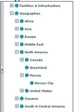
- Fly-out subcategories (slide 29)

I don't know how hard it is to introduce those kind of "tree" in the current dropdown / in replacement to the dropdown ?
Else we of course can manage to render it in a visually understandable way in the current dropdown.
Let's say we have the following taxonomies and children, ordered like that in the configuration panel:
1- Fruits and vegetables
1.1- Vegetables
1.2- Fruits
2- Meat and fish
2.1- Meat
2.1.1- Beef
2.1.2- Poultry
2.2- Fish
3- Dairies
3.1- Eggs
3.2- Yogourts
3.3- Cheese
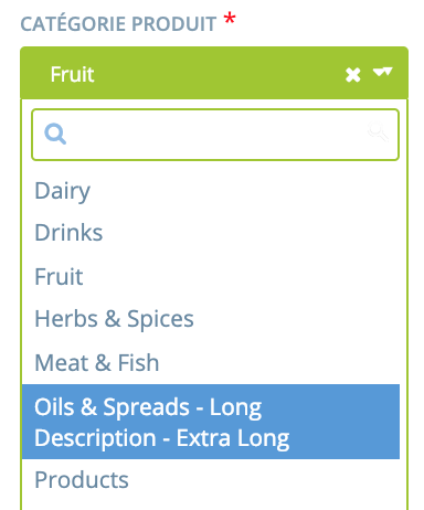
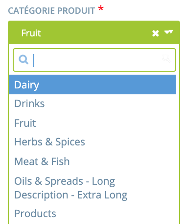
Option 1: we want to keep the current dropdown.
See the two suboptions in a visual example here https://ux.stackexchange.com/questions/84275/what-is-best-ui-ux-solution-for-displaying-taxonomies-hierarchy-in-simple-grid-l
Option 1.1: display children with parents name in front
Fruits and vegetables
Fruits and vegetables - Vegetables
Fruits and vegetables - Fruits
Meat and fish
Meat and fish - Meat
Meat and fish - Meat - Beef
Meat and fish - Meat - Poultry
Meat and fish - Fish
Dairies
Dairies - Eggs
Dairies - Yogourts
Dairies - Cheese
Option 1.2: display children with clear indication that it is a children
Fruits and vegetables
--- Vegetables
--- Fruits
Meat and fish
--- Meat
------ Beef
------ Poultry
--- Fish
Dairies
--- Eggs
--- Yogourts
--- Cheese
Option 2: user select first parent and is then proposed to select children, either with tree display or fly-out subcategories
(see above in the slide)
From where we are at it seems to me that it would be much simpler to keep the current dropdown and don't introduce expandable tree or fly-out subcategories options. So in that case 1.1 or 1.2 would be good. I tend to vote for 1.2 which I find lighter.
Would love to have a second UX view on this. @RachL or @kirstenalarsen maybe ?
myriamboure
on 15 Jan 2019
nice @myriamboure
I vote for keep it simple, option 1
Option 1.1 will tend to have longer items, entries are currently being line wrapped in the product edit page:
and without being selected:
based on this I vote 1.2
luisramos0
on 15 Jan 2019
Yes and for 1.2, can we have less number of dashes? Like:
Meat and fish
- Meat
-- Beef
Cool ! So I think the proposal is 1.2 option "display children with clear indication that it is a children"
About the number of dashes @sigmundpetersen I found it a bit confusing the one dash children as we use one dash for regular lists, I was afraid of some potential confusion, and putting more dashes make the level of children visually clearer and obvious, but happy to review my opinion if no one else find it confusing.
I try below with -- instead of --- for each level of children. That would be my proposal then. If there in an objection we can iterate again of course ;-)
Fruits and vegetables
-- Vegetables
-- Fruits
Meat and fish
-- Meat
---- Beef
---- Poultry
-- Fish
Dairies
-- Eggs
-- Yogourts
-- Cheese
Actually the way it is rendered when in a "code" format might be clear enough with one dash per level as you suggest @sigmundpetersen ... @RachL what do you think ?
myriamboure
on 15 Jan 2019
Just to clearly understand, the dashes would appear in the dropdown menu when creating / editing a new product? So when searching for a particular one (through the search, not scrolling the list) you would know that is it a children but not from which root taxonomy. Did I understood well @myriamboure
 RachL
on 15 Jan 2019
RachL
on 15 Jan 2019
Thanks @myriamboure for messaging me that this discussion was happening. Yes - the taxonomies drive me crazy and I'm happy to see the display of children suggestions. I concur that a few dashes (I don't know how many) is clear. And I think here we are talking about the display in the product entry dropdown - correct? What implications will this have for shopfront searching. For example - I have a food hub. Producer A has put eggs under the Diary child '---Eggs'. Producer B has only a few dairy items and they listed them all as 'Dairy'. So in the shopfront we'll have 'Dairy' and '---Eggs' show up as filters - correct? Or will we have only the parent show up - and when the user clicks it - then '---Eggs' shows. I just want to understand how these --- dashes show at the top of the shops because right now, the shopfronts are so ugly because of all the parent and children taxons. This could just make them uglier.
 tschumilas
on 15 Jan 2019
tschumilas
on 15 Jan 2019
You are right @RachL that might be an issue... or not ? If I find with a key word search the perfect category do I need to know under which parent category it is ?
@tschumilas good questions.
If producer A put egg under "eggs" and producer B put egg under "dairy" both would show if filter is on "dairy" but only the one on eggs would show if search is on egg.
In term of front end, Yuko made some proposal and you can look https://docs.google.com/presentation/d/10I8-3mRjxnPUXtEk04X3UERVPEPvqPjrEdF37_1KpmE/edit#slide=id.g41f0a2d615_0_50 the direction would be to be able to filter and have some tree unfolding possibility in term of search. On short term it woudln't change there will be one tag for each level (but hopefully those change will happen very soon !)
One decision we need to make, which is important: do we "force" to map at the "leave" ? So: do only the last levels of children are available for selection when creating/editing a product? We might add some "dairy other" children so people who don't know where to classify their products can put them there and we can sometimes check what is there and evolve the taxonomy.
I would be pretty in favor of that, especially in the context of a direction toward interoperability: the more details we have on a product the easier it would be to share the product information in a usable way to other platforms (for instance if eggs are under dairy, and the producer wants to share his catalog with another platform and in this other platform taxonomies are organized differently, the other platform might not know under which taxonomy to put it...)
@luisramos0 what do you think ?
myriamboure
on 15 Jan 2019
One decision we need to make, which is important: do we "force" to map at the "leave" ? So: do only the last levels of children are available for selection when creating/editing a product?
If we force that I don't see the point of having parent categories. We should just have (children) taxonomies, it would ease up everything, no?
You are right @RachL that might be an issue... or not ? If I find with a key word search the perfect category do I need to know under which parent category it is ?
Nope but then I don't see why I need to know there that a children is a children... In the product dropdown, I would suggest we have the taxonomies ordered by their position in the tree in super admin but with no "dash". I'm assuming that this was also one of Theresa concerns : will the dash be shown in front office?
RachL
on 15 Jan 2019
Yes @RachL - one of my concerns was how the dash looks in the front office.
But I keep asking myself - does a user need to know the parent for their child? Maybe not? In the short term - the shopfront will pick up the name of the category (regardless of where it is in the heirarchy). In the long term - I presume the shopfront will show parent categories - and then clicking them will reveal children. So does the user need to know the parent when they enter a child?
tschumilas
on 15 Jan 2019
In back office they don't need to know the parent categories. I agree with you @RachL that maybe then we don't have to show the parent categories (remove the dashes issue), or grey them if we want the manager to be conscious about the full display in front end (don't remove the dashes issue).
In front end (see Yuko design) I think parent categories make the search easier, there might be quite a lot of children categories, so we need to keep them... having a tree is made to simplify the search ! Dashes won't be seen in front end @tschumilas . Else another way to organize the search could be by facets and get rid of the categories tree and logic but it's too much of a modification and we shouldn't consider it.
So for now we do need parents and children to make search easier for buyers.
myriamboure
on 15 Jan 2019
If this is the only reason we keep them and if keeping them would lead us to something more technically difficult, I would like to raise the question : can we make the search easier without parents categories?
I mean there are other options than showing a list of categories in the filter section. For example a lot of users asked us if they could search by categories of product directly in the search bar. We can do that and add suggestion once the user has type 3 letters. With this for example we can have a list of categories as long as we want.
To be precise : I'm not saying we should do that, I'm just trying to understand how these taxonomies are used today :)
RachL
on 15 Jan 2019
I think there are different users who search in different ways. For ex - some people know what they are looking for and then search in the search bar is best. (But they can already search there by producer, and product and they can filter by category - so if they know what they want, they are OK. I think about the shoppers who don't know what they want - esp those new to the shop - who want to browse to see what there is. We need to make searching parents easier for these people because a parent category can have hundreds of items under it. On the design from Yoko - its not clear to me how a parent category breaks out to show the children. But it needs to somehow.
tschumilas
on 15 Jan 2019
I'm going to focus on the API documentation issue and leave this for someone else looking for a good first issue!
haseleyi
on 7 Feb 2019
A lot of good inception work is done on this issue so it will be a flying start for the next one to pick it up. Thank you @haseleyi !
I moved it back to Dev Ready but maybe it should even go further back to Bug backlog, what do you reckon @luisramos0 @daniellemoorhead ?
sigmundpetersen
on 7 Feb 2019
yes, I moved it to bug backlog into a position below the top s3s and translation s4s.
luisramos0
on 7 Feb 2019
seems like this maybe got way way out of scope of the original bug that was to be fixed? Should the whole child discussion be moved to a discourse feature request?
 kirstenalarsen
on 8 Feb 2019
kirstenalarsen
on 8 Feb 2019
Related issues
 shen-sat
·
3Comments
RachL
·
3Comments
shen-sat
·
3Comments
RachL
·
3Comments
 filipefurtad0
·
3Comments
filipefurtad0
·
3Comments
 sauloperez
·
3Comments
filipefurtad0
·
3Comments
sauloperez
·
3Comments
filipefurtad0
·
3Comments