Openfoodnetwork: [Bulk Invoice Printing] Add checkboxes and "print invoices" bulk action button
Description
- As a: enterprise user or a superadmin
- On page: admin/orders
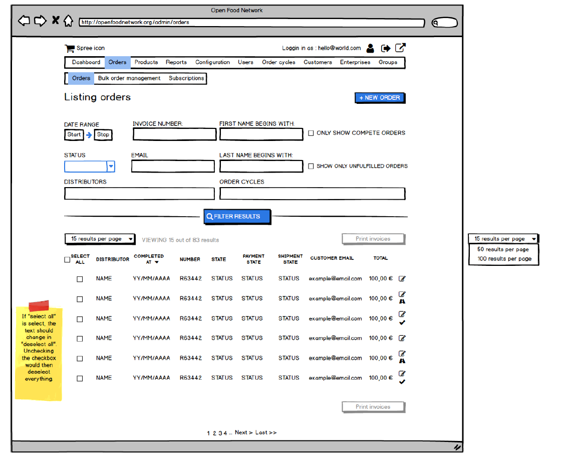
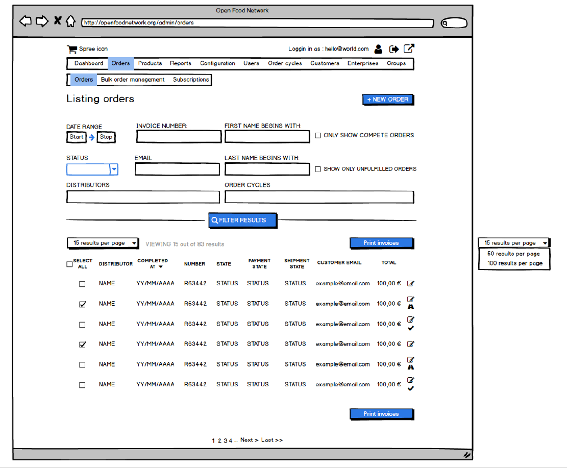
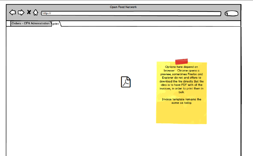
- I want to be able to: Apply existing filters on order page, and choose single bulk action to generate in a new tab a PDF to print all corresponding invoices.
Note : as long as no order are selected, the print invoices button stays disable.
Tasks
- [x] Add selectable checkboxes with Angular
- [x] Set up PDF invoice creation logic for multiple orders
- [x] Add bulk action button and endpoint
- [ ] Test large PDF resource use (potential timeouts?)
Mockups:
Acceptance Criteria
- All selected orders have an invoice in the PDF generated
- "Select all" limit is yet to define!
All 39 comments
Do the PDF generation display in a new tab? I guess yes as when I print a single invoice, it opens it in a new tab and enable me to print it easily. For OCs with many orders (like 100 or 200) how would the system react? Will we reach a timeout?
In the new process what we said is that in the product feature backlog we create an epic for the feature candidate chosen in the brainstorming and value/ease matrix thing (and not anymore the for need, as we were doing until now...). If there is only one issue in the epic I guess we can only create an issue, or only an epic with no issue in it.
@myriamboure @luisramos0 I'm still hesitant on the filter part. Is it really clear for a user that when he/she click on a bulk action what he/she prints is what he/she sees on screen? I mean, with checkboxes at least it is 100% clear. Do you remember why we put checkboxes aside ?
The choice here will impact a lot of future features, as well as old pages.
Furthermore, I need a tech owner to look at two points : 1. Browser limitation (is there any particular browser version where PDF won't work properly) ? 2. Number max of orders selected. I would advise for a threshold under which we are comfortable it will always work without timeout.
I'd like to volunteer to be tech owner on this one :)
Browsers should all be OK with PDFs. If they can't display them directly in a tab they still allow for download and opening them.
I don't think we'll have a clear idea of a maximum threshold for orders/PDF size until we've made a basic implementation and tested it, but after it's in place we could definitely look at some basic benchmarking and explore ways to make it more resource-efficient, if that is needed.
I answered on the original reason why we removed checkboxes in the epic discussion, it was a quick fix, much quicker to implement with only filter. But I definitely agree that on a longer term we need the checkboxes. Great that you want to own this feature @Matt-Yorkley !
A method I've used in the past to get around generating potentially hundreds of PDF invoices (not in OFN, but another system) was to output everything as a single HTML document, then include CSS page breaks:
@media print {
.invoice-wrapper {page-break-after: always;}
}
If you are then printing to paper, it will separate each invoice onto its own page automatically. OR if you want a single multi-page PDF, you can use a browser like Chrome's built-in print to PDF function to get one file containing all of the invoices, with proper page breaks between each one. We've been doing it that way for years now at CLFC.
May not be exactly what you're going for, but could be a viable option to avoid timeouts on large batches?
Issue description updated with all lastest comments/brainstorms.
Just a small thing, could the bulk actions dropdown be near the top of the results table and not tucked away above all the filters?
@Matt-Yorkley I thought about this as well. However today the action button is always above the filters on other OFN pages. I'm happy if we change it, but it might be weird to have two places at the same time?
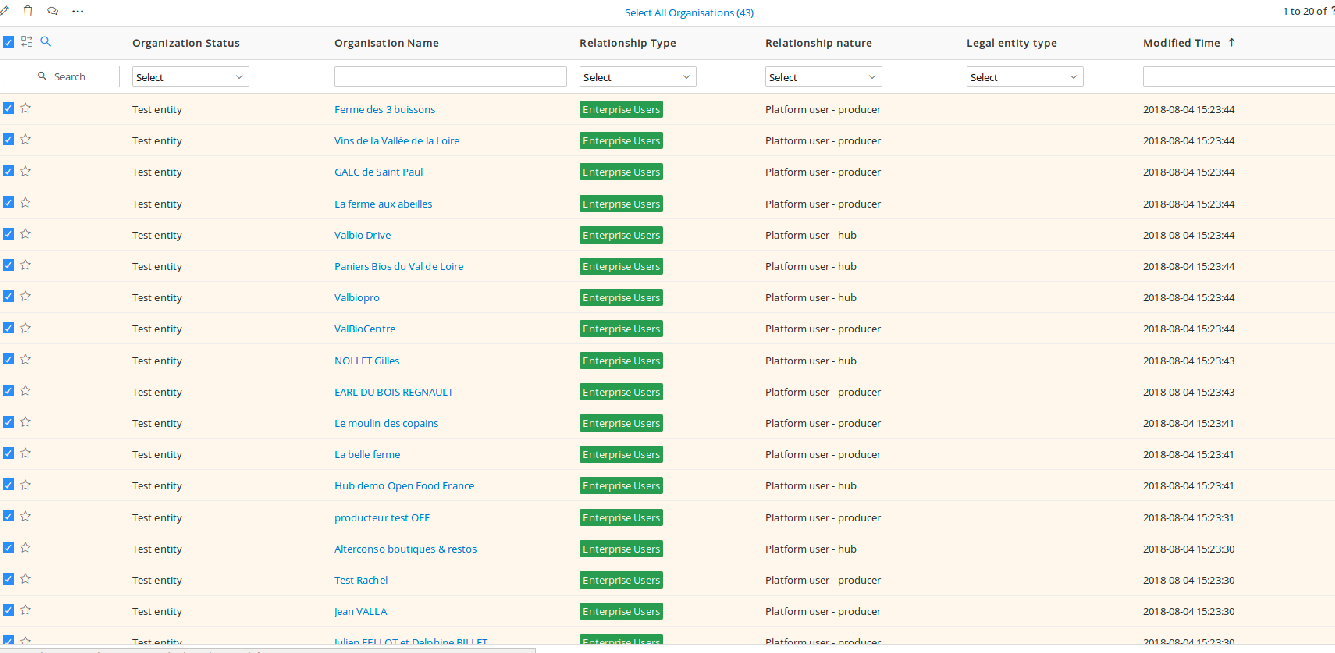
@RachL I think instead of offering the possibility to display 50/100 per page, or as a completent, I would add just on top of the list a clickable link "select all records (total number, i.e. 143)" that automatically thick all the checkboxes on all pages. And the link is then transformed to "deselect all records" which if I click deselect them all. I find it much easier than going through each page, slick "select all", etc.
See the two images I shared as an example on Slack, taken from our Vtiger CRM:
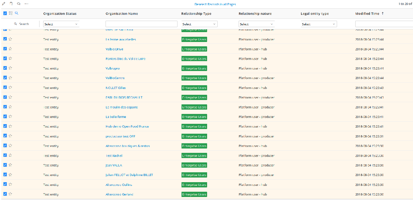
@RachL I think there's a distinction between actions being applied to selected items and general page actions, so having them in different positions is good in this case? I think it would be a bit clearer for the user if the bulk actions being applied are near to the items being selected.
Also, with the results per page thing we should probably show a count of how many items there are, which we don't currently do. So we should display something like: "87 Results. Viewing 1 to 50" next to the results per page dropdown.
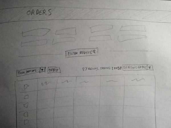
@Matt-Yorkley yes I agree, but then I think we will need to move on other pages some actions from the other actions button and set them in the bulk action button, as they are bulk actions. Just putting it here as a note, but this is something that we will need to check (in a separate issue of course).
Speaking of issues, do we need to split this one or is the size ok?
There are a few issues we can make, and they can be smaller bitesized jobs, with individual PRs. I think breaking down the technical jobs in to small chunks is the best option wherever possible. I'd suggest these, in order:
- Recreate the Spree view without deface overrides (this is something we do now when making big changes to a page).
- Angularise the current Orders page (without adding new features).
- Add the "results per page" dropdown and show feedback for results found / results shown.
- This issue (add checkboxes, bulk actions dropdown, and the print invoices bulk action)
If you look at the images from Vtiger I shared, the filters are below the bulk actions options... I don't know the good practice, just noticed that, and I find it pretty practical that way as a user personnaly. I'm afraid that we start moving bulk action below filters we have to review UX on all bulk action pages or our users might be disturbed, that worries me a little.
I think we should make a site-wide UX decision on where the bulk actions should be and then implement in this page and gradually throughout others. This is the ‘cleaning up the campsite’ approach to UX makeover and developing UX style-guide / decisions that people can look to and use - rather than more random decision within each feature change
@rachl do you have a view on where the bulk actions dropdown SHOULD be if we were ignoring current OFN pages / implementation?
On 8 Aug 2018, at 12:37 AM, Myriam notifications@github.com wrote:
If you look at the images from Vtiger I shared, the filters are below the bulk actions options... I don't know the good practice, just noticed that, and I find it pretty practical that way as a user personnaly. I'm afraid that we start moving bulk action below filters we have to review UX on all bulk action pages or our users might be disturbed, that worries me a little.
—
You are receiving this because you are subscribed to this thread.
Reply to this email directly, view it on GitHub https://github.com/openfoodfoundation/openfoodnetwork/issues/2510#issuecomment-411079666, or mute the thread https://github.com/notifications/unsubscribe-auth/ACxryPW7ihKBvPvg49hX5xiYC1qws3ymks5uOaZGgaJpZM4Vjgph.
Ok, so here is a new proposition but please bear in mind that I'm doing this with no data on how the page is currently used so don't hesitate to shout if I'm doing something that no user would do on the OFN :)
To my knowledge, it is best when the button defining action is close or in the same area that the stuff it is doing an action on. So I would keep it close to the results rather than on top of the page.
In terms of good practices, it is good to have the button on the right, but with a long list of orders I am currently wondering about repeating the button at the end of the page as well (usually, you go through the checkboxes, and when you are finished you are at the end of the page.... but this is an assumption, maybe 99% of the time the user will select everything, so having the button on top of the results is nice as well).
You will find on the drive a new PDF called finalv2 where I suggest also not loading orders when loading the page. This enables us to not show the action button at first, especially if all the user wanted to do is to create a new order. The less button the better.

After your feedbacks I will update the issue again and create the one with the results dropdown.
I agree that the actions button should be below the filters, closer to the action (so to speak ;)
I think repeating the button at the bottom of the page certainly wouldn't hurt and would be good
I am not sure about not loading orders. I have used this page a lot and it's very handy to be able to load it and just see that orders are coming in, who has ordered recently etc. If you have a reported problem it is most likely that you can see that order straight away, or with one click to load more. I think it would be a pretty significant useability backwards step to not have the orders load when you do load the page.
Isn't it a bit strange to have one action button at the right of "listing orders" ("new order") and another action button below the filters? I find it strange in term of UX personnaly. I woudl rather do what you did in delivery note suggestion @RachL which would be to hide/show the filters (as most websites do), so by default it can be hidden you can show and filter, when it shows results it hide again, so you see the action (which are on the top) just need the results.
Agree with @kirstenalarsen that not loading orders would be a backward, and there is no performance issues to my knowledge with that at the moment.
@kirstenalarsen @myriamboure thanks for your feedbacks!
No problem about showing order on first page, however it is weird to me that some pages work that way on OFN and others don't. That's why I've proposed that orders appear automatically if you have only one shop, and do not if you have several, which is a clear rule. Anyway if we keep this on order page, I think we should consider working on performance issue around other pages so that we have one unified way of accessing data.
On the issue you raised @myriamboure about having a strange feeling on the two action buttons: if the action you want to do is to create a new order, it is logical to have it on top as you come to this page to do that. So the button should be one of the first you see (or a submenu even). But then again, I don't know how people use it: do they use it often, do they do other stuff before using the new order button? etc So it's difficult to answer.
One way it could work is to make this button linked with the filters: so that if you have used filters the new order you will create will have pre-filed fields according to the filters selected. Then IMO it would make sense to put it after the filters. But to my knowledge this is not how the button works today right ?
I'm not sure I will have time to update the issue before leaving on holidays but I will do my best ;)
That's why I've proposed that orders appear automatically if you have only one shop, and do not if you have several, which is a clear rule
I understand @RachL but the use case and need here is a bit specific... maybe we need the clear rule to be the same everywhere, but it should be another rule then ;-)
A hub manager who manages various hubs will want sometimes to see info all hubs mixed, and sometimes info just for one hub. If I think of Suteau Biosol for instance in france they want to see the orders all mixed to follow up sometimes "what are the last orders" and be reassured that orders are coming through. If they have 6 distributors in their OC it's annoying to have to clik one by one on each distributor to see of orders I coming. To you see what I mean? So maybe we need to find another rule ;-)
if the action you want to do is to create a new order, it is logical to have it on top as you come to this page to do that
I disagree, you come to this page to view and manage the order you received online. Capturing one order from back office happens (for some hubs quite a lot) but it's more to manage edge cases like "I forgot to order and the OC is closed" or people who don't manage to make an order online. So viexing, accessing and bulk actions on order is at least as important as capturing a new order.
Definitely it doesn't work with the filters today, and I'm not sure that's desirable, as you capture edge cases orders one by one usually so it doesn't take more time to select the OC in the new order process than in a filter...
@myriamboure @kirstenalarsen Alright so I will put back the result on the page. I will focus on finishing the issue tomorrow. Just a note on your feedback: the need you are both describing is to see incoming orders. To me an order listing should not be used for that. This is clearly more a dashboard thing : like having the last 10 orders with link to the order page (prefilter on the hub you've clicked before). Anyway this is just my 2 sc here :)
I disagree, you come to this page to view and manage the order you received online. Capturing one order from back office happens (for some hubs quite a lot) but it's more to manage edge cases like "I forgot to order and the OC is closed" or people who don't manage to make an order online. So viexing, accessing and bulk actions on order is at least as important as capturing a new order.
Definitely it doesn't work with the filters today, and I'm not sure that's desirable, as you capture edge cases orders one by one usually so it doesn't take more time to select the OC in the new order process than in a filter...
I think we are mixing several things here. The point was just to say that after the filter it would be logical that you don't want to apply again your selection if you click a button located under the filter you've just filled, do you see what I mean? On the subject of importance, if it's equally important and used in different context it might be that it is not meant to be on the same page. Again, I find it weird to load orders in order to access a form that enables me to create a new one, especially if the list does not help me at all in the process of creation. So this is why to me if we keep them on the same page it should be on top, to be able to quickly click on it.
This is clearly more a dashboard thing : like having the last 10 orders with link to the order page (prefilter on the hub you've clicked before).
Why not... it would worth some discussion with our users to understand if they use the order listing and how before we can tell ;) I guess that could be enough to reassure them, and then if they want to do actions on orders they would use filters, so it's possible that what you say is right. That would probably increase performance not to load all orders at once... @kirstenalarsen what do you think about having a new dashboard box with 'last 10 orders" and view orders that redirects to orers section with no pre-loaded orders? Actually it sounds pretty good to me... @RachL if you want we can ask some of our users (Perrine, Josian, Olivier) from your mockups how they would feel about that (let's talk this afternoon).
About your second comment, I get your point. The problem with putting it on another page is that it adds one useless click (to go on a new submenu) so would keep it on the same page, but maybe we would need some quick advice/feedback on all this from Yuko? With her UX experience maybe she would have some quick brilliant suggestion we would all love :-) @kirstenalarsen what do you think? Maybe she can help us on those kind of rules that we can then apply in all our logic?
We're not loading _all_ the orders though, I think the current page loads 15 by default, and we can keep that. I agree with Myriam that we probably don't need the extra page and extra clicks in this case.
@myriamboure @Matt-Yorkley Guys actually I've never talked about a new page neither a new sub-menu ;) My point is also to reduce the number of click to access buttons. Sorry if it was not clear. We should maybe talk next time ;) Anyway, as we've said on slack, let's move bulk printing forward and decide on OFN UX rules for our next big features such as delivery note.
I have updated the issue above with new mockups and screenshots (still finalv2). The only changes are: 1. orders are back on first page load and 2. Action button is repeated at the end of the page as well.
Here are the list of issues @Matt-Yorkley 's proposed with their ID:
- Recreate the Spree view without deface overrides #2525
- Angularise the current Orders page (without adding new features). #2526
- Add the "results per page" dropdown and show feedback for results found / results shown. #2527
- This issue (add checkboxes, bulk actions dropdown, and the print invoices bulk action)
If we are all ok, I can update a little bit #2527 with mockups so that it is more clear what has to be tested. We might need also to detail a bit more what has to be tested on the two first @Matt-Yorkley .
And then I think the bulk invoice printing is ready to be picked-up or did I've missed something ? ping @myriamboure
I did write in some acceptance criteria for testing those two first issues. They will need minimal testing as the functionality should be unchanged in each one.
Question: can we hide/display filters to gain space on the page? my suggestion might not be relevant so ignore it if not.
I'm wondering about the action button at the bottom, I find it strange to be honest, I wouldn't do that. let's have just one place for one dedicated action, if users know the actions button are at a certain position, that's clearer no? Maybe some feedback from Yuko on this would be good. So we can decide and adopt the behavior everywhere, @RachL feel free to ask her some feedback on this and maybe the hide/display filters. Same, I would propose that as a rule for every page... and default would be that filters are displayed.
Those two comments are not blocking for starting the feature, just details I would like us to agree on.
@myriamboure on the filters I would prefer if we do as we said: no changes for BIP but we will do it on delivery note. What will be interesting then will be also to compare stats between the delivery note page and order page. E.g. are people really hiding the filters or not. And then decide what to do globally?
For the action button, if a user chose to have 100 results on that page, and is reviewing them in order to check the checkboxes. At the end of the page, do you really want him/her to scroll back to the top to hit the action button? Maybe we can show the bottom button only if 50+ results are shown?
Maybe we can show the bottom button only if 50+ results are shown?
Why not, I'm happy with that. But I'm afraid it is some more devs for something that might happen rarely... (printing more than 50 invoices at a time...) so maybe we can add it later if we notice people do print more than 50? Or if not much more work then we can do it know...
Ok about the filters.
@myriamboure it's not about printing 50 but showing 50, which is different. Maybe on the 50 showed they will only select 2. But yes, we don't know how it will be used yet...
hi people. All looking good to me - except one thing :)
it feels to me like the "X results per page" and "Actions" buttons should be swapped - so that the Actions button is above the checkboxes and it is more obvious which items it is being applied to. This is how @Matt-Yorkley had it in his mockup and i completely agree.
Don't think the left or rightness of the bottom box matters so much
@kirsten I'm afraid it might be too many buttons on the left, and as @RachL mentioned previously, we need a rule about where the action buttons are. Also the other action button (new order) is on the right and we need consistency. I suggested we ask feedback from Yuko based on those mockups, can we just do it quickly so she tells us where the action button and view per page button will best be?
@kirstenalarsen sorry wrote your pseudo wrong, trying a GitHub app which is not that good, can't edit my previous message ;-)
I think we have a precedent for the bulk actions button on the left in the Bulk Order Management page (as per my comments on delivery note epic) and it really makes sense to me there. Pinging @yukoosawa for opinion?
Yuko - do you have a view on having the bulk actions drop down on the left (above the check boxes) vs on the right as in @RachL 's 2nd mock above?

Hi Everyone (especially fellow UXer Rachel!!),
I am going to preface my comment by saying both options are good solutions and the following is only my preference :)
As a Gmail user I prefer having the bulk edit options located on the left hand side, above the checkboxes, so when they become 'available' it happens in the same visual space.
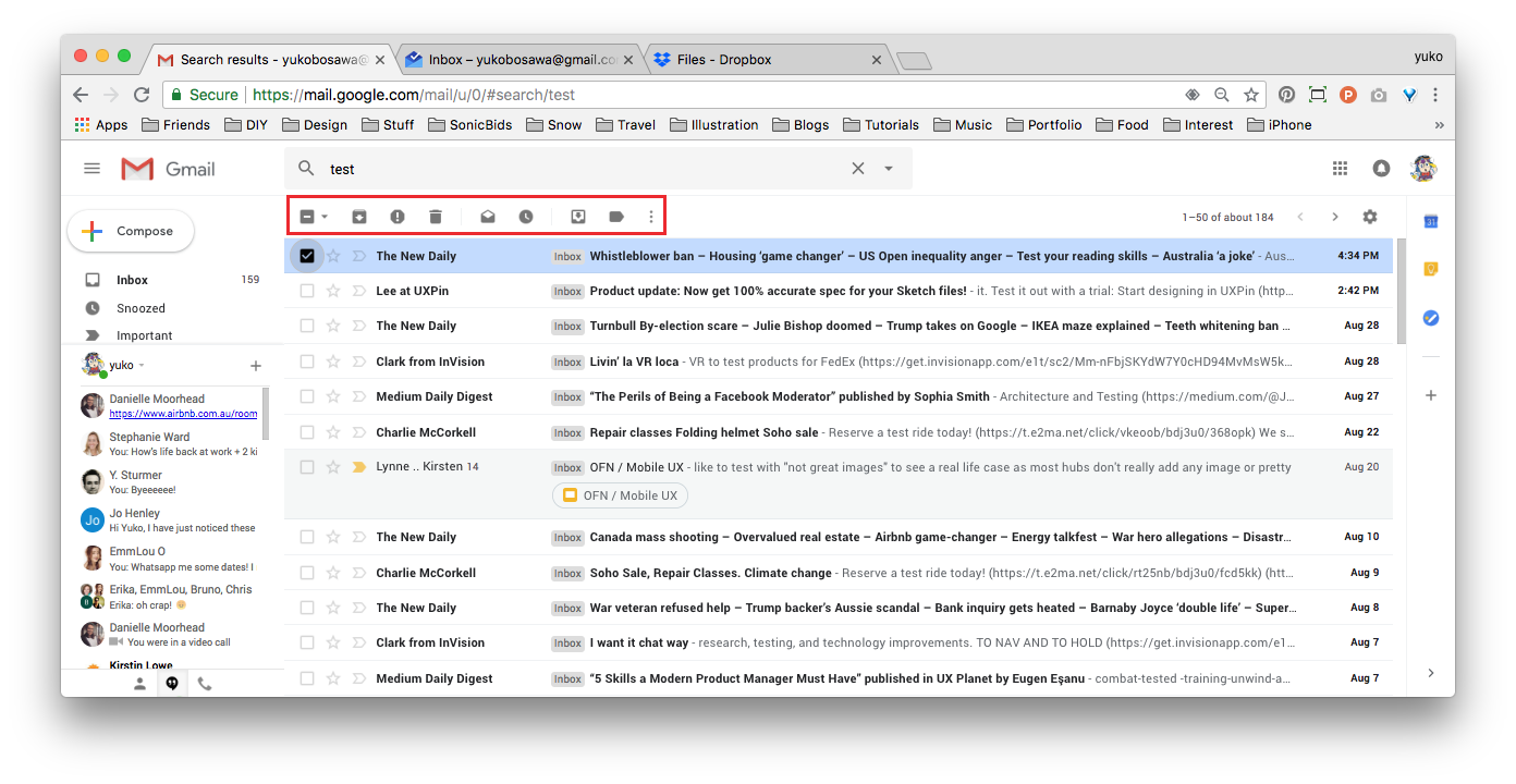
However Inbox and Dropbox present bulk actions on the right hand side, Inbox in a fixed header and Dropbox in a fixed righthand panel.
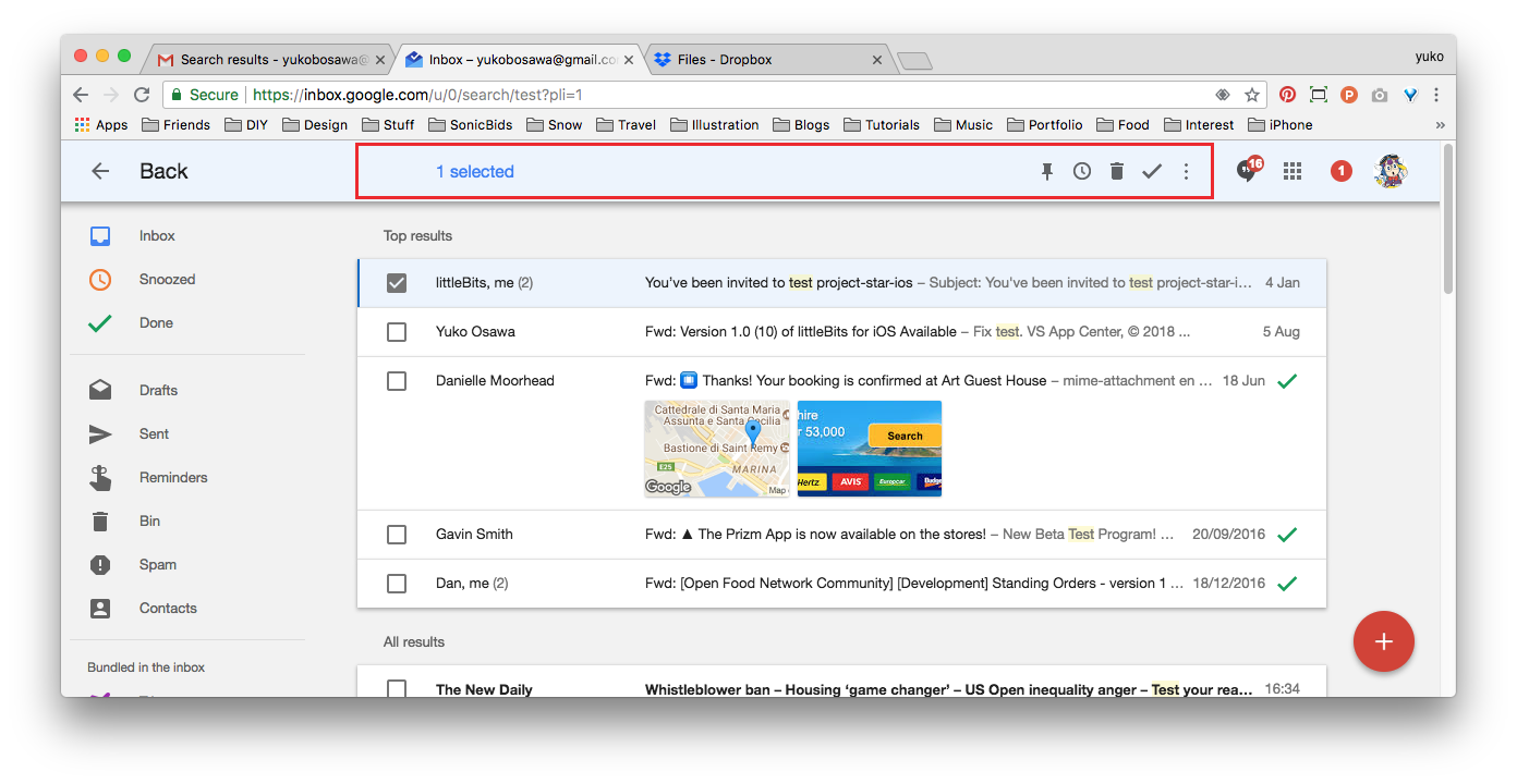
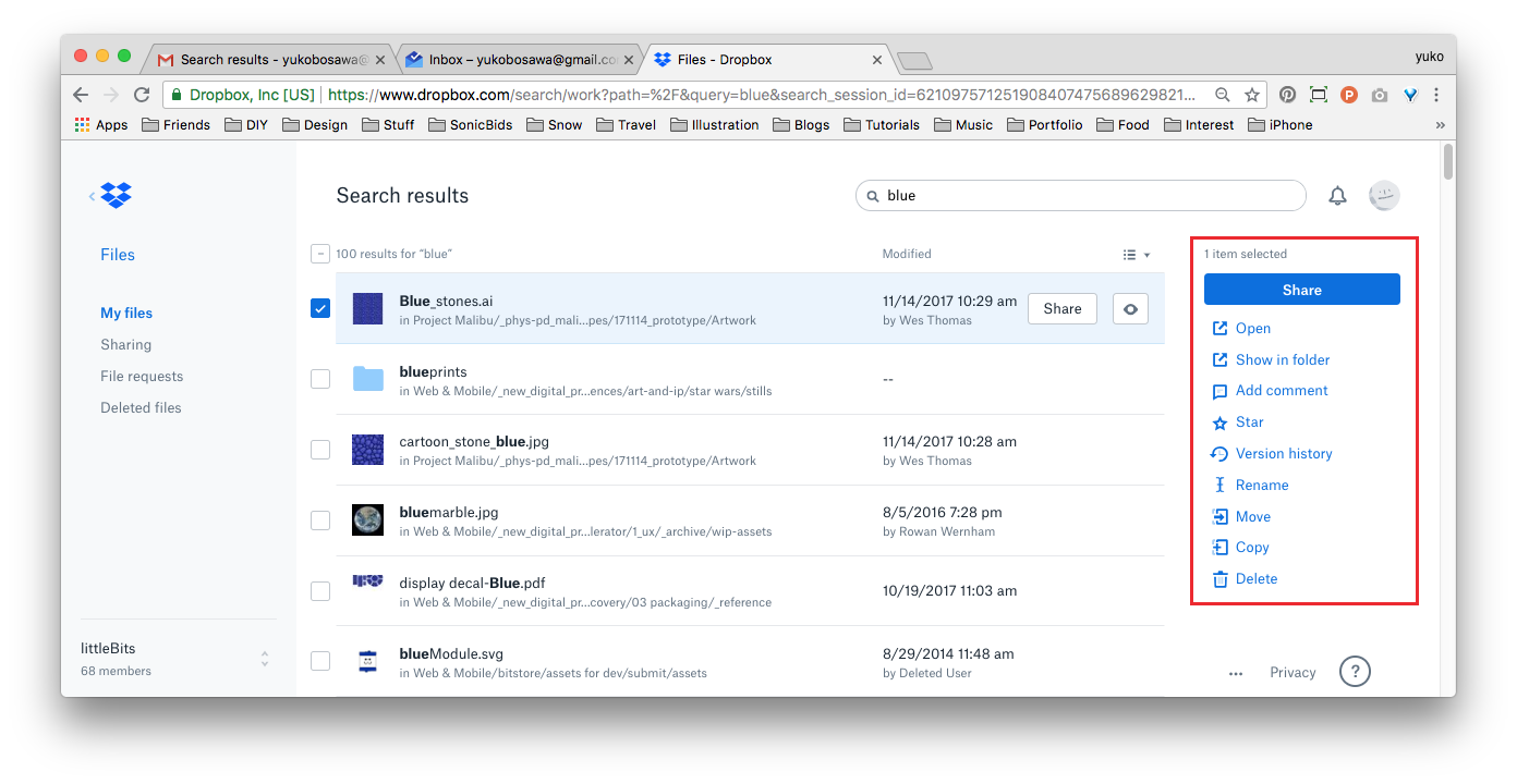
You can see a working version of the Material Design bulk edit functionality here: http://danielnagy.me/md-data-table/
As long as the button clearly changes in presentation when the first checkbox is activated, the action button position on the right is not an issue.
My only other comment is that if the only 'action' at this time is 'print invoices' - then it should be a button with a clear CTA. Once additional actions are added (Kirsten mentioned 'shipped', 'paid', 'resend email confirmation') then it could be converted to a dropdown - although having exposed options is better than hiding them away in a dropdown if possible :)
That "working version of the Material Design bulk edit functionality"!!!! I can imagine the full OFN backoffice looking like that ❤️
- As long as the button clearly changes in presentation when the first checkbox is activated, the action button position on the right is not an issue.
- if the only 'action' at this time is 'print invoices' - then it should be a button with a clear CTA. Once additional actions are added (Kirsten mentioned 'shipped', 'paid', 'resend email confirmation') then it could be converted to a dropdown - although having exposed options is better than hiding them away in a dropdown if possible
Yes I love both suggestions :-)
Closing as a duplicate of https://github.com/openfoodfoundation/openfoodnetwork/issues/2396#issuecomment-416998665 which was the original epic, let's move on conversation there. Content of this thread remain accessible and linked to the other description. We had discussion on two similar threads so we need to CLEAN UP!!!
Hum... it seems @RachL you used that issue both as one action issue and epic discussion of overall feature, should you recreate another issue for this issue and link to the epic? Or we can reopen it but I'm afraid people get confused by all the "epic scope" discussions here...
Most helpful comment
A method I've used in the past to get around generating potentially hundreds of PDF invoices (not in OFN, but another system) was to output everything as a single HTML document, then include CSS page breaks:
@media print {
.invoice-wrapper {page-break-after: always;}
}
If you are then printing to paper, it will separate each invoice onto its own page automatically. OR if you want a single multi-page PDF, you can use a browser like Chrome's built-in print to PDF function to get one file containing all of the invoices, with proper page breaks between each one. We've been doing it that way for years now at CLFC.
May not be exactly what you're going for, but could be a viable option to avoid timeouts on large batches?