Openfoodnetwork: UI for Language Switching
We need a user interface to switch the language. That could be a simple button in the navigation bar.
Button sets the new locale for the user and then reloads the page in the new language.
The Javascript UI just uses the asset the was loaded depending on the locale setting.
Design Suggestions:
Desktop 1 language = no change
Desktop 2 languages:

Desktop 3+ languages - closed menu:

Desktop 3+ languages - expanded menu:
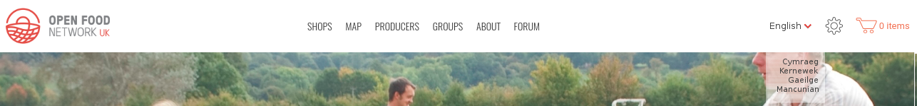
(Note the menu here is squashed. Would be great if it were more spacious. If unclear please ask. Transparency is consistent with other menus.)
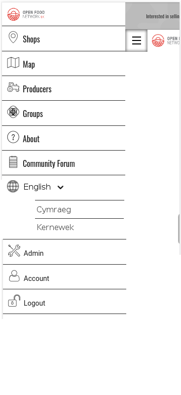
Mobile menu closed:
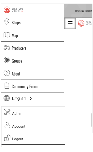
Mobile menu expanded:
 lin-d-hop
All 20 comments
@yukoosawa is on here too @lin-d-hop 😃
 daniellemoorhead
on 12 May 2017
daniellemoorhead
on 12 May 2017
Brilliant best practice notes from @yukoosawa
Reading through the slack and community discussions it looks like you have the key use cases covered so will provide tips on the UI (and any related UX).
Icon or flag or text switcher
There is no universally understood icon for ‘language’. Any icon used, ie. a globe, will need a text label to be understood - this can be the current language in use. Flag only icons are also not recommended unless accompanied by a text/written switcher. This way for a country such as Switzerland, the icon can be accompanied by Schweiz and Suisse. Text switchers should also be written in the language’s local format, ie. ‘Deutsch’ and ‘中文’ — not ‘German’ and ‘Chinese’.
Example:
- Icon + text: https://www.apple.com/choose-your-country/
- Text dropdown: http://www.visitmelbourne.com/
Location of switcher: header or footer
As the language switcher is tied to specific OFN instances, I would recommend locating it in the header or top navigation. Common placement is in the top righthand corner, if space allows show all options ie. English | Français.
The switch could also be located in the footer (ie. https://www.facebook.com/ not logged in) although keep in mind this works better for shorter pages, especially on mobile.
Text Expansion and Contraction
The general rule is to plan for text expansion of up to 30% to 40% when going from English to German, which is one of the more extreme examples of text expansion. Going from English to Spanish or French will probably only result in a 10% to 20% expansion. To safely design for any target language, a goal of 35% expansion is a good guideline for the body of the page, 40+% for menus.
Other thoughts
- Etsy displays country, language and currency (https://www.etsy.com/ca/) which allows the user to specify each independently.
- Google is particular in the way it treats multi-lingual sites https://support.google.com/webmasters/answer/182192?hl=en
- Language direction for certain languages such as Arabic and Urdu.
lin-d-hop
on 30 May 2017
Really looking forward to have this feature implemented. Glad to see it's on the roadmap.
My 2 cents to discussion. I personally would not recommend to show any sort of flag attached to the language, it would politically bring lots of problems and arguments specially from users of consumer groups(at least the one I know from Spain and Catalonia).
I think a selector with the languages names would be great (choosing from those languages activated in the OFN setup).
 capiscuas
on 7 Jul 2017
capiscuas
on 7 Jul 2017
Yes I support the text only dropdown. As a bonus I would have the box searchable which filters the results. But that is only needed if the language list becomes large.
 sigmundpetersen
on 7 Jul 2017
sigmundpetersen
on 7 Jul 2017
Yeah, the searchable box could be a bonus TODO for the future. Althought I doubt it would be used a lot since I understand each instance/installation of OFN concerns a region/state which maximum normally has between 1-4 active languages.
capiscuas
on 7 Jul 2017
I think most instances will not be running with a huge language set... so I can't imagine that will be needed by many. Even in regions where dozens/hundreds of languages are spoken it seems unlikely to be that the instance will have translations into more that a few of them.
lin-d-hop
on 27 Jul 2017
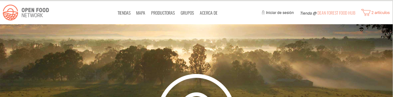
@lin-d-hop We might need a rethink on the initial UI design. When a shop is selected it shows up in the top navigation bar, leaving very limited horizontal real estate on the right hand side.
 Matt-Yorkley
on 23 Aug 2017
Matt-Yorkley
on 23 Aug 2017
@mllocs thoughts?
 enricostano
on 23 Aug 2017
enricostano
on 23 Aug 2017
Could we be considering a "hamburger" menu where we could put more of the entries like Log in, About, Language switcher and future meta features?
sigmundpetersen
on 23 Aug 2017
Wait this picture looks different from ours, we have the wheel where your "iniciar de sesion" is
sigmundpetersen
on 23 Aug 2017
The wheel/cog shows up when logged in.
Matt-Yorkley
on 23 Aug 2017
Of course. So can we consider putting the cog there when not logged in as well and put the switcher in the cog?
sigmundpetersen
on 23 Aug 2017
Thinking about it, might be worth going down the same path as many other sites and implement the hamburger menu on the desktop version. That way we don't constantly have to worry about cluttering the nav bar / fitting things in....
But I'd strongly suggest using a UI designer to redesign the complete navigation menu. Their brains think through all the implications of the design in ways that sometimes feel like voodoo magic 😁
daniellemoorhead
on 30 Aug 2017
@daniellemoorhead Agreed. But I'm not sure we can expect a quick turnaround on the UI design. So we need an interim solution.
@Matt-Yorkley When a user is logged in can we assume that we know something about their language preferences and move the language selection to the footer? Does that add too much complexity?
lin-d-hop
on 30 Aug 2017
@lin-d-hop I'm not sure we can always assume that, and moving the switcher between the header and footer is a bit weird for UX.
I guess if we used a flag icon as a button for a dropdown, and then used flags and language names in a dropdown list, it would use a small amount of header space but still work quite well? Just thinking of interim solutions, as opposed to the final UI...
Matt-Yorkley
on 31 Aug 2017
I think it is regressive to link language with nationality, specifically through a flag. But a small image of a globe or a blank flag might work as the icon to signify the dropdown.
For sure an interim design....
lin-d-hop
on 31 Aug 2017
what about a language icon? perhaps something like this?
sigmundpetersen
on 31 Aug 2017
lin-d-hop
on 31 Aug 2017
I've got a working language switcher dropdown now with a globe for the icon. I think the backend is still being code-reviewed/changed?
In order to make the dropdown list with localised language names, I've added a translation key to en.yml at the top for language_name: English with a translation note next to it, so that each language file can contain a localised version of the language's name, e.g language_name: Español for Spanish. Does that sound good?
I'll add some specs now but it should be good to go as soon as the backend is finished (#1572).
Matt-Yorkley
on 2 Sep 2017
1793 got merged. https://github.com/openfoodfoundation/openfoodnetwork/issues/2048 is still open.
 mkllnk
on 18 Jan 2018
mkllnk
on 18 Jan 2018
Related issues
 myriamboure
·
3Comments
Matt-Yorkley
·
3Comments
myriamboure
·
3Comments
Matt-Yorkley
·
3Comments
 kirstenalarsen
·
3Comments
kirstenalarsen
·
3Comments
 shen-sat
·
3Comments
shen-sat
·
3Comments
 RachL
·
3Comments
RachL
·
3Comments
Most helpful comment
Thinking about it, might be worth going down the same path as many other sites and implement the hamburger menu on the desktop version. That way we don't constantly have to worry about cluttering the nav bar / fitting things in....
But I'd strongly suggest using a UI designer to redesign the complete navigation menu. Their brains think through all the implications of the design in ways that sometimes feel like voodoo magic 😁