October: Chrome 81 has some updated styling features
Just to let the admins know and do some A-B testing with October CMS.
Google Chrome 81 have updated many styling features, a few months ago they did a full video on the features, I think this was the video I watched: https://www.youtube.com/watch?v=-oyeaIirVC0
Basically, in October CMS you get a very heavy black line around things when you select objects now.
It's actually a little bit annoying!
See example:
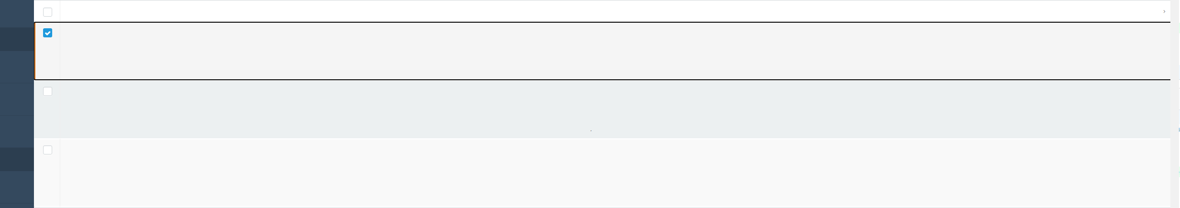
Also another thing is the checkboxes are different in the new chrome but that's actually a nice thing and looks much better in github.
I thought I'd let the admins know and they can decide if they want it to look like this or fix some different cross-browser styling.
Firefox looks like this in Nightly:
As per github issue: https://github.com/octobercms/october/issues/4819
Thought it best to tell you (before people start using Chrome 81 stable).
 ayumi-cloud
All 19 comments
p.s. Not going to create a pr until the admins give me feedback. Doing styling pr's is hard because one person says one thing and another person says another thing. So best to wait for a decision to be made first and then I be happy to code the pr.
Note: Google Chrome for many years added a soft blue line around things! Now it's a hard black line (which kind of looks ugly) I would guess it's to make developers a bit more pro-active in addressing accessibility coding issues.
ayumi-cloud
on 19 Jan 2020
One idea could be to create a new config file called: accessibility and have various options users can select, for example one user may want to turn this feature off, another user may want to style it blue etc. Then the config file could connect to a dynamic css file to style the backend, instead of the current setup which is hard-coded.
ayumi-cloud
on 19 Jan 2020
@ayumi-cloud I think best will be to remove this it looks ugly and if somebody wants it he is free to overwrite css by his custom backend styles.
 Samuell1
on 19 Jan 2020
Samuell1
on 19 Jan 2020
@Samuell1 yah I agree with you. Will wait for confirmation from the admins.
ayumi-cloud
on 19 Jan 2020
Personally I don't mind the dotted line, it does make the default styling more accessible. I'll leave this one up to @daftspunk though.
 LukeTowers
on 20 Jan 2020
LukeTowers
on 20 Jan 2020
My two cents: Dotted-line looks fine to me in the nav, the big black line looks gross 🤢. Whoever thought that would improve accessibility should be [insert awful event here].
 bennothommo
on 20 Jan 2020
bennothommo
on 20 Jan 2020
p.s. By the way, I don't have an issue with firefox - it's the chrome black line I hate.
:focus {
    outline: none;
}
removes it.
ayumi-cloud
on 20 Jan 2020
@ayumi-cloud i think it should be removed to be consistent with chrome.
Samuell1
on 20 Jan 2020
Personally I don't think we should remove any accessibility features added by browsers unless we're amping up our own accessibility game in turn to replace them. Just because it "looks bad" isn't a great reason to worsen the experience for someone else with a harder time using the interface.
LukeTowers
on 20 Jan 2020
@LukeTowers Yeah thats true.
@ayumi-cloud I think it should be added to :hover to prevent it appearing on desktops without pressing tab.
Samuell1
on 20 Jan 2020
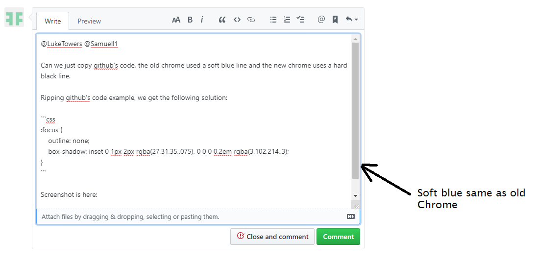
@LukeTowers @Samuell1
Can we just copy github's code, the old chrome used a soft blue line and the new chrome uses a hard black line.
Ripping github's code example, we get the following solution:
:focus {
    outline: none;
    -webkit-box-shadow: inset 0 1px 2px rgba(27,31,35,.075), 0 0 0 0.2em rgba(3,102,214,.3);
            box-shadow: inset 0 1px 2px rgba(27,31,35,.075), 0 0 0 0.2em rgba(3,102,214,.3);
}
Screenshot is here:
ayumi-cloud
on 20 Jan 2020
@ayumi-cloud But thats for input elements no? What you getting on chrome for non input elements like links for example?
Samuell1
on 20 Jan 2020
Sure, I don't mind that @ayumi-cloud
LukeTowers
on 20 Jan 2020
@Samuell1
What you getting on chrome for non input elements like links for example?
Nothing - no black border on links.
Let me show you an example:
@LukeTowers sure I will create a pr for that.
ayumi-cloud
on 20 Jan 2020
Fixed by #4895
LukeTowers
on 21 Jan 2020
@ayumi-cloud @LukeTowers Not sure why but in firefox it shows new box-shadow focus and even outline.
Samuell1
on 10 Feb 2020
@Samuell1 I've noticed that too.
bennothommo
on 10 Feb 2020
Sigh. You can never win. Personally I'm fine with that for now, it's not absolutely horrendous in that example.
LukeTowers
on 12 Feb 2020
@LukeTowers and i forgot to mention on some elements new focus is trigger even on desktop on mouse click
Samuell1
on 12 Feb 2020
Related issues
 axomat
·
3Comments
axomat
·
3Comments
 dunets
·
3Comments
dunets
·
3Comments
 mittultechnobrave
·
3Comments
mittultechnobrave
·
3Comments
 oppin
·
3Comments
oppin
·
3Comments
 kdoonboli
·
3Comments
kdoonboli
·
3Comments