October: Add 3 and 4 column support in backend
Summary of the PR
This is a quick list of what the PR will add to October and the conclusion to this discussion:
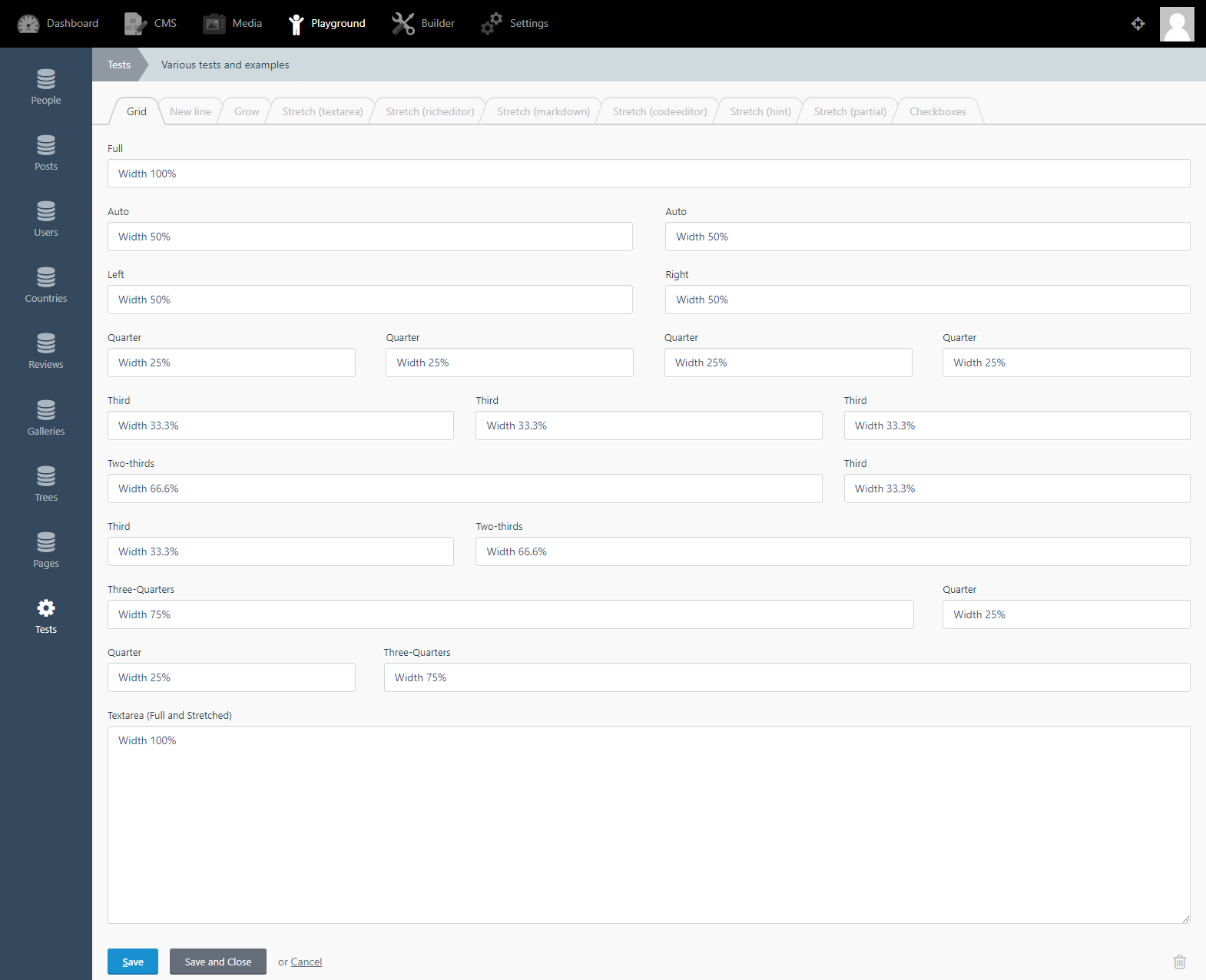
# One column layout (100%)
span: full
# Normal two column layout (50%)
span: left
span: right
span: auto
# Three column layout (33%)
span: third
# Four column layout (25%)
span: quarter
# Two-thirds column layout (66%)
span: two-thirds
# Three-fourths column layout (75%)
span: three-quarters
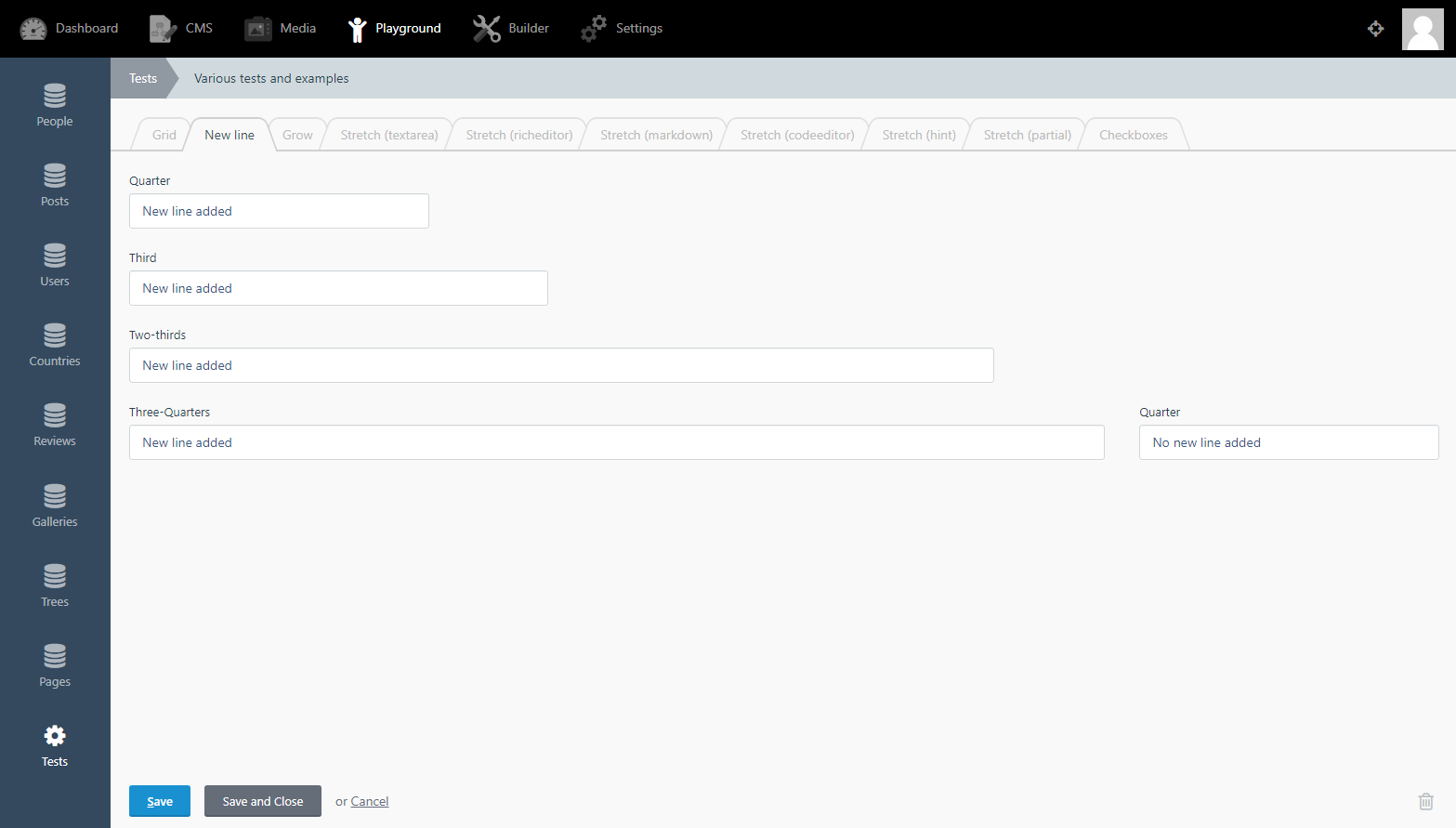
# New line (line break) for quarter, third, two-thirds and three-quarters fields
newLine: true | false
PR found here: https://github.com/octobercms/october/pull/4509
Doc's PR found here: https://github.com/octobercms/docs/pull/387
Examples
I've now finished this pull request feature, I welcome any testing and feedback - if you got a feature request or find a bug, comment below and tag me and I will try fix it and/or code it in for you.
New form fields
New line
Above: You can see each field is on a new line (instead of in a row).
Test plugin
I have updated the October test plugin to include all these new features, see screen shots:
PR for the test plugin can be found here: https://github.com/octoberrain/test-plugin/pull/77
Flexbox
The whole form area has been converted into Flexbox now! So any issues in designing your plugins - search for a solution under flexbox.
Error handling
The maths of this issue tries to solve a high combination of possible outcomes! This is because October has the following:
Various form field sizes e.g. full, quarter, third etc.
These form fields can be placed anywhere in the form e.g. left, middle, right etc.
October has a big selection of form widgets to use e.g. textarea, checkbox's, code editors etc.
The new fields and the new line API have been tested for many hours and is very stable. However, there maybe a few bugs and feel free to report them and we will try our best to fix them.
If all this fails then the last resort is to create a Partial file - depending on what you are trying to create.
 ghost
ghost
All 82 comments
@ayumihamsaki yes this would be amazing. Also love your colour picker any plans to
share the widget in a plugin ;)
 seanthepottingshed
on 7 Jul 2019
seanthepottingshed
on 7 Jul 2019
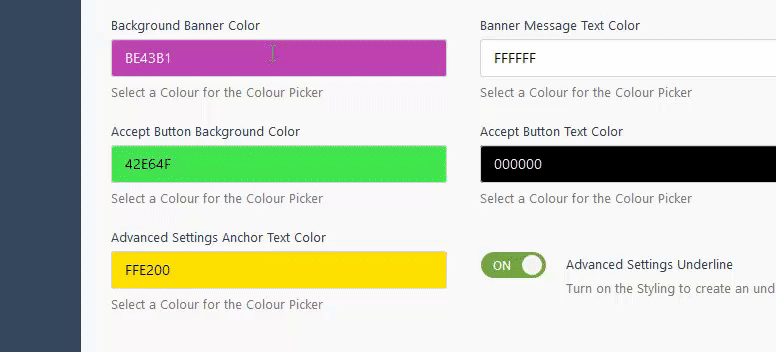
@seanthepottingshed I don't mind sharing the color picker but I hope that the October team would let me add it straight into the core of october. Here's what it looks like in real-time:
ghost
on 7 Jul 2019
@ayumihamsaki - I promise to stop detailing this issue, just one more question - does your colorpicker support RGBA?
seanthepottingshed
on 7 Jul 2019
@seanthepottingshed no problem, ask as many questions as you want. Just taking a small break from coding. It supports the following:
- RGB
- HEX
- RGBA
- HSL
- HSLA
- HSV
- Hexadecimal
ghost
on 7 Jul 2019
@ayumihamsaki you can already have multiple column fields by setting the cssClass property of the fields in question to bootstrap col- classes.
 LukeTowers
on 8 Jul 2019
LukeTowers
on 8 Jul 2019
@LukeTowers It's not exactly true, because col- classes add padding gap (they need to be used inside .row). You have to use cssClass: col-* p-l-0 p-r-0.
 Rike-cz
on 8 Jul 2019
Rike-cz
on 8 Jul 2019
There is way like this
.form-group.span-left1 {
    float: left;
    width: 22.75%;
    clear: left;
    margin-right: 1.5%;
}
.form-group.span-left2 {
    float: left;
    width: 22.75%;
    margin-left: 1.5%;
}
.form-group.span-right1 {
    float: left;
    width: 22.75%;
    margin-left: 3%;
}
.form-group.span-right2 {
    float: right;
    width: 22.75%;
    margin-left: 1.5%;
    clear: right;
}
and then for fields you just define span: left1
 Samuell1
on 8 Jul 2019
Samuell1
on 8 Jul 2019
@Samuell1 Yes, and we like to have it in core as well.
Rike-cz
on 8 Jul 2019
@ayumihamsaki what does the CSS for your proposal look like?
LukeTowers
on 8 Jul 2019
Here's a general overview of the few things I did, to make it work it 99.99% of all cases in the backend:
For 3 and 4 columns I set all the field to using
auto(notleft,rightorfull).Removed the
clear: left;andclear: right;CSS they create issues.Removed the
float: left;andfloat: right;and use Flexbox instead. Flexbox settings I use full prefixes for all browsers,wrapfeature andspace-between.I added CSS media queries to give a smooth repsonsive breakout when reducing screen size.
There is some strange CSS code in the repeater box I remove (when I switch over to flexbox), so I remove the
content: " "in the repeater field in the::afterand::before
Samuell1 code is correct and matches October's old method of CSS.
To compare the old method and mine, my method uses a more modern technique, below is a small example for the repeater field converting it into a 3 column:
@media only screen and (min-width: 900px) {
  #Form-field-Example-item_details-group .field-repeater-form {
    display: -webkit-box;
    display: -ms-flexbox;
    display: flex;
    -ms-flex-wrap: wrap;
    flex-wrap: wrap;
    -webkit-box-pack: justify;
    -ms-flex-pack: justify;
    justify-content: space-between;
  }
  #Form-field-Example-item_details-group .form-group {
    float: none;
    max-width: 32%;
    width: 100%;
    clear: none;
  }
  #Form-field-Example-item_details-group .field-repeater-form::before,#Form-field-Example-item_details-group .field-repeater-form::after {
    content: none;
  }
}
I hope the above code gives you an idea.
Things to consider:
Colour picker can be a plugin - no need to add to core (I know Luke will say).
This issue idea can be added direct to the Builder plugin! Meaning people don't need to write any CSS code they just select 3 columns in the dropdown menu for example.
If went ahead then I would like to remove the floats and clear and just move over to flexbox.
I have a 4K computer screen and adding 5 columns would in most cases be way too many. Adding 3 and 4 columns would give a nice UX. Going more things start to get messy, especially when you start to downscale the computer screen.
That's what I was thinking anyway.
It's totally up to you!
Cleaner Method:
@media only screen and (min-width: 900px) {
  #Form-field-Example-item_details-group .field-repeater-form {
    display: -webkit-box;
    display: -ms-flexbox;
    display: flex;
    -ms-flex-wrap: wrap;
    flex-wrap: wrap;
    -webkit-box-pack: justify;
    -ms-flex-pack: justify;
    justify-content: space-between;
  }
  #Form-field-Example-item_details-group .form-group {
    float: none;
    flex: 3;
    clear: none;
  }
  #Form-field-Example-item_details-group .field-repeater-form::before,#Form-field-Example-item_details-group .field-repeater-form::after {
    content: none;
  }
}
@ayumihamsaki if you can implement the following API (making it fully responsive for all layout options) then I think the columns would be acceptable. And you're right, I will say that the colour picker should be a plugin 😉
# One column layout
span: full

# Normal two column layout
span: left
span: right
span: auto

# Three column layout
span: third

# Four column layout
span: fourth
@ayumihamsaki @LukeTowers wishlist item - would it be possible to have a 75 / 25 arrangement with two columns? (ie. the first column spans 75% of the width, and the second column spans 25%).
It's something I've been achieving with CSS classes, but might be cool to give developers the flexibility with something in core.
 bennothommo
on 10 Jul 2019
bennothommo
on 10 Jul 2019
@ayumihamsaki If you're specifically making it so that there's 4 columns, I'd probably think just allowing them to enter in a number between 1-4 to denote the amount of columns they want the field to span:
span: 1 # One column
span: 2 # Two columns
span: 3 # Three columns
span: 4 # Four columns
Then they can arrange it however which way they like.
bennothommo
on 10 Jul 2019
@ayumihamsaki Yep, but you could still include your third and quarter keywords as well for 33% and 25%.
bennothommo
on 10 Jul 2019
Had a re-think maybe could just do this?
# One column layout (100%)
span: full

# Normal two column layout (50%)
span: left
span: right
span: auto

# Three column layout (33%)
span: third

# Four column layout (25%)
span: quarter

# Three-fourths column layout (75%)
span: three-quarters
Just out of curiosity, why do we need 'span: auto'? Shouldn't it be a default option?
 w20k
on 10 Jul 2019
w20k
on 10 Jul 2019
@ayumihamsaki it's not really related to downscaling or float.
It's mainly because of the way float works. So, to fix that issue you'd need to wrap each line in a separate block/section (and use clear for floated layout).
w20k
on 10 Jul 2019
Best will be to migrate it to flexbox
Samuell1
on 10 Jul 2019
Had a re-think maybe could just do this?
# One column layout (100%)
span: full

# Normal two column layout (50%)
span: left
span: right
span: auto

# Three column layout (33%)
span: third

# Four column layout (25%)
span: quarter

# Three-fourths column layout (75%)
span: three-quarters
@ayumihamsaki that looks good to me.
LukeTowers
on 10 Jul 2019
Cool, thanks for the confirmation.
ghost
on 10 Jul 2019
@LukeTowers I don't want to open another issue just to ask you this question.
Does October have a built in slider ?
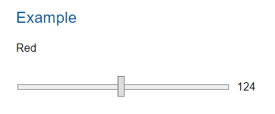
I looked in the doc's here: https://octobercms.com/docs/ui/form
(I checked every section under controls and styling and couldn't find one)
I checked the code and found October only has this:
input[type="range"] {
    display: block;
    width: 100%;
}
Doesn't seem to have a properly styled one though.
See example: https://materializecss.com/range.html#html5
ghost
on 11 Jul 2019
@ayumihamsaki no, and could you use the Slack to ask off-topic questions please? 😉
LukeTowers
on 11 Jul 2019
Gonna have to join this slack group, thanks.
ghost
on 11 Jul 2019
https://octobercms-slack.herokuapp.com/ @ayumihamsaki it's where all the cool people hang out 😉
LukeTowers
on 12 Jul 2019
@LukeTowers @ayumihamsaki and the beautiful people
seanthepottingshed
on 12 Jul 2019
@ayumihamsaki While I'm sure there's many improvements to make in the CSS, don't assume that just because it doesn't make sense to you, that it doesn't work.
Quite a few of the CSS rules are to fix certain issues with browsers. For example, the 0.1px rule is to force certain elements to be as minimum height as possible - when set to 0px, Firefox screws up the layout.
Also, display: table-row works, even if it isn't as "cool" to use as Flexbox or CSS Grid Layouts.
bennothommo
on 18 Jul 2019
@ayumihamsaki: Are you going to change backend Bootstrap v3 -> v4 too?
Rike-cz
on 18 Jul 2019
@ayumihamsaki Don't get me wrong - some of the quirks of the Backend CSS/JS have caused me headaches as well - any sort of clean-out and modernization is a good thing, so I definitely look forward to seeing what you can do with it - just be mindful that a lot of the code in there is in there for a reason.
bennothommo
on 18 Jul 2019
@ayumihamsaki There may be some backwards compatibility issues with v4 - especially for people using custom templates with their own Bootstrap code, or perhaps people using CSS classes to control the layouts of forms.
bennothommo
on 18 Jul 2019
Yah I could update that at the same time, makes sense. Are there any issues for people using bootstrap v3 html code with bootstrap v4. I don't want to cause backward compatibility issues for people's plugins.
Yes, there are many changes between this versions. For example .col-xs-12 is now .col-12 etc.
I am voting for v4, maybe optional, but v3 is history.
Rike-cz
on 18 Jul 2019
No v4. October isn't even really using Bootstrap at this point, it's more of a custom framework (storm) that's loosely based on v3. Not worth updating at all. If someone wants to use v4 then they're free to override everything under the sun to make that work but we are not going to go in that direction.
LukeTowers
on 18 Jul 2019
@LukeTowers: I think it's good to have standardized syntax, and if is base syntax derived from Bootstrap it would be better to stay actual. For example .col-xs- vs .col- or notation mismatch (.m-l-lg vs .{property}{sides}-{breakpoint}-{size}). But this is only my opinion and it's ease to make own custom css helpers.
Rike-cz
on 18 Jul 2019
Seems to be some issues with the 3 quarters spaces but otherwise looks good
LukeTowers
on 19 Jul 2019
@ayumihamsaki definitely padding/margin between columns is a bit odd.
w20k
on 19 Jul 2019
@ayumihamasaki whats with the API change from third to 3-1?
LukeTowers
on 20 Jul 2019
@ayumihamsaki I'm not sold on that formatting. If people really really want empty spaces between their fields then I suggest they use a partial to do so. I would much rather have a way simpler API of the original proposal then have a ton of extra classes for hyper specific column placement, especially considering that a major ability of October is highly extensible / dynamic forms that change what fields are present all of the time, which would require complex recalculating what specific position class to give to what field whenever you changed something instead of just having the simple options and having it all reflow as best as it can automatically under those conditions.
LukeTowers
on 21 Jul 2019
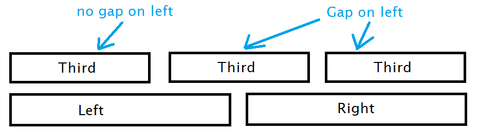
@LukeTowers Sure no problem and how to do the margins ?
For example:
Tab 1 we have the following:
Third - position 1 (first / n1 / odd)
Third - position 2 (n2 / even)
Third - position 3 (n3 / odd)
Left - position 4 (first / n1 / odd)
Right - position 5 (first / n1 / odd)
Third - position 6 (n4 / even)
Third - position 7 (n5 / odd)
Third - position 8 (n6 / even)
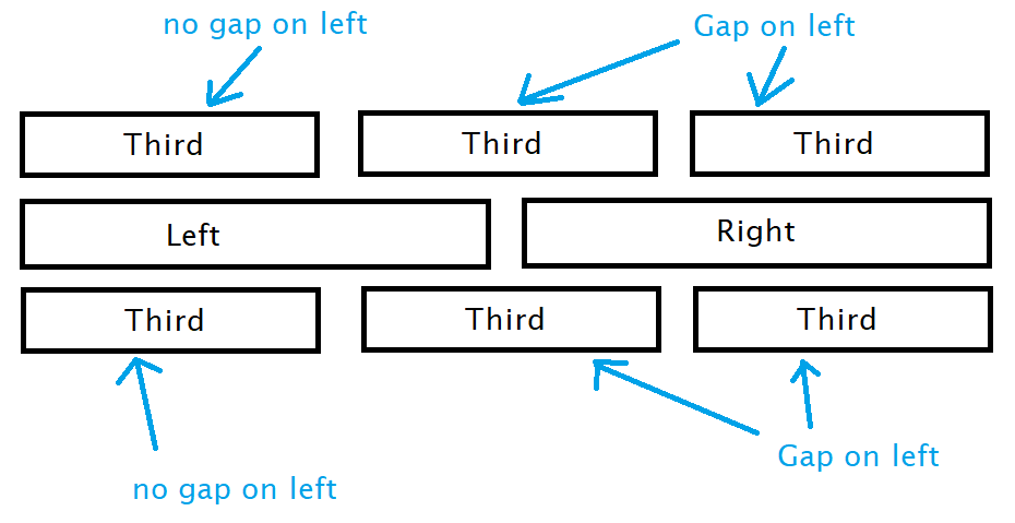
We also have Tab 2 on the same web page and have the following:
Third - position 1 (n6 / odd)
Third - position 2 (n7 / even)
Third - position 3 (last / n8 / odd)
Left - position 4 (last / n2 / even)
Right - position 5 (last / n2 / even)
ghost
on 21 Jul 2019
@ayumihamsaki you'll probably need to use the adjacent sibling selector: .third + .third:not(.third + .third + .third)
LukeTowers
on 21 Jul 2019
@ayumihamsaki I don't think that you should solve col movent with right/left-margin and the same class. Would be better to use the same approach as in Bootstrap with the offset-* class name.
Grid/skeleton should be as fluid as possible without any additional headaches :)
Horizontal alignment for Flexbox:
https://getbootstrap.com/docs/4.3/layout/grid/#horizontal-alignment
Offsetting columns:
https://getbootstrap.com/docs/4.3/layout/grid/#offsetting-columns
Pure.css Grid example:
https://purecss.io/grids/
w20k
on 22 Jul 2019
@w20k I read through and investigated what you suggested. It wouldn't solve the problem though, because bootstrap and pure.css grids are doing this method by allowing users to manually add in the offset column class, see screenshot:
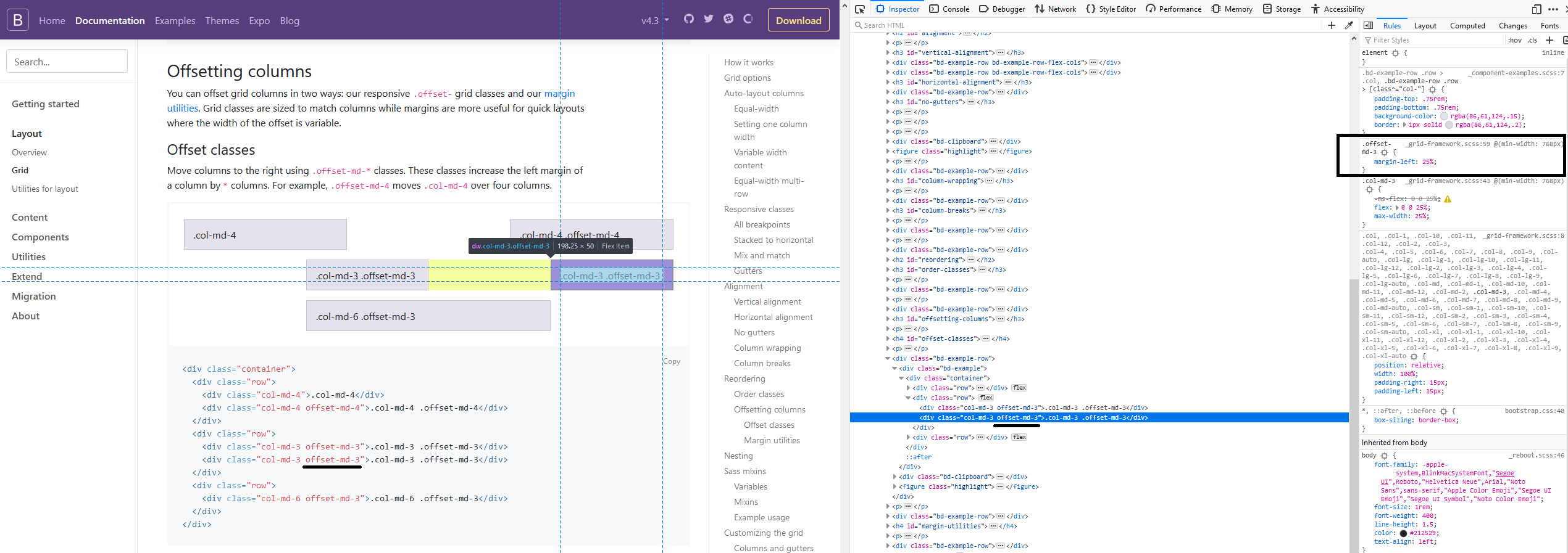
It's just a fixed margin value and then the user has to manually add in the class each time.
The way I'm suggesting and tested last night in the early hours was for October to automatically work out all the positions and then add the offset class.
I did have a question for you though, using jquery resize(); do you think it will use up much performance time? I actually want to code it so that when a user resizes the screen October will re-calculate all the grid fields and re-size everything according to media query patterns.
Before you say what I'm suggesting is too complicated I coded a test example last night and got it all working.
ghost
on 22 Jul 2019
@ayumihamsaki yeah, that's the main reason would really love to have it static without additional re-calculation from the JS side.
We could use debounce resize() (link below), but still to re-drawing all, even, only visible elements will be closer to Dashboard Isotope.js right now. Which ain't nice, IMHO.
So, I do think it's better to have a CSS + PHP rendering only, maybe if needed add up some JS logic.
Debounce resize:
https://www.paulirish.com/2009/throttled-smartresize-jquery-event-handler/
w20k
on 22 Jul 2019
Wait a second @ayumihamsaki, why do you cheat with 100% !important?
Could you show me your code, if you have something ready already, or is it in one of your PRs?
w20k
on 22 Jul 2019
@ayumihamsaki I do belive important should not be used, but need to investigate why.
w20k
on 23 Jul 2019
@w20k I think it's for these reasons: https://hashnode.com/post/why-not-to-use-important-in-css-cj7hd9swl01ny6iwtu8iich4j
p.s. thanks for the Debounce resize suggestion - working great!
ghost
on 23 Jul 2019
@ayumihamsaki you're welcome!
My question was regarding, why exactly we need to use important if it's just a grid, which should always be on the spot with overrides and in only few corner cases use hack (still belive it's a hack, where refactoring ain't an option, sort of).
w20k
on 23 Jul 2019
@w20k
I think the reason is because someone was being lazy (or doing some old style coding) when creating the backend field forms.
Normally I would do this:
@media only screen and (max-width: 769px) {
    .span-left {
        width: 100%
    }
}
@media only screen and (min-width: 769px) {
    .span-left {
        width: 50%
    }
}
But someone has coded the backend style like this:
@media only screen and (max-width: 769px) {
    .span-left {
        width: 100% !important
    }
}
.span-left {
        width: 50%
}
Because of the rest of the coding in October, I had no choice but to use !important. Maybe a disucssion with the admins with regards to the usage of !important in the LESS and CSS would be a good idea. Presonally looking at the code there is way too many !important tags that in many cases could be remove with cleaner code.
One example, of messy coding is this, settings page sidebar currently the setting were as follows:
@media (min-width: 1200px) {
    .sidenav-tree-root .sidenav-tree {
        width: 900px;
    }
}
@media (min-width: 768px) {
    .sidenav-tree-root .sidenav-tree {
        width: 600px;
    }
}
@media (max-width: 991px) and (min-width: 768px) {
    .sidenav-tree-root .sidenav-tree {
        width: 100%;
    }
}
@media (max-width: 768px) {
    .sidenav-tree-root .sidenav-tree {
        width: 100% !important;
        height: 100% !important;
        display: table-cell !important;
    }
}
@media (max-width: 768px) {
    .sidenav-tree {
        width: 100%;
        height: auto !important;
        display: block !important;
    }
}
.sidenav-tree {
    width: 300px;
}
Note the:
@media (max-width: 768px) {
    .sidenav-tree-root .sidenav-tree {
        height: 100% !important;
    }
}
@media (max-width: 768px) {
    .sidenav-tree {
        height: auto !important;
    }
}
That's totally incorrect.
October CMS has quite a few !important tags doing nothing right now.
ghost
on 23 Jul 2019
And they way I would normally do (desktop-first-approach):
.span-left {
        width: 50%
}

@media only screen and (max-width: 769px) {
    .span-left {
        width: 100%
    }
}
Could you make a note somewhere, I'll dig into your implementation later on the weekends if my main project won't bug me. Still, think it's a bit odd, though - probably needed!
Thanks a lot @ayumihamsaki !
w20k
on 23 Jul 2019
@ayumihamsaki I'm not a fan of JS being used for this at all, think of use cases where fields are being dynamically added or hidden / unhidden. What's the main issue you're having with the CSS right now?
LukeTowers
on 23 Jul 2019
@ayumihamsaki off the top of my head,
.column_container {
     text-align: justify;
}

.all-column-classes {
    display: inline-block;
    text-align: left;
}
Test results:
ghost
on 25 Jul 2019
@LukeTowers
I would like to tidy up the sidebar in the setting page, right now it looks like this:
This is kind of all over the place!
I would like to remove all those media queries and just have the following setup:
@media only screen and (min-width: 400px) {
    .sidenav-tree-root .sidenav-tree {
        width: 300px;
    }
}
@media only screen and (max-width: 400px) {
    .sidenav-tree-root .sidenav-tree {
        width: 80vw;
    }
}
What the above code does: Above 400px screen sizes we have a single column fixed sidebar. Below 400px width screens the sidebar is at 80% width so the mobile user can open and close the sidebar in the settings page.
Let me know if you are happy or not with this idea?
I will add it to the pr.
ghost
on 25 Jul 2019
@ayumihamsaki I don't want the PR being massive since each PR will be squashed down to a single commit. You can make a branch off of the branch you're working on for that PR and work on it in a separate PR if you'd like but I don't want it to be a part of the main one.
LukeTowers
on 25 Jul 2019
@LukeTowers I will have to wait then, because that pr is using those files and I can't branch them off right now.
ghost
on 25 Jul 2019
@ayumihamsaki I would recommend in the future that you clone October to your account and then for each PR you make use a branch off of the develop branch. That will make it a lot easier to manage all of the concurrent PRs to October for different things as well as sharing commits between PRs.
LukeTowers
on 26 Jul 2019
I have tagged everyone who has shown interest in this issue:
@seanthepottingshed
@LukeTowers
@Rike-cz
@Samuell1
@bennothommo
@w20k
@gergo85
@tobias-kuendig
@prhost
@pvullioud
If you want to see this added to October please add yourself as a tester to the pr found here: https://github.com/octobercms/october/pull/4509
(The pr was finished weeks ago and just sitting there waiting for some testers)
ghost
on 23 Aug 2019
More than happy to test, can anyone give me a quick guide as to how to download the repo in order to test, I'm a bit of a PR numpty...
seanthepottingshed
on 27 Aug 2019
@seanthepottingshed That would be most appreciated. Probably best to try this out on a fresh copy of October if possible. Here's the steps I would take - you'll need to run these through CLI:
- Check out a copy of the October CMS repo to a folder that you can view on the web:
git clone [email protected]:octobercms/october.git(this will add the files into a folder calledoctober - Then, you will want to checkout @ayumihamsaki's changes in a branch:
git fetch origin pull/4509/head:pr-4509. This will pull their changes into a branch calledpr-4509. You will then need to checkout the branch:git checkout pr-4509 - Then, go into the folder and get the Composer dependencies:
composer update - Next, run
php artisan october:envto create a.envfile in your folder. This will contain the configuration values for the database and site. - Once you've populated that file with your database and site details, run
php artisan october:upto install the necessary database tables.
At this point, you should have a working copy of October with the changes in #4509. Let me know if you have any dramas :)
bennothommo
on 27 Aug 2019
@bennothommo
Thanks for taking the time to explain, really appreciated. I will have a crack at it now ;)
seanthepottingshed
on 27 Aug 2019
It worked very well here, I used the test plugin, and tested at resolutions 1920 1366 1280 and 1024
Congratulations @ayumihamsaki , great job.
 prhost
on 27 Aug 2019
prhost
on 27 Aug 2019
Do you know you can add cssClass: col-md-4 and span: storm to achieve the same thing
 SebastiaanKloos
on 27 Aug 2019
SebastiaanKloos
on 27 Aug 2019
@SebastiaanKloos - https://github.com/octobercms/october/issues/4437#issuecomment-509110443
seanthepottingshed
on 27 Aug 2019
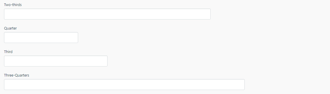
Is there no two-thirds?
seanthepottingshed
on 27 Aug 2019
Worked well. I tested also into tabs on recent
Chrome, Edge, Firefox
Thanks for the good work
 pvullioud
on 27 Aug 2019
pvullioud
on 27 Aug 2019
In my usecases it works fine. Thanks for great job and for everything you are doing for OctoberCMS @ayumihamsaki!
Rike-cz
on 27 Aug 2019
THANK YOU for everyone testing it - really appreciate your help and support.
Let me know if there are any conflicts with any field items or other parts of the CMS. That's the most important part of the testing - the code quality I can sort out with the admins.
@seanthepottingshed
Is there no two-thirds?
I will try and update the code today with regards to that. It's a good idea!
ghost
on 27 Aug 2019
@ayumihamsaki thanks for the good work. I have done this test at the airport while waiting my plane for LaraconEU :)
pvullioud
on 27 Aug 2019
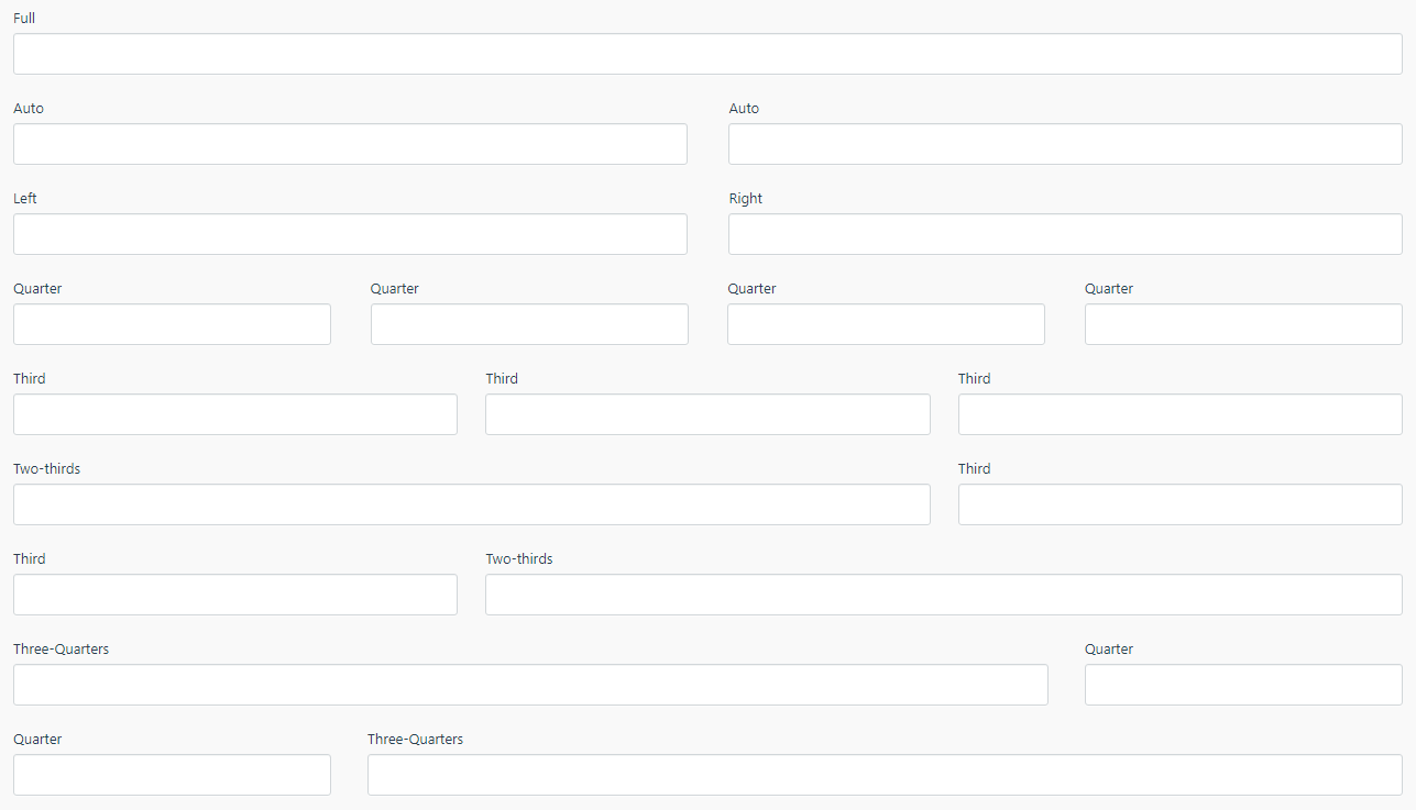
@seanthepottingshed Done, see results:

- CMS clever enough to calculate the offset's for you.
@LukeTowers Added span-two-thirds hopefully ok with you. (Will update the doc's as well).
ghost
on 27 Aug 2019
@SebastiaanKloos
Do you know you can add cssClass: col-md-4 and span: storm to achieve the same thing
You can do that and you can spend time working out all the offsets at the same time!
Take this example:
All I had to do was write a quick YAML file:
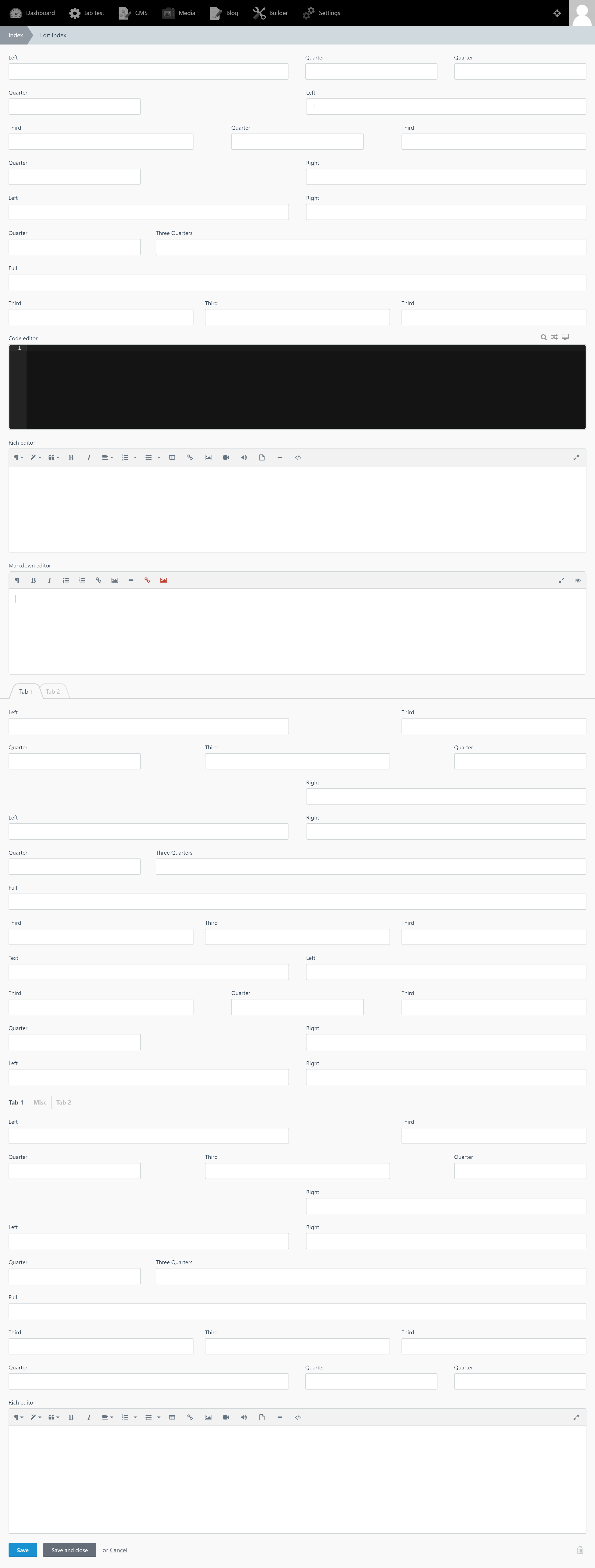
fields:
    one:
        label: 'Third'
        span: third
        type: text
    two:
        label: 'Two-thirds'
        span: two-thirds
        type: text
    three:
        label: 'Two-thirds'
        span: two-thirds
        type: text
    four:
        label: 'Third'
        span: third
        type: text
    five:
        label: 'Quarter'
        span: quarter
        type: text
    six:
        label: 'Two-thirds'
        span: two-thirds
        type: text
    seven:
        label: 'Two-thirds'
        span: two-thirds
        type: text
    eight:
        label: 'Quarter'
        span: quarter
        type: text
    nine:
        label: 'Third'
        span: third
        type: text
    ten:
        label: 'Third'
        span: third
        type: text
    eleven:
        label: 'Third'
        span: third
        type: text
I don't need to waste anytime working out any offsets or adding any extra code in to each field manually. October CMS can be coded to have the logic to become clever and work out all the offsets for you!
Here I'm helping you to _save time and increase productivity_. 🥇
I see why you’ve added the code. Just a small question. Is there any way to tell a quarter item to go on the next row? Or do I need to create a partial for this?
SebastiaanKloos
on 27 Aug 2019
@SebastiaanKloos
I see why you’ve added the code. Just a small question. Is there any way to tell a quarter item to go on the next row? Or do I need to create a partial for this?
This is a good question 😎 and I have coded an update to address that issue, so you don't need to bother creating a partial file to achieve that now!
Example 1 (No Line-breaks)
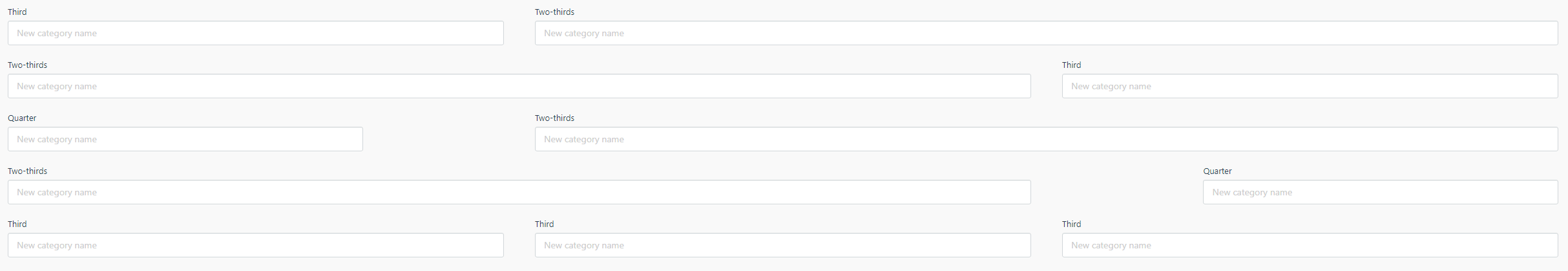
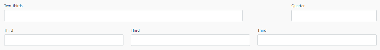
fields:
    one:
        label: 'Two-thirds'
        span: two-thirds
        type: text
    two:
        label: 'Quarter'
        span: 'quarter'
        type: text
    three:
        label: 'Third'
        span: third
        type: text
    four:
        label: 'Third'
        span: third
        type: text
    five:
        label: 'Third'
        span: third
        type: text
Gives us the following result:
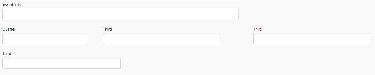
Example 2 (Let's make the Quarter field have a Line-break)
fields:
    one:
        label: 'Two-thirds'
        span: two-thirds
        type: text
    two:
        label: 'Quarter'
        span: 'quarter line-break'
        type: text
    three:
        label: 'Third'
        span: third
        type: text
    four:
        label: 'Third'
        span: third
        type: text
    five:
        label: 'Third'
        span: third
        type: text
Gives us the following result:
@LukeTowers Hope you ok with me adding
line-breakto the api. I will also update the doc's to show this example.fields: two: label: 'Quarter' span: 'quarter line-break' type: text😊
That’s awesome! However, I think the line-break config should not be inside the string of span. Maybe a new config for the field would be a bit better. I’m thinking of newLine: true | false.
SebastiaanKloos
on 28 Aug 2019
@SebastiaanKloos
That’s awesome! However, I think the line-break config should not be inside the string of span. Maybe a new config for the field would be a bit better. I’m thinking of newLine: true | false.
Thanks for your feedback 🎉
That's now done!
@LukeTowers
I've added a new API feature.
lineBreak: left | right
Results:
Line-break (left)
Line-break (right)
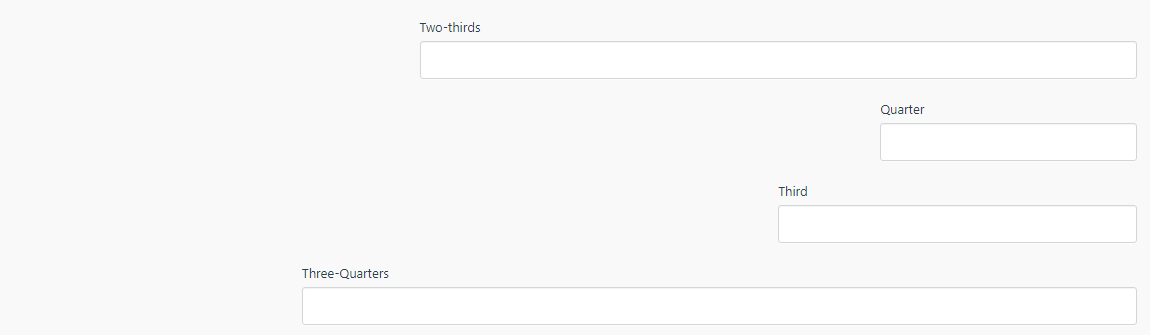
I thought people in the middle-east might want to have their line breaks on the right hand margin. So this setup works for both LTR and RTL.
Full,auto,leftandright- do not accept line breaks.
Will update doc's etc.
ghost
on 28 Aug 2019
Finished.
ghost
on 28 Aug 2019
@SebastiaanKloos
That’s awesome! However, I think the line-break config should not be inside the string of span. Maybe a new config for the field would be a bit better. I’m thinking of newLine: true | false.
Thanks for your feedback 🎉
That's now done!
@LukeTowers
I've added a new API feature.
lineBreak: left | rightResults:
Line-break (left)
Line-break (right)
I thought people in the middle-east might want to have their line breaks on the right hand margin. So this setup works for both LTR and RTL.
Full,auto,leftandright- do not accept line breaks.Will update doc's etc.
I was thinking, maybe true should be an alias for left
SebastiaanKloos
on 28 Aug 2019
@ayumihamsaki can you explain the lineBreak functionality in a bit more detail? @SebastiaanKloos maybe you can provide a real world example to help me visualize it more? Also @ayumihamsaki could you provide a real world example of why fields would be aligned to the right? lineBreak: left|right aren't making sense to me.
LukeTowers
on 28 Aug 2019
@LukeTowers I was thinking Arabic forms are written using the RightToLeft method, I did want to share this link (but doesn;t seem to work): https://blogs.msdn.microsoft.com/vsarabic/2010/05/13/arabic-windows-forms-applications/
ghost
on 28 Aug 2019
@ayumihamsaki I'm not convinced that should be the responsibility of a lineBreak attribute, it should probably be a global setting somewhere or at least a form setting. Either way I don't want to implement it until there is an actual custom need for it.
If the intention of the lineBreak option is to tell the form to put the field on its own new line, then I think the original proposal of newLine: true is a more logical choice.
LukeTowers
on 28 Aug 2019
No problem will rewrite the code now on that.
Done - updated code and doc's.
ghost
on 28 Aug 2019
+1 to this, it would be really nice to have more columns options for form fields, 2 is actually too much limited in many cases.
However, I think that all backend UI should be completely revamp. Not visually cause it's quite beautiful, but in conception. All that display:table remind me the 90's nightmare table layout. All that stuff should be converted to flexbox.
ghost
on 18 Sep 2019
@PubliAlex
However, I think that all backend UI should be completely revamp
Show me da 💰
LukeTowers
on 19 Sep 2019
Sure, here is it : A Complete Guide to Flexbox 😄
ghost
on 20 Sep 2019
I clicked on the link, but I did not see any $$ :stuck_out_tongue:
bennothommo
on 21 Sep 2019
We need a Dolla bill or a complete guide on how to move OCMS to a flexbox without breaking things :D
w20k
on 22 Sep 2019
I'm trying to convince my boss to be a silver partner + eventually a $50 monthly fee for the Luke Tower Patreon. Hope to be able to do that before the end of the year, that's the best I can do 😃
ghost
on 23 Sep 2019
Related issues
 mittultechnobrave
·
3Comments
mittultechnobrave
·
3Comments
 d3monfiend
·
3Comments
d3monfiend
·
3Comments
 atrauzzi
·
3Comments
atrauzzi
·
3Comments
 jvanremoortere
·
3Comments
jvanremoortere
·
3Comments
 dunets
·
3Comments
dunets
·
3Comments
Most helpful comment
No problem will rewrite the code now on that.
Done - updated code and doc's.