October: Revamp Plugin Management UX
Intro
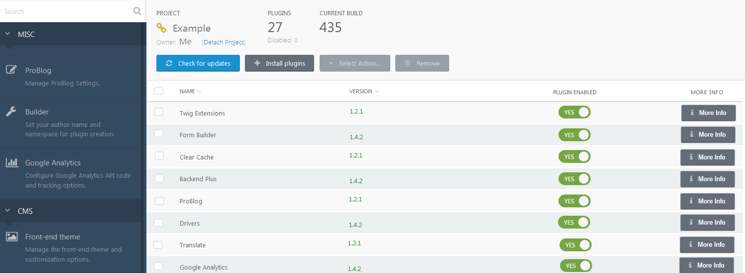
This issue is several issues merged together, which relate to updating the design of the plugin section in the backend.
Update 1 - Two web pages into a single page
This is from issue: https://github.com/octobercms/october/issues/3497
Currently, the plugin section is a little bit confusing on two web pages and can be merged into a single web page.
As Teranode said:
How about removing the description and authors, adding the toggle buttons, and add a third button that opens up more information about the plugin that contains the description and author and website, etc
Update 2 - Have one Single Column to turn Plugins on/off and update
This is from issue: https://github.com/octobercms/october/issues/3955
The following setup:
Updates Enabled: Turned ON
Plugin Enabled: Turned OFF
Paid plugins do not update.
As bennothommo suggested:
I'm wondering if this is such a bad thing, preventing updates to disabled plugins. A plugin that is disabled should effectively be non-functioning and have no effect to the site - including migrations added as part of an update. Disabling updates should only be allowed for an enabled plugin, to allow a site administrator to "freeze" on a certain version.
Update 3 - Make columns sortable
This is from issue: https://github.com/octobercms/october/issues/4196
As I said:
For example it would make life easier if we could have the list of plugins in alphabetical order - thus finding the plugins easier!
Summary of ideas so far
Below is a rough idea of a screenshot with regards to the above feature ideas:
Feedback
Please feel free to add input and ideas.
 ghost
ghost
All 13 comments
Why did you merge them into one issue instead of keeping them separate?
 LukeTowers
on 24 May 2019
LukeTowers
on 24 May 2019
I realized they are all talking about the same thing and can be grouped under the header "Revamp Plugin Management UX"
[edit] Also from a coding point of view, probably easier to do them all at the same time.
ghost
on 24 May 2019
@ayumihamsaki I had a thought that maybe the plugin list could be displayed as a grid, with small "cards" representing each plugin. Whilst it would be introducing a new UI format to October (albeit one that is kinda already implemented with the Dashboard), the big benefit is that it could be responsive - it could perhaps display 4 columns on desktop, and scale down to 2 columns and 1 column as the viewport shrinks. Thoughts on that?
 bennothommo
on 25 May 2019
bennothommo
on 25 May 2019
Cool idea, reminds me of this plugin: https://octobercms.com/plugin/sewa-tileable
ghost
on 25 May 2019
@bennothommo are you envisioning an official UI widget interface "TileList" similar to the plugin (except a lot more polished and incorporated in the core?)
LukeTowers
on 26 May 2019
@LukeTowers Yeah, I think that would be a useful widget to make available :)
bennothommo
on 27 May 2019
Go for it, that would be pretty neat!
LukeTowers
on 27 May 2019
I have started a pre-merge discussion for the Grid widget here: #4350. Please feel free to add any ideas or discussion in there. :)
bennothommo
on 27 May 2019
@bennothommo Good luck building it. I just want to ask and say, I would expect 50% of people to be happy with a grid and 50% want a list. If there could be an option to choose between the two that would be great.
(Having over 100 plugins a list is easy to search through than a grid).
Also please consider larger screen sizes, right now I'm using an 80 inch 4K computer monitor as an example. 4 columns would look huge, so the way I get around this issue is just using the flexbox flex-wrap Property, see here an example: https://www.w3schools.com/css/tryit.asp?filename=trycss3_flexbox_flex-wrap_wrap
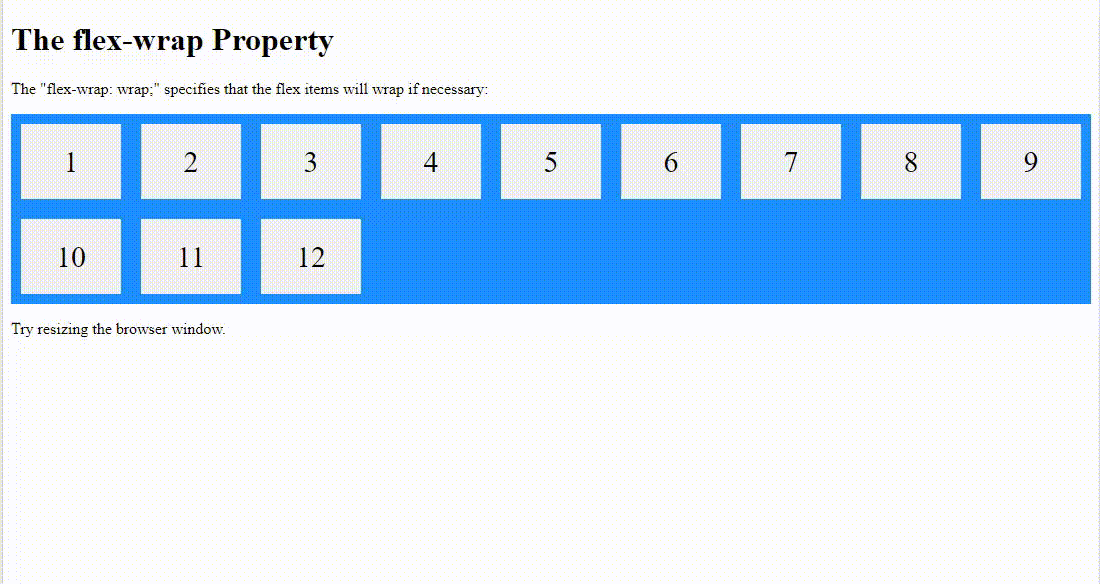
You may want to do something like this for large screens.
ghost
on 27 May 2019
@ayumihamsaki could you add those comments to the issue @bennothommo created
LukeTowers
on 27 May 2019
done
ghost
on 27 May 2019
This issue will be closed and archived in 3 days, as there has been no activity in the last 30 days. If this issue is still relevant or you would like to see action on it, please respond and we will get the ball rolling.
![github-actions[bot] picture](https://avatars.githubusercontent.com/in/15368?v=4&s=40) github-actions[bot]
on 2 Oct 2019
github-actions[bot]
on 2 Oct 2019
@ayumihamasaki2019
LukeTowers
on 2 Oct 2019
Related issues
LukeTowers
·
3Comments
 mittultechnobrave
·
3Comments
mittultechnobrave
·
3Comments
 oppin
·
3Comments
oppin
·
3Comments
 EbashuOnHolidays
·
3Comments
EbashuOnHolidays
·
3Comments
 m49n
·
3Comments
m49n
·
3Comments
Most helpful comment
@LukeTowers Yeah, I think that would be a useful widget to make available :)