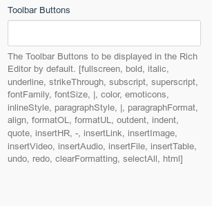
October: UX: Toolbar buttons comment is confusing
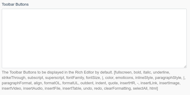
This comment suggests that a user has to add the toolbar buttons including the [ and ]. Doing this won't work and will fail without a visible error.
Further, this comment suggests the displayed list is the current/default configuration of the toolbar which it is not.
Since this form tab is mostly empty the options list could be moved to a separate partial.
Thoughts?
 tobias-kuendig
All 12 comments
Further, this comment suggests the displayed list is the current/default configuration of the toolbar which it is not.
That's totally incorrect if you read it once again, this part: _" to be displayed in the RE by default"_. Rephrased version: "This is the list of options that will be a default for Rich Editor when you choose".
@tobias-kuendig the message could be a bit more understandable with a usage example. Or even better, it would be much easier and understandable to make those options as a tag list
 w20k
on 7 Mar 2019
w20k
on 7 Mar 2019
+1 for the tag list.
What does by default refer to? When I set nothing in the textarea? When I don't further customize the editor toolbar? Is it even possible outside of this textarea?
If the comment shows the default config that is used if the textarea is left empty then it is wrong. For example undo and redo are not displayed by default.
tobias-kuendig
on 7 Mar 2019
Those options that you enter in the text area will be the default values for the Rich Editor (my guess, current default is different and not displayed, or stated what it is 😄 ).
If you don't enter values, will be a system default 😄That's a logical pitfall))
w20k
on 7 Mar 2019
Alright, maybe I'm not bright enough :grin:
I guess what the real problem was for me is the [ and ] which suggests we need to specify the config as an "Array". Doing this will change _some_ buttons on the editor but not to the config you specified. This is very confusing since there is no error.
tobias-kuendig
on 7 Mar 2019
This issue will be closed and archived in 3 days, as there has been no activity in the last 30 days. If this issue is still relevant or you would like to see action on it, please respond and we will get the ball rolling.
![github-actions[bot] picture](https://avatars.githubusercontent.com/in/15368?v=4&s=40) github-actions[bot]
on 3 Oct 2019
github-actions[bot]
on 3 Oct 2019
I could try and implement this config using the taglist form widget if the maintainers are interested. If not, feel free to close the issue.
tobias-kuendig
on 3 Oct 2019
@tobias-kuendig would be really nice to have! Make a PR, will review it! Thanks a lot!
w20k
on 3 Oct 2019
So I've been playing around with this idea and found some major problems:
- The taglist widget does not support a value to be added multiple times (like a horizontal toolbar separator). Since it is using select2 which is using a native HTML select box as a "data backend", I don't think this feature can be implemented without major refactoring (like using a plain text input field to store comma-separated values).
- select2 does not provide sorting of values out of the box (though it could be added using third-party plugins that provide sortable functionality). This means if you want to add a button at the beginning of a toolbar you have to remove all other values first and add them back.
I do like that this solution would make the configuration more user-friendly by providing translated names for the buttons instead of the technical names (like formatUL). I do feel, however, that the usability improvements are not worth the work required to implement all of the changes required to make this work.
What do you guys think? Any idea on another solution to make the configuration more user-friendly?
tobias-kuendig
on 5 Oct 2019
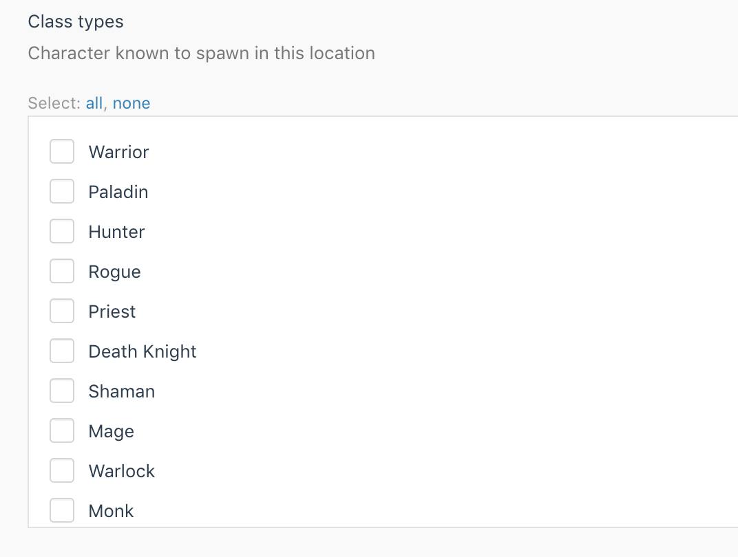
@tobias-kuendig what do you think about using a checkbox-list? It's not sortable as well, though could be done with js (in theory), but not worth time. But from a UX perspective - could be much more useful.
w20k
on 5 Oct 2019
This still doesn't solve the problem we have with separators: the user needs to be able to select the horizontal and vertical separators more than once :bowing_man:
tobias-kuendig
on 5 Oct 2019
@tobias-kuendig @w20k To be honest, I think it's best left as a textarea, and the hint below is updated instead. Neither of the options above handle the case where someone's added their own Froala plugin and they need their custom button to be available in the toolbar, whereas a textarea provides the capability immediately.
Perhaps instead of the hint, there could be some buttons underneath that insert templated configurations into the Toolbar Buttons textarea. For example, a "Default" button would insert the list of buttons that are currently listed in the hint. Another one called "Simple" may potentially just allow bold, italics, underline and links.
 bennothommo
on 5 Oct 2019
bennothommo
on 5 Oct 2019
Yes, the textarea is in this case definitely the easiest solution. I like the idea of the button presets! I'll tinker around with that a bit.
Regarding the hint below the field (which was my initial problem here :grin:): I'm now aware of what let me to think the displayed list is the default configuration (which it is not!): It's the separators. Why would the separators be displayed more than once if this is just the list of all possible options and not some default configuration?
I'll try to implement a solution with buttons and update the hint as I see fit.
tobias-kuendig
on 5 Oct 2019
Related issues
 ChVuagniaux
·
3Comments
ChVuagniaux
·
3Comments
 EbashuOnHolidays
·
3Comments
EbashuOnHolidays
·
3Comments
 atrauzzi
·
3Comments
atrauzzi
·
3Comments
 m49n
·
3Comments
m49n
·
3Comments
 jvanremoortere
·
3Comments
jvanremoortere
·
3Comments
Most helpful comment
Yes, the textarea is in this case definitely the easiest solution. I like the idea of the button presets! I'll tinker around with that a bit.
Regarding the hint below the field (which was my initial problem here :grin:): I'm now aware of what let me to think the displayed list is the default configuration (which it is not!): It's the separators. Why would the separators be displayed more than once if this is just the list of all possible options and not some default configuration?
I'll try to implement a solution with buttons and update the hint as I see fit.