October: Fix Sidebar and File Column bar in the code editor section
I was testing this on a pr I am working on and notice that this is also broken on a normal cms version, see screenshot:
Therefore I will open a new issue and this needs to get fixed separately.
This needs to be fixed before I can continue with the pr here: https://github.com/octobercms/october/pull/3974
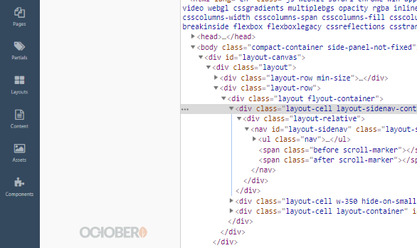
It's being injected with this code:
<div class="layout-cell w-350 hide-on-small" id="layout-side-panel" data-control="layout-sidepanel" style="left: 120px;top: 62px;height: 880px;">
The left:120px needs to have a different value with the css media query under 991px.
@media (max-width: 991px) and (min-width: 768px)
.layout-sidenav-container {
    width: 100px;
}

.layout-sidenav-container {
    width: 120px;
}

@media (max-width: 767px)
.layout-sidenav-container {
    width: 80px;
}
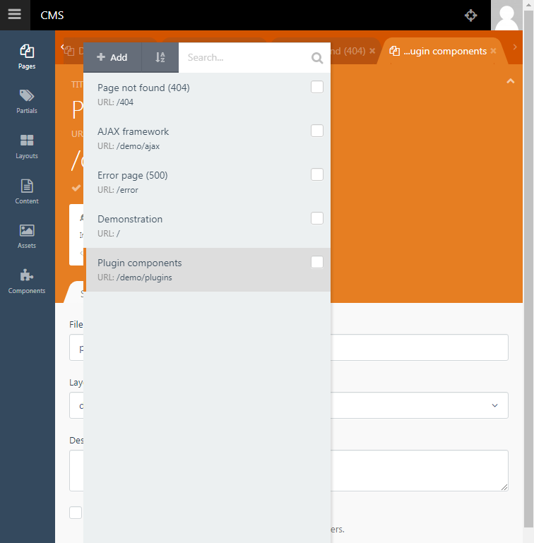
Also I think under 768px the design of October in the sidebar is very poor! I can't even read the small text. Please note Google Developers quote that you should use 16px font in mobile devices! Please see the sidebar screenshot under 768px and try to read the font size:
As you can see the sidebar font size is blurry to read because it is too small. That screenshot is on a computer, using a mobile device the dpi will make it even worse.
I would also suggest October using a default 16px (1rem) and also updating it's system to start using responsive fonts.
Easy Solution
Having a quick think on this why not just remove this code:
// Delete all this
@media (max-width: 991px) and (min-width: 768px)
.layout-sidenav-container {
    width: 100px;
}

@media (max-width: 767px)
.layout-sidenav-container {
    width: 80px;
}
There is no good reason why you need to reduce the sidebar and having a sidebar of 120px in width will not be problematic on a mobile device!
Then remove the font-size css which is getting smaller on smaller screen resolutions.
// Delete all this
@media (max-width: 767px) {
  #layout-sidenav {
    font-size: 10px;
  }
}
@media (max-width: 991px) and (min-width: 768px) {
  #layout-sidenav {
    font-size: 12px;
  }
}
and
// Remove this line
#layout-sidenav ul li a {
    padding: 1.429em .714em;
    display: block;
    /* font-size: .929em; */
    color: rgba(255,255,255,0.6);
    font-weight: normal;
    position: relative;
}
Done easy!
 ghost
ghost
All 3 comments
Before and after screenshots please
 LukeTowers
on 22 Dec 2018
LukeTowers
on 22 Dec 2018
@LukeTowers
Before

After
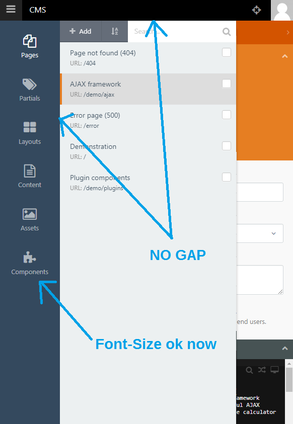
Note: The PR has a YouTube video demo'ing all the fixes.
ghost
on 23 Dec 2018
Closing this as it's been discussed here: https://github.com/octobercms/october/issues/4510
Pull request here: https://github.com/octobercms/october/pull/4511
ghost
on 13 Aug 2019
Related issues
 SeekAndPwn
·
3Comments
SeekAndPwn
·
3Comments
 atrauzzi
·
3Comments
atrauzzi
·
3Comments
 mittultechnobrave
·
3Comments
mittultechnobrave
·
3Comments
mittultechnobrave
·
3Comments
mittultechnobrave
·
3Comments
 ChVuagniaux
·
3Comments
ChVuagniaux
·
3Comments
Most helpful comment
@LukeTowers
Before
After
Note: The PR has a YouTube video demo'ing all the fixes.