October: Update the dashboard area with improved downscaling
I'm just going to open this issue, but I don't have time to fix it right now.
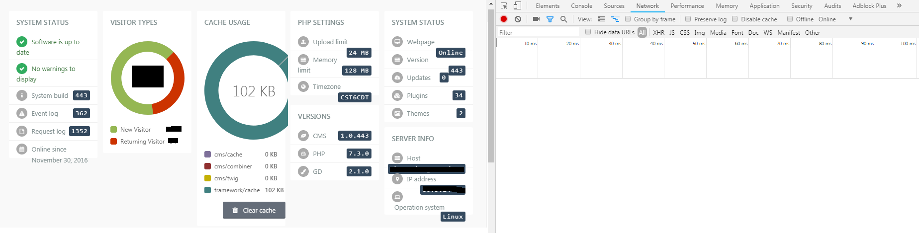
All the widgets in the dashboard for many plugins and the default ones are not responsive! If you open the dashboard screen in tablet mode or open chrome browser and open dev-tools and resize the screen you will see that there is no responsive code at all to any of the widgets.
Here's an example:
Maybe someone could have a look at it, or next year I will fix the css code there.
For now I just open the issue.
 ghost
ghost
All 26 comments
@ayumihamsaki part of the problem is that it isn't that easy for developers to make the widgets responsive with breakpoints because I don't think you can target the width of the container holding your elements, just your screen width. Any thoughts on that?
 LukeTowers
on 3 Dec 2018
LukeTowers
on 3 Dec 2018
@LukeTowers My initial thoughts is using flexbox and rem instead of px. Needs investigation, but I think can easily be upgraded, to make it easy for developers.
ghost
on 3 Dec 2018
@ayumihamsaki feel free to experiment with it, I'm not so sure it'll be that easy. Some other thoughts are allowing different layouts at smaller screen sizes and / or having developers specifying a min width for their widgets
LukeTowers
on 3 Dec 2018
Or as an option, we could help developers build a 'dashboard widgets' the smart way. Provide them with guidelines or a set of tests (or a test tool) for different resolution/options.
 w20k
on 3 Dec 2018
w20k
on 3 Dec 2018
@ayumihamsaki , @LukeTowers - what do you guys think, if we could create a separate branch or rep. to test these ideas? And to find the best possible solution?
w20k
on 3 Dec 2018
@LukeTowers @w20k I just remembered, I talked about the Dashboard with Luke a few months ago. From reading my old notes it seems like the dashboard is built using the JavaScript library:
- jquery.isotope
I wrote that October is using v1.5.26 and the new version is v3.0.6
So I would suggest we update that library first and go from there!
Link to my note: https://github.com/octobercms/october/pull/3825#issue-218400759
ghost
on 3 Dec 2018
if we could create a separate branch or rep. to test these ideas? And to find the best possible solution?
I'm up for that. Been wanting to create a wild experiment branch for a while. That allows dev's to create things and not worry about breaking October (before running tests).
ghost
on 3 Dec 2018
The main issue with the dashboard widgets is that a user can have 10 (or 12 if @ayumihamsaki's enhancement PR goes though) widgets all trying to display on the same row while in a mobile screen size.
LukeTowers
on 3 Dec 2018
Need to create a test site with jquery.isotope v3 running on it and see if that library can handle the tests or not?
ghost
on 3 Dec 2018
I think we could start with a simple approach for now 😉Maybe a new isotope version would fix it somehow)) Don't believe in it, but miracles tend to happened ))
w20k
on 3 Dec 2018
@LukeTowers Can I have permission to break this PR up into two sections:
- Update jquery.isotope.js library
- Update Dashboard to 12 from 10
Then @daftspunk can review the 12 column idea whenever he wants and the updated library can get pushed through to fix this issue.
p.s. I would need to cancel that PR as I don't have my console connected to it anymore and I would make two fresh new PR instead.
ghost
on 3 Dec 2018
@ayumihamsaki works for me
LukeTowers
on 3 Dec 2018
Isotope is being used for the drag n drop in dashboard.
ghost
on 21 Dec 2018
@LukeTowers @w20k I ran some tests on this last night and found that October's CSS does the following thing:
Below 768px make all the boxes 100%
Above 768px make all the boxes use a 10 column grid
Before I begin it is not just developers that need to change the widgets, October also has badly created widgets for example:
I suggest three things:
1. CSS Media Queries
A possible solution would be to use css media queries and have something like this:
p.s. I will base this on a 12-column grid from the previous pr I did.
Above 1800px use 12-grid
1600px - 1800px use 10-grid
1400px - 1600px use 8-grid
1200px - 1400px use 6-grid
1000px - 1200px use 4-grid
800px - 1000px use 2-grid
Below 600px use width 100%
2. Fix October's Default Widgets and make them Responsive
Remove all these width: 200px and into width: 100%, use flexbox instead of floats to make them auto scroll into the right row, and suggest developers to use vectors instead of normal pictures (so that the down scaling is better).
3. Update Plugin Developers Dashboard
Ask them to update their code and also set out some guidelines e.g. what I wrote in part 2.
4. Height Issue in ISOTOPE
I believe there is also a height issue where it needs adjusting as well. I will quote someone else's comment:
You can use isotope event https://isotope.metafizzy.co/events.html to trigger your MatchHeight again.
That way the MatchHeight recalculate the heights of each element.
ghost
on 22 Dec 2018
How would that work in terms of users defining the screen space a widget should take up?
LukeTowers
on 22 Dec 2018
@LukeTowers
Ok Luke this is the clever bit (you will laugh when you read this):
The User defines there dashboard using the 12-grid pattern (Max screen size). Then the cms will adjust it and down-scale everything doing the following:
For example,
Screen Size is: Width 1920px
So we have a 12-grid.
width-1 = width: 8.33%
width-2 = width: 16.66%
width-3 = width: 24.99%
width-4 = width: 33.32%
width-5 = width: 41.65%
width-6 = width: 49.98%
width-7 = width: 58.31%
width-8 = width: 66.64%
width-9 = width: 74.97%
width-10 = width: 83.3%
width-11 = width: 91.63%
width-12 = width: 100%
Then we adjust the screen to: Width 1700px
So this becomes a 10-grid pattern, we get the following:
width-1 = width: 9.95%
width-2 = width: 19.95%
width-3 = width: 29.95%
width-4 = width: 39.95%
width-5 = width: 49.95%
width-6 = width: 59.95%
width-7 = width: 69.95%
width-8 = width: 79.95%
width-9 = width: 89.95%
width-10 = width: 100%
width-11 = width: 100%
width-12 = width: 100%
Note the larger sized widths 11 and 12 become 100% and the smaller width widgets are increased in size thus allowing the content inside the boxes to not get compressed and become non-responsive!
Going down to a 8-grid pattern we get:
width-1 = width: 12.5%
width-2 = width: 25%
width-3 = width: 37.5%
width-4 = width: 50%
width-5 = width: 62.5%
width-6 = width: 75%
width-7 = width: 87.5%
width-8 = width: 100%
width-9 = width: 100%
width-10 = width: 100%
width-11 = width: 100%
width-12 = width: 100%
And so on,...
The problem before was making the boxes smaller as you reduced the screen resolution, this way what I have done is the complete opposite - made the boxes get bigger. Content inside the boxes should in theory look ok.
ghost
on 23 Dec 2018
Could you provide an example of how it would look scaling down with just plain coloured boxes perhaps?
LukeTowers
on 26 Dec 2018
Will try to sort that out in next few days.
ghost
on 26 Dec 2018
@LukeTowers @w20k Here is the coded test as requested - enjoy!
See here: https://htmlpreview.github.io/?https://github.com/ayumihamsaki/october-isotope/blob/master/dashboard-test.html
(Seems to work nicely)
ghost
on 27 Dec 2018
@ayumihamsaki could you do an example with blocks labelled with their column widths and at least one full row of 12 that I can play with the resize on?
LukeTowers
on 27 Dec 2018
@LukeTowers
Try this: https://htmlpreview.github.io/?https://github.com/ayumihamsaki/october-isotope/blob/master/dashboard-test-2.html
ghost
on 28 Dec 2018
I like it @ayumihamsaki, go ahead and make a PR for this. As far as I can tell too this won't have any effect on existing users using 10 column layout correct? If that's the case we don't have to worry about making 10 vs 12 configurable
LukeTowers
on 28 Dec 2018
New direction for this Github Issue:
(this comment has been placed here as notes)
I was looking at the networks files:
{"X_OCTOBER_ASSETS":{
"js":[
  "modules/backend/widgets/mediamanager/assets/js/mediamanager-browser-min.js?v456",
  "modules/backend/widgets/reportcontainer/assets/vendor/isotope/jquery.isotope.min.js?v456",
  "modules/backend/widgets/reportcontainer/assets/js/reportcontainer.js?v456"
],

"css":[
  "modules/backend/widgets/mediamanager/assets/css/mediamanager.css?v456",
  "modules/backend/assets/css/dashboard/dashboard.css?v456",
  "modules/backend/widgets/reportcontainer/assets/css/reportcontainer.css?v456"
],
"rss":[]
}}
I'm thinking of doing the following:
Load them properly via HTML and not via
jsonand also preload the assets.Delete
jquery.isotope.min.jsand use a more modern light-weight drag n drop library. An example new modern library example can be found here: https://shopify.github.io/draggable/examples/flexbox.htmlAdd the new flexbox code to the
dashboard.css
Reasons
Reasons for switching from Isotope library, Isotope was created before Flexbox was created and tried to fix the solution of responsive styling. Unfortunately, Isotope does a poor job at this. But there is now a solution called Flexbox and/or CSS Grids. The browser vendors all worked together to get these two major features installed in their browsers to address this problem. Now is the time to update the dashboard in October to take advantage of these new features.
## Goals
- Create a smooth responsive layout.
- Address bugs.
- Reduce loading time to improve performance.
- Use modern coding standards such as flexbox and new drag n drop api's
To quote Luke comments:
As long as it remains functionally the same (and nothing else uses isotope, check the reorder controller to be sure) I don't mind switching to something that works better as long as its thoroughly tested and actually demonstrably works better.
ghost
on 4 Jul 2019
I would also like to research a way to be able to upload and download dashboard layouts! For example, I would like to copy a dashboard layout from website A into website B.
e.g. Import and Export feature.
ghost
on 13 Aug 2019
This issue will be closed and archived in 3 days, as there has been no activity in the last 30 days. If this issue is still relevant or you would like to see action on it, please respond and we will get the ball rolling.
![github-actions[bot] picture](https://avatars.githubusercontent.com/in/15368?v=4&s=40) github-actions[bot]
on 6 Oct 2019
github-actions[bot]
on 6 Oct 2019
@ayumihamasaki2019
LukeTowers
on 6 Oct 2019
Related issues
 jvanremoortere
·
3Comments
jvanremoortere
·
3Comments
 Flynsarmy
·
3Comments
Flynsarmy
·
3Comments
 sozonovalexey
·
3Comments
sozonovalexey
·
3Comments
 kdoonboli
·
3Comments
kdoonboli
·
3Comments
 axomat
·
3Comments
axomat
·
3Comments
Most helpful comment
New direction for this Github Issue:
(this comment has been placed here as notes)
I was looking at the networks files:
I'm thinking of doing the following:
Load them properly via HTML and not via
jsonand also preload the assets.Delete
jquery.isotope.min.jsand use a more modern light-weight drag n drop library. An example new modern library example can be found here: https://shopify.github.io/draggable/examples/flexbox.htmlAdd the new flexbox code to the
dashboard.cssReasons
Reasons for switching from Isotope library, Isotope was created before Flexbox was created and tried to fix the solution of responsive styling. Unfortunately, Isotope does a poor job at this. But there is now a solution called
Flexboxand/orCSS Grids. The browser vendors all worked together to get these two major features installed in their browsers to address this problem. Now is the time to update the dashboard in October to take advantage of these new features.## Goals
To quote Luke comments: