This issue is to cover the latest UI changes in the stable version of October. Assuming you have enabled edge updates and are on the latest build, please provide your comments and feedback on the design changes. Once accepted your comment will be added to the main summary and deleted.
Main Menu Icons
 daftspunk
All 7 comments
My leading concern is about the feel about the October backend. The thing I enjoy most about our CMS is that it's just so simple. It's even in the slogan, we're "Getting back to basics".
With that said, here are the some things that jump out at me...
- System fonts - I understand the reasons behind wanting to use system fonts, but everything looks quite thick to me now. Are we really gaining that much from not having Open Sans included out of the box?
- Loading state transition on dashboard - The sudden change between background colors is a bit jarring to me. Perhaps a transition could be used here, or maybe just use the same background color as the dashboard.
 scottbedard
on 2 Apr 2016
scottbedard
on 2 Apr 2016
+1 on the fonts comment from @scottbedard. Everything's pretty thick and I feel like the overall spacing is a bit too much.
Screenshots in Chrome on Ubuntu:
Before

After

 tobias-kuendig
on 2 Apr 2016
tobias-kuendig
on 2 Apr 2016
My main gripes so far are to do with the sizes of things.
- Everywhere: Font sizes are ridiculously big. I first noticed the increase from 12/14px (description/title) to 14/15px in Settings. It seems everything else has got an increase too. Bigger fonts look horrible (to me) and waste space. The original sizes looked much cleaner, and were useful if you wanted to fit more than a couple columns in a list view.
- Settings Sidebar: Font issues aside, I prefer the muted titles/icons from before - they helped the section headings stand out a lot more. Now, they seem to blend in instead.
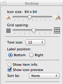
- Toolbar: I suspect the reason for text below icons was to fit more icons, but in the world of [ultra-]widescreen monitors, vertical space is valuable. I much prefer the text to the side as before. Maybe an option for this could be added to Backend Preferences, similar to desktop apps? (screenshot below)
- Buttons: When you hover over most button colours (primary, danger, info etc) they become a darker shade of the non-hover colour. With
btn-default, it goes from grey to blue.This seems to be a bug - the hover colour is grey in build 317. - Toolbar Icons: These feel like the candybar icons from early 2000's. Like @scottbedard said in #october, they're more akin to what you'd find in a nursery than a professional CMS.
- CMS tab: Pinning the sidebar is much more difficult than before due to the pin button being outside the main div. This could probably be fixed by adding a hide delay to the pages sidebar.
- Tabs: I actually like the new tabs. They're perfectly readable and look much "fresher" than before. The new tabs even resolve an issue with bottom border being broken. Not sure how it could be more difficult to read, as the colour and weight haven't changed at all (still
#ccccccandfont-weight: 400).
Overall, the forms look much cleaner than before. The font and toolbar sizes are what kills it for me. As a practical example, the Products list view in Octoshop used to display 22 rows. It's now down to 16.
Apologies for the essay. Figured I'd go 'round the whole backend at once instead of posting a dozen comments
 dshoreman
on 2 Apr 2016
dshoreman
on 2 Apr 2016
There seems to be a little bug when the colors are changed in the backend:

 filipac
on 2 Apr 2016
filipac
on 2 Apr 2016
+1 for the comments already made, particularly agree with @dshoreman.
For emphasis...
the font is just too big, list headings are now squashed for example. I have the problem that the top menu does not scroll for me unless I touch the screen but I still prefer the text on the right rather than restricting the length of the text.
I like the new tabs though, they are easier to see. In fact everything is clearer, but I think that is more to do with the contrast changes rather than the font size.
 axomat
on 2 Apr 2016
axomat
on 2 Apr 2016
+1 for comments above
-1 for color menu icons, I like b/w basic variants used before, because it's easy to read, it's consistent and it's easy to find new icon for my next plugin which fits actual style
Would be great to implement backend UI switcher (like backend themes) and have "Old good OctoberCMS theme" as one choice.
 vojtasvoboda
on 4 Apr 2016
vojtasvoboda
on 4 Apr 2016
Thanks for your feedback.
daftspunk
on 4 Apr 2016
Related issues
 mittultechnobrave
·
3Comments
axomat
·
3Comments
mittultechnobrave
·
3Comments
axomat
·
3Comments
 EbashuOnHolidays
·
3Comments
EbashuOnHolidays
·
3Comments
 oppin
·
3Comments
oppin
·
3Comments
 SeekAndPwn
·
3Comments
SeekAndPwn
·
3Comments
Most helpful comment
There seems to be a little bug when the colors are changed in the backend:
