Notepads: [Feature request] New icon
Is your feature request related to a problem? Please describe.
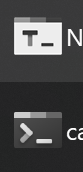
The current icon doesn't suggest a text editor but rather a console application
Describe the solution you'd like
A new icon in the fluent design style, similar to the new Office 2019 icons. The icon should use the green colour of the original notepad.exe . I would suggest to take inspiration from the OneNote application
 kephax
All 77 comments
- 'T' suggests text, but the name of the application starts with 'N'.
- Fluent Design is the guidelines Microsoft advises for Windows 10
kephax
on 1 Sep 2019
Just to be honest, I could not find or I do not have a better idea for the icon at this moment, so I would prefer the current one. If you have a better idea, you can show your work and paste it here and let everyone decide. I have seen many but personally I still prefer the current one. There is no right or wrong, just pure personal taste. Btw, we do not have to follow any guide lines here. This is not Microsoft App (At least not MS's app at this moment), as long as it matches the app's theme and fits well with the app, I am good with all approaches.
 JasonStein
on 2 Sep 2019
JasonStein
on 2 Sep 2019
I think the big issue with the current icon is that it looks too much like the new Terminal app. Not that it's bad per-se, but it could cause confusion or (worse) copyright issues. That said, I've followed the discussion and the author's desire about the icon and the app, so I tried a small mockup of what, imho, would improve it without chaging it too much:


The icon has a different shape that resembles a Notepad, but it's still loyal to the original. The top tabs with different shades are still present, and the T is still there. The underscore is gone both for spacing reasons and because it's more reminiscent of a console rather than a texting app.
Of course this is just a suggestion, but I'm open to feedback
 SOI7
on 2 Sep 2019
SOI7
on 2 Sep 2019
I think, either we keep the current icon with an “N” instead of a “T_”, with a blue colour like the original notepad, or we create an icon similar to OneNote but again with a blue colour and modified background. I will post some concepts
kephax
on 2 Sep 2019
But regular Notepad is blue, not green
SOI7
on 2 Sep 2019
I would say "N" would be better than "T". Especially since the app is called "Notepads" on all languages.
 AmionSky
on 2 Sep 2019
AmionSky
on 2 Sep 2019
In addition, the application is called Notepads so the icon should resemble that...
kephax
on 3 Sep 2019
I do not think the icon should or must have "N" just because the app is called Notepads. Btw, the "T" that I used in the icon is not some arbitrary character and T_ means text and it is a strong indicator. What I am trying to say here is that by changing "T" to "N" will not make it better dramatically. Until I have a better idea, I will go with what I have right now.
JasonStein
on 4 Sep 2019
But "T" does not imply text in all other languages and most applications don't use underscore as caret but avertical one.
AmionSky
on 4 Sep 2019
I do not think the icon should or must have "N" just because the app is called Notepads. Btw, the "T" that I used in the icon is not some arbitrary character and T_ means text and it is a strong indicator. What I am trying to say here is that by changing "T" to "N" will not make it better dramatically. Until I have a better idea, I will go with what I have right now.
What about the resizing I posted above? The T is still there, but the shape resembles a notepad more
SOI7
on 4 Sep 2019
@SOI7
it's not good I think
simply, the format is not optimize for an icon ...
 FJduFou
on 6 Sep 2019
FJduFou
on 6 Sep 2019
@JasonStein I would like to point out that people disagree with you on this statement:
I do not think the icon should or must have "N" just because the app is called Notepads.
You seem to like the current icon, you're understandably biased, however your users' opinions shouldn't go unnoticed.
 spikespaz
on 8 Sep 2019
spikespaz
on 8 Sep 2019
the icon is good ^^
FJduFou
on 8 Sep 2019
@JasonStein I would like to point out that people disagree with you on this statement:
I do not think the icon should or must have "N" just because the app is called Notepads.
You seem to like the current icon, you're understandably biased, however your users' opinions shouldn't go unnoticed.
No, I do not like the current icon that much, that is why I am keeping this thread alive and listening to all ideas. All I am saying in above threads can be summarized into below points:
- The ideas you guys come up with are good, makes sense but are more like tweaks and modifications. I would rather spent time on code instead of tweaking the icon like changing T to N. Not saying T is better, just saying that it would not change the overall look of the icon and make it dramatically better or more appealing.
Besides, most of the people do not even know that to tweak the icon is not easy. It seems to be easy but you have to make sure it is pixel perfect. Everything you do with the icon design has to be carefully done to make sure it looks good regardless of the scale like 100%, 150%, 200% etc.
These is no bias around a design, it is all about personal taste. Besides, if there are like at least 10 people asking me to change from T to N, I would definitely consider it more carefully. Even with that said, it does not mean changing from T to N will make it dramatically "better".
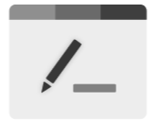
People who post questions, feature requests here are mostly people who have tech background (Most people do not even know what Github is). Notepads is not targeted purely for developers or tech people. This is a lightweight text editor for everyone. If let's say, 1000 people here ask me to change the icon to be something like a symbol which only developers know. Do you still think it is good to change? If 90% of the user base do not even know what Github is, do you still think it is a better design? One good example that I learned from above thread is that "T" only makes sense in English since it shorts for Text. If we dig more into it, we might end up translating Notepads app name into different locales instead of changing it from T to N which makes more sense. Instead, I am thinking about changing it to a Pen like icon:
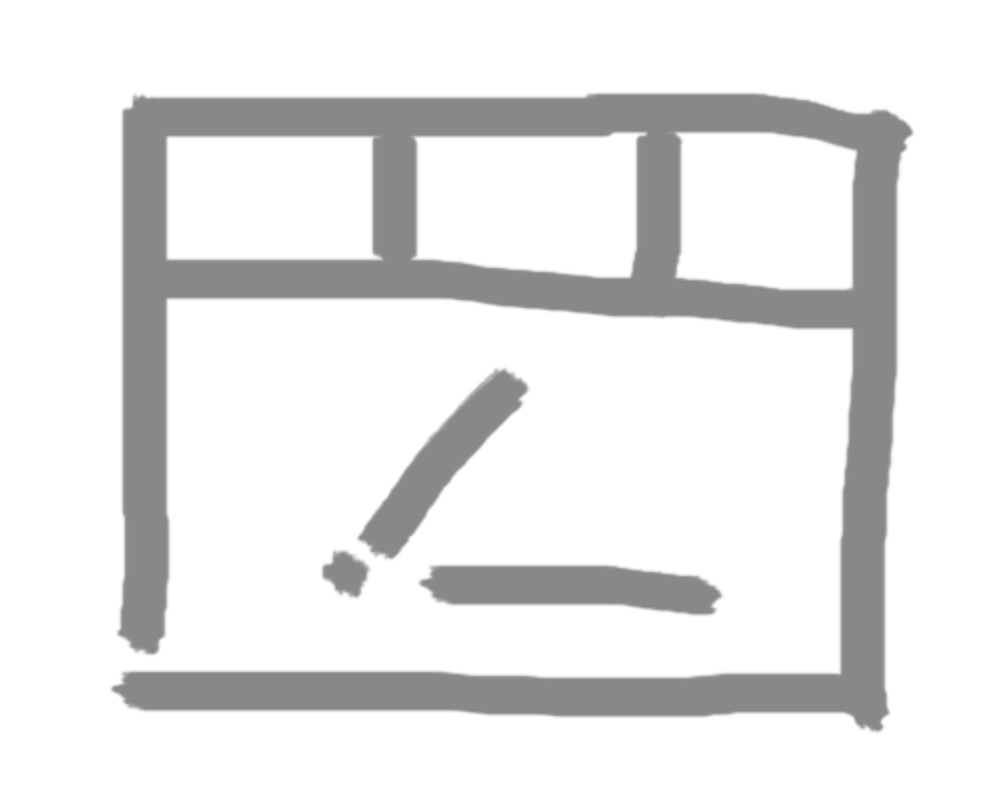
I am not ignroing any feature requests or ideas here, I read every single comment. There is no requirement for me to reply to everyone, this is not stated in any of the agreements also. Instead, everyone can share your opinions and ideas here. If I do not do it or follow, it does not mean your idea is dumb or I am biased.
If the current icon bothers you, you can make your own and build the project to run on your machine. It is easy and very doable. This is a free and open source project and it is MIT Licensed. It means, basically, you can do whatever you want.
Again, if anyone has better idea, share your draft here to let everyone judge and vote.
JasonStein
on 9 Sep 2019
Sorry for misinterpreting your earlier statement?
And for the record, I like the current icon. I do not think it needs a change. Take that however you wish.
spikespaz
on 9 Sep 2019
just not the pen, that's what I ask please
FJduFou
on 9 Sep 2019
With a shorter underscore the second one would be the best option
SOI7
on 9 Sep 2019
Also make it blue like the original notepad. The human brain see’s first colors then shapes.
Il giorno 9 set 2019, alle ore 18:13, Yair Aichenbaum notifications@github.com ha scritto:
[image]https://user-images.githubusercontent.com/39923744/64547734-3fc4d800-d2fb-11e9-9569-f528e71c86b6.png
—
You are receiving this because you authored the thread.
Reply to this email directly, view it on GitHubhttps://github.com/JasonStein/Notepads/issues/171?email_source=notifications&email_token=ADCDGY2NJFJ4AMCNV3KLQNDQIZY3HA5CNFSM4ISXSBX2YY3PNVWWK3TUL52HS4DFVREXG43VMVBW63LNMVXHJKTDN5WW2ZLOORPWSZGOD6IFUCQ#issuecomment-529553930, or mute the threadhttps://github.com/notifications/unsubscribe-auth/ADCDGY22UNOR7YEY5CSAN33QIZY3HANCNFSM4ISXSBXQ.
kephax
on 9 Sep 2019
Maybe make only the tabs, the underscore and the pen colored, and leave the background white
SOI7
on 9 Sep 2019
What about taking the OneNote icon make it this blue color with the pen in the background? The corner pf the background should be cut like a file
Il giorno 9 set 2019, alle ore 18:24, Yair Aichenbaum notifications@github.com ha scritto:
Not a big fan of a it but here is another version
[image]https://user-images.githubusercontent.com/39923744/64548496-bc0beb00-d2fc-11e9-80f9-a50d402f089c.png
—
You are receiving this because you authored the thread.
Reply to this email directly, view it on GitHubhttps://github.com/JasonStein/Notepads/issues/171?email_source=notifications&email_token=ADCDGY3GQZGNPOOBLSYS24DQIZ2DHA5CNFSM4ISXSBX2YY3PNVWWK3TUL52HS4DFVREXG43VMVBW63LNMVXHJKTDN5WW2ZLOORPWSZGOD6IGVZQ#issuecomment-529558246, or mute the threadhttps://github.com/notifications/unsubscribe-auth/ADCDGYYNAK732MFN3NBWEJLQIZ2DHANCNFSM4ISXSBXQ.
kephax
on 9 Sep 2019
Now it looks much better. Perhaps you could make the first tab more desaturated/brighter to stand out more since it's almost the same tint of the second, but other than that I don't have other feedback. Let's wait for Jason to hear his opinion
SOI7
on 9 Sep 2019
@yaichenbaum haha, very nice, just make the pen tip sharper like this:
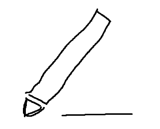
JasonStein
on 9 Sep 2019
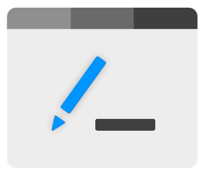
forget about color for now, the pen shape need to be simple, clean and iconic. Once the pen shape is figured out, rest is easy and I can ask my designer friend to polish the final version. That's just my initial idea, not sure if pen concept can work out nicely,
JasonStein
on 9 Sep 2019
@FJduFou Feel free to share your work since you talked to me on this before and have some scratches.
JasonStein
on 9 Sep 2019
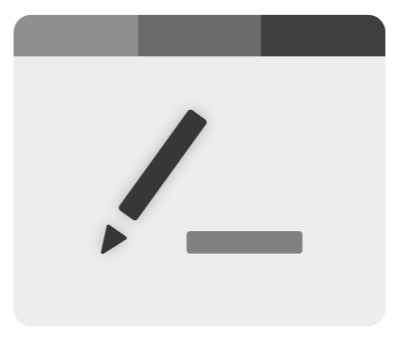
 yaichenbaum
on 9 Sep 2019
yaichenbaum
on 9 Sep 2019
Maybe reduce the gap between the pen body and tip a little bit and make the tip end a slightly rounded? Overall, it looks good.
JasonStein
on 9 Sep 2019
yaichenbaum
on 9 Sep 2019
spikespaz
on 9 Sep 2019
I agree. I like to use this app (It's awesome) instead of the classic notepad but the .txt icon distracts me, it is a little off style.
I would keep it simple and follow vscode icon style for the txt file and office style for the app main icon.
https://dribbble.com/shots/5677309-Free-Microsoft-Office-365-icons/attachments
https://raw.githubusercontent.com/microsoft/vscode/master/resources/win32/default.ico
 Tommasov
on 11 Sep 2019
Tommasov
on 11 Sep 2019
Something like this? "E" stands for Edit... Yeah, not the most appropriate

Tommasov
on 11 Sep 2019
I like this the most but then with an N.
Photoshop doesn’t have a D for “draw”, but a P. Facebook doesn’t have an S for social media,...
—
Best regards
Pietro Bua
Il giorno 11 set 2019, alle ore 17:22, Tommaso Vietina notifications@github.com ha scritto:
Something like this? "E" stands for Edit... Yeah not the most appropriate
[notepadsicon]https://user-images.githubusercontent.com/9279914/64710426-3af95300-d4b8-11e9-94ae-5589f4a36f6f.png
—
You are receiving this because you authored the thread.
Reply to this email directly, view it on GitHubhttps://github.com/JasonStein/Notepads/issues/171?email_source=notifications&email_token=ADCDGY7BYNUNO4FBRVQWP5LQJEEMBA5CNFSM4ISXSBX2YY3PNVWWK3TUL52HS4DFVREXG43VMVBW63LNMVXHJKTDN5WW2ZLOORPWSZGOD6O3YAA#issuecomment-530430976, or mute the threadhttps://github.com/notifications/unsubscribe-auth/ADCDGY7ZDFW5GNNDR3TQMADQJEEMBANCNFSM4ISXSBXQ.
kephax
on 11 Sep 2019
Yep, I've got u, but "N" is used by OneNote :( Source for improvement:
notepadsicon.pdf
Tommasov
on 11 Sep 2019
The new icon isn't going to follow the design of the microsoft suite so it doesn't matter that the letters clash. I think a vertical icon with an N or pen would work best. I think vertical is important as paper is mainly written on in portrait orientation.
Writing on this issue as the current icon is _very_ similar to the windows terminal icon and I keep opening the wrong app
 carlinmack
on 6 Nov 2019
carlinmack
on 6 Nov 2019
The new icon isn't going to follow the design of the microsoft suite so it doesn't matter that the letters clash. I think a vertical icon with an N or pen would work best. I think vertical is important as paper is mainly written on in portrait orientation.
Writing on this issue as the current icon is very similar to the windows terminal icon and I keep opening the wrong app
Yep, I agree.
.txt filetype icons should be upgraded as well. The actual one doesn't fit the Windows 10 UI
Tommasov
on 6 Nov 2019
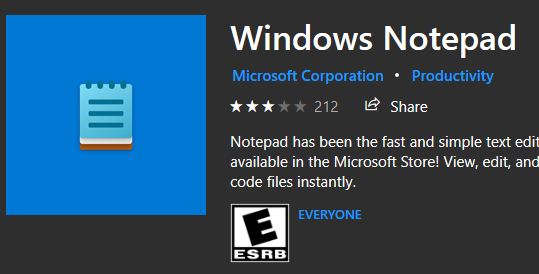
Windows Notepad has a new icon in the windows store, maybe we could make a one that is inspired from this
 mah-qurashy
on 24 Mar 2020
mah-qurashy
on 24 Mar 2020
any thoughts about this? 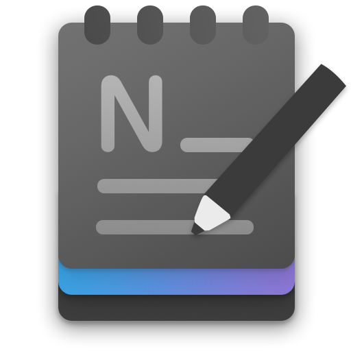
mah-qurashy
on 25 Mar 2020
Not bad at all, can give it more shadow behind pen. And I think the font of character "N" can be better. What about a white one for dark mode?
JasonStein
on 25 Mar 2020
It looks really good but I think it looks too similar to the built-in Notepad apps icon.
yaichenbaum
on 25 Mar 2020
Not bad at all, can give it more shadow behind pen. And I think the font of character "N" can be better.
how about this for a change?
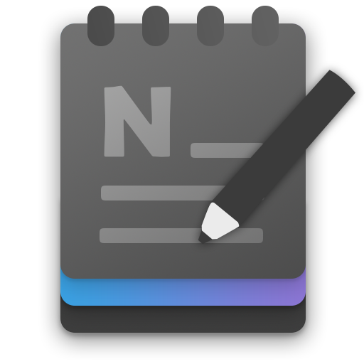
What about a white one for dark mode?
did some experimenting with a lighter version, did not like the way it came out, maybe we could just ditch the concept of having dark and light version of the icon? maybe change this to colored instead of black?
also i like the idea of the main app icon being dark, Notepads is widely mentioned as notepad with dark mode support.
It looks really good but I think it looks too similar to the built-in Notepad apps icon.
there's definitely a room for improvement, do you have any ideas for a change?
mah-qurashy
on 25 Mar 2020
any thoughts about this?
I like this but i would still use some green colour instead
kephax
on 25 Mar 2020
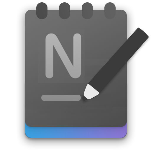
Personally I'd remove the lowest layer (the black one at the bottom) and detach the pen from the lines below it (or perhaps have only a single line, drawn by the pen). The font for the N looks better in the first concept
EDIT: Quick stab to show what I mean:
SOI7
on 25 Mar 2020
I actually like the idea of the icons all you guys shared above but it needs to be more polished. Feel free to sent out more variants for all of us to review. Thanks!
JasonStein
on 17 Apr 2020
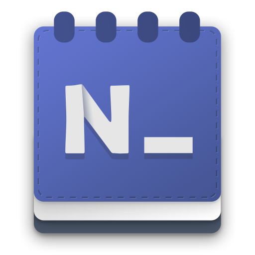
something a bit different
mah-qurashy
on 22 Apr 2020
@mah-qurashy I like it very much but I think the icon should also be modern/stylish/acrylic like so it can fit the overall looking of the app. Which means:
- The material look of the cover texture should be adjusted: maybe remove the dashed outline?
- "N" is a little bit cartoonish to me.
The overall design and color choices are great!
JasonStein
on 22 Apr 2020
@mah-qurashy I like it very much but I think the icon should also be modern/stylish/acrylic like so it can fit the overall looking of the app. Which means:
- The material look of the cover texture should be adjusted: maybe remove the dashed outline?
- "N" is a little bit cartoonish to me.
The overall design and color choices are great!
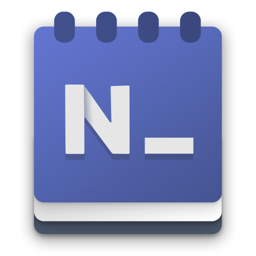
there you go
straightened the letter N, removed the dashed outline and added a tiny bit of noise to the background
mah-qurashy
on 22 Apr 2020
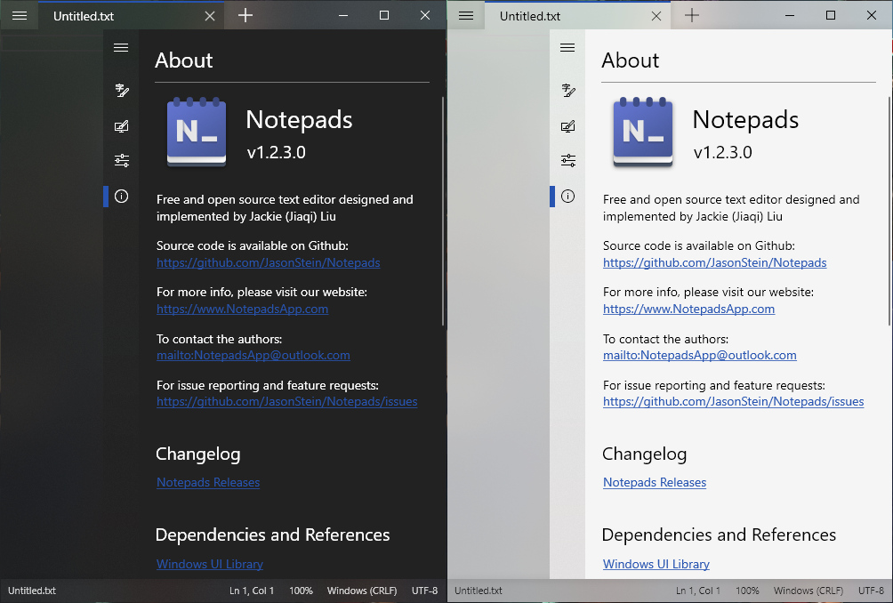
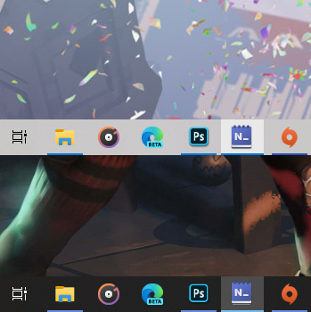
@mah-qurashy Can you paste some more screenshots to see what it looks like on task bar, tiles etc?
JasonStein
on 22 Apr 2020
@mah-qurashy Can you paste some more screenshots to see what it looks like on task bar, tiles etc?
for the final version i would do some sharpeneing and pixel perfect modifications on smaller sizes
i didn't do this yet for these screenshots, this is just resizing
mah-qurashy
on 22 Apr 2020
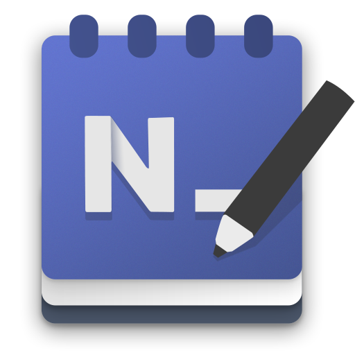
@JasonStein also been considering a version that has a pencil
mah-qurashy
on 22 Apr 2020
@JasonStein also been considering a version that has a pencil
The color looks good when in large scale but it still looks very cartoonish in small sizes. Maybe a darker one or change to something else to make it feel more "professional"?
JasonStein
on 22 Apr 2020
The color looks good when in large scale but it still looks very cartoonish in small sizes. Maybe a darker one or change to something else to make it feel more "professional"?
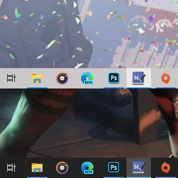
here's how the one with the pencil would look, did some desaturation, also made the whites much less brighter which i think make it less cartoonish to some extent
i think it still can be improved though
mah-qurashy
on 22 Apr 2020
The cartoonish look probably will never go away, because it's Microsoft's new design language that is cartoonish on purpose. I was actually wondering how it would look if the N, the underscore and the pen had softer/blurred shadows rather than the sharp ones they have now. Also, splitting the N into three overlapped lines with shadows rather than the two pieces you have now could be interesting
SOI7
on 22 Apr 2020
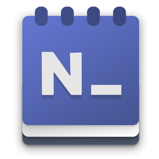
without pencil and the "N" in one part is very good as for me, can you try @mah-qurashy ?
FJduFou
on 22 Apr 2020
@SOI7
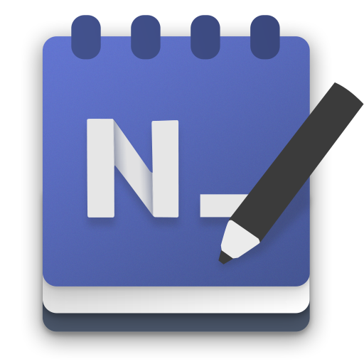
@FJduFou
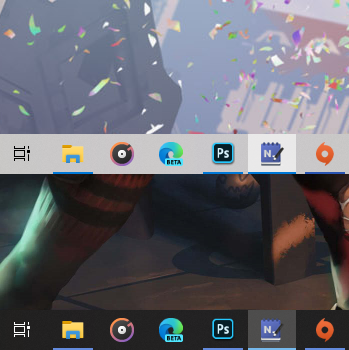
i also discovered that the screenshots i made had notepads icon 4 pixels larger than every other app icon, so here's how it would rather look in terms of size
mah-qurashy
on 23 Apr 2020
Soft shadows really help
SOI7
on 23 Apr 2020
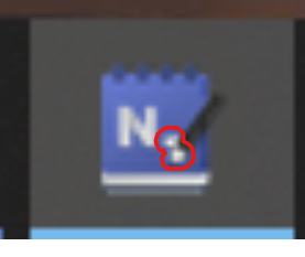
as for, this is a problem, this make 2 little white points
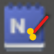
the pencil have 2 points (please don't have bad ideas)
FJduFou
on 23 Apr 2020
as for, this is a problem, this make 2 little white points
this is true, as i said this is just resizing
smaller sizes could be redrawn to have more readability

mah-qurashy
on 23 Apr 2020
this is true, as i said this is just resizing
smaller sizes could be redrawn to have more readability
yea, it's better, but, the pencil is important?
FJduFou
on 23 Apr 2020
@mah-qurashy I think we should just remove the pencil, reason is simple: It looks good on large icon but since user will spend more time on viewing the smaller ones, we should just make sure the smaller icon looks solid and good. Thoughts?
JasonStein
on 24 Apr 2020
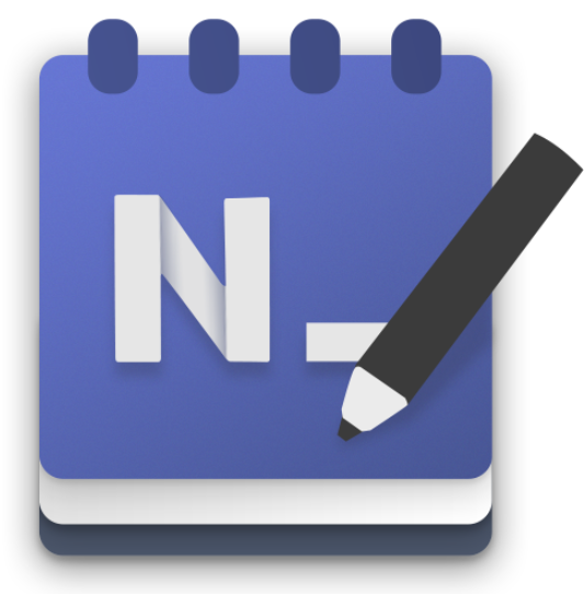
Can you remove the pencil in this one and show the small variants here? @mah-qurashy
JasonStein
on 24 Apr 2020
@JasonStein
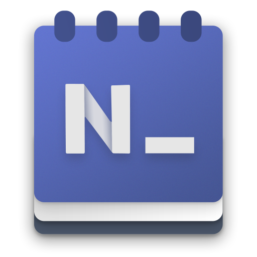
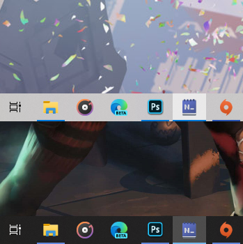
mah-qurashy
on 24 Apr 2020
also we could use the current icon color theme
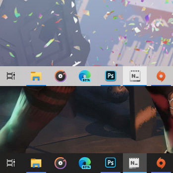
mah-qurashy
on 24 Apr 2020
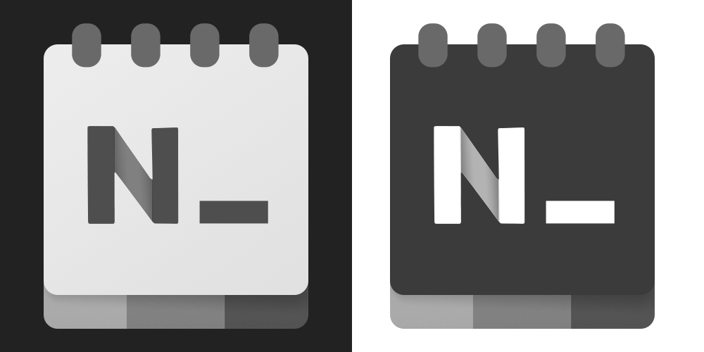
mah-qurashy
on 24 Apr 2020
yes, very good
FJduFou
on 24 Apr 2020
The bottom bar for dark icon should be reverse of the light icon. Also can you make the width bit more to make it rectangular rather than square.
 soumyamahunt
on 24 Apr 2020
soumyamahunt
on 24 Apr 2020
The bottom bar for dark icon should be reverse of the light icon. Also can you make the width bit more to make it rectangular rather than square.
Yea, why not, for reverse.
But for the square, I'm not agree with you because if more square, the bot is more big and don't follow this:

(New terminal icon)
FJduFou
on 24 Apr 2020
did reverse bottom bar and slightly increase vertical length
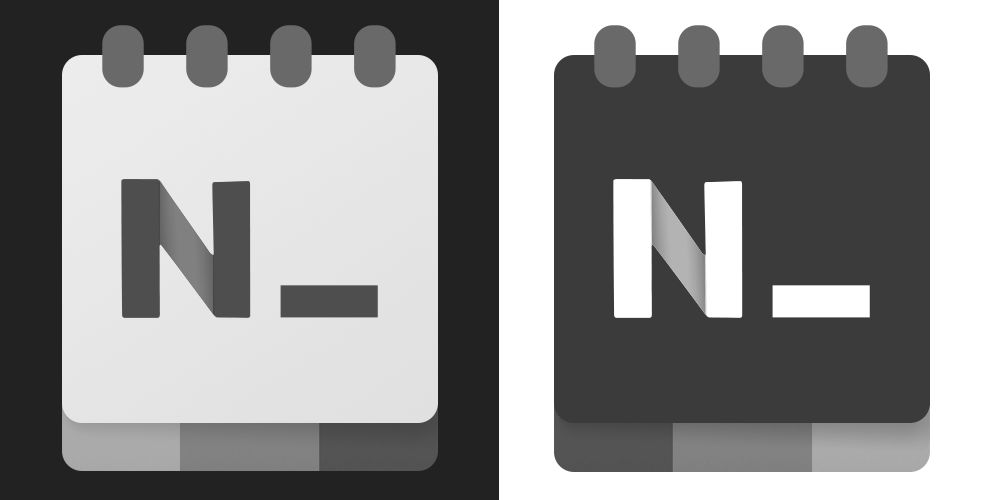
mah-qurashy
on 25 Apr 2020
@mah-qurashy
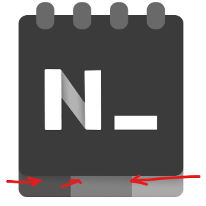
Can you increase the overall shadow behind all elements and especially the bottom edge? I feel it will look better in small sizes. Also reduce the color intensity of the darkest tab at the bottom to make it contrast more with cover frame.
Once done, can you paste them in small sizes as well? looks like we are on the good track for a new icon. Thanks for the hard work! Really appreciate!
JasonStein
on 25 Apr 2020
@JasonStein
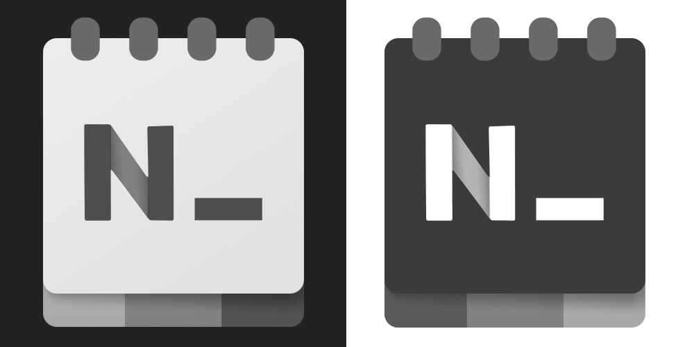
mah-qurashy
on 26 Apr 2020
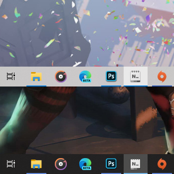
mah-qurashy
on 26 Apr 2020
Looks pretty good, what about shadow under "N" and "_"?
JasonStein
on 26 Apr 2020
Looks pretty good, what about shadow under "N" and "_"?
i actually removed that because it would be barely visible on the dark icon, also on the light one it would make the N_ look a bit blurry for smaller sizes
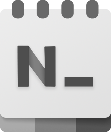
mah-qurashy
on 29 Apr 2020
Looks pretty good, what about shadow under "N" and "_"?
i actually removed that because it would be barely visible on the dark icon, also on the light one it would make the N_ look a bit blurry for smaller sizes
You are right, the shadow has to be darken enough to make it stands out, otherwise we should drop the shadow at all. Take windows terminal's icon as example:
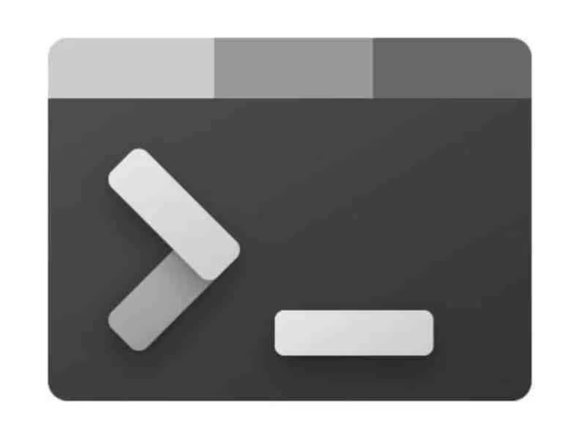
Btw, make sure your icon is pixel perfect so it won't look blurry when downscale to relative sizes.
In case you don't know, this is what I mean: https://icons8.com/articles/make-pixel-perfect-icons/
If you think adding the shadow won't make it look better, I am perfectly fine with that. This is already prefect and much better than what we have right now. I am looking forward to your PR btw:)
JasonStein
on 29 Apr 2020
Thanks @mah-qurashy for the hard work! Now we have a new redesigned icon!
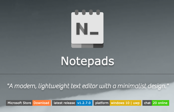
JasonStein
on 2 May 2020
Closing this thread for now unless someone has a better idea. I am pretty satisfied with @mah-qurashy 's work here. I think this is exactly what I wanted 🤟
JasonStein
on 2 May 2020
in case someone is interested, i have uploaded psd files for the new icons at https://github.com/mah-qurashy/Notepads-Icon
mah-qurashy
on 2 May 2020
You guys nailed it on the icon, btw. Looks fresh. I had a giddy little jump for joy when I saw the new icon appear on my start menu after an auto-update.
 stamminator
on 11 May 2020
stamminator
on 11 May 2020
Yeah, I too just want to say great job on the icon - fits well into the new Windows icon family while still resembling what it was previously. Well done.
 sotakal
on 13 May 2020
sotakal
on 13 May 2020
Related issues
 entdark
·
4Comments
entdark
·
4Comments
 frousselet
·
3Comments
frousselet
·
3Comments
 kompjoefriek
·
4Comments
kompjoefriek
·
4Comments
 pnp0a03
·
3Comments
pnp0a03
·
3Comments
 MC-Guan
·
4Comments
MC-Guan
·
4Comments
Most helpful comment