
All 878 comments
greate job
 i5ting
on 3 Dec 2014
i5ting
on 3 Dec 2014
I can't wait to stick that hard drive on my laptop lid.
 karlbright
on 3 Dec 2014
karlbright
on 3 Dec 2014
Maybe something more simple?
I love @substack 's proposal but don't know if it will be easy to stamp on tshirts and that kind of stuff logos are mostly used for.
svg here
 ghostbar
on 3 Dec 2014
ghostbar
on 3 Dec 2014

 zeke
on 3 Dec 2014
zeke
on 3 Dec 2014
+1 for @zeke
 andrewliebchen
on 3 Dec 2014
andrewliebchen
on 3 Dec 2014

During my lunch break.
karlbright
on 3 Dec 2014
+1 for @karlbright, nice job!
 ryanstevens
on 3 Dec 2014
ryanstevens
on 3 Dec 2014
I'm with @substack. Octagon O, binary, 10, etc. Probably needs the full "js" as a kicker, but that's for later.

svg under public domain "license".
 jbergstroem
on 3 Dec 2014
jbergstroem
on 3 Dec 2014
sticker pack:

licence: public domain or CC0 at your choice
 substack
on 3 Dec 2014
substack
on 3 Dec 2014
@substack these are really cool. nice work!
 travisjeffery
on 3 Dec 2014
travisjeffery
on 3 Dec 2014
@zeke does it also come in JavaScript yellow?
 yoshuawuyts
on 3 Dec 2014
yoshuawuyts
on 3 Dec 2014
"I" and an octagonal "O" in the z axis.

 hacksparrow
on 3 Dec 2014
hacksparrow
on 3 Dec 2014
@substack It's 2014 now can't we at least have SSD for the log? :P
 coodoo
on 3 Dec 2014
coodoo
on 3 Dec 2014
a kind of silly 4-color: 
 chrisdickinson
on 3 Dec 2014
chrisdickinson
on 3 Dec 2014
also, some jupiter transit: 
(based on
 and
and ![]() )
)
I think @substack's is my favorite thus far, though :)
chrisdickinson
on 3 Dec 2014
The inner star is an (irregular) octagon. It looks similar to Shuriken, a weapon of (JavaScript) ninja.

 kt3k
on 3 Dec 2014
kt3k
on 3 Dec 2014
@substack beautiful.
 sintaxi
on 3 Dec 2014
sintaxi
on 3 Dec 2014
@karlbright's one is my favorite so far, with a small change the yellow circle made to octagon
 greelgorke
on 3 Dec 2014
greelgorke
on 3 Dec 2014
@kylebright nice idea, but I'd switch the arrow direction, as currently it's accidentally symbolising backwards (anti-clockwise) movement, which as a forward thinking project it is symbolising the opposite of what we desire to do.
@zeke wasn't that logo style used by google I/O conference at some point?
On @substacks' design? It'll become illegible at smaller resolutions and printing will likely bleed. Also if seen in grey-scale it'll loose clarity. Similar on @chrisdickinson's Jupiter design, although I do love that rusty red color.
Given all my words here, I'll work on a few concepts when I get a moment.
 ThisIsMissEm
on 3 Dec 2014
ThisIsMissEm
on 3 Dec 2014
As a bystander:
- [ ] Choose mascot geometry shape
- Octagon — see Federick II
- Hexagon — the de-facto standard Web-ish shape
- other…
- [ ] Choose colors
- JS-ish Yellow — unoffical but stabilized
- Acid Green — Node style
- Red — aggressive, attack first
- @substack’s 80s Galore — freaking awesome
- other…
- [ ] Choose style
- @zeke’s minimalist
- @substack’s cell-shaded, reduced, minimalist figurative
- @chrisdickinson’s space-oriented, figurative, decorative
- @karlbright’s metaphoric
- other…
The octagon is IMHO fantastic. It has always been the symbol for rational thought, and I love it. But it’s not stackable as an hexagon is. So we’re losing some points on the ‘scalability’ concept there.
@substack colors are fantastic, but work only on figurative designs.
JS-ish yellow-ish is by far the easiest path.
 yuchi
on 3 Dec 2014
yuchi
on 3 Dec 2014
@kt3k By the way, I personally don‘t like the idea of JS-ers to be ninjas. Quick, dirty and criminal. (I love ninjas anyway). If we have to go criminal let’s go pirate :)
yuchi
on 3 Dec 2014
And a last note, the harddrive in @substack idea is perfectly executed but lacks of comunicative energy. Is io.js just a library for async disk io operations?
yuchi
on 3 Dec 2014
Got to spend a little more time at having another crack with some ideas before leaving work. Someone can polish these up if they say any potential, it definitely needs more time.
Idea being the octagon for V8 as @substack mentioned. Then the right hand side being the node colour and looking like an arrow forward before forming an I as the colours transition. This can work in B&W as well with some work and seperation between some elements. The "ribbons" were kind of meant as a way to show I/O without throwing arrows around.


license: public domain / CC0
karlbright
on 3 Dec 2014
@karlbright +1 (I really like the 2nd one)
 madbence
on 3 Dec 2014
madbence
on 3 Dec 2014
@karlbright very much looks like "no" rather than "i/o"
 phpnode
on 3 Dec 2014
phpnode
on 3 Dec 2014
@phpnode haha perfect!
 juliangruber
on 3 Dec 2014
juliangruber
on 3 Dec 2014
@phpnode I agree, needs some work. perhaps the I is formed from the bottom, or not joined at all. Throw around some ideas.
karlbright
on 3 Dec 2014
i'm doing loads of online 3D stuff these days so i did this mock-up..

here is the live demo & GLSL code
i think it could easily be simplified for e.g. a t-shirt print (something like a threshold filter : )
[edit]
threshold version looks like this (_needs tidying, this is just an very crude example_)

[/edit]
 joates
on 3 Dec 2014
joates
on 3 Dec 2014
I like @zeke's the best so far. We should try to avoid anything cartoony. Node/io.js is simple and low level but very powerful which is why I would want a simple, elegant logo. The only issue with @zeke's is that it is not unique/easily identifiable. Perhaps a variation of this with a couple tweaks to make it unique.
 jeffwhelpley
on 3 Dec 2014
jeffwhelpley
on 3 Dec 2014
@zeke's is really great but doesn't it bear too much resemblance to Node's logo style with the hexagons?
:+1: @karlbright, shadows on the second one are great - the style in general works well as it can easily be flattened and look good as a silhouette.
Let's not forget the importance of how the logo will look when it's desaturated/flat/turned into a decal.
 basicallydan
on 3 Dec 2014
basicallydan
on 3 Dec 2014
@chrisdickinson +1
 indutny
on 3 Dec 2014
indutny
on 3 Dec 2014
@karlbright +1
love the 2nd one~
 nighca
on 3 Dec 2014
nighca
on 3 Dec 2014
@karlbright 's first one :+1:
Only the bright yellow area doesn't set itself enough apart from the white background.
 jhnns
on 3 Dec 2014
jhnns
on 3 Dec 2014
oh, actually! @karlbright they are looking awesome.
indutny
on 3 Dec 2014
Flipping the slash there and making it layer in a clockwise motion, and I think it’d look great!
— Micheil
On 3 Dec 2014, at 9:16 am, Karl Brightman [email protected] wrote:
Got to spend a little more time at having another crack with some ideas before leaving work. Someone can polish these up if they say any potential, it definitely needs more time.
Idea being the octagon for V8 as @substack mentioned. Then the right hand side being the node colour and looking like an arrow forward before forming an I as the colours transition. This can work in B&W as well with some work and seperation between some elements.
license: public domain / CC0
—
Reply to this email directly or view it on GitHub.
ThisIsMissEm
on 3 Dec 2014
Why don’t we go crazy with octagons on something nerdy like this:

It’s an hyperbolic plane, with a regular octagonal tessellation. See http://gamedev.stackexchange.com/a/68271
yuchi
on 3 Dec 2014
Scribbles.

karlbright
on 3 Dec 2014
The bottom one looks inline with what I was thinking; I suspect the / may still look
better overlayed on top of the I though.
On 3 Dec 2014, at 12:21 pm, Karl Brightman [email protected] wrote:
Scribbles.
—
Reply to this email directly or view it on GitHub.
ThisIsMissEm
on 3 Dec 2014
@karlbright your sketches look great!
ghostbar
on 3 Dec 2014
Wow. Just wow. I love everyone's designs so much.
Can we have like a bunch of logos? :D
 Fishrock123
on 3 Dec 2014
Fishrock123
on 3 Dec 2014
ya like @substack's sticker pack! rotating logo spectrum
 reqshark
on 3 Dec 2014
reqshark
on 3 Dec 2014
I wish you could upvote comments.
I _really_ like @chrisdickinson's triangle one, but it's pretty subtle.
Also like: @jbergstroem's IO, @substack's sticker pack, @karlbright's IO.
Fishrock123
on 3 Dec 2014
@Fishrock123, hey good point. i also really like this node forward one from the website 
reqshark
on 3 Dec 2014
@reqshark I'd rather we come up with something ourselves haha, I think we should leave that for node-forward. :)
Fishrock123
on 3 Dec 2014
At first I was worried about using hexagons because when Node Forward had a hexagon based logo it was something Joyent was upset about and so I changed it hoping they would calm down (they didn't). Now that I've had some time to think about it though I don't think it matters, you can't trademark hexagons, and we aren't calling it node-* so whatever.
@karlbright I love where your's is going, especially the color fade from JS yellow to Node green. My only concern is how this might work on stickers. Perhaps if the "I" was _inside_ the hexagon, that would also solve the "No" issue.
 mikeal
on 3 Dec 2014
mikeal
on 3 Dec 2014
@karlbright playing on one of your earlier designs

mikeal
on 3 Dec 2014
@mikeal let them sue all of them: https://encrypted.google.com/search?q=hexagon+logo&hl=en&gbv=2&source=lnms&tbm=isch&sa=X&ei=TyJ_VNGqMoaoyAT0vICABw&ved=0CAgQ_AUoAQ&biw=1920&bih=1075#hl=en&gbv=2&tbm=isch&q=hexagon+logo
greelgorke
on 3 Dec 2014
@greelgorke in everywhere but Brazil, trademarks are specific to an _area_, so they have "node.js" in software with a reference to their hexagon design. The test for infringement is "can one be confused for the other" and so being a fork is part of the context. That said, our name is sufficiently different that a reasonable person can tell them apart so I don't think it's a problem.
mikeal
on 3 Dec 2014
@mikeal +1 But what about a rounded octagon?

yuchi
on 3 Dec 2014
(built with inkscape, polygon w/ 8 sides and 0.154 of rounding)
yuchi
on 3 Dec 2014
Hey everyone, rather than everyone just giving plus ones, why don't we come up with a few designs, then open a new ticket with the options and vote on it there?
That way here we can really hone in on ideas.
On 3 Dec 2014, at 14:17, Bent Cardan [email protected] wrote:
@Fishrock123, hey good point. i also really like this node forward one from the website
—
Reply to this email directly or view it on GitHub.
ThisIsMissEm
on 3 Dec 2014
@miksago I don't think we're at the final vote phase yet, let's keep throwing up ideas and collaborating for a while :)
mikeal
on 3 Dec 2014
We could also put the finalists up on the new iojs.org and have a real form to vote with instead of just +1 anarchy.
 cjihrig
on 3 Dec 2014
cjihrig
on 3 Dec 2014
A good exercise might be to include a sticker cut with each logo.
mikeal
on 3 Dec 2014
I like what @cjihrig is thinking.
@mikeal agreed.
Fishrock123
on 3 Dec 2014
Really love @karlbright's approach, feels very original / fresh... not sure the branding should orbit around the almighty sticker... Maybe have him come up with some ideas on how it could work in a sticker format? Maybe a few alternate configurations focused on different contexts?
 jondavidjohn
on 3 Dec 2014
jondavidjohn
on 3 Dec 2014
Here's a 10 minute idea :+1:


¯_(ツ)_/¯
 rafaelconde
on 3 Dec 2014
rafaelconde
on 3 Dec 2014

just a thought...
 christianallen
on 3 Dec 2014
christianallen
on 3 Dec 2014
or with blending...

christianallen
on 3 Dec 2014
+1 on @christianallen's second one (i.e. the blended)
jeffwhelpley
on 3 Dec 2014
ohhhh @christianallen :clap: :clap: :clap: (blended version)
jondavidjohn
on 3 Dec 2014
Love @yuchi 's octagonal rounded yellow
 danjenkins
on 3 Dec 2014
danjenkins
on 3 Dec 2014
+1 for color parity with the js and js next logos (yellow/black)
 donabrams
on 3 Dec 2014
donabrams
on 3 Dec 2014
Ok, two more:


rafaelconde
on 3 Dec 2014
+1 @karlbright (especially the second one above with the paper shadows), @zeke the simple black one, maybe in yellow, and @rafaelconde with these super simple ones above.
 therebelrobot
on 3 Dec 2014
therebelrobot
on 3 Dec 2014
@rafaelconde I really like the versatility of this design, you could see it being using in a variety of colors, easy stickers, and simple to make variations for other projects.
-1 on having ".js" in the logo :)
mikeal
on 3 Dec 2014
@mikeal it should be recognisable and scalable.
The problem with yellow is that with a white background and small size, it starts to blend with the background.
Glad you like it :+1:
rafaelconde
on 3 Dec 2014
@rafaelconde ya, but yellow would be great with no background on a silver macbook as a sticker :)
mikeal
on 3 Dec 2014
I <3 @zeke's first entry
(Hey @zeke if that doesn't get chosen, could @nodebots use it for our "IO Plugin" ecosystem? Come chat with us: https://gitter.im/rwaldron/johnny-five)
 rwaldron
on 3 Dec 2014
rwaldron
on 3 Dec 2014
@karlbright's is rad!
 tkellen
on 3 Dec 2014
tkellen
on 3 Dec 2014
@rafaelconde get me a circle PNG and I'll try to have stickers ready for JSFest :)
mikeal
on 3 Dec 2014
Here's the reason for my hesitation with @zeke's:
https://ui8.net
rafaelconde
on 3 Dec 2014
@mikeal done, with or without ".js"?
rafaelconde
on 3 Dec 2014
@rafaelconde no .js, it'll be a round die cut sticker :)
mikeal
on 3 Dec 2014
@mikeal do you have an email address I could send it to?
rafaelconde
on 3 Dec 2014
just post it here :)
mikeal
on 3 Dec 2014
Here:


rafaelconde
on 3 Dec 2014
@rafaelconde like it but it looks like a power switch, also the blue version you posted is really close to gravatar's logo / blank placeholder image (really similar blue too),

phpnode
on 3 Dec 2014
@phpnode you're right! Haven't thought about that :+1:
Maybe because of the blue background, because the gem itself I feel it's different enough. But then again, it's a very minimal approach. It's hard to be unique with two basic shapes, for the context, I think it works.
rafaelconde
on 3 Dec 2014
@rafaelconde's logo is also reminiscent of a flattened version of 1password's logo.
@zeke has the best so far, still.
andrewliebchen
on 3 Dec 2014
<3 @chrisdickinson's jupiter design's!
 tomgco
on 3 Dec 2014
tomgco
on 3 Dec 2014
LOL I assumed that @rafaelconde's was SUPPOSED to be a power switch. I.e. Power your web with io.js or something.
Love it, also love @zeke's. If you make stickers @mikeal you have to save me one as a Sponsor :D
 kenperkins
on 3 Dec 2014
kenperkins
on 3 Dec 2014
Amazing contributions from everyone. I'm so blessed to be in this community. I really like the power button :)
 ralphtheninja
on 3 Dec 2014
ralphtheninja
on 3 Dec 2014
+1 @zeke
IO in white inside a black hexagon.
 lfortin
on 3 Dec 2014
lfortin
on 3 Dec 2014
:+1: for @zeke! The crisp corners help to distinguish it from https://ui8.net, and it'd work really well at just about any size.
(Also, :+1: * 0.75 for @yuchi.)
 hegemonic
on 3 Dec 2014
hegemonic
on 3 Dec 2014
+1 for @zeke. Maybe make it an octagon (for V8), and it could come in yellow?
 dconnolly
on 3 Dec 2014
dconnolly
on 3 Dec 2014
 zeke
on 3 Dec 2014
zeke
on 3 Dec 2014

 iamdustan
on 3 Dec 2014
iamdustan
on 3 Dec 2014
(BTW everyone download this one from @zeke if you’re using Atom: https://github.com/zeke/atom-icon)
yuchi
on 3 Dec 2014
I'm thinking an octagon inside a hexagon.
 stuartpb
on 3 Dec 2014
stuartpb
on 3 Dec 2014
@zeke last one with the inverse color option is good.
 naed11
on 3 Dec 2014
naed11
on 3 Dec 2014

 firede
on 3 Dec 2014
firede
on 3 Dec 2014
@zeke :clap::clap::clap::clap::clap::clap::clap::clap:
yoshuawuyts
on 3 Dec 2014
Quick-and-dirty Inkscape mockup of the design elements I'd go for:

I'm in favor of something simple like this or @jbergstroem's, but the "I" needs serifs or a dot so it doesn't look like "10".
Also, the overlapping-color ones like @karlbright's end up looking more like a logo for Google I/O (not to mention they don't work in monochrome).
stuartpb
on 3 Dec 2014
For completeness:

yuchi
on 3 Dec 2014
And a sharper one (with stroke)

yuchi
on 3 Dec 2014
w/ the space and io theme maybe it'd be cool to explore NASA and other space org designs/logos.
 derekr
on 3 Dec 2014
derekr
on 3 Dec 2014
I really like the Gallilean moon themed ones, especially @chrisdickinson 's.

 aearly
on 3 Dec 2014
aearly
on 3 Dec 2014

Based on a flattened tesseract:

 grownseed
on 3 Dec 2014
grownseed
on 3 Dec 2014
Basic google image search for old nasa patches to serve as benchmarks/inspiration.
nasa001

juno001

nasa002

nasa003

derekr
on 3 Dec 2014
I really like @karlbright's sketches and his original mockups. I like the arrow forward + io combination.
 talon
on 3 Dec 2014
talon
on 3 Dec 2014
I thought I'd give this a go. Based on the octagon idea but mixed with the sort of style from the HTML5 and CSS3 logos.

I do really like @karlbright's ones too.
Licence: public domain/CC0
 CodeFoodPixels
on 3 Dec 2014
CodeFoodPixels
on 3 Dec 2014
I like the arrow forward + io combination.
@LegitTalon agreed. The arrow forward is a nice touch. https://github.com/iojs/io.js/issues/37#issuecomment-65376404
 timhudson
on 3 Dec 2014
timhudson
on 3 Dec 2014
@grownseed’s projected tesseract idea is fantastic, even if I don’t like the execution.
yuchi
on 3 Dec 2014
Some iterations of an idea

 vweevers
on 3 Dec 2014
vweevers
on 3 Dec 2014

svg
licence: public domain/CC0
substack
on 3 Dec 2014
Dangggg! I like those a lot.
derekr
on 3 Dec 2014
Wow, agreed. @substack great work.
naed11
on 3 Dec 2014
+1 @substack you never cease to amaze
therebelrobot
on 3 Dec 2014

 aredridel
on 3 Dec 2014
aredridel
on 3 Dec 2014
@substack wow.. that. that is fabulous.
Fishrock123
on 3 Dec 2014
Wow, @substack
aredridel
on 3 Dec 2014
I liked @karlbright's second one but thought it did look like a no at first, here is his flipped vertically

edit: which he suggested might look good so I flipped it myself to check
 calvinmetcalf
on 3 Dec 2014
calvinmetcalf
on 3 Dec 2014
+1 @calvinmetcalf and @karlbright
therebelrobot
on 3 Dec 2014
 substack
on 3 Dec 2014
substack
on 3 Dec 2014
+1 @zeke /yellow/
 gaearon
on 3 Dec 2014
gaearon
on 3 Dec 2014
+1 @substack something fun and drastically different from nodejs is a good thing
 rayshan
on 3 Dec 2014
rayshan
on 3 Dec 2014
Nice work everyone. @derekr great inspiration. @zeke @chrisdickinson @vweevers @firede: dig all of those.
@substack love the technicolor edition. Thats the front runner for me.
sintaxi
on 3 Dec 2014
My favorite part of @substack's new Jupiter designs are that the mark can be de-coupled from color treatment, allowing tremendous flexibility. It's also not obviously trying to copy node, which is also a good thing.
kenperkins
on 3 Dec 2014
+1 @substack + @calvinmetcalf + @karlbright
 betacar
on 3 Dec 2014
betacar
on 3 Dec 2014
@calvinmetcalf @karlbright really like this but it definitely reads as KO, how does it look without the connecting slash?, @substack's is fabulous but looks like the number 10.
Note: sorry for not contributing anything other than criticism in this thread, but my ms paint skills ain't what they used to be
phpnode
on 3 Dec 2014

Some spacetheme and polygon. Don't know how to chose colors tho..
I'm thinking someone else can do better with the idea of using the "i" as a orbit trail and space object and the O as it's planet.
 CarsonBanov
on 3 Dec 2014
CarsonBanov
on 3 Dec 2014
+1 for @zeke's IO in a hexagon. IMHO the simplest is the best.
 bajtos
on 3 Dec 2014
bajtos
on 3 Dec 2014

 lxe
on 3 Dec 2014
lxe
on 3 Dec 2014
@lxe :+1:
 benmkramer
on 3 Dec 2014
benmkramer
on 3 Dec 2014
@substack :+1::+1::+1::+1::+1::+1::+1:
CodeFoodPixels
on 3 Dec 2014
Yep, @substack's logo in https://github.com/iojs/io.js/issues/37#issuecomment-65484765 is the only version I really liked so far.
It looks good in highres, and can easily be simplified to a small favicon.
Others are... either too complex, or too simple. It's hard to get the right balance there.
 rlidwka
on 3 Dec 2014
rlidwka
on 3 Dec 2014
@karlbright +1 for the logo ;)
 bodokaiser
on 3 Dec 2014
bodokaiser
on 3 Dec 2014
@substack 's latest is beautiful.
@karlbright how does it look when the ribbon from the I to the O "folds behind" the I?
aearly
on 3 Dec 2014
The IO is ever watchful.
 kriskowal
on 3 Dec 2014
kriskowal
on 3 Dec 2014
I like the space theme, but I feel like depicting Jupiter so explicitly is confusing. I made a sketch of what could be used to keep the moon imagery without appearing so busy.

 tjbrennan
on 3 Dec 2014
tjbrennan
on 3 Dec 2014
Apologies in advance for being pedantic, but the spelling of Jupiter's moon is "Io" (not "IO"), and there is already a programming language named "Io", whose binary is named "io". Co-opting another programming language's "thing" is uncool.
rwaldron
on 3 Dec 2014
Go had the same problem :wink: (issue, status: unfortunate)
madbence
on 3 Dec 2014
disambiguation edition:

licence: public domain / cc0
J style is from JPL logo, S style is from NASA logo
substack
on 3 Dec 2014
@substack can you adjust the height of the "I" to match the Jupiter, and to give it a bit more balance?

lxe
on 3 Dec 2014
+1 to adjusting the height of @substack's otherwise delightful effort per @lxe's suggestion.
I also like that it feels like the Monolith orbiting Jupiter.
 seldo
on 3 Dec 2014
seldo
on 3 Dec 2014
These are so wonderful! <3
 ceejbot
on 3 Dec 2014
ceejbot
on 3 Dec 2014
@lxe:

substack
on 3 Dec 2014
Definitely better! I personally don’t like the lettering :|
yuchi
on 3 Dec 2014
The Great Red Spot works really well as the dot in io.js.
 gkatsev
on 3 Dec 2014
gkatsev
on 3 Dec 2014
oooh that's cool.
zeke
on 3 Dec 2014
@gkatsev Definitely. +1 @substack
therebelrobot
on 3 Dec 2014
My take on @substack’s

yuchi
on 4 Dec 2014
+1 @yuchi hexagon
 AbeEstrada
on 4 Dec 2014
AbeEstrada
on 4 Dec 2014
+1 @yuchi hexagon, but the orbit streak needs an outline or something over the planet, so you can make it out
 SomeoneWeird
on 4 Dec 2014
SomeoneWeird
on 4 Dec 2014
Jupiter is very nice, great direction! But other details need to be just as well executed as Jupiter.
I like @yuchi's variation but still not sure about “I”. Something about it seems wrong.
gaearon
on 4 Dec 2014
So good!
zeke
on 4 Dec 2014
By the way this is gonna be a rush to be the first posting an idea or a modification. Let’s put a long deadline, so we can take our time thinking.
yuchi
on 4 Dec 2014
@yuchi I think there should be a little scattering of tiny black rectangles near the Red Spot. https://www.youtube.com/watch?v=38EDhpxzn2g
(I think this is a great logo sketch and am happy to see it inside a hexagon.)
 othiym23
on 4 Dec 2014
othiym23
on 4 Dec 2014
(actually is @substack’s, I just refined it to my personal taste :P)
yuchi
on 4 Dec 2014
@yuchi this is a collaboration. :)
zeke
on 4 Dec 2014
I tried to give my submission when Node was in the redesign stage too.
I’m happy to see io.js asking directly for it.
And to everyone reading/proposing logos: I’d love to see this project succeed.
yuchi
on 4 Dec 2014
The swoop is much more raygun gothic, I like it. Perhaps it should fold back behind the "I" to give it more depth?
substack
on 4 Dec 2014
z-space magic
zeke
on 4 Dec 2014
Here is the svg: https://gist.github.com/yuchi/44a4f59be9cf68d83dd4
license: CC0
yuchi
on 4 Dec 2014
Actually is not a brush, but two ellipses one removed from the other, so the svg cannot help that much in modifying it. For vector beginners: To add depth just split the I in two (top and bottom) and place the bottom part on top of the swoosh.
BTW I’m totally in line with @rwaldron note on the io programming language.
yuchi
on 4 Dec 2014
This is amazing work. Good stuff everyone.
Is CC0 really the best license? I find the concept of waiving moral rights to be largely unethical. Although the iojs brand should be completely open and free to use. I don't feel those who have contributed should have to waive their moral rights and it is better for the iojs brand if the artists retain that very basic protection.
sintaxi
on 4 Dec 2014

 cianomaidin
on 4 Dec 2014
cianomaidin
on 4 Dec 2014
@sintaxi CC0 is a public domain dedication (https://creativecommons.org/publicdomain/zero/1.0/deed.en) but with extra language for jurisdictions that don't strictly have a simple way of disavowing copyright to the public domain.
I'm releasing my logos here as public domain/cc0 because I would rather people just did whatever they pleased with the images without the burden of attribution.
substack
on 4 Dec 2014
+1 @yuchi Really like the Jupiter.
 Eunoia
on 4 Dec 2014
Eunoia
on 4 Dec 2014
@substack no doubt awesome of you and I agree with the sentiment. By using this licence I see exposure here that could be negative to the project. I think this license would be perfect if it was waiving all economic rights, but not moral rights (just like MIT, ISC, BSD).
By waiving moral rights, anyone would be free to use use the brand in ways that may damage your reputation because you waived your right to attribution (including your right to not be attributed). Although this is unlikely, it is still exposure to you as a artist/contributor and thus that exposure transfers to the project itself which to me isn't a positive.
TLDR; IMHO art contributions should waive all economic rights and retain moral rights, just like the code.
sintaxi
on 4 Dec 2014
I'm going to ignore voting in this thread and just pay attention to what stickers I see the most over the next few months :)
mikeal
on 4 Dec 2014
By waiving moral rights, anyone would be free to use use the brand in ways that may damage your reputation because you waived your right to attribution
"right to attribution" is too restrictive, because no matter how small part you're copying, you have to include all the legal boilerplate with it.
I usually prefer WTFPL license over MIT because of this.
rlidwka
on 4 Dec 2014
like @karlbright's sketch. very similar to the infinity symbol but is not infinite. a callback never called is infinite however a "healthy" event loop isn't.
 binarykitchen
on 4 Dec 2014
binarykitchen
on 4 Dec 2014
@rlidwka "right to attribution" does not mean that attribution is required. It means the artist can object to misattribution or request their name be removed if the artwork is being used for a purpose not intended by the artist, and thus could damage their reputation as a result. I would prefer if the artists retained this very basic protection as it would offer some measure of protection to the iojs project by proxy.
sintaxi
on 4 Dec 2014
My tweaks on @yuchi's tweaks on @substack's design:

Made it appear as if the swish ends behind the I and made the swish and moon on the hexagon version white for contrast.
svg: https://gist.github.com/lukeb-uk/c3484145000062c685cd
License: CC0
CodeFoodPixels
on 4 Dec 2014
The Jupiter directions are way too complicated. There's Jupiter, the red spot, the moon, the swoosh, the "I", the hexagon. When you consider the most effective tech logos, they're comprised of very few components.
This is why I like @zeke's logo. It's the Node hexagon (history). It's the "IO" name. It's black because this is a pirate operation. It's striking, recognizable, works well at a variety of sizes.
andrewliebchen
on 4 Dec 2014
+1 @zeke 's - super simple and to the point and almost everyone will immediately "get it"
 shorttompkins
on 4 Dec 2014
shorttompkins
on 4 Dec 2014
I've just realised what @zeke's reminds me of. 10 Downing Street (headquarters of the British government):

CodeFoodPixels
on 4 Dec 2014

 RGBboy
on 4 Dec 2014
RGBboy
on 4 Dec 2014
I dig the @lxe enhanced version unambiguous @substack : https://github.com/iojs/io.js/issues/37#issuecomment-65506457
I don't think there needs to be one winner here -- different mediums may benefit from different logo styles. Embrace the diversity before we trigger another fork :smile:
 jmonster
on 4 Dec 2014
jmonster
on 4 Dec 2014
:+1: for @lukeb-uk's tweaks on @yuchi's tweaks on @substack's design. Hex version.
:+1: for @zeke with the yellow hex
https://cldup.com/u6j8ggQJ9p.svg
Ultimately I think I lean toward's @zeke's version for many of the reasons @andrewliebchen raises, but I'd hang a print of a montage of all the designs created by @substack in my office if it was available. so much good.
 brock
on 4 Dec 2014
brock
on 4 Dec 2014
Sticking to my tesseract idea for now :)


grownseed
on 4 Dec 2014
More personal tweaks on @yuchi, @substack's work:
Made it more minimal, opted for lighter, flatter colors

 fhinson
on 4 Dec 2014
fhinson
on 4 Dec 2014
+1 @fhinson ; would put that hex sticker on my laptop!
ceejbot
on 4 Dec 2014
:+1: @fhinson. Here's my stab at it.

it has that, "I'd bring that home to mom" feel
brock
on 4 Dec 2014
 fhinson
on 4 Dec 2014
fhinson
on 4 Dec 2014

Just for fun ^^^
there is already a programming language named "Io", whose binary is named "io". Co-opting another programming language's "thing" is uncool.
@rwaldron raises a good point which probably warrants it's own discussion.
timhudson
on 4 Dec 2014
For fun

license: public domain
 xta
on 4 Dec 2014
xta
on 4 Dec 2014
Really like @RGBboy's entry, for the lettering, use of negative space, and subtle hint at the node hexagon. @zeke's is great as well. Simpler = better for logo design IMO, they generally need to work at small sizes and in black & white.
 af
on 4 Dec 2014
af
on 4 Dec 2014
@fhinson's latest refinement of @substack's idea is my favourite so far, @zeke's a strong second. I think the planet idea could be made even more minimal, eliminating the orange stripes for just a black-on-yellow or yellow-on-black color scheme borrowed from zeke.
seldo
on 4 Dec 2014
+1 @karlbright the 2nd
 norfish
on 4 Dec 2014
norfish
on 4 Dec 2014

A hybrid of @zeke and @substack, kind of. You can try slapping a .JS in there, but it would eventually have to not be Helvetica.

 lucthev
on 4 Dec 2014
lucthev
on 4 Dec 2014
looked through these, don't know who to credit at this point...probably everybody.
JS came from the standard javascript logo (couldn't find a font), and the IO is in Montserrat

 blakev
on 4 Dec 2014
blakev
on 4 Dec 2014

 penn300bb
on 4 Dec 2014
penn300bb
on 4 Dec 2014
Nice work @penn300bb! Is that bread in the background?
 rvagg
on 4 Dec 2014
rvagg
on 4 Dec 2014
io.js - Is that bread in the background?
karlbright
on 4 Dec 2014

RGBboy
on 4 Dec 2014

 KalebClark
on 4 Dec 2014
KalebClark
on 4 Dec 2014
@yuchi +1
how are the decision gonna be taken :P
 dvidsilva
on 4 Dec 2014
dvidsilva
on 4 Dec 2014
@lucthev, I like your idea, but would be better with an orbit of a different color from the text's color.
 micnic
on 4 Dec 2014
micnic
on 4 Dec 2014
+1 @yuchi hexagon
 hex7c0
on 4 Dec 2014
hex7c0
on 4 Dec 2014
Here is my contribution to this!

 cgmx
on 4 Dec 2014
cgmx
on 4 Dec 2014
I love @RGBboy's first design, sign me up for a sticker of that
stuartpb
on 4 Dec 2014
@Spr0xy jo?
 timoxley
on 4 Dec 2014
timoxley
on 4 Dec 2014
@timoxley IO. I'm using the Courgette font.
cgmx
on 4 Dec 2014
@timhudson +1000!! Fantastic!
@RGBboy reiterate on the last one! Refine it because looks awesome!
yuchi
on 4 Dec 2014
 Binary switches?
 ohscott
on 4 Dec 2014
ohscott
on 4 Dec 2014
Though probably, not red, lol
ohscott
on 4 Dec 2014
@calvinmetcalf @karlbright +1
@timhudson +1
@lukeb-uk @substack +1
 miguelmota
on 4 Dec 2014
miguelmota
on 4 Dec 2014

;)
miguelmota
on 4 Dec 2014
@substack's Jupiter idea has long legs. And @lukeb-uk's refinement is going in the right direction. Need to reduce it down, much much more if possible. And use some negative space for the moon.
I suggest that the i is lower case (to differentiate from lO) and the moon is the dot of the 'i'
(I'm here as a designer, not a developer via Designer News feed and thought it was a really interesting thread).
 liamcrean
on 4 Dec 2014
liamcrean
on 4 Dec 2014
@miguelmota

 valanz
on 4 Dec 2014
valanz
on 4 Dec 2014
@liamcrean great idea! /cc @substack
 asbjornenge
on 4 Dec 2014
asbjornenge
on 4 Dec 2014
More seriously, I really like the last iteration from @fhinson .
@seldo I don't think that simplify the planet would be a good idea. You would lose the originality of the logo.
valanz
on 4 Dec 2014
I disagree 100% @valanz. Design (especially of identities) is about rationalisation of an idea, distilling a concept down. Removing all superfluous elements until you have just the story without any noise. To refine it (what is the essence of Jupiter) and keep it's character is possible while still keep originality. This was my point - not necessarily to to end up with a big red circle with a storm 'dot' but rather a simpler representation of the planet and other elements.
liamcrean
on 4 Dec 2014
+1 for @zeke
 remy
on 4 Dec 2014
remy
on 4 Dec 2014
@liamcrean I obviously agree with your comment. My point was to say that the planet should reflect Jupiter and keep details that make this planet recognizable. Otherwise, it would be a random planet or even be interpreted as a big circle like you said.
valanz
on 4 Dec 2014
@zeke's is simple and elegant, +1
 allouis
on 4 Dec 2014
allouis
on 4 Dec 2014
@karlbright love your take on it :-)
 oncletom
on 4 Dec 2014
oncletom
on 4 Dec 2014

hmmm?
 mhingston
on 4 Dec 2014
mhingston
on 4 Dec 2014
^ win.
liamcrean
on 4 Dec 2014
Here's a couple of ideas - one new and one developing the Jupiter into a simpler mark.


liamcrean
on 4 Dec 2014
this one becomes a network (this is not the logo, but how it could animate, or showing how it can be extended for design purposes) - component 'grid'. Lines, dots combine like morse code. Simplicity and structure at it's core.

/ hijack
liamcrean
on 4 Dec 2014
IMO this is awesome: https://github.com/iojs/io.js/issues/37#issuecomment-65376404
But if you want to speak about the planet logo, this degradation: https://github.com/iojs/io.js/issues/37#issuecomment-65615548 is not cool. Actually the logo is cool like that: https://github.com/iojs/io.js/issues/37#issuecomment-65523982 that's original and it's simple.
And this last https://github.com/iojs/io.js/issues/37#issuecomment-65616272 ... Trolling like others ? :')
Just sayin'.
 Nek-
on 4 Dec 2014
Nek-
on 4 Dec 2014
I'm agree with Nek the planet logo https://github.com/iojs/io.js/issues/37#issuecomment-65615548 is not cool.
 williamjehanne
on 4 Dec 2014
williamjehanne
on 4 Dec 2014
Logo suggestion from me and @asbjornenge : )

SVG here: https://gist.github.com/persille/b8f74703acf1aaca68cc
 ghost
on 4 Dec 2014
ghost
on 4 Dec 2014
Weeeee :bowtie: It's a robot! :space_invader:
asbjornenge
on 4 Dec 2014
How's this one guys? The same shape adapts to different sizes.

The final image with the JS embedded in a circle is a hint at IO as Jupiter's moon.
Concepts: Sexy Hexy • Symmetricity • Jupiter 1 • Jupiter 2 • Floppy • Floppy Hex • Cassettes!
 vjk2005
on 4 Dec 2014
vjk2005
on 4 Dec 2014
@vjk2005 nice! Maybe a bit thinner line and not as wide? I like it :+1:
asbjornenge
on 4 Dec 2014

 ibmiojs
on 4 Dec 2014
ibmiojs
on 4 Dec 2014
@RGBboy your 1st is top draw
 iancrowther
on 4 Dec 2014
iancrowther
on 4 Dec 2014

 hemanth
on 4 Dec 2014
hemanth
on 4 Dec 2014
I think we should avoid going for a lowercase i and an uppercase O because it feels way too close to iOS.
CodeFoodPixels
on 4 Dec 2014


 salmiak
on 4 Dec 2014
salmiak
on 4 Dec 2014
@asbjornenge thanks! I've got a couple more concepts to post, then I'll circle back and update the first one with a thinner line-weight version : )
Meanwhile, here's another idea I had: what if we spelt out "JS" in binary?

Concepts: Sexy Hexy • Symmetricity • Jupiter 1 • Jupiter 2 • Floppy • Floppy Hex • Cassettes!
vjk2005
on 4 Dec 2014
@vjk2005 That's wicked cool and über geeky :+1:
ghost
on 4 Dec 2014
@vjk2005 woah, that is way cool! :+1: to that one!! :rocket: :space_invader:
asbjornenge
on 4 Dec 2014

 abovedave
on 4 Dec 2014
abovedave
on 4 Dec 2014
@vjk2005 I really like it!!
salmiak
on 4 Dec 2014
@vjk2005 It’s great!
yuchi
on 4 Dec 2014

Fork designed by Megan Sheehan from the thenounproject.com
 JonnyBurger
on 4 Dec 2014
JonnyBurger
on 4 Dec 2014
I really dig @substack's and think a further exploration of the jupiter idea would be awesome. It's definitely more widely appealing than binary ;)
 ColeTownsend
on 4 Dec 2014
ColeTownsend
on 4 Dec 2014
I really like @vjk2005's latest submission.
 belhaj
on 4 Dec 2014
belhaj
on 4 Dec 2014
@ColeTownsend :+1:
valanz
on 4 Dec 2014
@vjk2005 :+1:
madbence
on 4 Dec 2014
@vjk2005 +1
 line-o
on 4 Dec 2014
line-o
on 4 Dec 2014
@salmiak has killed it! I don't care if that's the official logo or not. I need that as a sticker. Beautiful work.
 jboshers
on 4 Dec 2014
jboshers
on 4 Dec 2014
@valanz :+1: :+1: :+1: LOL like "ioge" I get it. :)
I don't think anyone caught the reference on mine, completely non-serious version. I just wanted to use the guy from too many cooks.
brock
on 4 Dec 2014
this err.. "symbolises" the javascript gods are angry. there are 2 o's because node has an o and io has an o, so there is separation.. duality in the software universe :-P
edit (_there is no 'i' in team, so there is no i in the logo either_) /edit

i have no idea actually what this is, i was just messing around with a truchet pattern ;-)
@joat_es
joates
on 4 Dec 2014
so that's it.. (i think) 2 o's and no 'i', the thing at the bottom it's sort of like a person going yay \o/ and juggling with the 2 o's ... yep that explains it _wink_
joates
on 4 Dec 2014
@vjk2005 oo nice!
Fishrock123
on 4 Dec 2014
+1 @zeke
 kenwheeler
on 4 Dec 2014
kenwheeler
on 4 Dec 2014
@vjk2005 +1 for the binary
 RangerMauve
on 4 Dec 2014
RangerMauve
on 4 Dec 2014
+1 for:
@rafaelconde
@vjk2005
@zeke
 bryansattler
on 4 Dec 2014
bryansattler
on 4 Dec 2014
A rework of @substack's Jupiter:

Swoosh extends out the side.
aredridel
on 4 Dec 2014
@aredridel Bad lettering, good idea.
yuchi
on 4 Dec 2014
Yeah. Not sure what kind of love to give that.
aredridel
on 4 Dec 2014

aredridel
on 4 Dec 2014
@vjk2005 that one is great! can you do that on just the standard JS Logo square? I'll get some stickers printed for JSFest next week :)
mikeal
on 4 Dec 2014
@chrisdickinson +1
 richardanaya
on 4 Dec 2014
richardanaya
on 4 Dec 2014
@zeke +1
 j0lv3r4
on 4 Dec 2014
j0lv3r4
on 4 Dec 2014
+1 for @vjk2005 (both) and @fhinson
 nathanbrock
on 4 Dec 2014
nathanbrock
on 4 Dec 2014
+1 for @zeke
I'm all up for putting this stuff in a voting system. This thread is running wild by now.
 filipecatraia
on 4 Dec 2014
filipecatraia
on 4 Dec 2014

 one-aalam
on 4 Dec 2014
one-aalam
on 4 Dec 2014
@aredridel, your last logo… But squared, a different font, and with less colours (something like this), and it will be perfect. :)
 gnclmorais
on 4 Dec 2014
gnclmorais
on 4 Dec 2014
+1 for @aredridel
 CYBAI
on 4 Dec 2014
CYBAI
on 4 Dec 2014

 ElijahHudley
on 4 Dec 2014
ElijahHudley
on 4 Dec 2014
Great stuff. The simplest concepts will be more successful in the long run. My favorites have been those utilizing the hexagon. Sticking to Neutraface, as in the JS logo, might be a good idea as well.

 charpie
on 4 Dec 2014
charpie
on 4 Dec 2014
I really love the Jupiter themed stuff. Specifically @aredridel great work @substack
 raphaeleidus
on 4 Dec 2014
raphaeleidus
on 4 Dec 2014

Square, but no change in colors.
aredridel
on 4 Dec 2014
I want most of these on my laptop. You all rock.
aredridel
on 4 Dec 2014
@mikeal sure thing! I'll post a high-res version here in a few minutes : )
vjk2005
on 4 Dec 2014

 dbounds
on 4 Dec 2014
dbounds
on 4 Dec 2014
@dbounds Not sure stealing Google's design is a good idea.
CodeFoodPixels
on 4 Dec 2014
Just sketched up this guy if anybody thinks some sort of mascot or character would be interesting.

charpie
on 4 Dec 2014
+1 for @vjk2005 (the binary one)
 mpal9000
on 4 Dec 2014
mpal9000
on 4 Dec 2014

One more humble submission...
 dlmanning
on 4 Dec 2014
dlmanning
on 4 Dec 2014
How about using just the “O” from the design proposed by @taylorjbrennan?

 iclanzan
on 4 Dec 2014
iclanzan
on 4 Dec 2014
@vjk2005 the first one (the io with a blended stroke) looks too much like a horizontal 5 for my liking.
kenperkins
on 4 Dec 2014
I think this issue is just the most beautiful endorsement of this project :heart:
asbjornenge
on 4 Dec 2014
@mikeal PDFs OK?
vjk2005
on 4 Dec 2014
@kenperkins it's definitely an issue, still trying to work my way around it : ) I posted it to get the concept out of my head asap so someone could take it and run with it in another direction.
vjk2005
on 4 Dec 2014
+1 @zeke's hexagon logos (black and yellow)
 sergiolepore
on 4 Dec 2014
sergiolepore
on 4 Dec 2014
@dbounds that's the Google I/O logo...
sergiolepore
on 4 Dec 2014
I call this one "The Scream".

 lavie
on 4 Dec 2014
lavie
on 4 Dec 2014
+1 to all @karlbright @charpie @calvinmetcalf ideas!
 athiwatc
on 4 Dec 2014
athiwatc
on 4 Dec 2014
I tried swinging by Jupiter in this concept. Any takers?

Concepts: Sexy Hexy • Symmetricity • Jupiter 1 • Jupiter 2 • Floppy • Floppy Hex • Cassettes!
vjk2005
on 4 Dec 2014
@vjk2005 I will have stickers December 10th :)
mikeal
on 4 Dec 2014


Just adding to the inspiration pool.
 motleydev
on 4 Dec 2014
motleydev
on 4 Dec 2014
@mikeal what do you think: time to pull the better ideas out into a "vote" issue? Or has there been a BDFL type decision to use @vjk2005's design?
ThisIsMissEm
on 4 Dec 2014
I can see so many people going "huh?" at @vjk2005's design. It looks more like a sideways S than "IO"
 JonDum
on 4 Dec 2014
JonDum
on 4 Dec 2014
inspired by @substack @lukeb-uk and the rest of this thread

 pruett
on 4 Dec 2014
pruett
on 4 Dec 2014
@miksago that's a good question for @mikeal. Voting seems to align with the "open governance" mantra that started io.js in the first place. Who wants to make a Google form?
Seems like these are the top candiates:
@substack's latest and another revision with some tweaked versions
@zeke's submission and a gif
@vlk2005's 101010 submission and Jupiter submission
 indexzero
on 4 Dec 2014
indexzero
on 4 Dec 2014
it's way too early to vote, why not create a new repo, /iojs/logo and solicit PRs with logos there. Will be much easier to see the individual submissions.
phpnode
on 4 Dec 2014
@vjk2005 https://github.com/iojs/io.js/issues/37#issuecomment-65687941 Kudos for the B&W one :)
valanz
on 4 Dec 2014
btw, i'm not picking a winner, i'm just going to make stickers of any logos i like and i'd encourage everyone else to do the same
mikeal
on 4 Dec 2014
Plurality beats voting much of the time. Let there be lots of options!
aredridel
on 4 Dec 2014
@phpnode Agreed it's way too early. So many good designers who may want to contribute have not seen this thread or have had time to come up with something. Should give it at least a week or two before voting.
JonDum
on 4 Dec 2014
I think @phpnode has the best idea. Make a repo for all of these logos and let folks +1 the PRs
indexzero
on 4 Dec 2014
Proposal: logo.iojs.org
- People submit logos and agree that they are licensed for open and general use without attribution
- The website shows all submitted logos grouped by shape (squares, hexagons, octogons, circles, etc)
- The website encourages people to make stickers of any submitted logo and hand them out.
If there aren't a lot of objections I'll bring this up at the TC meeting.
mikeal
on 4 Dec 2014
@mikeal that sounds great. Will it live at https://github.com/iojs/logo.iojs.org with PR-based voting? Or will the site itself have a voting mechanism built into it? Leaderboards are powerful motivators.
indexzero
on 4 Dec 2014
@mikeal Sounds good to me.
@indexzero If it has voting, it shouldn't show the votes publicly or sort by most voted. Just let people +1 ones they like to avoid popularity bias.
JonDum
on 4 Dec 2014
@JonDum even better, it should randomize each section each time the page is loaded.
gkatsev
on 4 Dec 2014
@gkatsev +1
mikeal
on 4 Dec 2014
question: what formats and resolutions do submissions need to be?
mikeal
on 4 Dec 2014
i think people should still use this thread as a way to kick ideas around.
mikeal
on 4 Dec 2014

Based on @aredridel @substack and @timhudson
The io letters are transparent. License would be whatever you guys want it to be.
 Torthu
on 4 Dec 2014
Torthu
on 4 Dec 2014
@mikeal SVG source + 500x500px PNG render showcasing 3 sizes of full color, light on dark, dark on light.
JonDum
on 4 Dec 2014
@mikeal SVG or some form of vector + 500x500px PNG/JPG
CodeFoodPixels
on 4 Dec 2014
All of these should be the official logo. These are great! More!
substack
on 4 Dec 2014
I'm not a contributor to this project or anything related i just saw it and i liked the simple i inside the O a lot. I'm just recommending for a decision to make something like this:
TEST:

because its always a big difference having just a digital logo and a logo living on conference badges etc.
I did liked the planet idea, maybe someone has a better one?
I did not liked the shadow versions, too fancy
this is just a recommendation how to "pick" a logo. because taste isn't a good way to decide :) may you should ask for a web, shirt and icon version. then you see how good it is. Put it between some others and see how good it works
 MarieSchweiz
on 4 Dec 2014
MarieSchweiz
on 4 Dec 2014
I think this is the strongest conceptually: https://github.com/iojs/io.js/issues/37#issuecomment-65632787
Lots of ways it could be extended and manipulated. And that yellow is brill.
liamcrean
on 4 Dec 2014
@mikeal alright, seemed like you were picking the winner by suggesting you were getting stickers made, which seemed pre-emptive.
+1 for using just a repo, no need for someone to try and maintain a website.
On formats:
SVG / Vector, 500px, 60px (small size to see quality loss), Black & White + Colour, on light and dark backgrounds.
ThisIsMissEm
on 4 Dec 2014
+1 for a repo
BTW gists are also handy for rating. Those can get stared. And github has also an api for those.
 marcbachmann
on 4 Dec 2014
marcbachmann
on 4 Dec 2014
io.js.8

lavie
on 4 Dec 2014
I'm betting someone will eventually upload a JPEG, all artifact-y and stuff. Also, designers might not know how to do pull requests. Shouldn't it be something more user-friendly?
filipecatraia
on 4 Dec 2014
@vjk2005 small thing on your design from https://github.com/iojs/io.js/issues/37#issuecomment-65632787 you might want to tweak the typeface to make both the "I" and "O" characters to have the exact same height, rather than varying slightly, even though that variance is typically desired in type, in the logo it looks a little strange.
ThisIsMissEm
on 4 Dec 2014
@MarieSchweiz Very nice. Works well in color and monochrome, large and small... good stuff.
 darrenderidder
on 4 Dec 2014
darrenderidder
on 4 Dec 2014
it was just thought as help how to pick a logo. you guys don't think in a way how a logo should be picked. A logo needs to be very durable and survive a lot of competition and...
how ever. It was a suggestion what to ask for. If you get the sourcefile its easy to make all the pixel and vector versions you want. What you want to know is...how good is it.
and with luck you are not close to another logo...
MarieSchweiz
on 4 Dec 2014
@miksago they are both equally tall at 20px but I guess the circle tapering away at the extremes makes the line look longer. I'll bring it down a notch to make it look even : )
vjk2005
on 4 Dec 2014
@MarieSchweiz I like your logo the most, it's very clean and simple.
 shime
on 4 Dec 2014
shime
on 4 Dec 2014
couldn't help myself :) http://teespring.com/iojs-binary
mikeal
on 4 Dec 2014
@vjk2005 and @MarieSchweiz are pretty awesome!!!
:+1:
:beers:
 lagden
on 4 Dec 2014
lagden
on 4 Dec 2014
If you like a logo a lot I would suggest doing a teespring campaign with the "profit" cut down to zero. It's basically kickstarter for tshirts, so it doesn't cost you anything and the tshirt is only "funded" if enough people buy them.
mikeal
on 4 Dec 2014
Chiming in to support @vjk2005's brilliant ASCII binary square.
Anyway, let's have that repo and maybe let this issue quiet down. My inbox is 90% notifications for this thread right now.
stuartpb
on 4 Dec 2014
you could just unsubscribe to this issue :)
mikeal
on 4 Dec 2014
Its not about tshirts alone. If you have this as a keyvisual its nice. you should
Use the logo with context - try a sponsorsheet, put other logos close to it. see how good it survives.
The t-spring looks very nice. much nicer than mine and the idea is nerdy.
research its uniqueness. its not okay to steal other peoples LOGOs if someone is writing OS in binary or PPS it could look similiar. the binary idea is good, hopefully not too used so nobody gets "its a logo"
because even developers can't read fluid binary
you'll see, test it a little, the hardest test is a conference badge with other logos like Google and...Yahoo on it. logos which running a bit wider. no space for it...try it.
MarieSchweiz
on 4 Dec 2014
@rvagg
https://github.com/iojs/io.js/issues/37#issuecomment-65544529 ??
It's a Cheerio.
I know I know... I just thought we should make it punny with an eye + a cheerio = Eye-O .js
penn300bb
on 4 Dec 2014
@mikeal Yeah, but I want to, at some level of granularity, stay up-to-date on new developments- it's just I'd rather do it by getting notified of each new logo/PR than every _comment_ on every logo.
stuartpb
on 4 Dec 2014
My vote for the official logo:
var http = require('http');
var logos = require('iojs-logos');

http.createServer(function(req, res) {
  logos.random().pipe(res);
}).listen('1010');

Really rough, just toying around in Illustrator on my lunch break.
edit: another version

JonDum
on 4 Dec 2014
aredridel
on 4 Dec 2014
@timhudson https://github.com/ralphtheninja/iojs-logos :)
ralphtheninja
on 4 Dec 2014
@mikeal @aredridel @vjk2005 I'm sooo getting both of those! :bowtie:
asbjornenge
on 4 Dec 2014
There is now a repo for this on the iojs Github org. If you submitted a logo a PR there will make sure it ends up on logos.iojs.org when it goes live.
indexzero
on 4 Dec 2014
@MarieSchweiz's submission is also briliant. I love its minimalism and how it conveys the idea of an orbiting moon. Plus it works well in different colors, backgrounds, and sizes.
belhaj
on 4 Dec 2014
I'm really digging @RGBboy 's logos
 fritzvd
on 4 Dec 2014
fritzvd
on 4 Dec 2014
@MarieSchweiz Your placeholder logo reminds me of the Deutsche Post logo :) By the way if you feel like learning about io.js / node.js come to a NodeSchool Berlin event: https://github.com/nodeschool/berlin
 finnp
on 4 Dec 2014
finnp
on 4 Dec 2014
thanks @finnp but i'm good and busy enough with other technologies'. Maybe someday :)
All i wanted to get you is...Pretty pictures aren't everything. And while a IOOI logo might be not that much recognizable and a Gem from the top only works with shadows.
I'm trying to educate you guy's http://www.fastcodesign.com/3039353/how-top-designers-tell-clients-that-their-taste-sucks :>
MarieSchweiz
on 4 Dec 2014

 kempster
on 4 Dec 2014
kempster
on 4 Dec 2014

kempster
on 4 Dec 2014
I'm an artist with the sketching capabilities of a 4th old. But I was
playing with the idea of the I being a knife and the O being a plate
Because having proper node.js future is like having proper breakfast.
Op 4 dec. 2014 23:58 schreef "Matt Kempster" [email protected]:
[image: iojs2-01]
https://cloud.githubusercontent.com/assets/439995/5307850/0d148c00-7c09-11e4-8c0d-dd08eb3181b4.png—
Reply to this email directly or view it on GitHub
https://github.com/iojs/io.js/issues/37#issuecomment-65719262.
fritzvd
on 5 Dec 2014
:+1: @zeke https://github.com/iojs/io.js/issues/37#issuecomment-65457204
 d-simon
on 5 Dec 2014
d-simon
on 5 Dec 2014

Torthu
on 5 Dec 2014
The subtle happy face in the logo above might actually win me over.
 tbranyen
on 5 Dec 2014
tbranyen
on 5 Dec 2014

 aentan
on 5 Dec 2014
aentan
on 5 Dec 2014
[Update: I fixed these logos. The hexagon and octagon were off kilter, and the "IO" was too thin.]
bored on a plane, put these few variations together:


(svgs if anyone wants to remix: https://dl.dropboxusercontent.com/u/2474669/iojs-logo-svgs.zip)
 getify
on 5 Dec 2014
getify
on 5 Dec 2014
Here is my attempt:

Here is a personalized version that @tbranyen might use:

 RH2
on 5 Dec 2014
RH2
on 5 Dec 2014
Thought I'd have a go at it:

 Rob-ot
on 5 Dec 2014
Rob-ot
on 5 Dec 2014
For your viewing pleasure: http://tableflip.io:1234/

It's a quick hack so may well asplode. The code is here if anyone wants to noodle:
https://github.com/olizilla/iojs-logo
 olizilla
on 5 Dec 2014
olizilla
on 5 Dec 2014
@olizilla boomd already :(
edit: nevermind, network is playing up.
SomeoneWeird
on 5 Dec 2014
@olizilla awesome stuff. Now we need to randomize it.
gkatsev
on 5 Dec 2014
@olizilla Nice, but unfortunately it pulls in other images that have been posted that aren't necessarily logo submissions. I guess that's kind of unavoidable.
CodeFoodPixels
on 5 Dec 2014
An iteration inspired by @RGBboy

line-o
on 5 Dec 2014
@olizilla And a PR to shuffle each time it returns the logos to the browser: https://github.com/olizilla/iojs-logo/pull/1
gkatsev
on 5 Dec 2014
@olizilla Added a PR so we can exclude non-submission images.
CodeFoodPixels
on 5 Dec 2014
@lukeb-uk now we just need to make it tally up numbers for clicks or something.
gkatsev
on 5 Dec 2014
https://github.com/iojs/io.js/issues/37#issuecomment-65457393 and https://github.com/iojs/io.js/issues/37#issuecomment-65457204 have my vote
 balupton
on 5 Dec 2014
balupton
on 5 Dec 2014


RGBboy
on 5 Dec 2014
@rgbboy those are great!
aredridel
on 5 Dec 2014
Submission guidelines added to iojs/logos (https://github.com/iojs/logos). PR to get them on http://logos.iojs.org.
indexzero
on 5 Dec 2014
My concept:

A guy push the Node.js. (node forward)
 JacksonTian
on 5 Dec 2014
JacksonTian
on 5 Dec 2014
I LOVE the Binary IO design: https://github.com/iojs/io.js/issues/37#issuecomment-65632787 by @vjk2005 . Ordered the shirt (hope it gets printed).
It's geeky, it's clever, it's a take on the JS logo... it's great.
:+1:
 kelsin
on 5 Dec 2014
kelsin
on 5 Dec 2014
I'm really surprised no one has commented on @mhingston's meat-in-the-pan contribution. It's very avant-garde. Svankmajeresque.
@mhingston the orientation of the pan is not well suited to a hex sticker. Might you have a source file with layers preserved?
zeke
on 5 Dec 2014
@Rob-ot :+1:
zeke
on 5 Dec 2014
This is my favorite github issue in the world.
zeke
on 5 Dec 2014


 fundon
on 5 Dec 2014
fundon
on 5 Dec 2014
You are all my favorite people in the whole wide world. This is awesome.
 karloscarweber
on 5 Dec 2014
karloscarweber
on 5 Dec 2014
agree with @aredridel let amyone use the logo they wish to :+1:
dvidsilva
on 5 Dec 2014
@zeke Sure, as requested...
https://github.com/mhingston/io-meat-dish/blob/master/io-meat-dish.psd
Inspired by @fhinson submission although I couldn't help but form the plate association. Great work so far though on all the submissions.
mhingston
on 5 Dec 2014
@calvinmetcalf I like your design.
 jiangzhuo
on 5 Dec 2014
jiangzhuo
on 5 Dec 2014
Dropping my take on this. :)

_Simple version_

_Flatty version with color_
Design thoughts:
- "i" should resemble input
- "o" should resemble output
- "js" in the center
 darkspotinthecorner
on 5 Dec 2014
darkspotinthecorner
on 5 Dec 2014
There is perfect cyrillic symbol:
Ю
 cavinsmith
on 5 Dec 2014
cavinsmith
on 5 Dec 2014
@ghostbar Cool, but it would be nice in two colors. Like "IO" - yellow and "js" -- white in yellow "O"
 wtfil
on 5 Dec 2014
wtfil
on 5 Dec 2014
Just a fast sketch.

 SabatoUrciuoli
on 5 Dec 2014
SabatoUrciuoli
on 5 Dec 2014
@JonDum That logo looks amazing! Just need couple more design iterations.
 dashed
on 5 Dec 2014
dashed
on 5 Dec 2014
@mhingston I really love you design, but i feel it may be off putting to non-meat eaters, could you also create a similar vegetable version?
 dominictarr
on 5 Dec 2014
dominictarr
on 5 Dec 2014
A sort of abstract concept.


 BurntCaramel
on 5 Dec 2014
BurntCaramel
on 5 Dec 2014
you guys are awesome
 rafinskipg
on 5 Dec 2014
rafinskipg
on 5 Dec 2014

 johndevlin
on 5 Dec 2014
johndevlin
on 5 Dec 2014
@BurntCaramel, one step further:

yuchi
on 5 Dec 2014

Knife and plate.. JS for breakfast. Because what better way to start the day then having a node.js with a future
Also I really dig this one: https://github.com/iojs/io.js/issues/37#issuecomment-65487051
fritzvd
on 5 Dec 2014
@SabatoUrciuoli even thou I really like it, it's a bit to similar to:
https://www.google.com/events/io
 lucasmotta
on 5 Dec 2014
lucasmotta
on 5 Dec 2014
(i'm not a designer, sorry) my vision:

 m0sk1t
on 5 Dec 2014
m0sk1t
on 5 Dec 2014
@vjk2005 this is amazing +1 +1
allouis
on 5 Dec 2014
this one by @RGBboy https://github.com/iojs/io.js/issues/37#issuecomment-65548896 is cool
travisjeffery
on 5 Dec 2014
@vjk2005 cool!
m0sk1t
on 5 Dec 2014
For your consideration.


 fabzl
on 5 Dec 2014
fabzl
on 5 Dec 2014
@dominictarr I'm actually vegetarian myself, but all the reddish Jupiter hues seemed to lend themselves more readily to a meat dish. Updated io-meat-dish with a "rabbit food" version ;)
Thumbnails...


mhingston
on 5 Dec 2014
:+1: https://github.com/iojs/io.js/issues/37#issuecomment-65772673
On 5 December 2014 at 11:36, Miles Hingston [email protected]
wrote:
@dominictarr https://github.com/dominictarr I'm actually vegetarian
myself, but all the reddish Jupiter hues seemed to lend themselves more
readily to a meat dish. Updated io-meat-dish
https://github.com/mhingston/io-meat-dish with a "rabbit food" version
;)Thumbnails...
[image: io-meat-dish]
https://cloud.githubusercontent.com/assets/9764437/5314411/01768540-7c6a-11e4-9fb5-0ca99fb3efee.png
[image: io-veg-dish]
https://cloud.githubusercontent.com/assets/9764437/5314412/017e3bd2-7c6a-11e4-8509-79f8f5bb31f3.png—
Reply to this email directly or view it on GitHub
https://github.com/iojs/io.js/issues/37#issuecomment-65772673.
*Nelen & Schuurmans *
Postbus 1219 3500 BE Utrecht
Zakkendragershof 34-44 Utrecht
tel. 030 2330 200
@fritzvd http://twitter.com/fritzvd
www.nelen-schuurmans.nl
fritzvd
on 5 Dec 2014
since everyone seems to like the letters "IO" being part of the logo, and a hexagon to bring it all together:
another attempt with adjusted colors:

RH2
on 5 Dec 2014
@mhingston Great work, and I see it's also gluten free!
dominictarr
on 5 Dec 2014
no one has made a crayons + duplo logo yet!
dominictarr
on 5 Dec 2014
I really like Torthu's first one.
- The "O" being the moon IO is nice
- The stylized Jupiter, simple but recognizable
- Orbit swish is dynamic
but
- I'd go for a circular, rather than hexagonal Jupiter to avoid aggravation
- I guess the background is transparent, not black, but the swish will be invisible on white background
- Consider losing the dot of the 'i' - looks like a competing Jovian moon, which is confusing.
- Jupiter could be more yellow, to be more JSy.
 erikcorry
on 5 Dec 2014
erikcorry
on 5 Dec 2014

 Floby
on 5 Dec 2014
Floby
on 5 Dec 2014

 Undistraction
on 5 Dec 2014
Undistraction
on 5 Dec 2014
First post logo is really cool and highly meaningful, IMO. The GLSL one was also geeky and actually all was great. Thank you all!
I just want to note that,
It would very cool if you indicate which license you are releasing your work to!
I've uploaded @substack great works here (the Wikipedia image repository) because they had indication of the free license.
 ebraminio
on 5 Dec 2014
ebraminio
on 5 Dec 2014
After a lot of submissions, I still think this is the strongest concept we have:

Licence: public domain/CC0
- It keeps our familiar JS logo identity: same format, same fonts, same sizes.
- Integrates familiar colours, also from the JS logo: #f3df49 (JS yellow) and #2e2e2c (JS grey).
- Io is subtly in the picture, taking the form of one of Jupiter’s moons, Io.
- Io looks quite yellow on the photos I found around the web (because of sulphur), so it gets the JS yellow.
gnclmorais
on 5 Dec 2014
The Jupiter idea is cool
 nickleefly
on 5 Dec 2014
nickleefly
on 5 Dec 2014
@fabzl +1 !!
https://github.com/iojs/io.js/issues/37#issuecomment-65772643
 yosuke-furukawa
on 5 Dec 2014
yosuke-furukawa
on 5 Dec 2014
Maybe something with the greek god Io: http://en.wikipedia.org/wiki/Io_(mythology)
There is also a sea, called after Io: https://www.google.com/maps/place/Ionisches+Meer/@37.7884803,18.8076195,17z/data=!3m1!4b1!4m2!3m1!1s0x1341c723f26515dd:0x43cbc2a69eb87ab8
 tiefenb
on 5 Dec 2014
tiefenb
on 5 Dec 2014
Whats the domain for the site going to be? http://iojs.io?
 mystiqueninja
on 5 Dec 2014
mystiqueninja
on 5 Dec 2014
@mystiqueninja iojs.org, repo: iojs/iojs.github.io
 KenanY
on 5 Dec 2014
KenanY
on 5 Dec 2014
Here's my take...

The weight of the font should give the logo clarity, even at smaller sizes, and when you get down to favicon sizes, just drop the JS altogether.
I love a bunch of the examples above, but just wanted to share a really simple typography-based idea that was bouncing around in my head.
 colingourlay
on 5 Dec 2014
colingourlay
on 5 Dec 2014
@gnclmorais I'm not sure if it's just me, but it doesn't feel like it's iojs, it just feels like it's a modified logo for JS, but still for JS.
CodeFoodPixels
on 5 Dec 2014
+1 @calvinmetcalf idea
 hersonls
on 5 Dec 2014
hersonls
on 5 Dec 2014
This idea came to mind right off the bat, there's probably a better font choice to execute this better but you get the idea of the layout...

 LeesonBrown
on 5 Dec 2014
LeesonBrown
on 5 Dec 2014
+1 for @zeke
 ferdinandrosario
on 5 Dec 2014
ferdinandrosario
on 5 Dec 2014
+100 for @zeke
 dylanized
on 5 Dec 2014
dylanized
on 5 Dec 2014
For me, it is the best:https://cloud.githubusercontent.com/assets/1128607/5288405/972c7126-7b02-11e4-84f9-91e219ebfa4f.png
For many reasons, IO is infinite, every não second you can receive an IO request and the logo tell me, my application is never down.
 thebergamo
on 5 Dec 2014
thebergamo
on 5 Dec 2014
Here's an idea that keeps it simple and takes advantage of the two-letter symmetry in the name.


 alexbndk
on 5 Dec 2014
alexbndk
on 5 Dec 2014
@bndkn Oh, that's spiffy. Hip.
aredridel
on 5 Dec 2014
just playing

darrenderidder
on 5 Dec 2014
@bndkn cool. @johndevlin like it! @Torthu @kempster like those too. @MarieSchweiz probably my fave. Super cool thread :+1:
darrenderidder
on 5 Dec 2014
Was searching for some inspiration, loved the space references, reminded me of the illustrations on the Voyager Golden Record (more info).

Will try to put together something in that light later today. Great work all!
 nickbytes
on 5 Dec 2014
nickbytes
on 5 Dec 2014
Taking node.js logo as base, minimalistic, 16x16 base size, SVG with minimal code: <svg xmlns="http://www.w3.org/2000/svg" height="16" width="16"><path fill="#06C" d="M8,0l-8,4v8l8,4,8-4v-8l-8-4zm0,3l1.5,0.75v8.5l-1.5,0.75-1.5-0.75v-8.5l1.5-0.75z"/></svg>
Color and B&W previews:


 lukeshiru
on 5 Dec 2014
lukeshiru
on 5 Dec 2014
Using the hexagon as a grid.

 jordan-gadapee
on 5 Dec 2014
jordan-gadapee
on 5 Dec 2014
with grid:

jordan-gadapee
on 5 Dec 2014
A lot of these marks feel really cold, I believe the logo needs to have an element of familiarity to it. Plus, this mark comes with a jingle.

 steve-mrsh
on 5 Dec 2014
steve-mrsh
on 5 Dec 2014
Relevant blog post written when node was rebranded by Chris Glass :
http://blog.nodejs.org/2011/07/11/evolving-the-node-js-brand/
" and focused on what Node is: _kinetic, connected, scalable, modular, mechanical and organic._"
 Delapouite
on 5 Dec 2014
Delapouite
on 5 Dec 2014

...mashing up https://github.com/iojs/io.js/issues/37#issuecomment-65438601 and the Jupiter orbit ideas (with a 2001 Space Odyssey monolith hint in there for good measure)
 stedman
on 5 Dec 2014
stedman
on 5 Dec 2014
@stedman This one looks nice.
 rakeshjuyal
on 5 Dec 2014
rakeshjuyal
on 5 Dec 2014
I like https://github.com/iojs/io.js/issues/37#issuecomment-65632787 but not sure about using it though cuz it looks too much like the Computer History Museum logo.

 tonluong
on 5 Dec 2014
tonluong
on 5 Dec 2014

Two simple logo ideas. One abstract, the other a little more literal.
(The "I / IO" is offset because moons or something.)
 samuelfine
on 5 Dec 2014
samuelfine
on 5 Dec 2014
Thoughts?

Download SVG at http://chadmichaelwright.com/io.js.logo.1.svg
 chadmichaelwright
on 5 Dec 2014
chadmichaelwright
on 5 Dec 2014
@jordan-gadapee +1!!
@samuelfine left one +1000!!!!!!
yuchi
on 5 Dec 2014

 adwilk
on 5 Dec 2014
adwilk
on 5 Dec 2014
@jordan-gadapee now that's good.
 wnda
on 5 Dec 2014
wnda
on 5 Dec 2014
There shouldn't be an official logo. Just updated, new ones all the time.
 CodisRedding
on 5 Dec 2014
CodisRedding
on 5 Dec 2014

 pronevich
on 5 Dec 2014
pronevich
on 5 Dec 2014
There shouldn't be an official logo. Just updated, new ones all the time.
@fourq
This is fantastic. What about a ‘window’ logo (the one from @samuelfine is perfect) that shows different patterns/backgrounds/ideas/faces based on a monthly poll?
What do you think on this @mikeal?
yuchi
on 5 Dec 2014
@fourq it should just load a logo at random from here on the website.
gkatsev
on 5 Dec 2014
@yuchi Well thank you! I threw together an example of what I think you're talking about, one Jupiter-tastic and one appropriately festive.

samuelfine
on 5 Dec 2014
Yeah! Yeah Yeah!
yuchi
on 5 Dec 2014
I really think an effort of forever changing logos will represent what is going on here with the node.js repo split.
CodisRedding
on 5 Dec 2014
plus think about how many shirts there will be! ;)
CodisRedding
on 5 Dec 2014
didn't have a _ton_ of time, but here goes

 BenEddy
on 5 Dec 2014
BenEddy
on 5 Dec 2014
A split yes, but deff needs a connection back to it since it's playing nice and not trying to run away
CodisRedding
on 5 Dec 2014
@BenEddy +1 beautiful inspired design
 matteddy
on 5 Dec 2014
matteddy
on 5 Dec 2014
I'm no graphic designer so the implementation is not really good. But my idea is to use down arrow for I as input and up arrow in O for output.

 mohsen1
on 5 Dec 2014
mohsen1
on 5 Dec 2014
Something I was playing around with during my lunch break

matteddy
on 5 Dec 2014
not a single pic with a fork in it eh
CodisRedding
on 5 Dec 2014
@kempster I updated my twitter header with yours. https://twitter.com/socialnull
CodisRedding
on 5 Dec 2014
These are all amazing guys! @warbux is probably my favorite, followed by @bndkn, but I like the tongue in cheek logo @adwilk did.
 hjc
on 5 Dec 2014
hjc
on 5 Dec 2014
Holy crap I'm bad at this. It looks like I'm advocating a D&D game.

CodisRedding
on 5 Dec 2014

SVG
My take inspired by previous entries. js is in the moon :D
 hitripekac
on 5 Dec 2014
hitripekac
on 5 Dec 2014

 jeeStyle
on 5 Dec 2014
jeeStyle
on 5 Dec 2014
Close to 500 comments in 3 days, this thread is hot : )
For my next concept, I took another pass at Jupiter...

Concepts: Sexy Hexy • Symmetricity • Jupiter 1 • Jupiter 2 • Floppy • Floppy Hex • Cassettes!
vjk2005
on 5 Dec 2014
Inspired by @charpie (I would say @hitripekac too since his/hers is awesome, but I designed this before I saw his/hers).
In theory, if this logo was used, it would have brand guidelines. These would specify which to use, depending on the background. Apart from wanting to explore my creativity, this is why I produced four versions of the logo.
The colours are inspired by the unofficial JS logo, and the font inspired by type writers to represent the fact that it's code. Oh, and I've used a hexagon to signify node


 benwtks
on 5 Dec 2014
benwtks
on 5 Dec 2014

 stephenhandley
on 5 Dec 2014
stephenhandley
on 5 Dec 2014
@darkspotinthecorner those images would be awesome vim/airline status bar images http://screencast.com/t/mnea3oIWRgHm
CodisRedding
on 5 Dec 2014
Featured some of these in a recent article I wrote :) https://medium.com/node-js-javascript/fragmentation-7e87d28f60fe
mikeal
on 5 Dec 2014
![]()
 pheuter
on 5 Dec 2014
pheuter
on 5 Dec 2014
I like @benwatkinsart's or @zeke's hexagonal yellow and black logos. I like them because:
- It's pretty clear that they have something to do with javascript
- They're simple
- They're compact
- They will tile nicely with all the other hexagonal laptop stickers
 coen-hyde
on 5 Dec 2014
coen-hyde
on 5 Dec 2014
Thanks @coen-hyde :)
benwtks
on 5 Dec 2014
+1 @benwatkinsart - simple, beautiful and memorable!
 lo5
on 5 Dec 2014
lo5
on 5 Dec 2014
Is there a place we can start voting on some of these amazing designs? and FWIW, I like @benwatkinsart's latest ones the most.
 tnguyen14
on 5 Dec 2014
tnguyen14
on 5 Dec 2014

 technicalmedia
on 5 Dec 2014
technicalmedia
on 5 Dec 2014
Thanks @lo5 and @tnguyen14
benwtks
on 5 Dec 2014
I love the hexagon logos (I'm a fan of the hexagon laptop sticker standard. One thing to note: Nobody ever said "I wish my logo were more visually complex" but many have wished that their logo were visually simpler. A logo that has one or two colors offers versatility that will serve well in the long-term. One trick you can do is zoom the image way out (postage stamp sized) and see if the imagery still makes sense.
 newz2000
on 5 Dec 2014
newz2000
on 5 Dec 2014
No voting. Just make stickers and t-shirts and have fun :)
mikeal
on 5 Dec 2014
Working on few ideas, here's the first one.
Let me know what do you think. I'll post another tomorrow ;)

 AntoinePlu
on 5 Dec 2014
AntoinePlu
on 5 Dec 2014
One trick you can do is zoom the image way out (postage stamp sized) and see if the imagery still makes sense.
Good point @newz2000 :+1:
Here's my logo zoomed out
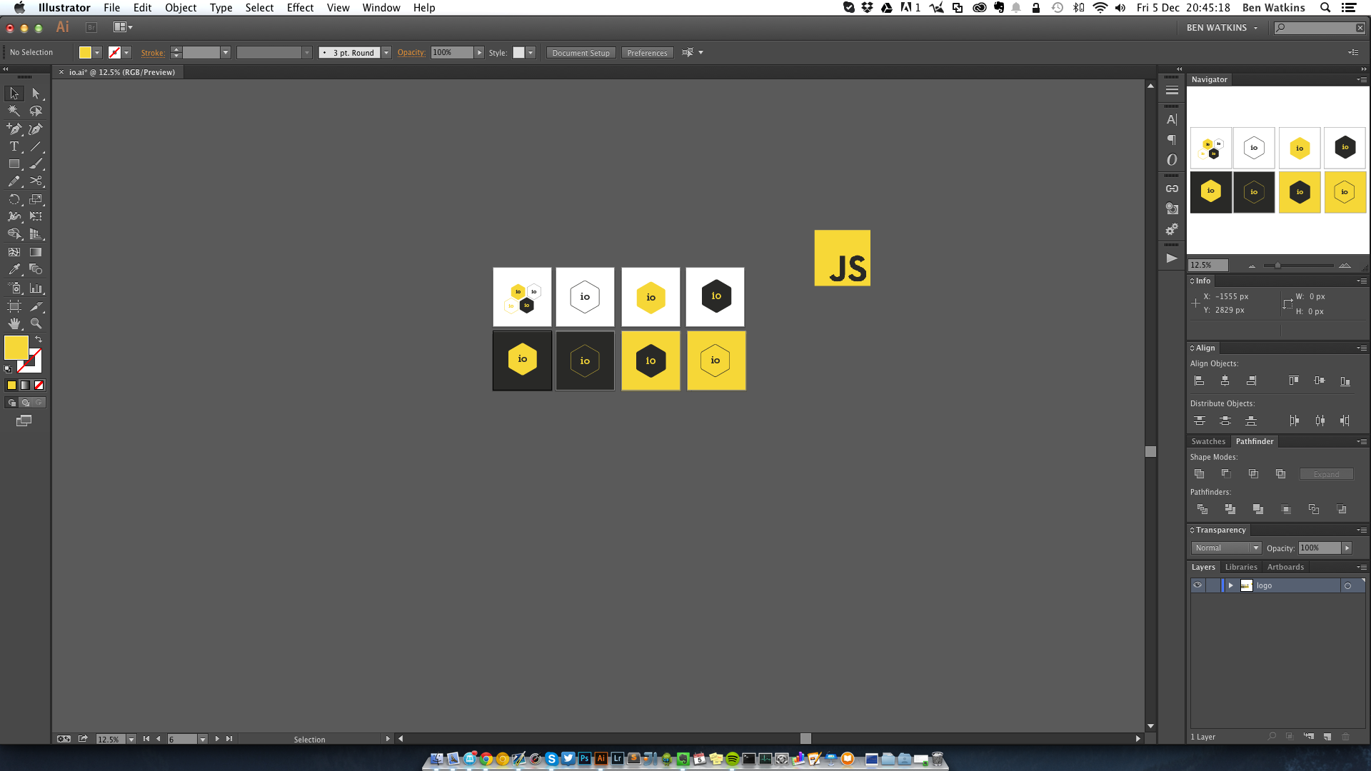
benwtks
on 5 Dec 2014
Nice work @AntoinePlu :+1:
benwtks
on 5 Dec 2014
A lot of these are really great! My favorite so far are iterations of @karlbright (inverted one)
I suggest we do away with that horrible piss yellow color, it's sort of an anti-color. #please
Kind of digging the Jupiter thing, but I feel like it gives the wrong message -- Big? Massive? Also leans towards meteor.js branding. Pass on that.
 qodeninja
on 5 Dec 2014
qodeninja
on 5 Dec 2014
These formed while blending ideas from all of you
- as simple as @zeke
- utilising cyrillic letter Ju (as @cavinsmith also noted)
- derived from the uberbinary version from @vjk2005

License: CC-0
Will upload SVGs when needed.
line-o
on 5 Dec 2014

 saw
on 5 Dec 2014
saw
on 5 Dec 2014

Everything speaks for this version. Its obvious, human friendly AND you can type it >IO
 kof
on 5 Dec 2014
kof
on 5 Dec 2014
That @lukeb-uk Jupiter swish one is by far the best.
 trashguy
on 5 Dec 2014
trashguy
on 5 Dec 2014

I think it embodies true I/O.
 alkhe
on 5 Dec 2014
alkhe
on 5 Dec 2014
Adding a campaign for my personal favorite: the Jupiter concept by @substack, et al.:
 Schoonology
on 5 Dec 2014
Schoonology
on 5 Dec 2014
@AntoinePlu, your version is simply the most elegant in this thread…! It is now my favourite (specially the top versions), kudos!
gnclmorais
on 5 Dec 2014
+1 @AntoinePlu, @MarieSchweiz
Simple, versatile designs that are distinctive and don't rely on color or text(a letter or two is okay) are best, I think. Both of these I could see as an icon, on merchandise, part of the official site for IO.js, or part of a 'powered by IO.js' badge/shoutout that doesn't conflict with the scheme in which it is embedded.
 asarudick
on 5 Dec 2014
asarudick
on 5 Dec 2014
@benwatkinsart @gnclmorais @Shabonkerz Thanks guys! I'll give you more this weekend with other ideas and variations.
AntoinePlu
on 5 Dec 2014
@JonDum +1
@karlbright +1
 zeusdeux
on 5 Dec 2014
zeusdeux
on 5 Dec 2014
Added a teespring campaign for mine: http://teespring.com/iojs-jupiter-swish-hex
CodeFoodPixels
on 5 Dec 2014
Don't forget women's shirts!
aredridel
on 5 Dec 2014
@aredridel - Agreed! I made mine so fast, I missed the option. Now only if Teespring let me add it after the campaign has launched...
Schoonology
on 5 Dec 2014
Pretty sure you can. Edit the campaign?
aredridel
on 5 Dec 2014
@vjk2005 Your second one looks super professional. I really like the sans-serif since it makes it more they are letters instead of symbols.
JonDum
on 6 Dec 2014
My two-bit-coins-worth:
I have enjoyed watching @substack's jupiter being consistently improved upon throughout the thread. First, @yuchi improved on the orbit and bumped the i up a bit. Nice. @fhinson dropped the orbit which was a win for the fans of @zeke's minimalist piece. Then @liamcrean hardened it up, albeit with a questionable take on the colours.
Keep them coming.
 shennan
on 6 Dec 2014
shennan
on 6 Dec 2014

 solie
on 6 Dec 2014
solie
on 6 Dec 2014


Here's what I thought up! Let me know what you think :)
 ashleyegalante
on 6 Dec 2014
ashleyegalante
on 6 Dec 2014
Github really isn't a good place to do something like logo review. Whomever is running this should migrate this to Dribbble.
 scottsword
on 6 Dec 2014
scottsword
on 6 Dec 2014
Dribbble would be good, but not everybody has dribbble... _cough_ _cough_ (I don't)
benwtks
on 6 Dec 2014
Who needs dribbble when you have http://tableflip.io:1234/ ?
gkatsev
on 6 Dec 2014
@gkatsev this is amazing :)
mikeal
on 6 Dec 2014
@olizilla now we need a "starfield" screen saver with all the IOJS logos flying through space.
dominictarr
on 6 Dec 2014
Also another idea:
i.pipe(o)
dominictarr
on 6 Dec 2014
@dominictarr nailed it
shennan
on 6 Dec 2014
:+1: for @vjk2005's Jupiter concept: https://github.com/iojs/io.js/issues/37#issuecomment-65687941
 parkr
on 6 Dec 2014
parkr
on 6 Dec 2014
Here's my idea.

 jackwlee01
on 6 Dec 2014
jackwlee01
on 6 Dec 2014
I was unable to add a women's shirt without recreating the campaign, _so recreate it I did._
Here's the new link: http://teespring.com/iojs-jupiter-2
Schoonology
on 6 Dec 2014
@saw I think you are making a good start with your bikeshed, but it would be better if it was longer instead of wide.
The problem is your bike shed is a stack, to get the first bike out you have to pop all the other bikes and then push them back in. This isn't scalable.
dominictarr
on 6 Dec 2014
Black and white versions


benwtks
on 6 Dec 2014
@dominictarr Shouldn't that be o.pipe(i) however? :grinning:
kenperkins
on 6 Dec 2014
@kenperkins no, i has an _output_, which is redirected with .pipe to the _input_ of o :P
yuchi
on 6 Dec 2014
Let's produce a belt out of the design from @vjk2005 :smile:.
A friend of me is working at a belt buckle factory in france and we could get good prices from him to produce some buckles.

marcbachmann
on 6 Dec 2014
@marcbachmann wow! I love that yellow on black one!
Fishrock123
on 6 Dec 2014
@yuchi it was a little bit tongue and cheek as it might have been interpreted as input.pipe(output) Which as I read it works just fine. Clearly it's time for a drink.
kenperkins
on 6 Dec 2014
@marcbachmann I'll back that kickstarter :)
mikeal
on 6 Dec 2014
@marcbachmann yellow on matte black, dayum!
vjk2005
on 6 Dec 2014
@kenperkins That's what it _should_ have been interpreted as. :)
alkhe
on 6 Dec 2014
@RGBboy love those!
ghost
on 6 Dec 2014
guys, space is the wrong metaphor for io.js
binarykitchen
on 6 Dec 2014
:+1: for space being the wrong metaphor.
andrewliebchen
on 6 Dec 2014
@yuchi rounded octagon and @karlbright octagon/fish are awesomesauce. The Jupiter variations are cool as well.
 kwhinnery
on 6 Dec 2014
kwhinnery
on 6 Dec 2014
OK guys, super crazy idea time.
Remember the old 5 inch floppies? They had two prominent things on the back: the media access slot and the central hub. Together the two form an I and O! And the floppy, being a retro disk storage medium, would make a really ironic logo for IO.js :D

Concepts: Sexy Hexy • Symmetricity • Jupiter 1 • Jupiter 2 • Floppy • Floppy Hex • Cassettes!
vjk2005
on 6 Dec 2014
Thank you @kwhinnery :)
yuchi
on 6 Dec 2014
@marcbachmann That yellow on black one! Seconding @mikeal, I'd join that kickstarter.
CodeFoodPixels
on 6 Dec 2014

 AllThingsSmitty
on 6 Dec 2014
AllThingsSmitty
on 6 Dec 2014
too many cooks fits the theme of the project best so that's where my vote goes
 Tavistock
on 6 Dec 2014
Tavistock
on 6 Dec 2014
I'll start the wiki
Tavistock
on 6 Dec 2014
+1 @benwatkinsart
yellow on black is hot
dylanized
on 6 Dec 2014
Thanks @dylanized
benwtks
on 6 Dec 2014
@AllThingsSmitty nice
RH2
on 6 Dec 2014
@newz2000
:+1:
https://twitter.com/maxogden/status/540735851685085184
 kysnm
on 6 Dec 2014
kysnm
on 6 Dec 2014
Trying another pass at the floppy idea, more abstract and more hex-y this time : )

Concepts: Sexy Hexy • Symmetricity • Jupiter 1 • Jupiter 2 • Floppy • Floppy Hex • Cassettes!
vjk2005
on 6 Dec 2014
Hey Guys , Hope you'll like this

 ali-sao
on 6 Dec 2014
ali-sao
on 6 Dec 2014
@karlbright nice one :+1:
 darionyaphet
on 6 Dec 2014
darionyaphet
on 6 Dec 2014
@ali-sao ,nice!
 julytian
on 6 Dec 2014
julytian
on 6 Dec 2014
@lukeb-uk I like the second one
 hheedat
on 6 Dec 2014
hheedat
on 6 Dec 2014
@zeke I like it !
 mnotw
on 6 Dec 2014
mnotw
on 6 Dec 2014
@substack I like the third one, so geek style.
 xudafeng
on 6 Dec 2014
xudafeng
on 6 Dec 2014
definitely @zeke
The jupiter logo looks nice but how will it do in the context of a website? The website would need to be space-themed or something like that.
 rclai
on 6 Dec 2014
rclai
on 6 Dec 2014
Just putting one out there.

 crc442
on 6 Dec 2014
crc442
on 6 Dec 2014
( io.js ) logo minimal and flat design | enjoy :)


 anand-designer
on 6 Dec 2014
anand-designer
on 6 Dec 2014
Small one with a html twist.

crc442
on 6 Dec 2014
+1 for @zeke
 qbaty
on 6 Dec 2014
qbaty
on 6 Dec 2014
+1 for @zeke
 marcelerz
on 6 Dec 2014
marcelerz
on 6 Dec 2014

there's a fish in there.
aentan
on 6 Dec 2014
Threw this together for fun, based on the classic by @zeke. The i looks like an l though :disappointed:

af
on 6 Dec 2014
@vjk2005 is my fav... @MarieSchweiz is my second ... I really favor simple and clean... The many color ones just don't do it for me.
 tracker1
on 6 Dec 2014
tracker1
on 6 Dec 2014
Vjk hex floppy that is... Grr
tracker1
on 6 Dec 2014
It should be different than nodejs.
 Hell0wor1d
on 6 Dec 2014
Hell0wor1d
on 6 Dec 2014
+1 for @karlbright it's nice
 wuzy
on 6 Dec 2014
wuzy
on 6 Dec 2014
A different view, just for fun, i hope you enjoy it :P

Here you have the fonts and resources that i used :)

Cheers!
 rggGit
on 6 Dec 2014
rggGit
on 6 Dec 2014
I hava no idea.
 xing634325131
on 6 Dec 2014
xing634325131
on 6 Dec 2014

 spronkey
on 6 Dec 2014
spronkey
on 6 Dec 2014
@Undistraction love your minimalism https://github.com/iojs/io.js/issues/37#issuecomment-65777897
juliangruber
on 6 Dec 2014
Ю.js?
 dy
on 6 Dec 2014
dy
on 6 Dec 2014
Giving this a try, so here are some I came up with:


 cheeaun
on 6 Dec 2014
cheeaun
on 6 Dec 2014
Something with diode, anode, current flow, resistance. Node should fork every year, this art directing stuff is fun :-)

 rhalff
on 6 Dec 2014
rhalff
on 6 Dec 2014
@rggGit +1
That looks bloody brilliant mate.
I just worry how easily and consistently can that be reproduced on other media (paper, cloth, etC).
zeusdeux
on 6 Dec 2014
You absolutelly should choose this as logo!

 NekR
on 6 Dec 2014
NekR
on 6 Dec 2014

Fairly simple design with some different coloured versions.
 roryrjb
on 6 Dec 2014
roryrjb
on 6 Dec 2014
I would suggest no more logos we have a LOT of quality ones already here. Lets figure out a way to vote on them.
coen-hyde
on 6 Dec 2014
@julytian thank you
ali-sao
on 6 Dec 2014
@benwatkinsart I very like yours, it refers to both node and js, but I believe font has to be sans.
dy
on 6 Dec 2014

For creating this logo was used: Golden ratio, idea of the link between IO, output and input
 Printaju
on 6 Dec 2014
Printaju
on 6 Dec 2014
Thanks @dfcreative
benwtks
on 6 Dec 2014
another logo :D 
solie
on 6 Dec 2014
+1 for @karlbright
 mofas
on 6 Dec 2014
mofas
on 6 Dec 2014
Hi guys! Here's my last concept (I hope :P )
My idea for this concept comes from old cassette tapes.

If you really think about it, the looping cassette tapes and their continuous stream of analog music is very much like the Streams we use so heavily in Node.js, and soon, IO.js.
I thought it was fitting to model my last concept on this wonderful storage medium from the past : )

As you can see, the spools together spell out "IO". The "JS" in IO.js can have two placements, at the bottom for the portrait version of the logo and on the right side middle for the landscape version of the logo.
Bonus! Here's an animation showing the logo spools looping and rewinding back like those cassette tapes, analogous to streams...

This can be used for loading screens and such.
And yes, poor IO_bot needs a set of wheels, but I ran out of time ; )
Concepts: Sexy Hexy • Symmetricity • Jupiter 1 • Jupiter 2 • Floppy • Floppy Hex • Cassettes!
vjk2005
on 6 Dec 2014
@vjk2005 a lot of awesome stuff!
reqshark
on 6 Dec 2014
@vjk2005 this is great stuff :+1: IO_bot is cool
 fspoettel
on 6 Dec 2014
fspoettel
on 6 Dec 2014
@reqshark thanks! I've been working non-stop except taking breaks to do my regular client work ;D It's a relief to finally get all the concepts out of my head and into pixels. Now I can sit back and watch the rest of the show : )
vjk2005
on 6 Dec 2014
@felics thanks! I like IO_bot too, I wish I had more time to flesh out all the details on him : )
vjk2005
on 6 Dec 2014
@vjk2005 :+1: I really liked the minimalist Jupiter 2.
hemanth
on 6 Dec 2014
@hemanth thanks Hemanth! I thought it was an original idea but it didn't seem to get much traction here :)
vjk2005
on 6 Dec 2014
Favorite issue. Wild designs!
 victusfate
on 6 Dec 2014
victusfate
on 6 Dec 2014

I/O army :D
solie
on 6 Dec 2014
Oh god... this thread is worth than a 99design topic.
Why don't you create a real brief with ideas and let designers do ?
AntoinePlu
on 6 Dec 2014
IOJS medic/helper :D

solie
on 6 Dec 2014
Been working on this. Let me know if anyone gives a hoot and I'll tidy it up and plonk an SVG on here.

shennan
on 6 Dec 2014
Here's what I had in mind. Hexagon based concept.

zeusdeux
on 6 Dec 2014
@karlbright & @calvinmetcalf look best, imho
 stevenvachon
on 6 Dec 2014
stevenvachon
on 6 Dec 2014
I love most of all of these entries..
But still I jumped the gun, and just bought one of these:
http://teespring.com/iojs-jupiter-2 (not the only one it seems)
On 6 December 2014 at 16:49, Steven Vachon [email protected] wrote:
@karlbright https://github.com/karlbright & @calvinmetcalf
https://github.com/calvinmetcalf look best, imho—
Reply to this email directly or view it on GitHub
https://github.com/iojs/io.js/issues/37#issuecomment-65902762.
*Nelen & Schuurmans *
Postbus 1219 3500 BE Utrecht
Zakkendragershof 34-44 Utrecht
tel. 030 2330 200
@fritzvd http://twitter.com/fritzvd
www.nelen-schuurmans.nl
fritzvd
on 6 Dec 2014
my last
iojs learner :D

iojs wizz :D

solie
on 6 Dec 2014
@rrgGit The JS in a hexagon is the property of Joyent, we can't use it.
@coen-hyde As @mikeal said:
No voting. Just make stickers and t-shirts and have fun :)
@AntoinePlu Why restrict it? This is involving all of the community.
CodeFoodPixels
on 6 Dec 2014
That's what I have! :-D

 cfsghost
on 6 Dec 2014
cfsghost
on 6 Dec 2014
This looks promising
Also a bit international

 tremez
on 6 Dec 2014
tremez
on 6 Dec 2014
Here is my idea, inspired by all of you above.
In my opinion, IO.js is Javascript code running around the topic of IO. so I created this logo.

 acumon
on 6 Dec 2014
acumon
on 6 Dec 2014
I really like the colors @benwatkinsart used. They provide hint to the fact that the project is javascript related but the logo is not strictly dependent on color. Some variation on font size should be applied when the logo is smaller. +1 from me.
hitripekac
on 6 Dec 2014
Thanks, and good idea :+1: @hitripekac
benwtks
on 6 Dec 2014
Some ideas are amazingly badass. Here are a couple of designs I made in a few minutes. They are definitely riffing off some of the design ideas posted here.


Much has been done with the hexagon, which is cool. I liked the idea of an octagon with 8 sides for v8. So I used that
Other than that I've kept them as simple as possible, as this is just a first step anyway.
 nmn
on 6 Dec 2014
nmn
on 6 Dec 2014
@nmn Great work :+1:, I recommend that you change the i to a darker colour though (to make it easier on the eyes), and that you sort the outer point where the i begins to bend over the octagon at the top.
benwtks
on 6 Dec 2014
@benwatkinsart I didn't really spend any time picking the colours. I know that they kinda suck, but my idea was just to put the shapes out there. I'm sure someone will take this and make it much better.
I'm not a designer.
nmn
on 6 Dec 2014
Fair enough, for colours maybe try something like this

1076b6 for the i
05aff2 for the octagon
benwtks
on 6 Dec 2014
Inspiration:

dy
on 7 Dec 2014
Live JSFiddle: http://jsfiddle.net/Vanuan/wrn4yvos/4/
There is a room for improvement (sort by date, add author, track +1s, pagination, etc)
 Vanuan
on 7 Dec 2014
Vanuan
on 7 Dec 2014
Is this what you meant @hitripekac? I think too many variations will result in a confusing and inconsistent brand, but just using a bigger font size in certain instances (for example on a favicon, or small watermark), could be useful.


benwtks
on 7 Dec 2014
@benwatkinsart sans variation of your logo:

Especially the right one: strong association with js & node.
Basically it’s subtler @zeke version.
dy
on 7 Dec 2014
Aentan's one looks beautiful! +1
 arqex
on 7 Dec 2014
arqex
on 7 Dec 2014
@dfcreative looks nice, but doesn't that make it the same as @zeke's one? https://github.com/iojs/io.js/issues/37#issuecomment-65457204 (other than the colours being slightly different and the font size being smaller on normal)
The original (with slab serif), had a more unique look to it, whereas sans looks plain. (no offence @zeke or @dfcreative or anyone else using sans or recommending it)
The other issue with sans is that "io" now looks like "10"
benwtks
on 7 Dec 2014
@benwatkinsart so that’s nice that it looks like 10, it refers to bits etc. Also sans refers to ubiquitous unofficial js logo - with slab it gets lost.
Yes, it is @zeke’s version with better colors/shape/size, it’s just to show what I meant.
dy
on 7 Dec 2014
Fair enough
benwtks
on 7 Dec 2014
@karlbright I prefer the first of https://github.com/iojs/io.js/issues/37#issuecomment-65376404
 xcatliu
on 7 Dec 2014
xcatliu
on 7 Dec 2014
@karlbright +1
 wahyd4
on 7 Dec 2014
wahyd4
on 7 Dec 2014


 demohi
on 7 Dec 2014
demohi
on 7 Dec 2014
+1 @charpie as mascot !
 juaniyyoo
on 7 Dec 2014
juaniyyoo
on 7 Dec 2014
Based upon @karlbright


juaniyyoo
on 7 Dec 2014
iojs is quite geeky by the name. To add more computing or geek stuff would be to much.
Isn't it better to add a fresh touch ?
juaniyyoo
on 7 Dec 2014
:set bg=light

juaniyyoo
on 7 Dec 2014
Based upon @charpie mascot

juaniyyoo
on 7 Dec 2014
@juliangruber Thanks a lot. I like that it's multiple relevant things ( 1. A moon and a planet, 2. Drive internals - Actuator axis and spindle, 3. the letters iO) at the same time. Would be easy to add a touch of colour by colouring the dot of the _i_ too.
Undistraction
on 7 Dec 2014
That's I do.

 cesar2535
on 7 Dec 2014
cesar2535
on 7 Dec 2014
@vjk2005 awesome designs :+1:
 dark-reiser
on 7 Dec 2014
dark-reiser
on 7 Dec 2014
⌬
 govpack
on 7 Dec 2014
govpack
on 7 Dec 2014
@govpack looks like you found a screwdriver bit unicode character. :grin:
marcbachmann
on 7 Dec 2014
| Dark version | Light version | Favicon |
| :-: | :-: | :-: |
| _(Light background)_ | _(Dark background)_ | |
|  |
|  |
|  |
|
juaniyyoo
on 7 Dec 2014


juaniyyoo
on 7 Dec 2014
@govpack @marcbachmann more unicode: ⥃⥀

 sidorares
on 7 Dec 2014
sidorares
on 7 Dec 2014
@rggGit 's stuff is awesome! :+1: Looks different than just-another-js-thing.io
I also like @solie 's warriors ^^
jhnns
on 7 Dec 2014
@dark-reiser thanks! : )
vjk2005
on 7 Dec 2014
Following @demohi logo
 Or
Or 
juaniyyoo
on 7 Dec 2014
@benwatkinsart Yep, that is what I meant. Great work.
hitripekac
on 7 Dec 2014
https://www.io.com it has a logo similar to @zeke's.
aentan
on 7 Dec 2014
I haven't seen many with the word Node in it. There was some talk about not being able to use Node.js but the word Node was too general of a term to have a copyright. Node is still the "heart" of the project.
CodisRedding
on 7 Dec 2014
@hitripekac Thanks :)
benwtks
on 7 Dec 2014
@juaniyyoo The second one is awesome! :+1: (https://cloud.githubusercontent.com/assets/2240017/5331641/bf2f6082-7e33-11e4-87e5-fcfaa6cf15d4.png)
benwtks
on 7 Dec 2014
@juaniyyoo the dark version with the light background (https://cloud.githubusercontent.com/assets/2240017/5330807/276ae3ae-7e0e-11e4-9163-b7d1c5f39c1f.png) is really nice
benwtks
on 7 Dec 2014
jesus christ too many logos! so is joyent keeping any talent? how does one decide whether to stay or jump ship if uninterested in the political or principle reasons behind this shift? Or are they going to cross-pollinate to eachothers projects?
 Cinemacloud
on 7 Dec 2014
Cinemacloud
on 7 Dec 2014
@tachy0n I'm wondering similar things. I did suggest a podcast from each side "io.js" (asked on Twitter) and joyents NodeUp (created issue for idea https://github.com/nodeup/contribute).
CodisRedding
on 7 Dec 2014
@fourq I think it'd be best if we avoided using node, it would only add to any confusion. Also NodeUp isn't Joyent's, it's a community thing.
CodeFoodPixels
on 8 Dec 2014
@lukeb-uk I didn't realize that NodeUp wasn't Joyent. I'm torn about wheather io.js or node-[somthing] is more confusing. Maybe because I'm so found of the term Node.
CodisRedding
on 8 Dec 2014
Maybe a play on the hex + arrows + event loop?

 ugate
on 8 Dec 2014
ugate
on 8 Dec 2014
I think if we put @anandpatel9016 first image inside hexagon that would be a great logo +1 :+1:
 volkovasystems
on 8 Dec 2014
volkovasystems
on 8 Dec 2014
+1 for @aentan, i like fish.
 PeakFish
on 8 Dec 2014
PeakFish
on 8 Dec 2014
Quick riff off of @yuchi, @substack - 70's Kitch -


 mrmowgli
on 8 Dec 2014
mrmowgli
on 8 Dec 2014
+1 for @karlbright
 yurenju
on 8 Dec 2014
yurenju
on 8 Dec 2014
Another design, with a few options.
Plain/Outline

Simple Colors

Variation 1

alkhe
on 8 Dec 2014

jeeStyle
on 8 Dec 2014
Look at this,design by Hadrain,E-mail:[email protected]


 Hadrain
on 8 Dec 2014
Hadrain
on 8 Dec 2014


iojs.sketch
License: CC0
 RayPS
on 8 Dec 2014
RayPS
on 8 Dec 2014
@Hadrain is the first going in a direction i like. though i don't think we need that much emphasis on ".js"
This is enough IMO (and yes, I understand the moon is the dot, and yes I think it works anyway):

 algesten
on 8 Dec 2014
algesten
on 8 Dec 2014
Gosh, @caineio got mad.
indutny
on 8 Dec 2014
I really like @vjk2005 cassette the best now... what about having the spools as octagons instead of circles? (v8 inspiration)
tracker1
on 8 Dec 2014
FWIW: "IO" looking like "10"... "10" in binary is 2, so maybe the first version release of io.js should 2.0? mildly trolling kidding.
getify
on 8 Dec 2014

 eljefedelrodeodeljefe
on 8 Dec 2014
eljefedelrodeodeljefe
on 8 Dec 2014
@mikeal No voting. Just make stickers and t-shirts and have fun :)
👍 <3 this!
 techjeffharris
on 8 Dec 2014
techjeffharris
on 8 Dec 2014
RayPS's great concept, given the low-poly treatment


 roartex
on 9 Dec 2014
roartex
on 9 Dec 2014
@roartex: RayPS's great concept, given the low-poly treatment
Thank you, and low-poly is awesome👍
RayPS
on 9 Dec 2014
Did a quick sharp logo 


 grozyan
on 9 Dec 2014
grozyan
on 9 Dec 2014
@grozyan +1 for the last one. I want that on a t-shirt so bad!
zeusdeux
on 9 Dec 2014
How about something more square, and with the relevant rock?


shennan
on 9 Dec 2014
Or turning it on its head...

shennan
on 9 Dec 2014
Here's my shot.


 fnky
on 9 Dec 2014
fnky
on 9 Dec 2014
@fnky love it
 julianduque
on 9 Dec 2014
julianduque
on 9 Dec 2014

5 Minute logo sketch. Clock Work logo :-)
 joeyjava
on 9 Dec 2014
joeyjava
on 9 Dec 2014
@fnky the idea is great!
But maybe it is much better without round edges
arqex
on 9 Dec 2014
@fnky +1
 jonattanva
on 9 Dec 2014
jonattanva
on 9 Dec 2014

 A-gambit
on 9 Dec 2014
A-gambit
on 9 Dec 2014
@zeke and @benwatkinsart also have a hidden benefit: they can be conveyed as a single character:
⬢
A good logo should ensure:
- The letters can be read.
- The logo us usable with a minimal amount of colours.
- It doesn't look like Google IO (ie, with the O a big circle and the I a rectangle).
- It doesn't look like a power button, ie with an I in the middle of O.
We want io's logo to be distinct.
 mikemaccana
on 9 Dec 2014
mikemaccana
on 9 Dec 2014

Some of the thoughts behind this:
- In/out is binary. The logo is split in half; two sides; binary.
- IO and Node, Node and IO, two complementary sister projects; two partners like the two halves of the logo forming a whole.
- IO is also a fork, a continuation. The split logo represents a split approach.
- It looks like the head of a bolt; Node's logo looks like nuts; they both relate to construction, engineering, industry. But in different ways. Different tools, similar purpose. And again they complement each other: the nuts and bolts of event-driven JavaScript I/O.
Some pros:
- Simple
- Legible at small size
- Doesn't look like Google IO or a power button
- Doesn't re-use aspects of the Node logo
What do you guys think?
 cjcenizal
on 9 Dec 2014
cjcenizal
on 9 Dec 2014
- It looks like buttocks.
timoxley
on 9 Dec 2014
@timoxley I concur, it looks like a butt. We'd never hear the end of node and io half-assing things.
asarudick
on 9 Dec 2014
You guys are being really immature. I just don't see it. But I can see you're going to continue to make your asinine remarks despite any rebuttal I make, so here is a more holistic approach, with the I _inside_ of the O. Now if you can just keep your wise cracks to yourself...

cjcenizal
on 9 Dec 2014
"rebuttal"
CodisRedding
on 9 Dec 2014
Toilet seat?
shennan
on 9 Dec 2014
@mikemaccana exactly!
I think this one is even better: ⎔
At first, it is called "Software-Function Symbol", which is really nice I believe.
At second, it is somewhat more supported by windows (at least I can see it, unlike other UTF8 hexes here).
Finally, it refers to "loop" symbol from the flow chart:

Though it has a different angle.
dy
on 9 Dec 2014
@dfcreative Oh the irony... Chrome (current) on Windows 8.1, can't see the symbol in your comment, only a box...
tracker1
on 9 Dec 2014
@fnky your top one, I in the hexigon was close to one I was thinking of submitting.. though was thinking of using an octagon...
tracker1
on 9 Dec 2014
After reviewing the submissions over the past week I felt like the logo ought to be a bit simpler, cleaner — something timeless and that scales well. Here's my take.

And here's a what it would look like sponsoring a badminton tournament.

 taylorpoe
on 10 Dec 2014
taylorpoe
on 10 Dec 2014

 phitw
on 10 Dec 2014
phitw
on 10 Dec 2014
@taylorpoe How about this

RayPS
on 10 Dec 2014
@RayPS Hahahaha, that made my day!!!
ralphtheninja
on 10 Dec 2014
A couple attempts of mine. They've already been merged into the logos repository a few days back.

And with a green hex in the hole...

 aspoon
on 10 Dec 2014
aspoon
on 10 Dec 2014
@tracker1 that's ok. Lots of npm packages neither work on windows %)
dy
on 10 Dec 2014
@RayPS Ka-boom. I think we have it.
taylorpoe
on 10 Dec 2014
I'd rather go for @zeke
Maybe a smal "js" string under neath?
 chinda-keodouangsy
on 10 Dec 2014
chinda-keodouangsy
on 10 Dec 2014
A few ideas from our designer.


 zwigby
on 10 Dec 2014
zwigby
on 10 Dec 2014
There needs to be an IoJsLogo subreddit so we can up/down vote
On Wed, Dec 10, 2014 at 11:42 AM, Charlie Key [email protected]
wrote:
A few ideas from our designer.
[image: io-js-logo-01-03]
https://cloud.githubusercontent.com/assets/354440/5382822/b90756b2-807a-11e4-9ab3-e811610488c4.jpg
[image: io-js-logo-01-02]
https://cloud.githubusercontent.com/assets/354440/5382824/b9250360-807a-11e4-82c4-8291f831c148.jpg
[image: io-js-logo-01-01]
https://cloud.githubusercontent.com/assets/354440/5382823/b911fbf8-807a-11e4-9fe4-4e8c9a475b63.jpg—
Reply to this email directly or view it on GitHub
https://github.com/iojs/io.js/issues/37#issuecomment-66510741.
dominictarr
on 10 Dec 2014
@mikeal No voting. Just make stickers and t-shirts and have fun :)
CodeFoodPixels
on 10 Dec 2014
just make it simple

flat color

 cho2
on 11 Dec 2014
cho2
on 11 Dec 2014
another simple one


cho2
on 11 Dec 2014
I sketched a few ideas and digitized my favorite mark. Inspired by @zeke _&_ @rggGit. :beers:


 jlmakes
on 11 Dec 2014
jlmakes
on 11 Dec 2014
@julianlloyd, it is a mix of G and F clef with io touch ?
juaniyyoo
on 11 Dec 2014
I picked up some iojs knitwear at H&M.

fritzvd
on 11 Dec 2014
@cho2 The JS in a hexagon is Joyent's and we cannot use it.
CodeFoodPixels
on 11 Dec 2014
@juaniyyo My motivation was to capture the letter forms of i o j and s with one stroke. The hexagon and yellow color seemed to be a popular motif here… and that is where I landed. :smile_cat: :8ball:
jlmakes
on 11 Dec 2014
@julianlloyd quite melodic :musical_score: :smile:
juaniyyoo
on 11 Dec 2014
rhalff
on 11 Dec 2014
Research
When I heard about the project I decided to make a journey in search of the animal that best represents the sound "io". After an extensive search and several gallons of coffee, I found the animal that met the requirements, best pronouncing onomatopoeia (hee-haw): the donkey¹.
¹ https://www.youtube.com/watch?v=gROO7xSTxfY
Inspiration

Final work

hexb.in friendly!

license: public domain / CC0
 guillecura
on 11 Dec 2014
guillecura
on 11 Dec 2014
haaaaa nice one ^
juliangruber
on 11 Dec 2014
@guillecura this is fantastic!
phpnode
on 11 Dec 2014
@guillecura love it !! +1
julianduque
on 11 Dec 2014
@guillecura I vote this!!!
RayPS
on 11 Dec 2014
@guillecura + 1
jonattanva
on 11 Dec 2014
@guillecura Simple and marvelous!!!!!!!!! +1
 cayasso
on 11 Dec 2014
cayasso
on 11 Dec 2014
@guillecura +1
 pricco
on 11 Dec 2014
pricco
on 11 Dec 2014
@guillecura +1 FTW
 crueber
on 11 Dec 2014
crueber
on 11 Dec 2014
haha, I hope not. it's a bit too JackasS-y
CodisRedding
on 11 Dec 2014
@fourq That's kind of what makes it brilliant.
crueber
on 11 Dec 2014
lol, I guess
CodisRedding
on 11 Dec 2014
HorseJS will be pleased.
gaearon
on 11 Dec 2014
Wow, there are some amazing logos in this thread!! This is my first attempt at any design-related work. It's a modification of substack's, but inspired by the 2001's Jupiter - monolith scene.


 RnbWd
on 11 Dec 2014
RnbWd
on 11 Dec 2014
@GuilleCura marvelous!
 RodrigoEspinosa
on 11 Dec 2014
RodrigoEspinosa
on 11 Dec 2014
finally, we have a mascot!
On Thursday, December 11, 2014, Guillermo Cura [email protected]
wrote:
Research
When I heard about the project I decided to make a journey in search of
the animal that best represents the sound "io". After an extensive search
and several gallons of coffee, I found the animal that met the
requirements, best pronouncing onomatopoeia (hee-haw
http://en.wikipedia.org/wiki/List_of_animal_sounds#cite_ref-12): the
donkey¹.¹ Braying Donkey https://www.youtube.com/watch?v=gROO7xSTxfY
Inspiration[image: Donkey]
https://camo.githubusercontent.com/5b7b75491a0ac2bdaedb8e7862787652afc7ac36/687474703a2f2f6e657773636f6d612e636f6d2f77702d636f6e74656e742f75706c6f6164732f323031322f31312f646f6e6b65792d6b69642d79656c6c696e672e6a7067
Final work[image: IO.js Logo]
https://cloud.githubusercontent.com/assets/2917909/5396118/652d6c5e-8136-11e4-9d2c-b7e3e7542a53.jpg
hexb.in friendly![image: IO.js Hexbin]
https://cloud.githubusercontent.com/assets/2917909/5396122/71688d00-8136-11e4-8ab2-604c58106c9d.jpglicense: public domain / CC0
—
Reply to this email directly or view it on GitHub
https://github.com/iojs/io.js/issues/37#issuecomment-66632306.
mikeal
on 12 Dec 2014
@guillecura That is awesome. +1
tracker1
on 12 Dec 2014
@guillecura +1000
 nachoaIvarez
on 12 Dec 2014
nachoaIvarez
on 12 Dec 2014
Going for a different approach.

Here you see the logo (center) surrounded by its related concepts, which I think captures the essence of IO.js. It also has potential as a monogram.

Nuts & Bolts: Holding things together.
Human Iris: Beauty and evolution.
Flower: Softness and geometry.
Honeycomb: Hexagons, structure and resilience.
Binary: Computers and code.
Neurons: Intelligence and network/community.
aentan
on 12 Dec 2014
@aentan this is very clever. maybe a js in the middle? wouldn't violate the hex w js restriction as not a hex.
 BootstrapNYC
on 12 Dec 2014
BootstrapNYC
on 12 Dec 2014
+1 @karlbright
 rambo-panda
on 12 Dec 2014
rambo-panda
on 12 Dec 2014
maybe this will spark an idea for someone far more talented than myself.

BootstrapNYC
on 12 Dec 2014
@guillecura outstanding!
 olistic
on 12 Dec 2014
olistic
on 12 Dec 2014
Hey guys!
Been working a couple of days with a bunch of designers at @aerolab on this. We've been looking and reading this thread very carefully so we didn't miss out on anything :)
Hope you enjoy it <3

 alevizio
on 12 Dec 2014
alevizio
on 12 Dec 2014
@alevizio You are the Pro
RayPS
on 12 Dec 2014
@alevizio nice!
 vrunoa
on 12 Dec 2014
vrunoa
on 12 Dec 2014
These are all amazing. @alevizio that's really cool. Love the flags.
gkatsev
on 12 Dec 2014
Great work @alevizio and @aerolab !
 wikichaves
on 12 Dec 2014
wikichaves
on 12 Dec 2014
Dammit @alevizio, now I have to go pull out the big guns ;P
Great job btw, it's a terrific identity : )
vjk2005
on 12 Dec 2014
awesome @alevizio and @aerolab :D
cho2
on 12 Dec 2014
Great Job @alevizio
 therockstar
on 12 Dec 2014
therockstar
on 12 Dec 2014
@alevizio dayum. *_*
zeusdeux
on 12 Dec 2014
@alevizio Very awesome. Mind splitting up into smaller images with some pure logos as well?
ralphtheninja
on 12 Dec 2014
Great work @alevizio. I don’t like the repeating pattern. We’re losing the power of the ‘breach’ (that small triangle on bottom right) because we’re repeating it every time.
yuchi
on 12 Dec 2014
+1 @guillecura
 krbnr
on 12 Dec 2014
krbnr
on 12 Dec 2014
+1 to @alevizio. :ship: that now.
 brunolazzaro
on 12 Dec 2014
brunolazzaro
on 12 Dec 2014
+1 @guillecura
 ngonzalvez
on 12 Dec 2014
ngonzalvez
on 12 Dec 2014
Wow @alevizio #lechuga inspiration !! <3 <3 Kudos to @aerolab !! +1
julianduque
on 12 Dec 2014
+1 to @alevizio! Well done buddy!
 spacecowb0y
on 12 Dec 2014
spacecowb0y
on 12 Dec 2014
Awesome @alevizio is awesome
 impronunciable
on 12 Dec 2014
impronunciable
on 12 Dec 2014
Awesome work @alevizio and @aerolab team!
 juanrossi
on 12 Dec 2014
juanrossi
on 12 Dec 2014
It's almost Joyent's orange color which is #ff6600 instead of #ff6633
 3rd-Eden
on 12 Dec 2014
3rd-Eden
on 12 Dec 2014
Wow I really like the "fold" at the bottom. But isn't the overall shape too similar to Node.js's logo?
 coreh
on 12 Dec 2014
coreh
on 12 Dec 2014
+1 to @alevizio !! Awesome work!!
CYBAI
on 12 Dec 2014
@alevizio +100000000000000
jonattanva
on 12 Dec 2014
Joyent orange is the first thing that comes to mind when I see that logo.
CodisRedding
on 12 Dec 2014
It's very hard to decipher the letters IO from the logo. No matter how well executed it is:

Seems like a sizeable issue.
 olivierlacan
on 12 Dec 2014
olivierlacan
on 12 Dec 2014
E_TOO_MANY_AWESOME_LOGOS
 wacko
on 12 Dec 2014
wacko
on 12 Dec 2014
@olivierlacan I agree. That, and if that jackass logo is used with it ever, it's going to clash.
CodisRedding
on 12 Dec 2014
Well done @alevizio :)
 montogeek
on 12 Dec 2014
montogeek
on 12 Dec 2014
+1 @alevizio. Clean, professional, and with logical direction.
therebelrobot
on 12 Dec 2014
@alevizio dayyyyyum :heart_eyes:
travisjeffery
on 12 Dec 2014
@alevizio so nice work!!!
 soberzhou
on 12 Dec 2014
soberzhou
on 12 Dec 2014
@guillecura +1 awesome!!!!
 lucho99
on 12 Dec 2014
lucho99
on 12 Dec 2014
@alevizio awesome work! kudos! but I think not suitable for the JS world! logos like ember, yeoman, grunt, etc. represents what I'm trying to say.
lucho99
on 12 Dec 2014
+1 @guillecura
 pdjota
on 12 Dec 2014
pdjota
on 12 Dec 2014
@guillecura + 1 iiii oooooooo... :D
 ivan-ravecca
on 12 Dec 2014
ivan-ravecca
on 12 Dec 2014
HI!
I wondered which means IO.JS for me .... R: Quantum explosion ! :)
FINALIST COLLABORATION: type of collaboration and collective creation that presents the final results, with brief descriptions, references and arguments supporting the final result.
We take this result, improve it, change it, and deliver new proposals.


http://www.reddit.com/r/atheism/comments/1bjpoa/this_image_demonstrates_how_perspective_can/
This image demonstrates how perspective can influence perception, and how seemingly opposing points of view can both be right and wrong at the same time
https://www.youtube.com/watch?v=UnURElCzGc0
//BY OTHER SIDE//
COLLABORATIVE CO- CREATION : the design process is complex, multiple approaches arrive at the same time, it is a set of decisions. Many roads are abandoned from the unique perspective of the creator with their approaches, value judgments, aesthetic preferences etc.
When looking regarding many elements are discarded, leaving valuable material that can be used powerfully by others, with a different thought process gets to see what someone else could not.
An original idea is the result of putting common elements differently, impacting and generates remembrance.
Co-creation is possible because we share the process rather than the result , we can discuss and provide feedback to understand and admire the process reaching a consensus that achieves ownership and transcendence.


 Citrustaller
on 13 Dec 2014
Citrustaller
on 13 Dec 2014
I like this black hole ones. Great stuff citrus
Op 13 dec. 2014 00:06 schreef "Citrus" [email protected]:
HI!
I wondered which means IO.JS for me .... R: Quantum explosion ! :)FINALIST COLLABORATION: type of collaboration and collective creation that
presents the final results, with brief descriptions, references and
arguments supporting the final result.
We take this result, improve it, change it, and deliver new proposals.[image: screen shot 2014-12-12 at 5 40 56 pm]
https://cloud.githubusercontent.com/assets/7132530/5420796/ebb662e8-8227-11e4-9067-1361a78d6374.png
[image: screen shot 2014-12-12 at 5 44 15 pm]
https://cloud.githubusercontent.com/assets/7132530/5420800/eefcfafc-8227-11e4-9f13-dfdb4c17d504.png
[image: screen shot 2014-12-12 at 5 44 12 pm]
https://cloud.githubusercontent.com/assets/7132530/5420801/f1511860-8227-11e4-96b4-9246fb208e6f.pnghttp://www.reddit.com/r/atheism/comments/1bjpoa/this_image_demonstrates_how_perspective_can/
This image demonstrates how perspective can influence perception, and how
seemingly opposing points of view can both be right and wrong at the same
timehttps://www.youtube.com/watch?v=UnURElCzGc0
//BY OTHER SIDE//
COLLABORATIVE CO- CREATION : the design process is complex, multiple
approaches arrive at the same time, it is a set of decisions. Many roads
are abandoned from the unique perspective of the creator with their
approaches, value judgments, aesthetic preferences etc.
When looking regarding many elements are discarded, leaving valuable
material that can be used powerfully by others, with a different thought
process gets to see what someone else could not.
An original idea is the result of putting common elements differently,
impacting and generates remembrance.
Co-creation is possible because we share the process rather than the
result , we can discuss and provide feedback to understand and admire the
process reaching a consensus that achieves ownership and transcendence.[image: screen shot 2014-12-12 at 5 57 13 pm]
https://cloud.githubusercontent.com/assets/7132530/5420848/98b7a524-8228-11e4-9d30-5b8686442ca6.png
[image: screen shot 2014-12-12 at 5 58 19 pm]
https://cloud.githubusercontent.com/assets/7132530/5420851/9c845e90-8228-11e4-8543-461c610c632a.png—
Reply to this email directly or view it on GitHub
https://github.com/iojs/io.js/issues/37#issuecomment-66849363.
fritzvd
on 13 Dec 2014
Wonderful, @alevizio ! I have reservations on the actual logo, but the use of orange-grey and Source seems great!
Also, just curious... why do people insist on sticking "JS" on the logo?
aspoon
on 13 Dec 2014
Most of the logos exposed above are really sad (sorry, they "say" nothing and they make me feel like when a graphical designer writes code). I hope there is something better and more "expressive".
 ibc
on 13 Dec 2014
ibc
on 13 Dec 2014
Sorry I can't draw or design, but my idea is that it should look something like this

Or, if this is "too industrial", something with sharp edges (like those fictional magical knives).
I'd abandon the hexagonal shape (for now), but the logo should be drawn in a flat style.
 mzdv
on 13 Dec 2014
mzdv
on 13 Dec 2014
@vjk2005 binary concept is awesome - I coloured in a relevant i o :


another approach would be to keep the central I O black, and fade the others gray
 davidmarkclements
on 13 Dec 2014
davidmarkclements
on 13 Dec 2014
Here's mine:
![]()
Coloured:
![]()
Study and Motivation
The logo was inspired by the vibrant and common visual language defined by the other more famous
community's logos: the official JS and the Node JS ones.
I've decided to use a simple hexagonal form, inscribed in a square, to mantain a continuity with the Node JS logo, overlapped on other two hexagon, to give the idea of a moving fast technology, with a particular attenction to a positive and collaborative future.
Colors
All logo's colors are similar to the JS ones:
geometric hexagon comes with a yellow scale, starting from a relaxing #f2df61, ending with a
lighter #fbf3c6, while font color is the classic #2e2e2c.
Font family
The font family is Neutraface 2, not the same of the JS logo, but a relatad one, from the same font foundry, Houseind.
Eeeeee YA!
 gabrieledarrigo
on 13 Dec 2014
gabrieledarrigo
on 13 Dec 2014
I'm quite late to the party, took some iterations to create the concept.
My assumptions:
- ".js" is unnecessary to be part of the logo. It is going to be used in google searches and tags, but not needed as part of the brand.
- Keep it simple. Fit into 1 kB svg. Imagine it being in favicon, on pens and so on.
Concept: "always on".

License: CC0
 lekevicius
on 13 Dec 2014
lekevicius
on 13 Dec 2014
Unless there's an uncaught exception. In which case it's off.
On Saturday, December 13, 2014, Jonas Lekevicius [email protected]
wrote:
I'm quite late to the party, took some iterations to create the concept.
My assumptions:
- ".js" is unnecessary to be part of the logo. It is going to be used
in google searches and tags, but not needed as part of the brand.- Keep it simple. Fit into 1 kB svg. Imagine it being in favicon, on
pens and so on.Concept: "always on".
[image: logo]
https://cloud.githubusercontent.com/assets/218656/5424690/76a55388-8303-11e4-8c30-686426d38187.png—
Reply to this email directly or view it on GitHub
https://github.com/iojs/io.js/issues/37#issuecomment-66885258.
shennan
on 13 Dec 2014
and restarts
line-o
on 13 Dec 2014
太搞笑了,喜欢大家的创意!
 island205
on 14 Dec 2014
island205
on 14 Dec 2014
I like @karlbright 's design. It's perfect.
 docee
on 14 Dec 2014
docee
on 14 Dec 2014
@zeke logo is the best one https://github.com/iojs/io.js/issues/37#issuecomment-65362394
 iamstarkov
on 14 Dec 2014
iamstarkov
on 14 Dec 2014
满屏幕各种图片,真的是醉了。
同学你们好有创意。
 soliury
on 14 Dec 2014
soliury
on 14 Dec 2014
 substack
on 14 Dec 2014
substack
on 14 Dec 2014

太极图
 alsotang
on 15 Dec 2014
alsotang
on 15 Dec 2014

alsotang
on 15 Dec 2014
Similar in spirit to io.js, here's a design that's both simple and progressive. The shapes mathematically beautiful while conveying a sense of organicity. Color variations will follow this post.

 jakubkeller
on 16 Dec 2014
jakubkeller
on 16 Dec 2014

jakubkeller
on 16 Dec 2014

jakubkeller
on 16 Dec 2014
@JakubSK, can you intersect/blend two of these to create an hexagon? The blended one can be lower in tone.
yuchi
on 16 Dec 2014
@JakubSK can you try it with the background flipped so that it's pointing "forwards" instead?
 lurnid
on 16 Dec 2014
lurnid
on 16 Dec 2014
@JakubSK Great point, @lurnid.
yuchi
on 16 Dec 2014
This is what I meant: (including @lurnid note)

yuchi
on 16 Dec 2014
@yuchi I actually was toying around with the idea of flipping it. I'll get to that today and upload some flipped versions. Thanks!
jakubkeller
on 16 Dec 2014
@yuchi @JakubSK 'really like where this is going. For some reason I keep seeing a "glow" just under the top background layer...
aspoon
on 16 Dec 2014
Something like this... (don't mind the orientation, the color, or the lack of "IO"... just quickly cooked this up)

aspoon
on 16 Dec 2014
@aspoon I appreciate the feedback. My plan was to make it as simple as possible. Adding a glow already makes it more complex than it has to be I believe... As for the shape, I wanted to stay away from the "shield" look. It was more meant to be that of a Reuleaux Triangle that was slightly askew. I have models prepared that simply flip the direction of the original to convey progress by indirectly "pointing" up and forward.
jakubkeller
on 16 Dec 2014
Hey Guys, we're back!
Since we had an immense an very positive feedback from the community, not only here but in other social networks we wanted to payback with something. Since the biggest debates about the logo we're regarding the color we made a color picker tool to test out the colors and see what the rest of the community does regarding colors.
I'm going to leave the link over here http://aerolab.github.io/iojs-colorpicker/#f26b24-032c2c-0.3
Be sure to share it on any social networks so later we can find out what was the most chosen color.
Special thanks to our team and @RobertoGonzalez that was able to build this up so quickly :)
Go ahead an play around!

alevizio
on 16 Dec 2014
Love the idea for getting feedback on color @alevizio. Amazing talent. But I find your methods manipulative.
Here's quoting Julie Zhuo of Facebook:
Scenario: a talented designer comes in with a polished prototype of beautifully laid out content containing professional photography of smiling, attractive people and super interesting content. There’s a tight and compelling narrative about how someone will use this product. Everyone is so wowed by the stunning nature of the presentation that not a lot of questions are asked. When something looks good, you sometimes trust that it is good.
Mistaking good execution for a good product
I believe we've generated enough first round ideas. There's also the danger of a slippery slope into groupthink. Why don't we propose ideas on how we can narrow down the top 5 to 10 most promising concepts? Then go from there. Aren't we designers suppose to solve problems?
aentan
on 17 Dec 2014
it would be nice to have an interactive tool like the one proposed by @alevizio but as @aetan said start from the concepts and receive feedback from there.
Citrustaller
on 17 Dec 2014
@aentan that wasn't the idea at all, I apologise if you saw it that way.
We tried exploring all the options and leaving everything open to discussion. The first part of our proposal explains all the concepts & different approaches we made. We wanted to show the community all the different ways, logos or ideas we have. After doing all that thinking and exploring we wanted to show how the graphic system would expand to all the other materials, such as conferences, installation kit, etc.
Were you quote "When something looks good, you sometimes trust that it is good." it's very superficial. There's a lot of thought & effort put behind this logo, a lot of decisions & a lot of work to get to it. The presentation is the least important, that's why tried to balance it out with a strong concept. We don't think it's manipulative to make a toy to play around with color and see how the logo might look, it's just something cool to play around with if you liked our concept.
If our logo was just a cool presentation with mockups and a graphical I would understand your justification, but I really don't find that way or at least that wasn't the objective. The idea was always to make a very good & strong concept with a good graphical outcome, the presentation was just a small part of it, I don't think you're looking a the whole picture here.
At the end it's just another proposal you might like or not, you just have more tools to play around with or see how the final logo would look in different places.
alevizio
on 17 Dec 2014
@zeke for the logo and @guillecura for the mascot. +1
cayasso
on 17 Dec 2014
The @alevizio / Aerolab logo, is quite beautiful, but hard to read. The "i" is a stretch. Overall, it is an impressive mark, but I'd recommend they continue to explore some of the other ideas. Quite a few good ones hit the cutting room floor.
 waltercolindres
on 17 Dec 2014
waltercolindres
on 17 Dec 2014
+1 to walters comments just now. the "i" is janky.
917-855-9806
www.grapevine.im
On Wed, Dec 17, 2014 at 12:17 AM, waltercolindres [email protected]
wrote:
The @alevizio https://github.com/alevizio / Aerolab logo, is quite
beautiful, but hard to read. The "i" is a stretch. Overall, it is an
impressive mark, but I'd recommend they continue to explore some of the
other ideas. Quite a few good ones hit the cutting room floor.—
Reply to this email directly or view it on GitHub
https://github.com/iojs/io.js/issues/37#issuecomment-67278386.
BootstrapNYC
on 17 Dec 2014
Last one, I promise... 8D

aspoon
on 17 Dec 2014
That reminds me of openstack.
On 17 Dec 2014, at 08:20, aspoon [email protected] wrote:
Last one, I promise... 8D
[image: io-3d_100]
https://cloud.githubusercontent.com/assets/3837974/5467797/00c3d0fe-8600-11e4-87d8-a1731a565d19.png
—
Reply to this email directly or view it on GitHub
https://github.com/iojs/io.js/issues/37#issuecomment-67285636.
marcbachmann
on 17 Dec 2014
anybody know when the deadline is for submissions?
 mannuelf
on 17 Dec 2014
mannuelf
on 17 Dec 2014
No deadline, no voting, make logos, make t-shirts, make stickers and have
fun
On Wed, 17 Dec 2014 7:49 am Mannuel [email protected] wrote:
anybody know when the deadline is for submissions?
—
Reply to this email directly or view it on GitHub
https://github.com/iojs/io.js/issues/37#issuecomment-67287631.
CodeFoodPixels
on 17 Dec 2014
Why don't we propose ideas on how we can narrow down the top 5 to 10 most promising concepts?
I suggest modifying this fiddle so that each submission is sorted by author and each author is sorted by number of mentions:
http://jsfiddle.net/Vanuan/wrn4yvos/5/
This way we can choose logos that get the most appeal.
Vanuan
on 17 Dec 2014
I really like the jupiter logos by @substack @yuchi and @lukeb-uk, particularly @lukeb-uk's last revision. I know some people said they're too busy and complicated but I think they're really eye-catching (plus I am a sucker for anything space-themed).
 MattSidor
on 18 Dec 2014
MattSidor
on 18 Dec 2014
I'm favoring the more simple designs... 2-3 colors max... just my opinion though...
That said, I'd suggest waiting until about a week before first release, and put up a voting page.. 2 days before, vote from top 3-5... then do logo announcement with first release.
tracker1
on 18 Dec 2014
As has been said many times, no voting, just make logos, t-shirts and
stickers, and have fun
CodeFoodPixels
on 18 Dec 2014
When does voting start?
...kidding
CodisRedding
on 18 Dec 2014

 buttreygoodness
on 18 Dec 2014
buttreygoodness
on 18 Dec 2014
I'm not particularly up for voting - but I'm wondering where the decision
of no voting should come from, if not the community?
On Thursday, December 18, 2014, Jeff Adkins [email protected]
wrote:
[image: iojs]
https://cloud.githubusercontent.com/assets/81444/5494949/85f9cb6e-86b6-11e4-9cbb-8b13648ff966.png—
Reply to this email directly or view it on GitHub
https://github.com/iojs/io.js/issues/37#issuecomment-67548086.
shennan
on 18 Dec 2014
So is there a website? Will any of these be on there if so? A site to explain iojs. Images could change daily with this many.
CodisRedding
on 19 Dec 2014
@fourq http://iojs.org/
jakubkeller
on 19 Dec 2014
@alevizio +1
 shanelau
on 19 Dec 2014
shanelau
on 19 Dec 2014
So far, @RGBboy's work is pretty good.
And @alevizio is real pro, great concepts.
 franza
on 19 Dec 2014
franza
on 19 Dec 2014
@franza @RGBboy just a hint of swastika in that one, probably not ideal.
phpnode
on 19 Dec 2014
好多设计不错,很漂亮呢 :)
 ladyrank
on 19 Dec 2014
ladyrank
on 19 Dec 2014
好多设计不错,很漂亮呢 :)
Automatic translation: _A lot of good designs! Nice!_
yuchi
on 19 Dec 2014

this one is mine
 Shishishi444
on 19 Dec 2014
Shishishi444
on 19 Dec 2014
+1 @substack's first suggestion. The original and the best
 jeshuamaxey
on 19 Dec 2014
jeshuamaxey
on 19 Dec 2014

 Mysdes
on 19 Dec 2014
Mysdes
on 19 Dec 2014
+1 for @Mysdes, very original
franza
on 19 Dec 2014
@franza thanks
Mysdes
on 19 Dec 2014
@Mysdes :+1: That's very cool. I like that it incorporates both meanings of IO to some degree.
crueber
on 19 Dec 2014
@Mysdes wow very cool!
alevizio
on 19 Dec 2014
+1 for @Mysdes as well
 frolovmx
on 19 Dec 2014
frolovmx
on 19 Dec 2014
+1 @guillecura nice!!!
 liyuO
on 20 Dec 2014
liyuO
on 20 Dec 2014
nice
 zdan
on 20 Dec 2014
zdan
on 20 Dec 2014
The inspiration: having javascript run on metal.
so this is for the metal fans:

 germ13
on 21 Dec 2014
germ13
on 21 Dec 2014
oh cool, maybe we can get some burnout stoner inspiration next.
CodisRedding
on 21 Dec 2014
@fourq careful what you ask for, i have my 'metallica' font installed and ready.
germ13
on 21 Dec 2014
lol @germ13 I'd like to see it. Both with just io and the longer io.js.
CodisRedding
on 21 Dec 2014

mystiqueninja
on 21 Dec 2014
@alevizio BANG!!!!
 pnecas
on 22 Dec 2014
pnecas
on 22 Dec 2014
Shocking fact of the day: There is a persisting hexagonal cloud pattern at the north pole of Saturn, some say it's created by aliens...
This image was taken by the Cassini spacecraft and is not photoshopped.

This one came off the internut, and is photoshopped

This guy may be substacks cousin, who knows?

http://en.wikipedia.org/wiki/Saturn's_hexagon

 missinglink
on 22 Dec 2014
missinglink
on 22 Dec 2014
+1 for @Mysdes
 sethetter
on 22 Dec 2014
sethetter
on 22 Dec 2014
+1 for @yuchi
 FarmanYu
on 23 Dec 2014
FarmanYu
on 23 Dec 2014

 zhentao-huang
on 23 Dec 2014
zhentao-huang
on 23 Dec 2014
@yidahis
please speak english, or at least provide translation.
在 2014年12月24日,09:44,yidahis [email protected] 写道:
https://cloud.githubusercontent.com/assets/20490/5278054/11c3bb4e-7b10-11e4-89a7-9c57386fe30f.png 我觉得这个也很不错,小伙伴们怎么看?
—
Reply to this email directly or view it on GitHub https://github.com/iojs/io.js/issues/37#issuecomment-68017783.
alsotang
on 24 Dec 2014
Google Translate says:
I think this is also very good , to see how little friends
On 24 December 2014 at 13:46, alsotang [email protected] wrote:
@yidahis
please speak english, or at least provide translation.在 2014年12月24日,09:44,yidahis [email protected] 写道:
<
https://cloud.githubusercontent.com/assets/20490/5278054/11c3bb4e-7b10-11e4-89a7-9c57386fe30f.png>
我觉得这个也很不错,小伙伴们怎么看?—
Reply to this email directly or view it on GitHub <
https://github.com/iojs/io.js/issues/37#issuecomment-68017783>.—
Reply to this email directly or view it on GitHub
https://github.com/iojs/io.js/issues/37#issuecomment-68023631.
 johnsoftek
on 24 Dec 2014
johnsoftek
on 24 Dec 2014
my translation is:
I think this is also good. What do you guys think?
在 2014年12月24日,12:10,johnsoftek [email protected] 写道:
Google Translate says:
I think this is also very good , to see how little friendsOn 24 December 2014 at 13:46, alsotang [email protected] wrote:
@yidahis
please speak english, or at least provide translation.在 2014年12月24日,09:44,yidahis [email protected] 写道:
<
https://cloud.githubusercontent.com/assets/20490/5278054/11c3bb4e-7b10-11e4-89a7-9c57386fe30f.png>
我觉得这个也很不错,小伙伴们怎么看?—
Reply to this email directly or view it on GitHub <
https://github.com/iojs/io.js/issues/37#issuecomment-68017783>.—
Reply to this email directly or view it on GitHub
https://github.com/iojs/io.js/issues/37#issuecomment-68023631.—
Reply to this email directly or view it on GitHub https://github.com/iojs/io.js/issues/37#issuecomment-68024537.
alsotang
on 24 Dec 2014
An attempt at something ultra-minimalist.

 greim
on 26 Dec 2014
greim
on 26 Dec 2014
how much do i owe?
 ai10
on 26 Dec 2014
ai10
on 26 Dec 2014
This is mine,

 haio
on 29 Dec 2014
haio
on 29 Dec 2014
you know the story:Adam & Eve and Snake
I : an apple tree.
O: an apple.
J: the woman called Eve nestled in the tree
S:the snake
 shoothao
on 29 Dec 2014
shoothao
on 29 Dec 2014
Nice share!
 zjhiphop
on 29 Dec 2014
zjhiphop
on 29 Dec 2014

jakubkeller
on 29 Dec 2014
@engineapp great logo. horrible animation. Could you make the first rectangle to move around the circle with a “trail” of rectangles (composing the logo) while the circle disappears? (opacity or size could do the job)
yuchi
on 29 Dec 2014
@engineapp, my favourite so far.
 fixe
on 29 Dec 2014
fixe
on 29 Dec 2014
+1 2nd @karlbright + @substack + @blakev + @lucthev + @liamcrean + @vjk2005
 danilo-valente
on 29 Dec 2014
danilo-valente
on 29 Dec 2014
Thanks @fixe @danilo-valente @yuchi
@yuchi Good idea. However, I've removed the pen link from here for now. Prefer to focus time on branding/design.
 engineapp
on 29 Dec 2014
engineapp
on 29 Dec 2014
@engineapp, @yuchi http://codepen.io/marcbachmann/pen/raMbxd
marcbachmann
on 29 Dec 2014
Much better. Nice build animation @marcbachmann
engineapp
on 29 Dec 2014
@engineapp, ok! Just don’t forget that «an animatable logo is a concrete logo» (no reference, just my personal philosophy on design)
@marcbachmann not what I meant but interesting nonetheless!
yuchi
on 29 Dec 2014
@engineapp, @marcbachmann Had to remove the easing but this is the idea: http://codepen.io/anon/pen/KwgYgq
yuchi
on 29 Dec 2014
Maybe that animated gif here adds to @missinglink's findings and can be worked with:

line-o
on 30 Dec 2014
I just noticed this brainstorming and wanted to add my concept of a simple broken circle (I'm not a graphic artist so I just modified a letter 'O' :

 RobinNixon
on 4 Jan 2015
RobinNixon
on 4 Jan 2015
@substack's logo ideas in https://github.com/iojs/io.js/issues/37#issuecomment-65484765 and https://github.com/iojs/io.js/issues/37#issuecomment-65501686 may be some of the most beautiful logo ideas I've seen in quite some time.
 DomT4
on 5 Jan 2015
DomT4
on 5 Jan 2015
Real fun thread. Every logo looks beautiful.
How about chose everything? SVG format and changes the logo from time to time, like desktop wallpaper. Just kidding ;)
 stken2050
on 5 Jan 2015
stken2050
on 5 Jan 2015
Here's something simple

 Greg-Johns
on 5 Jan 2015
Greg-Johns
on 5 Jan 2015
There are a lot of great options here... can we get them uploaded somewhere we can properly vote? Maybe something like this: http://woobox.com/photocontests
 probablyup
on 5 Jan 2015
probablyup
on 5 Jan 2015
@zeke and @jordan-gadapee are my favorites so far - the shapes are just so clean and would be easy to use in many mediums.
probablyup
on 5 Jan 2015
Happy New Year guys! A wedding in the family (sister's) put me out of action for the past few weeks but I'm back with some new stuff in the pipes that's getting ready to roll out soon : )
vjk2005
on 7 Jan 2015

 thotty
on 9 Jan 2015
thotty
on 9 Jan 2015

Input > Output as an endless loop
 bennyschudel
on 10 Jan 2015
bennyschudel
on 10 Jan 2015
@bennyschudel one of the best logos I've seen thus far
jakubkeller
on 10 Jan 2015
@bennyschudel i like it. the concept is very cool. my two cents: the color doesn't "pop". how about same design, a bit less elliptical, a bit more circular. And as for the color, if the outline looked like it was made by dueling tron light-cycles.
germ13
on 10 Jan 2015
Just a general comment - logos should be designed in black & white, with color added as the last step. If a mark can't stand on its own based on shape, it's not ready.
Disclaimer: I've been part of the design process for several logos at different companies.
probablyup
on 13 Jan 2015

It stands for

I have it in Vector format (SVG, AI) also.
 userpixel
on 13 Jan 2015
userpixel
on 13 Jan 2015


Greg-Johns
on 13 Jan 2015
@bennyschudel I really like it, though maybe with a slightly more direct perspective.
tracker1
on 13 Jan 2015
@Gajit looks a lot like the node.js logo, which may be an infringement on the mark, given that this is a fork/derivative project.
tracker1
on 13 Jan 2015
Perhaps a hyper-stylized riff on Ouroboros?
probablyup
on 13 Jan 2015
yeah, I wanted to work in a nod to node.
Greg-Johns
on 13 Jan 2015
@bennyschudel :+1:
 t32k
on 14 Jan 2015
t32k
on 14 Jan 2015
Hi guys! Congrats on the launch : )
As promised, I brought you a new concept!
Please check it out : )
vjk2005
on 14 Jan 2015
@vjk2005, very good concept. Congratulations!
thotty
on 14 Jan 2015
Is the logo in the website the final winner or can we still send proposals? I've got a couple of good ideas on my mind...
 telemakhos
on 15 Jan 2015
telemakhos
on 15 Jan 2015
very nice @Gajit !
 guybrush
on 15 Jan 2015
guybrush
on 15 Jan 2015

New drawing inspired by @wookiehangover at OaklandJS tonight
 junosuarez
on 15 Jan 2015
junosuarez
on 15 Jan 2015
@thotty thank you!
Btw, anyone have trouble with the presentation? A friend said she couldn't scroll past the header image; the page kept throwing her back to the top. If it's a common problem, i'll remove the header effect.
vjk2005
on 15 Jan 2015
From what I've read, they're picking a logo per release
On Thu, 15 Jan 2015 5:33 am Vijay [email protected] wrote:
@thotty https://github.com/thotty thank you!
Btw, anyone have trouble with the presentation? A friend said she couldn't
scroll past the header image; the page kept throwing her back to the top.
If it's a common problem, i'll remove the header effect.—
Reply to this email directly or view it on GitHub
https://github.com/iojs/io.js/issues/37#issuecomment-70041856.
CodeFoodPixels
on 15 Jan 2015
@lukeb-uk hard to imagine them going with that idea. Technically they can do sub-branding for each version like Ubuntu does with each OS release but considering their goal for a rapid release cycle it's just not feasible.
vjk2005
on 15 Jan 2015
@vjk2005 See https://github.com/iojs/io.js/issues/304#issuecomment-69627898
CodeFoodPixels
on 15 Jan 2015
@lukeb-uk interesting idea, would love to see them pull it off : )
vjk2005
on 15 Jan 2015
io, looks like a snail
 yuhengliang
on 16 Jan 2015
yuhengliang
on 16 Jan 2015
The logo per release did sound like a silly idea. But they could be onto something...
io.js should only have just 1 logo for brand consistency. Every major release should have a name, because it helps with awareness. (e.g. Android: KitKat/ Ubuntu: Utopic Unicorn).
A logo for each major release could probably be a way to increase release awareness. Lets say you see a headline like:
"The Latest io.js 2.0.1 dangerous-butterfly Is Available For Download"
[logo/ symbol of a dangerous butterfly image]
It's a more complete set of information for news & media outlets. But it shouldn't get carried away, should be kept as minimalistic as possible.
 julienetie
on 16 Jan 2015
julienetie
on 16 Jan 2015
The current plan is to take a logo for every minor (not patch) release. The logo is chosen by whoever takes on the difficult job of corralling everyone in to getting their work done and shipping that release.
This is the strategy for the time being, it could change in the future, it could be this way forever :)
mikeal
on 16 Jan 2015

zeke
on 16 Jan 2015
@mikeal I see, It's different, I guess it can't hurt to see,
@zeke Spot on lol
julienetie
on 17 Jan 2015
Hi, this is my attempt I did this morning.

 long-lazuli
on 19 Jan 2015
long-lazuli
on 19 Jan 2015

Just updated my logo concept with lots of tiny tweaks and a whole bunch of new art including a poster and a new t-shirt design, check it out!
vjk2005
on 1 Feb 2015
@vjk2005 wow :O
Fishrock123
on 1 Feb 2015
@Fishrock123 thank you!
vjk2005
on 1 Feb 2015
+1 @zeke /black /yellow
 theseyi
on 11 Feb 2015
theseyi
on 11 Feb 2015
Love the case study @vjk2005. :heart_eyes:
 jasonlong
on 11 Feb 2015
jasonlong
on 11 Feb 2015
As much as I really like some of the others, I think @zeke has by far the most mentions in this thread... I agree with others that black text over yellow would probably be the most appropriate colors (given the JS logo).
tracker1
on 11 Feb 2015
This brand:
looks like a Brazilian mobile operator brand:
![]()
I always remember that!!!
lagden
on 12 Feb 2015
@lagden, WTF!
é mesmo! Hehehehe
thotty
on 13 Feb 2015
@lagden Your point?
ghost
on 14 Feb 2015
@BenjaminProgram My point is: @vjk2005 and @alevizio are in the top!!!
lagden
on 18 Feb 2015
@lagden I meant about the Brazillian thing.
ghost
on 20 Feb 2015
@BenjaminProgram I don't understand about which Brazilian thing do you want know?
lagden
on 21 Feb 2015
I'll give it a shot! (Re-posting from iojs/logos#31)
The io.js logo, in and of itself, isn't that important. It's just an image. But in the greater context of io.js's whole endeavor, the logo and visual brand are essential. Along with the name, the logo is how people will think of this project. And people _are_ thinking about io.js. When they consider adoption, or contributing, or discussing, or even rejecting. Having a distinctive visual identity can focus that thought. The logo can be like a lens around an idea. It won't make the idea any better, but it can help people see it.
A good logo should be simple and easy to recognize. A good logo should be unique: easy to distinguish, clear in how it communicates its meaning.
Goals
The logo should refect the values and characteristics of io.js.
- io.js is a platform. The logo will be used in smaller sizes, and it a wider range of applications (together with other logos, as a cut-out) so it will lean more to the side of simplicity and shrinkability, as it
- io.js should feel approachable. There is a stigma when you break away from from a tried-and-true convention. The logo should quell anxieties, like "It's cool. io.js is legit."
- io.js should feel exciting. io.js is focused on improving its platform over stagnation.
The node visual brand
node's visual brand was designed in 2011. It is based on _process visualization_, and uses an isometric grid to align hexagonal shapes. The hexagon shape has adopted by the node community for a visual identity. It's flexible and can be used together with other identities. The hexagon has been a strong asset for node. But I feel it's important to make a distinction. io.js may have been born out of node, but it deliberately different. The io.js logo should be different as well. io.js lives outside the hexagon.
My initial exportations played with the simple I and O shapes.
This version is made of two tori (plural of torus, or doughnuts, for the hungry). When viewed at 90 degrees, a torus loses its circular shape and looks like a skinny pill.


To show how the logo is made of the tori, it could be animated.


This concept is okay. It's nicely simple, but not unique. There's possible confusion with Google I/O conference.
Others have explored using the moon Io and Jupiter. There are some really nice logos. But the best logo will not come from this concept. The circular shape of the planets is too simple and the complexity of Jupiter's multiple bands of color is too complex. The concept will have to come from something else.
The moon Io is named after the character Io from Greek mythology. Io was a maiden desired by Zeus. To hide the object of his affection from his wife Hera, Zeus transformed Io in a cow.

A cow could work. The cow isn't the most charismatic of animals, but they are well known. This would be no ordinary cow, either. This cow is a person, a beauty of myth trapped inside an animal. This cow has a story. There's a bit of a parallel with the story of io.js, in Zeus' rebellion, or how a simple-looking thing like a cow could hold an intelligent persona.
I found references from The Noun Project and Google image search.


Starting with a simplified icon of a cow's head, I kept refining the shape. I wanted the logo to look like a mix between a cow and a Super Mario mushroom.
The eyes are the I O shape. This red is taken from the Latvian red cow.

Being 2 color allows a wider range of applications.


Some might react "I don't see a cow" or "I don't read IO." This is okay. It's not supposed to be a cow, or immediately legible as "IO." The logo's job is to visually identify the concept. It's supposed to be its own thing.
This logo is simple enough that you can draw from memory. It is unique. It doesn't resemble generic JS library logos. It has a story. It matches with the values and characters of io.js. This is a good logo.
 desandro
on 22 Feb 2015
desandro
on 22 Feb 2015
I wanted a really simple representation of "io" - I also think it is kind of fitting that it is just using basic geometry.

 adamthebig
on 23 Feb 2015
adamthebig
on 23 Feb 2015
FYI we're moving closer to having an official logo/brand on the website side. Feel free to stalk https://github.com/iojs/website/issues/181 to see how that continues to evolve -- or to add your 0.02€.
 snostorm
on 23 Feb 2015
snostorm
on 23 Feb 2015
io-eclipse
I decided to throw my hat in the ring for the io.js logo concepts.
The io-eclipse logo depicts Io, one of Jupiter's moons, starting to eclipse its parent planet. Io sits where the dot of a lowercase "i" is in the word "io" and Jupiter is circular like an "o." Its color palette is simple and it works at any size on both light and dark backgrounds. View the SVG preview on CodePen.

 chrisnager
on 23 Feb 2015
chrisnager
on 23 Feb 2015
Sweet
On 23 February 2015 at 23:45, Chris Nager [email protected] wrote:
io-eclipse https://github.com/iojs/logos/pull/32
I decided to throw my hat in the ring for the io.js logo concepts.
The io-eclipse logo depicts Io
http://en.wikipedia.org/wiki/Io_%28moon%29, one of Jupiter's moons,
starting to eclipse its parent planet. Io sits where the dot of a lowercase
"i" is in the word "io" and Jupiter is circular like an "o." Its color
palette is simple and it works at any size on both light and dark
backgrounds. View the SVG preview on CodePen
http://codepen.io/chrisnager/pen/bNMooR/?editors=100.[image: io-eclipse-preview]
https://cloud.githubusercontent.com/assets/547599/6339261/a637d546-bb82-11e4-9407-bee37cb13763.png—
Reply to this email directly or view it on GitHub
https://github.com/iojs/io.js/issues/37#issuecomment-75654371.
*Nelen & Schuurmans *
Postbus 1219 3500 BE Utrecht
Zakkendragershof 34-44 Utrecht
tel. 030 2330 200
@fritzvd http://twitter.com/fritzvd
www.nelen-schuurmans.nl
fritzvd
on 24 Feb 2015
@chrisnager incredibly well executed, IMO.
yuchi
on 24 Feb 2015
@mikeal unless I'm mistaken I believe in recent TC/WG meetings you stated that you're no longer planning to do rolling logos, correct?
 dotproto
on 24 Feb 2015
dotproto
on 24 Feb 2015
@svincent people can continue to post them here but we did have to abandon the "one logo per release" thing for purely practical reasons (there are far too many resources to update and we're releasing very often).
We also found that there's a huge number of places a logo has to end up under a lot of different constraints and no single logo really works in all places, that's why a brand treatment is usually necessary. The website WG and evangelism WG are working on a set of assets we can use everywhere but I'd encourage people to keep posting community images, I still use them in blog posts and other places all the time :)
mikeal
on 24 Feb 2015

Already copyrighted though :)
Vanuan
on 26 Feb 2015


 andrewluetgers
on 3 Mar 2015
andrewluetgers
on 3 Mar 2015
Yes! This is the one! hahaha awesome.. For some reason I want to play ski
or die?
On 3 March 2015 at 07:44, Andrew Luetgers [email protected] wrote:
[image: io-logo]
https://cloud.githubusercontent.com/assets/232036/6457629/3bac3386-c13e-11e4-88cf-d71ea5d12fdf.jpg—
Reply to this email directly or view it on GitHub
https://github.com/iojs/io.js/issues/37#issuecomment-76895327.
*Nelen & Schuurmans *
Postbus 1219 3500 BE Utrecht
Zakkendragershof 34-44 Utrecht
tel. 030 2330 200
@fritzvd http://twitter.com/fritzvd
www.nelen-schuurmans.nl
fritzvd
on 3 Mar 2015
You guys have talent! Holy crap! I couldn't read all the comments, but I skimmed through and I agree with most of the suggested guidelines. I would, however, add this remark; the official name is io.js (all lower case letters), and a _lot_ of entries capitalize the name. Shouldn't the logo reflect the name and, thus, do not get mixed up with Google I/O conferences? :)
On another note, I don't necessarily like the idea of having yet another hexagon logo, even if it is stackable and "popular", I'd suggest something different. Simple, but different.
I like @karlbright 's first scribbles, the third one with the spaces between the rotating triangles/polygons is something that has not been exploited much so far. They are in an octagon shape, but they can easily be abstracted from the shape since composed of other, smaller, polygons.
Like these :


 yanickrochon
on 15 Mar 2015
yanickrochon
on 15 Mar 2015
possible logo

 ramyku
on 21 Apr 2015
ramyku
on 21 Apr 2015

 jjmiyao
on 28 Apr 2015
jjmiyao
on 28 Apr 2015
I propose something like a function where i is the name of function and O is parenthesis and js a param, so are you ready... tadaaaa...... i(js)
:)
 elvisbegovic
on 29 Apr 2015
elvisbegovic
on 29 Apr 2015
Is it time to take a vote on the logo? I feel like there's more than enough submissions :+1:
 adriancooney
on 7 May 2015
adriancooney
on 7 May 2015
No votes. I never want this thread to end.
On Thu, May 7, 2015 at 4:42 AM Adrian Cooney [email protected]
wrote:
Is it time to take a vote on the logo? I feel like there's more than
enough submissions [image: :+1:]—
Reply to this email directly or view it on GitHub
https://github.com/iojs/io.js/issues/37#issuecomment-99829406.
RnbWd
on 7 May 2015
Ok folks, thanks for all the designs. I hope to see more of them out in the wild when people are feeling creative, and I'd love to get some stickers printed here and there of some of the designs.
People can still contribute to the thread for fun and whatnot, but it's gotten a little inactive, and with the merge of io.js and node.js there isn't too much reason to keep the thread "open" on the issue tracker.
So long and thanks for all the logo ideas & fun! :)
Fishrock123
on 21 Jul 2015
We've started a thread for a logo iterations of the official Node.js logo https://github.com/nodejs/evangelism/issues/179
mikeal
on 20 Oct 2015
Related issues
 cong88
·
3Comments
cong88
·
3Comments
 mcollina
·
3Comments
mcollina
·
3Comments
 fanjunzhi
·
3Comments
stevenvachon
·
3Comments
fanjunzhi
·
3Comments
stevenvachon
·
3Comments
 sandeepks1
·
3Comments
sandeepks1
·
3Comments
Most helpful comment
:+1: @fhinson. Here's my stab at it.
it has that, "I'd bring that home to mom" feel