Nivo: How to set time scale ticks dynamically
Hi,
It's my first time working with responsive line, and I find it a bit hard to understand how to format the ticks to be values of my choice.
here's my code on codesandbox:
https://codesandbox.io/s/sad-villani-kzre3?file=/src/App.js
My goal is to set the ticks to be every 1 hour/15 minutes (want to see how it looks first), but anyway I want to set the first tick dynamically according to the first value on the data obj (in my code, it should be 12:00).
Also, If anyone could explain why the current ticks are set the way they are in my code (I see it starts from 14:20)
 DavidTawil
All 10 comments
The sandbox provided is a starter sandbox, I don't see any nivo code in there. Try setting the yScale.useUTC: false see if that fixes the ticks.
 wyze
on 27 May 2020
wyze
on 27 May 2020
Hi @wyze , thanks for the reply.
Sorry about the sandbox, not sure what I did wrong but I'm able to see it.
Anyway, I'm not sure where to add yScale.useUTC: false
Here's my Line code:
<ResponsiveLine
        data={data}
        margin={{ top: 20, right: 110, bottom: 50, left: 60 }}
        xScale={{
          type: "time",
          format: "%H:%M",
          precision: "minute",

        }}
        xFormat="time:%H:%M"
        yScale={{
          type: "linear",
          min: "auto",
          max: "auto",
          stacked: true,
          reverse: false,
        }}
        curve="natural"
        axisTop={null}
        axisRight={null}
        axisBottom={{
          format: "%H:%M",
          orient: "bottom",
          tickSize: 5,
          tickPadding: 5,
          tickRotation: 45,
          tickValues: "every hour",
        }}
        axisLeft={{
          orient: "left",
          tickSize: 5,
          tickPadding: 5,
          tickRotation: 0,
          legendOffset: -40,
          legendPosition: "middle",
        }}
        enableGridX={false}
        colors={['#75a8eb', '#5901f9', '#ff2366' ]}

        pointSize={5}
        pointColor={{ theme: "background" }}
        pointBorderWidth={2}
        pointBorderColor={{ from: "serieColor", modifiers: [] }}
        pointLabel="y"
        pointLabelYOffset={-12}
        enableArea={true}
        areaBaselineValue={20}
        areaOpacity={0.05}
        enableSlices="x"
        crosshairType="x"
        useMesh={true}
        legends={[
          {
            anchor: "right",
            direction: "column",
            justify: false,
            translateX: 99,
            translateY: 0,
            itemsSpacing: 12,
            itemDirection: "left-to-right",
            itemWidth: 80,
            itemHeight: 23,
            itemOpacity: 0.75,
            symbolSize: 13,
            symbolShape: "circle",
            symbolBorderColor: "rgba(0, 0, 0, .5)",
            effects: [
              {
                on: "hover",
                style: {
                  itemBackground: "rgba(0, 0, 0, .03)",
                  itemOpacity: 1,
                },
              },
            ],
          },
        ]}
      />
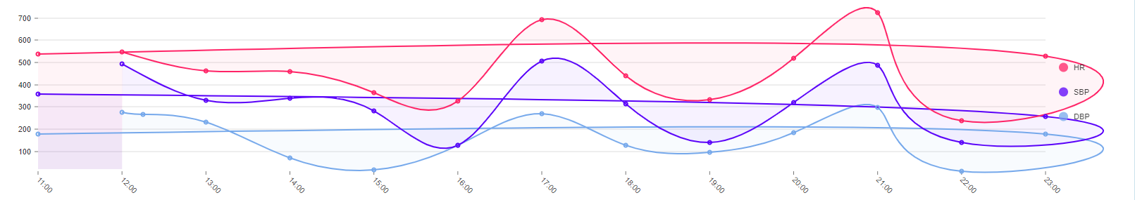
and here's an example of the data:
"data": [
      {
        "x": "12:00",
        "y": 276
      },
      {
          "x": "12:15",
          "y": 266
      }
]
DavidTawil
on 28 May 2020
You would change xScale from:
{
  type: "time",
  format: "%H:%M",
  precision: "minute",
}
to:
{
  type: "time",
  format: "%H:%M",
  precision: "minute",
  useUTC: false,
}
@wyze looks like it is working, thanks!!
DavidTawil
on 30 May 2020
Awesome, glad we got it solved!
wyze
on 30 May 2020
hey @wyze
I have another question, maybe you can help me with that also.
Currently the line works good as long as the data it's receiving in the "x" is sorted by time, meaning if the json will look like this
     {
    "id": "DBP",
    "color": "hsl(103, 70%, 50%)",
    "data": [
      {
        "x": "12:00",
        "y": 276
      },
      {
          "x": "12:15",
          "y": 266
      },
      {
        "x": "13:00",
        "y": 231
      },
      {
        "x": "14:00",
        "y": 70
      },
      {
        "x": "15:00",
        "y": 17
      },
      {
        "x": "16:00",
        "y": 127
      },
      {
        "x": "17:00",
        "y": 271
      },
      {
        "x": "18:00",
        "y": 129
      },
      {
        "x": "19:00",
        "y": 95
      },
      {
        "x": "20:00",
        "y": 183
      },
      {
        "x": "21:00",
        "y": 297
      },
      {
        "x": "22:00",
        "y": 11
      },
      {
        "x": "23:00",
        "y": 179
      },
      {
        "x": "11:00",
        "y": 179
      }
    ]
  }
the tick for "11:00" is created before all of the others and the line becomes messy and go back all the way from 23:00 to 11:00
I've tried to go over the documentation, maybe it has something to do with the domain property, but I didn't have any luck.
DavidTawil
on 31 May 2020
The time series needs to be linear (in order), so you should sort the data before passing it to the chart.
wyze
on 31 May 2020
and there's no way to show the data not sorted? because the data I receive is of 24 hours that splits to two days (let's say it can start from 8:00AM on 5/30/20 and end at 7:59AM 5/31/20)
DavidTawil
on 31 May 2020
It will need to be sorted, you can add the date to the x value, then just format to time only, that should give you what you want.
wyze
on 1 Jun 2020
Awesome! thanks a lot @wyze
DavidTawil
on 1 Jun 2020
Related issues
 PattieC4ke
·
3Comments
PattieC4ke
·
3Comments
 tj
·
4Comments
tj
·
4Comments
 Buvaneshkumar7
·
3Comments
Buvaneshkumar7
·
3Comments
 Haaziq-Uvais
·
3Comments
Haaziq-Uvais
·
3Comments
 indvstry
·
3Comments
indvstry
·
3Comments