Describe/explain the bug
When given monthly data on a line chart, the x-axis is off-by-one by apparently rounding the month down. Messing with the xScale precision makes this problem worse.
To Reproduce
https://codesandbox.io/s/nivoline-off-values-z5hm9
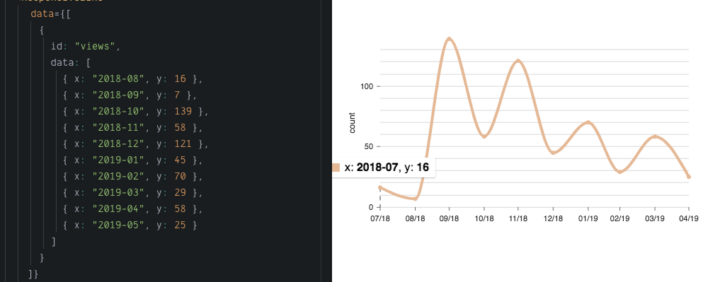
If you look at the data, it goes from "2018-08" to "2019-05". However, the axes and the data points when you hover over them are "mislabeled" so that { x: "2018-08", y: 16 } becomes { x: "2018-07", y: 16 }
Expected behavior
Data points to be labeled as they are given in the data array, with the correct month in the x-axis.
Screenshots
Desktop (please complete the following information):
- OS: MacOS 10.13.6
- Browser: Chrome
- Version 0.58.1, react 16.8.1
Additional context
In the discord channel, it seemed like this might be a timezone issue... I am in MST(+7)
 annaloukianova
All 2 comments
If you add useUTC: false to your xScale, it appears to fix it. I'm not sure what is going on around all the UTC/non-UTC stuff.
 wyze
on 5 Jun 2019
wyze
on 5 Jun 2019
Thanks!
annaloukianova
on 5 Jun 2019
Related issues
 stahlmanDesign
·
3Comments
stahlmanDesign
·
3Comments
 tj
·
4Comments
tj
·
4Comments
 indvstry
·
3Comments
indvstry
·
3Comments
 dubzzz
·
3Comments
dubzzz
·
3Comments
 vagnervst
·
4Comments
vagnervst
·
4Comments
Most helpful comment
If you add
useUTC: falseto your xScale, it appears to fix it. I'm not sure what is going on around all the UTC/non-UTC stuff.