Nextcloud-notes: List widget no longer opens app when tapping on title bar
Prior to v3.2.0, tapping on the title bar of the list widget has opened the main application. By having the widget on my home screen, I could see my top notes immediately, and yet I could very simply and easily open up the app to get full access to my notes list.
This was a simple and useful facility and helped to keep a richly functional yet uncluttered display when using Nextcloud Notes app.
With the list widget changes in v3.2.0, this no longer works. The former "new note" "+" area at the right side now spans the whole title bar. I cannot find a way to get from the list widget to the main app.
Please could this functionality be reinstated ? This is such a major use case for me that I have had to downgrade to 3.1.x for the time being and I would be very grateful if you can help with this feature.
 nickleverton
All 11 comments
Hi @nickleverton
our intention was to get more space for the actual content. Now simply making the header scrollable would look a bit weird, that's why we decided to make it a ➕ button.
Do you have any suggestion (design wise) how it could look like to readd the "open" functionality? Simply putting one additional button in the first item will not work. We don't have text to explain it and we don't have any tooltips etc.
What do you think about adding a last menu item which displays "open category"?
cc @jancborchardt
 stefan-niedermann
on 12 Mar 2021
stefan-niedermann
on 12 Mar 2021
I also would like to better understand your workflow. Why do you want to open the list in the app via the widget? There are only three differences right now between the list widget and the actual app:
- The app shows an excerpt in the second line (I plan to also show the excerpt in the widget in the midterm future.)
- The app allows you to mark a note as favorite without navigating into it
- The app allows you to swipe to delete a note directly
Or maybe it's just "used behavior"?
stefan-niedermann
on 12 Mar 2021
Hmm, good point. Maybe indeed we could do it like before where we have the title say the category name (or "Nextcloud Notes") and the + button on the right – with the adjustment that the header is also part of the scrollable content.
That way we have the best of all 3:
- Quick way to open the app main view if e.g. you don’t have the extra icon since you already use the widget
- Still proper way to add a new note, the
+as icon is enough - Whole widget area available for scrolling, list doesn’t look cramped
 jancborchardt
on 12 Mar 2021
jancborchardt
on 12 Mar 2021
(Also cc @nimisha-vijay since it’s user feedback on the widget redesign :)
jancborchardt
on 12 Mar 2021
Sorry @nimisha-vijay - i couldn't remember your GitHub nickname :wink:
This is a mockup based on jans input:
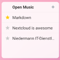
"Open <category>" is just a proposal and can be changed to only the category of course.
stefan-niedermann
on 12 Mar 2021
Looks super nice @stefan-niedermann! I would just show the category name without "Open", since it’s reasonably obvious it would open the app. :) (Every individual note doesn’t say "Open" either" ;)
Additional points but not necessities:
- We could show the Notes icon on the left of the category title, so it’s consistent
- Are the favorite stars interactive? I assume not cause it’s a small space, and if indeed not then I would say let’s only show them for actual favorited notes, and leave them out for regular notes
- I’d say the horizontal lines are not necessary, much like we removed them inside the app itself too.
What do you think @stefan-niedermann @nimisha-vijay? :)
jancborchardt
on 12 Mar 2021
Notes icon on the left
✅ Agree
Are the favorite stars interactive?
❌ No, but i disagree on hiding the icon on non-starred notes. This will cause strange alignments:
- if there aren't any favorites in the list at all, there will be a gap at the left side
- If we move the text to the left in case no note is a favorite, it will look different to other list widgets and glitch if one note becomes a favorite
However - this is out of scope for this issue, please open a separate if you want to discuss it further 🙂
horizontal lines are not necessary,
✅ Agree, but please also open an corresponding issue in the news apps repository - there are also line separators (screenshot)
stefan-niedermann
on 12 Mar 2021
Sounds good! Opened an issue in the News app repo. And good points about the stars – we just keep it like this, then it’s also exactly like in the app. :)
jancborchardt
on 12 Mar 2021
Will be fixed in v3.2.3.
@nickleverton a bit more communication and a few more responses to questions next time would be really nice :wink:
stefan-niedermann
on 13 Mar 2021
Hi, I'm really sorry that I find fast moving discussions hard to follow, DAYJOB takes enough focus out of me sometimes and it needs strength just to write something up. I hope you can bear with me. Thankyou all for the inputs to my request anyway and I am indeed grateful to you.
Starting from the top, the difference between widget and main app is that the widget shows note titles in a compact form suitable for sharing screen space with other widgets. The main app shows titles and first line or lines, which forms a more expanded summary and is very useful in itself. The main app also shows notes in a grouped format. It also gives access to menus, filtering, etc in a very easy to access manner.
All of the above combine to give a larger format, expanded and more informative display which greatly aids comprehension but which would not be appropriate for the compressed information presentation inherent in any widget. However, if you can reach the main app by a single press from the widget, then all this extra detail and functionality is only a single press away from the screen which contains the neat little widget.
This is the workflow behind my use case, that use case is a need for a brief summary on my home screen but instant access to the full functionality if I need it. Hope this makes sense to you :)
As to how to implement it, I have to apologise but I don't know Android UI, so it has also delayed me in replying to try to think this though. In most graphical toolkits, not that I'm in any way a GUI developer, I would expect to be able to group elements together and form a title bar from that. I am happy to accept your explanation that the updated UI makes this hard but am not well enough up on Android I'm afraid.
I am about to post the above and then I'll make time to try to understand the actual suggestions you have come up with. I will see if I can get this done by the end of the weekend.
Thankyou all again and I'm sorry that I can't be so responsive as you expect. NC is a great app all round and the NC Notes app on my phone is just such a game changer for how I use it; using Notes to store and interchange snippets of information seamlessly between phone, laptop and desktop really has become my number one use for a smartphone over the couple of years I've had one.
nickleverton
on 13 Mar 2021
Just had a chance to upgrade now and want to say the new widget looks good and does exactly what I hoped for, thankyou.
nickleverton
on 27 Mar 2021
Related issues
 maenujem
·
7Comments
stefan-niedermann
·
5Comments
maenujem
·
7Comments
stefan-niedermann
·
5Comments
 quthla
·
4Comments
quthla
·
4Comments
 KopfKrieg
·
4Comments
KopfKrieg
·
4Comments
 returntrip
·
4Comments
returntrip
·
4Comments
Most helpful comment
Hi, I'm really sorry that I find fast moving discussions hard to follow, DAYJOB takes enough focus out of me sometimes and it needs strength just to write something up. I hope you can bear with me. Thankyou all for the inputs to my request anyway and I am indeed grateful to you.
Starting from the top, the difference between widget and main app is that the widget shows note titles in a compact form suitable for sharing screen space with other widgets. The main app shows titles and first line or lines, which forms a more expanded summary and is very useful in itself. The main app also shows notes in a grouped format. It also gives access to menus, filtering, etc in a very easy to access manner.
All of the above combine to give a larger format, expanded and more informative display which greatly aids comprehension but which would not be appropriate for the compressed information presentation inherent in any widget. However, if you can reach the main app by a single press from the widget, then all this extra detail and functionality is only a single press away from the screen which contains the neat little widget.
This is the workflow behind my use case, that use case is a need for a brief summary on my home screen but instant access to the full functionality if I need it. Hope this makes sense to you :)
As to how to implement it, I have to apologise but I don't know Android UI, so it has also delayed me in replying to try to think this though. In most graphical toolkits, not that I'm in any way a GUI developer, I would expect to be able to group elements together and form a title bar from that. I am happy to accept your explanation that the updated UI makes this hard but am not well enough up on Android I'm afraid.
I am about to post the above and then I'll make time to try to understand the actual suggestions you have come up with. I will see if I can get this done by the end of the weekend.
Thankyou all again and I'm sorry that I can't be so responsive as you expect. NC is a great app all round and the NC Notes app on my phone is just such a game changer for how I use it; using Notes to store and interchange snippets of information seamlessly between phone, laptop and desktop really has become my number one use for a smartphone over the couple of years I've had one.