Next.js: next/image is not a drop-in replacement for the <img> tag
Bug report
Describe the bug
While the Next 10 blog post states that next/image is a drop-in replacement for the <img> tag, this is not the case for many layouts.
To Reproduce
Steps to reproduce the behavior, please provide code snippets or a repository:
Expected behavior
The layout should remain the same before and after switching from <img> to next/image.
Screenshots

System information
- OS: macOS
- Browser (if applies) Chrome and Firefox, but problem is independent of browser
- Version of Next.js: 10
- Version of Node.js: v14.9.0
 kbrgl
kbrgl
All 10 comments
Did you try putting unsized param to component?
 M1ck0
on 28 Oct 2020
M1ck0
on 28 Oct 2020
@M1ck0 I just tried it, doesn't work. I added another card to the sandbox with the unsized parameter. It looks exactly the same as the regular next/image component.
kbrgl
on 28 Oct 2020
The layout is pretty simple, with a wrapper component (the card) containing two children: a next/image component or <img> tag, and a <p>.
The wrapper has display: flex enabled and align-items: center enabled. This is likely part of why next/image fails to render correctly, since the Image component uses two levels of div wrapper over the img tag, some of which use absolute positioning.
kbrgl
on 28 Oct 2020
You actually didn't add unsized
You rendered this
<NewsletterCardImg />
<h2>next/image</h2>
<NewsletterCardNextImage />
<h2>next/image (unsized)</h2>
<NewsletterCardNextImage />
And also
function NewsletterCardNextImageUnsized() {
return (
<div className={styles.card}>
<Image
className={styles.cardImage}
src="/great-stuff-logo.png"
alt="Newsletter logo"
height={96}
image
width={96}
/>
<p className={styles.cardText}>
You’ll find most of my writing on my newsletter, Great Stuff, where
I share insights from what I’m reading, listening to, and watching.{" "}
<a href="https://kabirgoel.substack.com">Subscribe now!</a>
</p>
</div>
);
}
should be
function NewsletterCardNextImageUnsized() {
return (
<div className={styles.card}>
<Image
className={styles.cardImage}
src="/great-stuff-logo.png"
alt="Newsletter logo"
unsized
/>
<p className={styles.cardText}>
You’ll find most of my writing on my newsletter, Great Stuff, where
I share insights from what I’m reading, listening to, and watching.{" "}
<a href="https://kabirgoel.substack.com">Subscribe now!</a>
</p>
</div>
);
}
Oops! You're right. Fixed that. It renders differently now, way larger than it should be, so still not a drop-in replacement. Here's a screenshot:
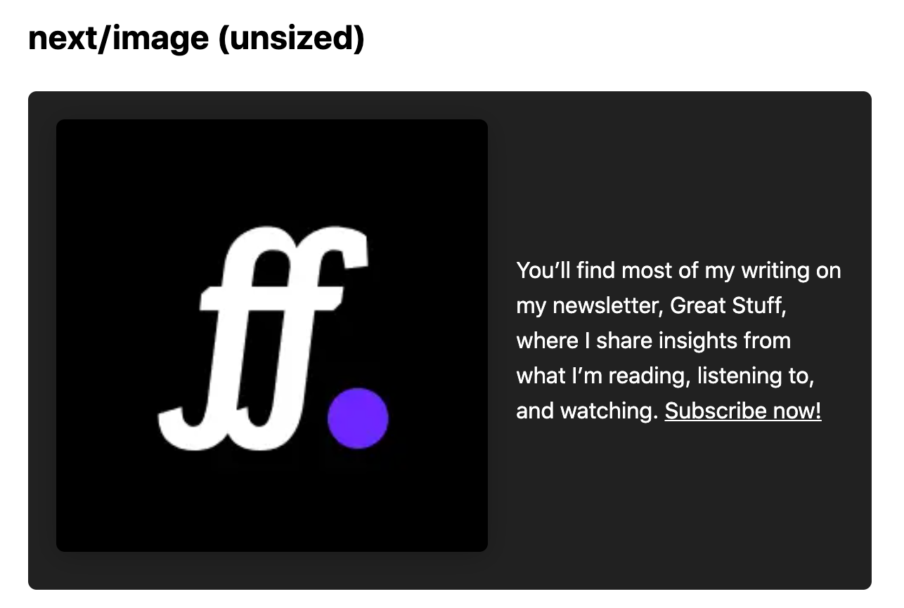
(Also updated the screenshot in the original comment.)
kbrgl
on 29 Oct 2020
The problem is the same across Chrome and Firefox. The screenshot in the original comment was taken using Firefox's screenshot tool, but it's the same on Chrome as well.
kbrgl
on 29 Oct 2020
I came across a similar issue with using Material-UI grid container. I had to attach overflow:'auto' on the display:flex container element but this seems still a slight different issue than yours.
 dohomi
on 29 Oct 2020
dohomi
on 29 Oct 2020
really messes things up if you use it as a drop in replacement especially when using flex boxes, I had margins on my images which won't work now as the component surrounds the image with divs and there is no way to directly put margins on that div
minimal reproduction of the issue
https://codesandbox.io/s/happy-tdd-dn1q3?file=/pages/index.js
the same code is repeated twice once using the new image component and once the old one and while it's expected to act similarly - it doesn't
 kush-agra
on 30 Oct 2020
kush-agra
on 30 Oct 2020
The next/image component isn't meant to be a drop-in replacement for the <img /> component! That said, next@canary should give you the tools necessary to make this work correctly.
Something along these lines:
      <div className={styles.cardImageWrapper}>
        <Image
          src="/great-stuff-logo.png"
          alt="Newsletter logo"
          width={256}
          height={256}
          layout="responsive"
        />
      </div>
.cardImageWrapper {
  flex: 0 0 96px;
  margin-right: 20px;
  border-radius: 6px;
  box-shadow: 0 3px 18px 0 rgba(0, 0, 0, 0.2);
}
 Timer
on 2 Nov 2020
Timer
on 2 Nov 2020
@Timer thank you for the solution! It would be great to update the Next 10 blog post/documentation to reflect this, because they very clearly state that it's a drop-in replacement, which may be misleading to users.
kbrgl
on 2 Nov 2020
Related issues
 knipferrc
·
3Comments
knipferrc
·
3Comments
 timneutkens
·
3Comments
timneutkens
·
3Comments
 olifante
·
3Comments
olifante
·
3Comments
 DvirSh
·
3Comments
DvirSh
·
3Comments
 kenji4569
·
3Comments
kenji4569
·
3Comments
Most helpful comment
@Timer thank you for the solution! It would be great to update the Next 10 blog post/documentation to reflect this, because they very clearly state that it's a drop-in replacement, which may be misleading to users.