Background
Howdy guys. I'm new to the project and I want to learn how everything is set up and eventually be helpful in getting new card packs up and contributing with other things. I'm coming from C#/C++/AS3/Python educational game development and asset pipeline work so I'm also bringing myself up to speed with web stuff. I have experience with UX as well, so I thought some UX/UI work would be the easiest thing for me to tinker with to feel my way through the code.
Topic
I always seem to mess up in the deck builder when editing cards. I click the "-" button trying to increase the number of cards from 1 or 2, only to realize I was clicking on the "-" and not the "+".
Context
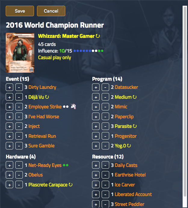
When this happens, the card goes to 0 and then is removed from the list. I then have to go back to the Add Cards section to search and then re-add it.
This frustrates me a bit, so I thought I'd see what I could to do improve the deck building experience. This is certainly not the only reason to make a change, but it triggered a desire to look deeper into how the UI was set up and the User Experience behind it.
UX Patterns
Pattern A
In the west, the reading pattern is left to right, and numbers progress from lower to higher from left to right as well. This is counter to the order of the buttons on the Deck Builder.

Potential Improvement
I think changing the order to have the decrement "-" button on the left and the increment "+" button on the right would conform better to this standard.
Pattern B
Secondly, the number of cards is slightly dissociated with the input buttons. The left button is far removed from the number it is modifying. This creates an odd association where the right button is more strongly associated with the value it is modifying than the left. During use, this can also cause a user to not catch that they are changing the number in ways they are not intending to per Pattern A.

Potential Improvement
I believe the number being placed between the two buttons to create a natural flow of increment and decrement as well as provide equal association with the buttons for the number would be beneficial.

Summary
Overall, I believe this follows UX patterns a bit more closely and creates a more pleasant interaction and sense of aesthetics for the interface. The following would be the result of the changes:
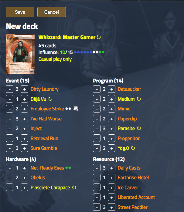
I realize that many people may just copy pasta their decks in from other places where they store them and not use these buttons, but as a visual person I personally like to use jnet to make my decks so I use these buttons a lot.
What do you guys think? I have tinkered with the code to create these mockups, so I could submit a pull request if you guys feel like it looks good.
 msbeck
All 15 comments
I like the changes. Nice one.
 danhut
on 13 Feb 2018
danhut
on 13 Feb 2018
These are insightful suggestions. Let's see a PR!
 nealterrell
on 13 Feb 2018
nealterrell
on 13 Feb 2018
Great. Can you help me with my first time PR? I've never used GitHub as a programmer on a team and I've always just used repos as the owner for backups.
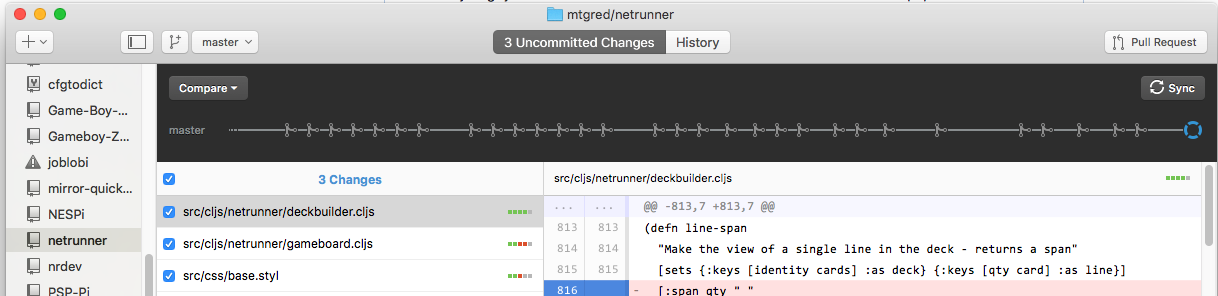
I'm assuming I submit a PR to dev, yes?
When I switch to the dev branch-
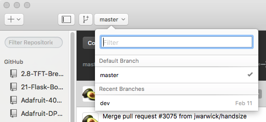
My Uncommitted Changes no longer appear in the queue.
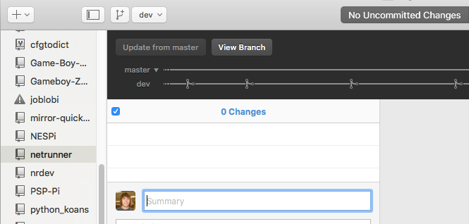
EDIT
Perhaps I just hit the Pull Request button on master? (Please don't take out your pitchforks for me using the GUI)
msbeck
on 13 Feb 2018
You should commit your changes to a new branch of your personal fork of the project. Then sync/push that branch to GitHub. Once you've done that, GH web UI should show a "create PR" button when viewing the project home page.
nealterrell
on 14 Feb 2018
Do I need authentication to do so?
$ git pull origin master
From https://github.com/mtgred/netrunner
 * branch            master     -> FETCH_HEAD
Already up-to-date.
$ git checkout -b inc-dec-button-updates
M   src/cljs/netrunner/deckbuilder.cljs
M   src/cljs/netrunner/gameboard.cljs
M   src/css/base.styl
Switched to a new branch 'inc-dec-button-updates'
$ git push origin inc-dec-button-updates
Username for 'https://github.com': msbeck
Password for 'https://[email protected]':
remote: Permission to mtgred/netrunner.git denied to msbeck.
fatal: unable to access 'https://github.com/mtgred/netrunner.git/': The requested URL returned error: 403
You won't be able to commit directly to this repository. You'll need to fork it first, then clone your fork to your machine. That is where you'll reapply your changes, commit to a new branch, and push to origin (GitHub)
nealterrell
on 14 Feb 2018
Got it: https://github.com/mtgred/netrunner/pull/3081
TYVM
msbeck
on 14 Feb 2018
A very sensible, well-reasoned change. 🍺
 JoelCFC25
on 14 Feb 2018
JoelCFC25
on 14 Feb 2018
::frown::
Verbally, the association is "plus or minus" and in most applications the "first" button is the "add more" (e.g. insert comes before delete in Excel, Confluence, Jira)
Putting the number between the buttons seems ok, though it hurts the ability to study the list.
A better solution to the originally expressed issue would be retaining 0 count cards in the list until the deck changes are saved.
 Eric-Fletcher
on 15 Feb 2018
Eric-Fletcher
on 15 Feb 2018
The Net Deck has it as minus button to the left of the plus button, so I'm happy with -/+ order.
I do agree that having the numbers between the buttons feels a bit disruptive, but I'm not feeling strongly about it.
I like the idea of keeping "0" count cards in until save.
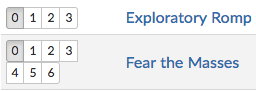
An additional idea is to have NRDB style 0/1/2/3 style radio buttons, although that might raise the question of screen space and be a general CSS nightmare.
 Saintis
on 15 Feb 2018
Saintis
on 15 Feb 2018
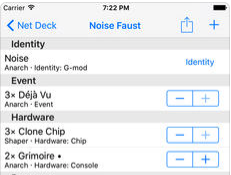
The Net Deck has it as minus button to the left of the plus button, so I'm happy with -/+ order.
Deck Builder for Netrunner (Android) also shares this same order.
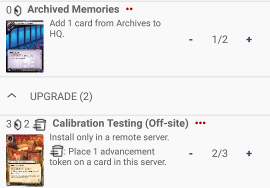
They have the counts in between the buttons as well, for symmetry, which is another good reason for our numbers to be in the middle that I did not mention in my original case.
An additional idea is to have NRDB style 0/1/2/3 style radio buttons, although that might raise the question of screen space and be a general CSS nightmare.
I agree with it being a CSS trouble, especially for the cards which you can have more than 3 of. A few edge cases perhaps, but would be messy ones. Also, it would likely take up more horizontal and even vertical space. Imported cards with long names will be squeezed even further, especially those which already are.
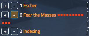
Verbally, the association is "plus or minus"
Colloquial phrases don't have bearing on web interactions when it comes to UX decisions.
and in most applications the "first" button is the "add more" (e.g. insert comes before delete in Excel, Confluence, Jira)
Though easily mistaken as similar, an insert and delete function does not share strong analogies with incrementing and decrementing. Insert and delete in the contexts of spreadsheets confers the sense of placement, reorganization, and position. The interaction under consideration is a number increasing or decreasing.
Also, insert and delete generally appear as menu items, among many others, and usually as a second click after a right click; thus they are distanced quite far from being likened to consecutively clicking a small button to increment or decrement a numeral.
Finally, excel does not use the analogy you are asserting in other parts of their program.

Increasing the zoom is accomplished by clicking the "+" on the right and vise versa.
A better solution to the originally expressed issue would be retaining 0 count cards in the list until the deck changes are saved.
Me spending time working on the proposed changes was triggered by my frustration with the cards disappearing and so forth, but the UX reasons for changing the buttons still stand and tangentially keep that from occurring.
msbeck
on 15 Feb 2018
Merged!
JoelCFC25
on 18 Mar 2018
i dont think this is a good change. just a heads up.
 prozz
on 18 Mar 2018
prozz
on 18 Mar 2018
You're not alone, but I seriously doubt it will be reverted. Everyone has been conditioned to these UI components being arranged the opposite of just about everything else similar to it. You'll get used to it.
JoelCFC25
on 18 Mar 2018
for me its not about +/- placement, i can get used to whatever order u plan to put it.
it's about reading decklist in edit mode which is very troublesome. in my deck i got:
- 3 injects
not - 3 [blablabla] injects
prozz
on 18 Mar 2018
Related issues
 dnddmdb
·
4Comments
dnddmdb
·
4Comments
 bblum
·
3Comments
bblum
·
3Comments
 x3N1GM4x
·
5Comments
x3N1GM4x
·
5Comments
 LessRekkless
·
5Comments
LessRekkless
·
5Comments
 CasMat9
·
3Comments
CasMat9
·
3Comments