Netnewswire: Long Line Length in Article Views
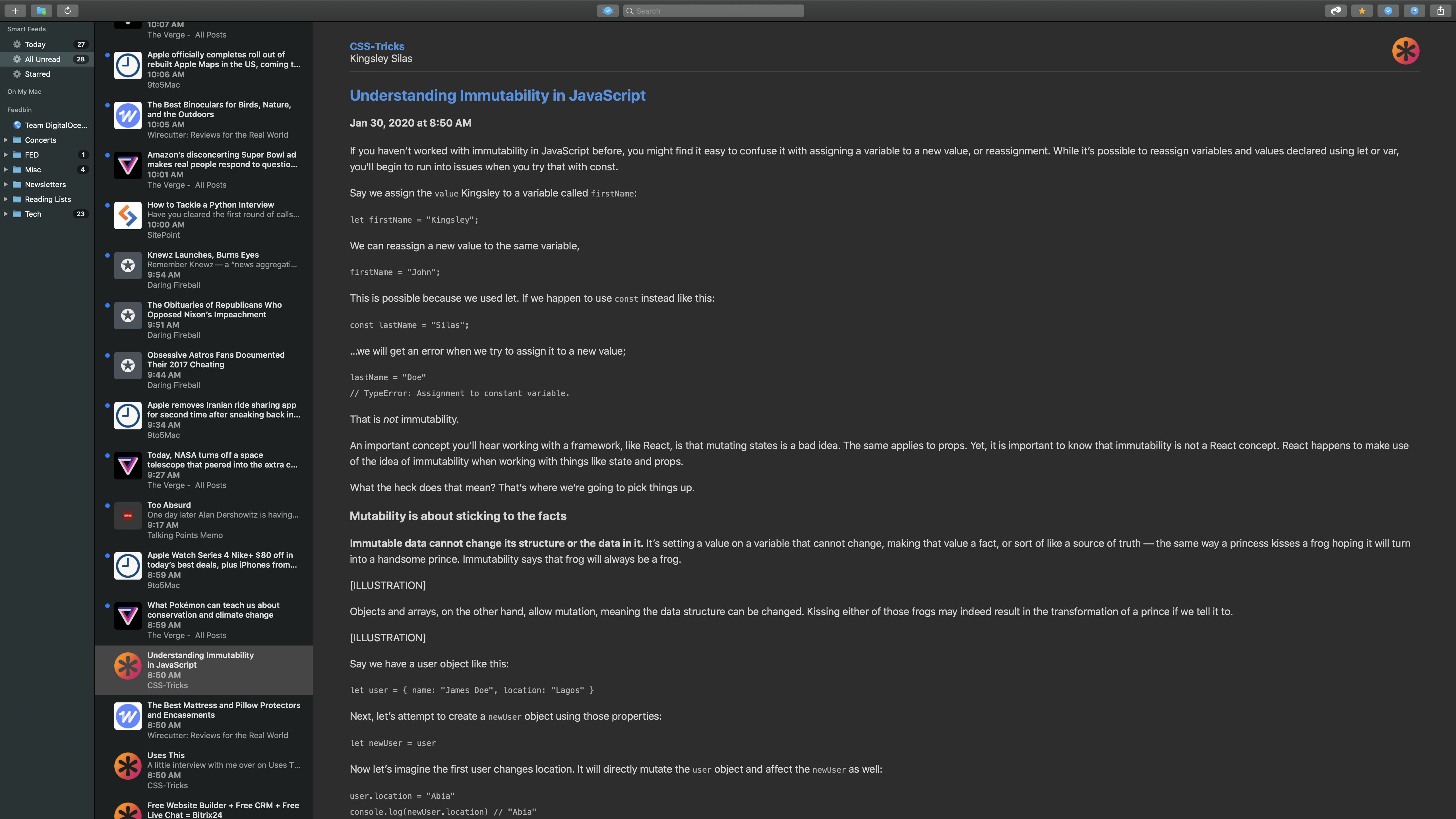
I am someone that reads NNW for Mac at full screen on a 27" monitor and the line length of the text gets pretty long.
Issue
Line length appears too long when window is very wide on large screens (Ex: full screen on 27" monitor) making readability hard.
Proposed Solution
Add a max-width to the content area in the web view via CSS:
.articleBody {
    line-height: 1.6em;
    max-width: 1200px; /* New */
}

body .headerTable {
    border-bottom: 1px solid var(--header-table-border-color);
    max-width: 1200px; /* New */
}
Open Questions
- Should it be centered?
- What is a sensible max width for users?
- Preference?
- Should there be an option to turn turn this off?
- If so, what would the default be?
- Would this fall under the theming feature?
Hopefully I have the info needed for this but let me know if you have any questions. If this update is CSS changes, I would be able to help with the implementation.
 rtvenge
All 11 comments
Let’s do something for the 5.0.4 version.
 brentsimmons
on 1 Feb 2020
brentsimmons
on 1 Feb 2020
Is 1200px a reasonable size? I don't have a working display that goes that wide at the moment.
 Wevah
on 21 Feb 2020
Wevah
on 21 Feb 2020
That 1200px was something arbitrary I came up with. I did a little research and I'm wondering if 768px would be a better width. Line Lengths are generally based on character counts which we don't have the luxury of in css/the web.
I did see FeedBin's web interface is using max-width: 660px at font-size: 16px on theirs.
I tried this css out in the web inspector and this is what it looked like:
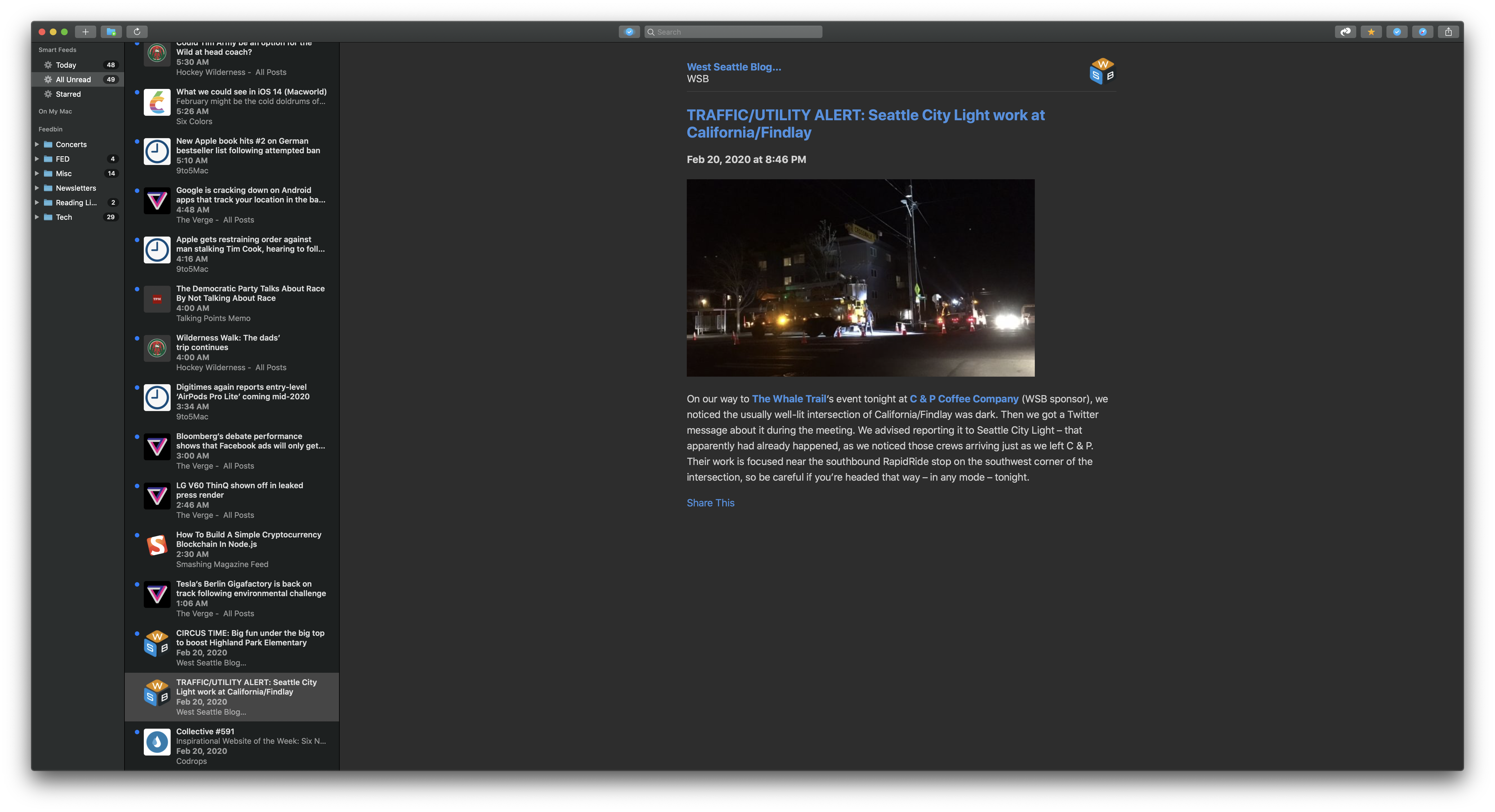
body {
    margin-top: 20px;
    margin-bottom: 64px;
    margin-left: auto; /* new/updated */
    margin-right: auto; /* new/updated */
    max-width: 768px; /* new/updated */
    padding-left: 64px; /* new/updated */
    padding-right: 64px; /* new/updated */
    font-family: -apple-system;
    font-size: 18px;
    word-wrap: break-word; /* break long words or URLs */
}
Wait, my display is absolutely over 1200px. I'm not very awake.
Wevah
on 21 Feb 2020
max-width could also be set in relative units.
Wevah
on 21 Feb 2020
Relative units such as a percentage or vw (viewport width) could be used. I think in this case, we don't want the line length to go over an absolute width so I don't think a relative max-width would be best.
We _could_ do a relative unit on width and an absolute on the max-width:
body {
  width: 80vw;
  max-width: 768px;
}
I meant em or rem or ex, so it scales with the font size.
Wevah
on 21 Feb 2020
Ah sorry. 😆
That would be a better way to do it. 44em computes down to 792px with the current css s that could be a good value.
body {
    margin-top: 20px;
    margin-bottom: 64px;
    margin-left: auto;
    margin-right: auto;
    max-width: 44em;
    padding-left: 64px;
    padding-right: 64px;
    font-family: -apple-system;
    font-size: 18px;
    word-wrap: break-word; /* break long words or URLs */
}
I'll probably round that to 800 because I like it, but that sounds reasonable.
Wevah
on 28 Feb 2020
Oh, right, em. I'll try 44!
Wevah
on 28 Feb 2020
I added the same rules as yours without even looking. 🎉
Wevah
on 28 Feb 2020
Related issues
 mhoutman
·
5Comments
mhoutman
·
5Comments
 sgoodwin
·
7Comments
sgoodwin
·
7Comments
 myurieff
·
4Comments
myurieff
·
4Comments
 gferreroferri
·
8Comments
gferreroferri
·
8Comments
 dumprop
·
6Comments
dumprop
·
6Comments