Netnewswire: Feature request: compact article list
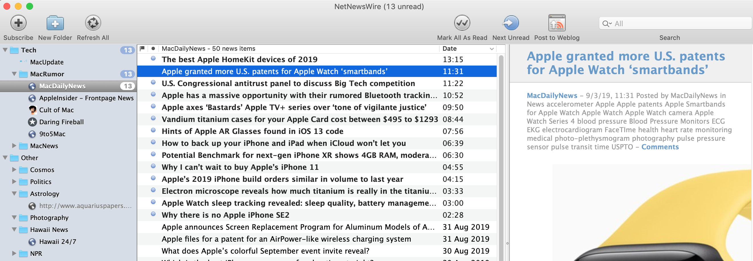
One of my favorite things about NNW 3 is the single-line listings with title, source, date, and creator in columns. I don’t expect that same level of customization, but an alternate “compact” view without smaller favicons (or no favicons) and fewer lines per article would be nice.
 stewf
stewf
All 9 comments
RSS ideally provides a quick scan of article headlines without having to read a lot of text. The ability to limit the description line to 1, 2, 3 etc. provides the user with better options that match their scanning style. Hope to see such a feature in NNW5 soon!
 2stepbay
on 4 Sep 2019
2stepbay
on 4 Sep 2019
Example from how I set up NNW 3
2stepbay
on 4 Sep 2019
+1 Agree. I want this exact same functionality added back in. And actually, also have the option to have my titles across full width with the content below. Same functionality as NNW 3
 noahkuhn
on 6 Sep 2019
noahkuhn
on 6 Sep 2019
+1 Would love to see this feature in NNW soon! This is a feature that is currently holding me back from using NNW over Feedly on a daily basis. One line compact view of Feedly is just so much faster to scroll through.
 zulu101
on 12 Sep 2019
zulu101
on 12 Sep 2019
yes, as it is now it seems to me to be dispersive to read and I cannot get used to it
 sbarex
on 3 Nov 2019
sbarex
on 3 Nov 2019
This ought to be an easy change. Surprised it hasn't been made.
2stepbay
on 3 Nov 2019
While wiring up a simple table view is pretty easy, no feature is as easy as just that.
And, critically, there are other things with higher priority at the moment, such as the iOS app, Feedly syncing, content extraction, and some other things.
We’ll get to this — it’s important, for sure — but it has to wait for some other things first.
 brentsimmons
on 3 Nov 2019
brentsimmons
on 3 Nov 2019
Probably the readability would be better using for the date label a smaller font with normal weight, or put in the top right corner as in Mail.
sbarex
on 4 Nov 2019
I tried to create a pull request with date aligned on right side: #1247
sbarex
on 4 Nov 2019
Related issues
 sgoodwin
·
7Comments
sgoodwin
·
7Comments
 tinybot-ca
·
7Comments
tinybot-ca
·
7Comments
 myurieff
·
8Comments
myurieff
·
8Comments
 gferreroferri
·
8Comments
gferreroferri
·
8Comments
 jothachil
·
3Comments
jothachil
·
3Comments
Most helpful comment
+1 Agree. I want this exact same functionality added back in. And actually, also have the option to have my titles across full width with the content below. Same functionality as NNW 3