Netlify-cms: Add New Button Component
Based on the design in #2557, add or update the Button component and any dependencies of this component to the project. Feel free to use this CodeSandbox for reference.
You can also refer to this...
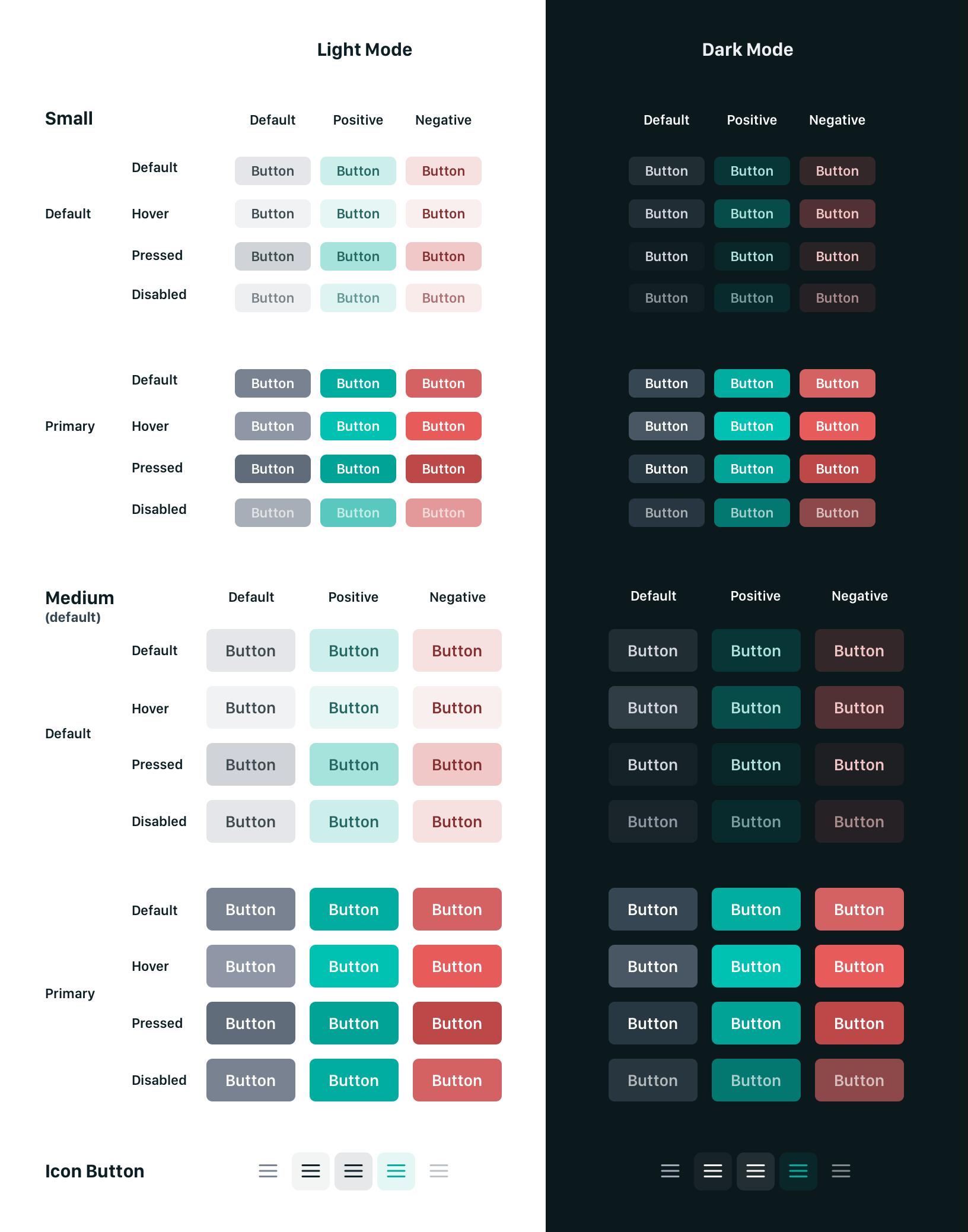
- [x] Update or add component to project
- [x] Add to Storybook
- [ ] Replace and use new component throughout project
- [ ] Write component tests
- [ ] Ensure tests pass
- [ ] Open a pull request
 austincondiff
All 8 comments
I would like to do it 😄
 pniedzwiedzinski
on 18 Feb 2020
pniedzwiedzinski
on 18 Feb 2020
Thanks @pniedzwiedzinski! We'll be merging everything to https://github.com/netlify/netlify-cms/tree/future/v3 and I'll make sure to sync it with `master.
 erezrokah
on 18 Feb 2020
erezrokah
on 18 Feb 2020
I was thinking about colors, maybe I could create a bootstrap-like api
Success

Danger
Normal
pniedzwiedzinski
on 19 Feb 2020
@pniedzwiedzinski I've updated my first comment in this issue with a chart of the different buttons that should be available. Refer to it and my sandbox here https://codesandbox.io/s/netlify-cms-editor-design-j1cg3
austincondiff
on 19 Feb 2020
Okay, so I think this could work like this:
size- the size of the button (size|medium)type- the type of the button (default|positive|negative)primary- if is primary
<Button size="small" type="positive">Button</Button>
<Button size="medium" primary>Button</Button>
Should the icon button be in the same component? From what you sent they work a bit differently. I am thinking about creating the IconButton that will work like this:
type- the type of the icon that will be passed to theIconcomponent
<IconButton type="menu" />
Also, what stands this green variant of the icon for? Is it like an active state?
pniedzwiedzinski
on 19 Feb 2020
Okay, I misunderstood the concept of the icon, so this would be like this:
<Button size="small" icon="menu" />
Note, I made some changes to the Button component in my sandbox. Please update accordingly.
austincondiff
on 27 Feb 2020
I have added this component itself to the project and to storybook in the v3-ui-redesign branch. We still need to test and use it through the app. Please branch from this branch if you plan to do this.
austincondiff
on 3 Mar 2020
Related issues
 ciokan
·
3Comments
ciokan
·
3Comments
 papandreou
·
3Comments
papandreou
·
3Comments
 bkroggel
·
3Comments
bkroggel
·
3Comments
 chriskirknielsen
·
3Comments
chriskirknielsen
·
3Comments
 jake-101
·
3Comments
jake-101
·
3Comments
Most helpful comment
@pniedzwiedzinski I've updated my first comment in this issue with a chart of the different buttons that should be available. Refer to it and my sandbox here https://codesandbox.io/s/netlify-cms-editor-design-j1cg3