Netlify-cms: Update Login Screen UI
Why
In support of #2557, this issue aims to provide an initial task to help stakeholders get acclimated to the project.
Goal
Implement an updated login screen UI based on mockups by @AustinCondiff:
https://projects.invisionapp.com/share/3ATIRBHKW9F#/screens/380522637
Details
- The mockup shows the Git Gateway password login screen - that UI comes from the netlify-identity-widget repo and is non-trivial to customize. Recommend considering that part out of scope for this issue.
- Due to the previous point, a mockup should be made showing how the other backends, which currently consist only of a button instead of a form, should appear.
- The current login components use some strange positioning, which led to https://github.com/netlify/netlify-cms/issues/2133 being opened. That issue can probably be resolved under this one.
Tasks
- [ ] Create additional login screen mockup with oauth button in place of form - @AustinCondiff
- [ ] Implement design and document related components in Storybook - @danoszz & @timmysmalls
Prerequisites
- #3102
 erquhart
All 6 comments
@timmysmalls and I will be meeting up next week to nail the UI/UX implementation of this screen and document it in Storybook. 🪁
 danoszz
on 19 Jan 2020
danoszz
on 19 Jan 2020
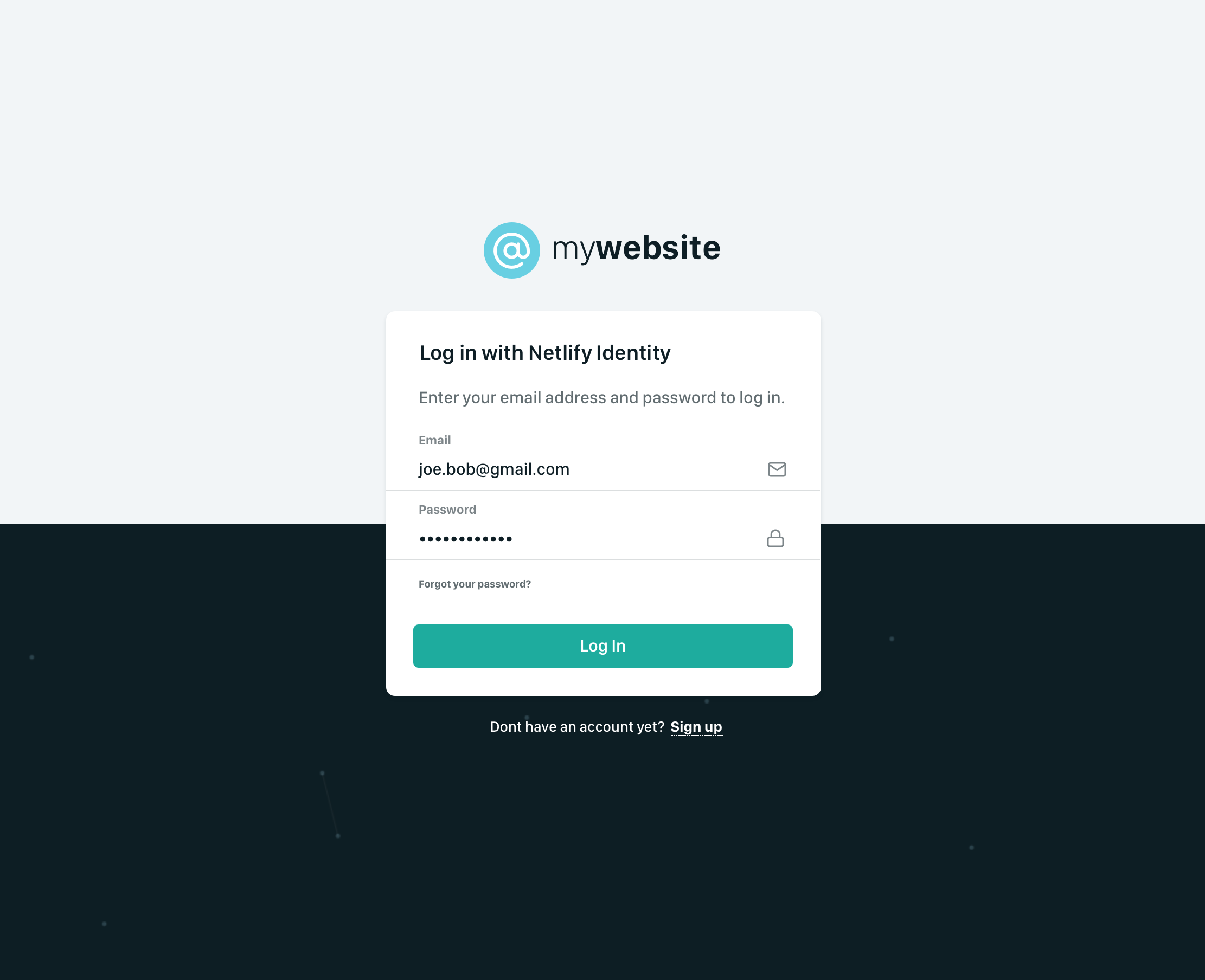
@austincondiff to speed up the workflow, I've taken on your task if you don't mind. Attached below are the designs for the login screen w/o the netlify-identity-widget UI. This will be our starting point.
What's next?
Today @timmysmalls and I will take an approach to implement the design and components in Storybook. We'll keep you guys posted.
danoszz
on 24 Jan 2020
Progress log
We've decided on the following:
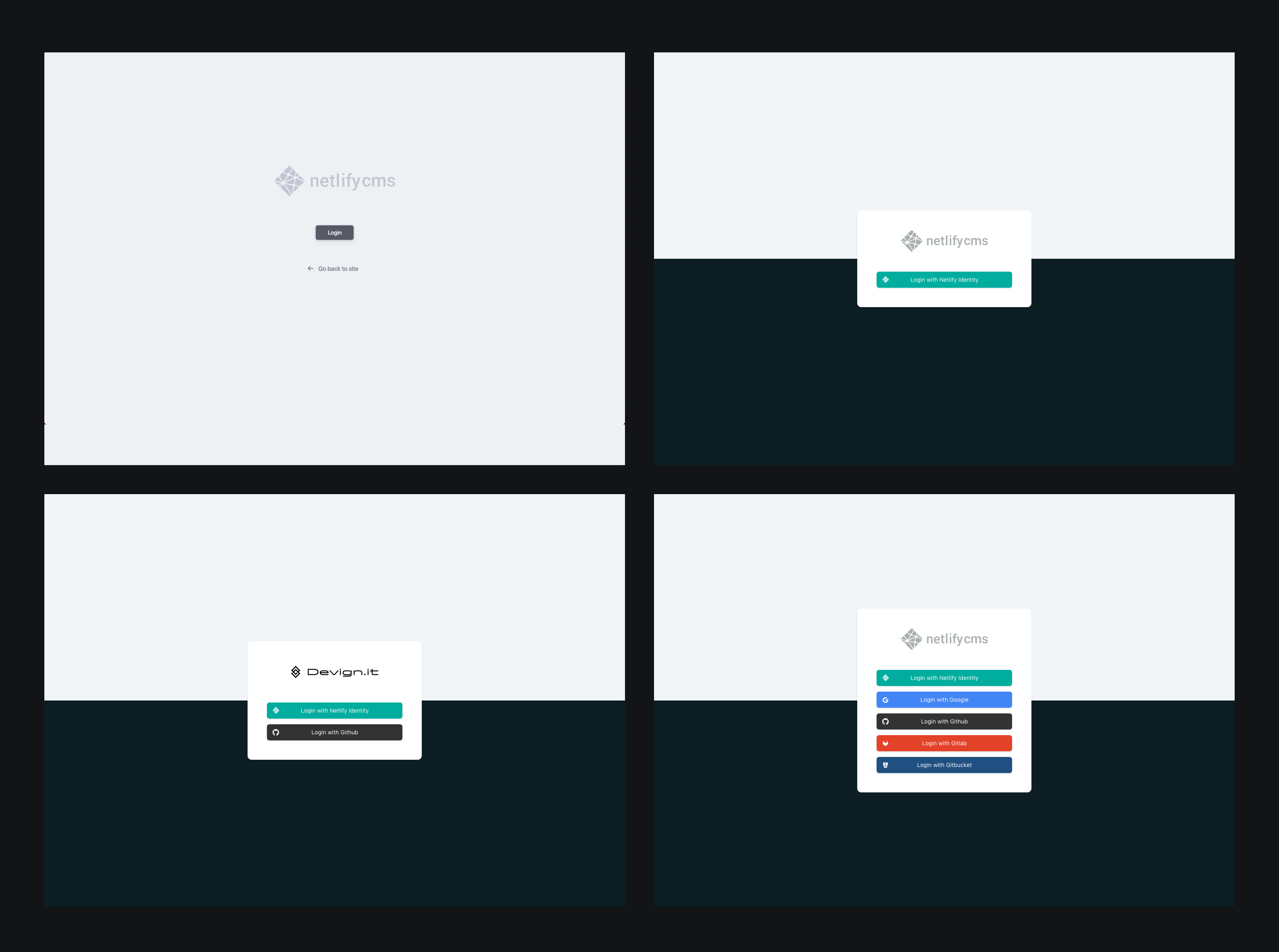
- Design: the dark background will be on top instead of bottom - To grab the users attention for the login button, it should be high contrast with the background. Also this is pattern seen in the Netlify UI
Pattern in Netlify UI
New design login page
danoszz
on 24 Jan 2020
Progress log
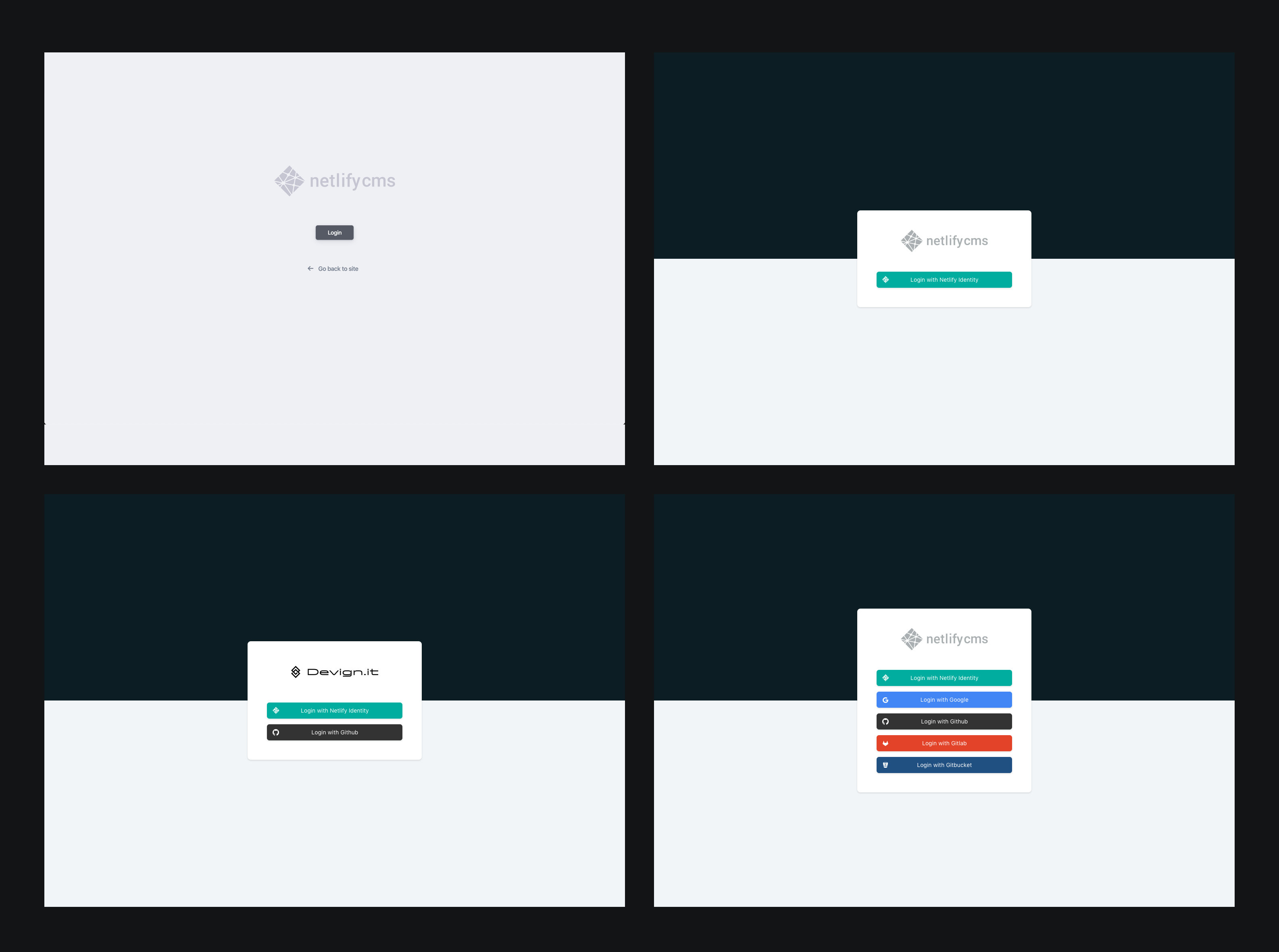
We've made a lot of progress today, this is our current progress:
- [x] Find a smooth working method together w/ @timmysmalls 👯♂️
- [x] Create additional login screen mockup with oauth button in place of form
- [x] Implement design - layout
- [x] Implement design - modal
What's new?
Together we decided on the following. Hopefully, this is alright:
- We changed the design a bit as mentioned above.
- All new UI components and stories are located in
packages/netlify-cms-ui-default/src - Rewrote the packages
netlify-cms-backend-testandnetlify-cms-backend-proxyto be depending onpackages/netlify-cms-ui-default/src/AuthenticationPage.jsso we keep the login screen UI DRY - Added variable
length.magicNumberwhich we use in every _spacing_, _padding_, _margin_, _width_, and _height_ to keep the UI consistent. Right now this number is based on 48px, which is used in the Netlify design system. In my experience, having a base number while creating a Design System works flawlessly. For example
const NewComponent = styled.div`
  min-width: calc(${lengths.magicNumber} * 5);
  padding: calc(${lengths.magicNumber} / 2);
  border-radius: ${lengths.borderRadiusCard};
  background-color: white;
`;
All progress is pushed to:
🔗Timmysmalls' fork
🔗Danoszz' fork
What's next?
- [ ] Implement design - external provider buttons - @timmysmalls
- [x] Document components in Storybook - @danoszz
- [x] Fix error in Storybook when importing SVG - probably need to import a custom
webpack.config.js- @danoszz - [ ] Make a PR to resolve this issue - ?
danoszz
on 24 Jan 2020
@timmysmalls I am ready to do a PR for this issue, how's stuff going with the external provider buttons? Can I assist with anything?
Once we have the buttons, we can resolve this issue 🏄♂️
danoszz
on 6 Feb 2020
Our first Storybook component is alive 🎡
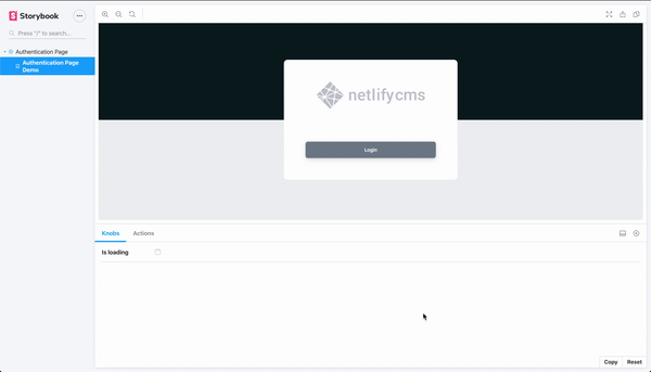
danoszz
on 6 Feb 2020
Related issues
 marcojakob
·
3Comments
marcojakob
·
3Comments
 mikecrittenden
·
3Comments
mikecrittenden
·
3Comments
 zebapy
·
3Comments
zebapy
·
3Comments
 papandreou
·
3Comments
papandreou
·
3Comments
 emckay
·
3Comments
emckay
·
3Comments
Most helpful comment
Our first Storybook component is alive 🎡