Nerd-fonts: Powerline Icons are too small
Using mintty, the screenshot shows "Meslo LG S DZ" but the other "Meslo"-fonts, "Droid Sans Mono", "Bitstream Vera Sans Mono" and "DejaVu Sans Mono" also look like this.

 darookee
All 49 comments
I have this occurring on xft based rendering as well, using urxvt. It only seems to occur with the powerline glyphs. This strikes both OSx XQuartz and windows XServer.
 karlmutch
on 9 Sep 2015
karlmutch
on 9 Sep 2015
I've been away but I will look into this when back.
@darookee I will have to try things out on Windows in term emulators.
@karlmutch I was able to get it working for me on urxvt. Can you share your config settings?
I have:
URxvt.font: xft:Droid Sans Mono for Powerline Plus Nerd File Types Mono:pixelsize=16:antialias=true:hinting=true
 ryanoasis
on 9 Sep 2015
ryanoasis
on 9 Sep 2015
I'm getting it (on urxvt) with
urxvt.font: xft:Meslo LG S DZ for Powerline Plus Nerd File Types Mono:pixelsize=14
(as well as a bunch of other Meslo variations)
Droid sans (urxvt.font: xft:Droid Sans Mono for Powerline Plus Nerd File Types Mono:pixelsize=14) also has the issue, but others (Inconsolata and Anonymous Pro were the ones I noticed) are fine.
 lotrfan
on 11 Sep 2015
lotrfan
on 11 Sep 2015
that was off of master (6158e08) with a semi-patched version of urxvt 9.21
lotrfan
on 11 Sep 2015
I had urxvt 1.19 and replicated the same using Droid Sans Mono will see
what happens when using the 2 fonts you mentioned worked.
On Sep 10, 2015 11:19 PM, "Jeffrey Tolar" [email protected] wrote:
that was off of master (6158e08
https://github.com/ryanoasis/nerd-fonts/commit/6158e08ce0367090e9383a2e795aa03d3550f2b4)
with a semi-patched
https://aur.archlinux.org/packages/rxvt-unicode-patched/ version of
urxvt 9.21—
Reply to this email directly or view it on GitHub
https://github.com/ryanoasis/nerd-fonts/issues/26#issuecomment-139462565
.
karlmutch
on 11 Sep 2015
Excellent work, but as darookee says. DejaVu Sans Mono PowerLine symbols are too small. I can't find any other issues, just those. Using mintty here too.
 CanisHelix
on 13 Sep 2015
CanisHelix
on 13 Sep 2015
@ShiroiKuma there are small and big powerline symbols .you must have tried smal one . try this ⮀ ⮂
 kiranps
on 14 Sep 2015
kiranps
on 14 Sep 2015
Oh okay. I'm using UxE0B0 and UxE0B1 in my prompt. I'll look for other codes.
On Sep 14, 27 Heisei, at 19:16, kiran ps [email protected] wrote:
@ShiroiKuma there are small and big powerline symbols .you must have tried smal one . try this ⮀ ⮂
—
Reply to this email directly or view it on GitHub.
CanisHelix
on 14 Sep 2015
I'm also seeing glyph size anomalies, but on OS X using iTerm and Anonymous Pro. Screenshots:
This was taken using the pre-patched font from the repository:

The arrow glyphs are E0B0 - E0B3.
You can also see that E0A0 is abnormally small:

The version from powerline/fonts (Anonymous Pro for Powerline) doesn't have these issues:


Inconsolata for Powerline Plus Nerd File Types doesn't have this issue either, but has the strange spacing that was described in #29 (but this seems to be related to using Anonymous Pro for ASCII characters and Inconsolata for non-ASCII):


 iravid
on 15 Sep 2015
iravid
on 15 Sep 2015
I compared both fonts using the Symboltable in Windows. The first one is DejaVu Sans Mono from the powerline repository:

The second one from nerd-fonts

darookee
on 15 Sep 2015
I have the same Issue on OSX yosemite with iTerm2. I used "Droid Sans Mono for Powerline Plus Nerd File Types Plus Font Awesome Plus Octicons". So this is no windows-only problem..
 dritter
on 16 Sep 2015
dritter
on 16 Sep 2015
Thanks for all the info I think it will help. :)
ryanoasis
on 16 Sep 2015
- DejaVu Sans Mono
- Meslo LG M
- Droid Sans
- Anonymice (best)
I tried these 4x, and didn't see such small icons. Although the icons are a bit small. It's not dramatic, but because they are monotyped for Mintty compatibility, sometimes the icons just don't look as good in Windows. Anonymice seemed to have the best sized icons.
This is Meslo LG M:

If you look closely, the segment separator is too small. It doesn't reach all the way to the top of the bar.
And even the home directory icon - it doesn't expand as large as it should.
Compare this to Anonymice:

The home directory icon takes up a slightly larger percentage of the bar (still too small imo). And the segment separator (flame) actually expands the proper amount vertically.
Some of these issues are unavoidable with monospaced icons. Although some of these icons can just be made bigger. The flame probably cannot be any bigger, since it is expanded the proper amount already for this font. But the home directory icon could easily be made 20-30% larger.
 DanielGGordon
on 4 Feb 2016
DanielGGordon
on 4 Feb 2016
@DanielGGordon Awesome! Thanks for the detailed report and feedback. It will prove helpful :tada:
Yeah getting things to look right with fonts can be a huge pain :worried:
ryanoasis
on 5 Feb 2016
I am getting the same effect when trying to patch the PragmataPro font set:

 kierun
on 18 Aug 2016
kierun
on 18 Aug 2016
@kierun Thanks yeah that looks really bad. I am going to try to really get back into fixing some of these serious issues.
ryanoasis
on 19 Aug 2016
kierun
on 19 Aug 2016
I believe small powerline glyphs should at least be fixed in the latest version but I will test urxvt in particular with the menttioned fonts and if it goes well I will close this issue
Anyone else that could test things out that would be appreciated :smile:
ryanoasis
on 20 Feb 2017
I'm still having some issues with my Powerline glyph sizes in iTerm.
DejaVuSansMonoforPowerline Nerd Font (complete)

vs DejaVu Sans Mono for Powerline

 nomoon
on 3 Mar 2017
nomoon
on 3 Mar 2017
@nomoon Thanks for the details. Looks more like an alignment issue than size issue?
Btw, I like your prompt. Where is it from? :blush:
ryanoasis
on 4 Mar 2017
@ryanoasis that's powerlevel9k, which is in the process of rolling out nerd font support. I do think there's a bit of a sizing issue, though. The powerline arrows typically protrude a bit at the bottom.
nomoon
on 4 Mar 2017
@nomoon Ah I should have realized it was PL9K. Yeah I have been kind of following along with the developments :smile:
The powerline arrows typically protrude a bit at the bottom
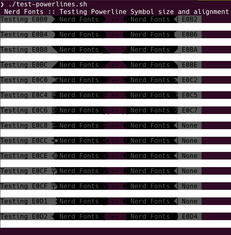
Working on a test script that will help us test sizing and alignment issues more easily
ryanoasis
on 5 Mar 2017
I'm noticing the same thing as @nomoon, however It only appears with knack nerd font regular & driodsansmonoforpowerline nerd font book... but not with furamonoforpowerline nerd font regular
 Arzte
on 10 Mar 2017
Arzte
on 10 Mar 2017
Hi,
I seem to have a related issue. I'm using nerd-fonts with p9k, OS X iterm2
I see one-pixel gaps between the segments on the right, but not on the left:

I'm using 14pt Meslo LG M Regular for Powerline Nerd Font Complete in iTerm2 profile.
Problem goes away if I use regular Meslo Powerline version (but I lose the additional icons)
rgds.
 voiprodrigo
on 10 Mar 2017
voiprodrigo
on 10 Mar 2017
@SirDoctors and @voiprodrigo Thanks for the details.
So I think I would need to test the original (unpatched sources of these fonts) unless either of you can do that as well (the ones included in this repo here).
Some of these fonts we have a config (config_has_powerline) where if present the patcher _should_ not touch or attempt to patch the powerline glyphs but instead use the ones provided by the source font.
That's why I want to check the source fonts to see if they have the same gap issues.
ryanoasis
on 11 Mar 2017
@ryanoasis I just downloaded both of the unpatched DejaVu Sans Mono & DejaVu Sans Mono for Powerline fonts, and they appear to work correctly. Only thing that I noticed is the regular "DejaVu Sans Mono" font file seems to already have the Powerline glyphs in it.
nomoon
on 11 Mar 2017
I downloaded Hack and removed the nerd fonts patched version from my fonts cache fc-cache -f -r -v after selecting and reloading my terminal (gnome-terminal) and tmux I'm noticing this 
Arzte
on 11 Mar 2017
My discovery is that if you use
- Mono variant:
- you'll get _small icons_
- but have _no gaps_ between the triangles
- non-Mono variant:
- you get the _full-sized icons_
- but _have gaps_ between the triangles
A typical 'you can't have one without the other'. :thinking:
 xasx
on 5 Apr 2017
xasx
on 5 Apr 2017
Depends on font.
Say, in Pragmata (it is monospaced by itself, but it also have Mono varint without ligatures) it is anyway 1px gap appears for "left-turned" triangles on some (!) font sizes.
And some icons is anyway small in both variants).
And this is much more sad, because I'd like to use ~9pt size font in my terminal (having 271x75 Terminal on PragmataPro @ 9pt @ FullHD @ 96DPI), and >=13pt sizes on most fonts (including pragmata) are both too big and gives much less text space in terminal (especially, vertically). Although, bad side of this behaviour is that some devicons/awesome isons are too small to distinguish (either by design or because of patching/compilation issue) 😢 .
 msva
on 6 Apr 2017
msva
on 6 Apr 2017
So hopefully in 1.1 this will be as close to 'fixed' as possible.
Here are some comparisons with Hack (Knack)
current


WIP (v1.1)


@SirDoctors Are you saying you are seeing those gaps with Hack proper or with the patched Nerd Fonts Knack ?
@xasx Yes that is _mostly_ true:
- Mono variant:
- you'll get _small icons_
Mono variant will always have 'small' icons because of the nature of monospaced they have to be that small to retain the scale or they would become stretched
- non-Mono variant:
- you get the _full-sized icons_
- but _have gaps_ between the triangles
This is something v1.1 is targeting to fix.. along with some glyph alignment issues, and so far it is at least looking _better_
ryanoasis
on 7 Apr 2017
Mono variant will always have 'small' icons because of the nature of monospaced they have to be that small to retain the scale or they would become stretched
Don't get me wrong. I fully understand that it has to be like that with strictly-monospaced fonts and that it is the best way to offer terminals that only support monospaced fonts a way to incorporate the Nerd Fonts.
xasx
on 7 Apr 2017
@xasx No worries, apologies if I came across as if you didn't understand :smile: . Thanks for summarizing the current state in a clear way
ryanoasis
on 8 Apr 2017
Mono variant will always have 'small' icons because of the nature of monospaced they have to be that small to retain the scale or they would become stretched
Don't get me wrong. I fully understand that it has to be like that with strictly-monospaced fonts and that it is the best way to offer terminals that only support monospaced fonts a way to incorporate the Nerd Fonts.
For terminals that support double-width chars (i.e. Arch's rxvt-unicode-wcwidthcallback in AUR), using a non-nerd font with FontAwesome as fallback offers a better result. It would be nice to have the same with nerd fonts (not necessarily removing the strictly-monospaced fonts).
 cemsbr
on 28 Apr 2017
cemsbr
on 28 Apr 2017
@cemsbr If you are referring to a fallback option for Nerd Fonts that is possible with this fontconfig.
The font with just the symbols has yet to be uploaded to the repo (but one could take the config as-is and replace the symbol font with a patched font of their choosing).
Let me know if I misunderstood your 'would be nice to have' :blush:. Cheers
ryanoasis
on 11 May 2017
Sorry, I wasn't clear enough. I was using single-width fonts and found the double-width ones (non-nerdy :)) to be more readable. However, I've just searched for double-width in the readme and found that there's an option for the patcher to use single- or double-width glyphs. That's what I was looking for. Great work!
cemsbr
on 14 May 2017
@cemsbr Sure no problem! That's understandable, some of the information is probably still not very clear up front.
Heh this issue is getting pretty popular... I think I when I re-patch all the fonts in prep for v1.1.0 we can probably call this fixed :smile: :crossed_fingers:
ryanoasis
on 19 May 2017
In case it's not clear, this is also happening with Knack, but only with the glyphs in my right prompt.

Is this the right issue to post this in? Seems like we are talking about both glyphs that are too small, and glyphs that have gaps.
 katylava
on 30 May 2017
katylava
on 30 May 2017
I have the same issue as @katylava with the Meslo fonts:

Top row: vim
Bottom row: tmux
 mavam
on 3 Jun 2017
mavam
on 3 Jun 2017
@katylava , @mavam First my apologies for the somewhat late response. I was about ready to say (and show) that this will be fixed in the next version (v1.1.0) when all the fonts are re-patched... however with the current code I am having some problems with it even building fonts that are detected by the OS. I suspect some py3 compat changes causing this... I haven't looked into it very deeply yet.
ryanoasis
on 8 Jun 2017
@katylava @mavam
Here is a comparison of the gaps:
v1.0.0
v1.1.0 WIP

You can see the gaps are almost entirely gone. I think this is a case where perfect is the enemy of good :smile: so we will build v1.1.0 as it appears here.
ryanoasis
on 18 Jun 2017
Any sort of ETA on this? :3
 pradyunsg
on 3 Aug 2017
pradyunsg
on 3 Aug 2017
@pradyunsg Yep, actually I would say this weekend (either 5th or 6th August) as a part of v1.1.0 Release
ryanoasis
on 4 Aug 2017
Fonts have been uploaded. Feel free to test them out. :smile:
Closing this for now...
ryanoasis
on 5 Aug 2017
I still have a gap at the right hand side prompt for the retina version of FuraCode (but it's fine for regular, etc.)
 mashehu
on 10 Aug 2017
mashehu
on 10 Aug 2017
@mashehu I saw the same thing, but it was size dependent. It looks really good to me though and much better!
InputMono thin 12pt - small gap

InputMono thin 13pt - no gap (although maybe 1px too short at the bottom?)

I see the same thing with the pre-packaged fonts like sauce code pro.
 CPWeaver
on 10 Aug 2017
CPWeaver
on 10 Aug 2017
I also see a minimally small gap when using Droid Sans Mono, at 11. It apparently turns red (probably depending on the color scheme) when I select 12. And there's no gap at 13 (but that's way too huge).
At 17, using Fura, the gap is super visible:
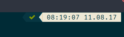
I am wondering whether this still has something to do with the fonts themselves. Maybe OS/Theme/Terminal/whatever dependent rendering issue?
xasx
on 11 Aug 2017
@ryanoasis Thanks for the release! :tada: It's a major improvement over the previous versions. :)
That said, even I'm seeing a small gap on Terminal on OSX; the current patching still has a gap around the powerline symbols, albeit fairly small.
I think you'll agree that there be a new Issue for that; since this issue of small size of the powerline symbols issue is fixed AFAICT.
pradyunsg
on 11 Aug 2017
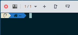
Hi, I have the same problem with nerd-font (hack font regular Hack Regular Nerd Font Complete or Sauce Code Pro Nerd Font Complete). Tilix or Gnome-terminal.
 ghost
on 15 Apr 2018
ghost
on 15 Apr 2018
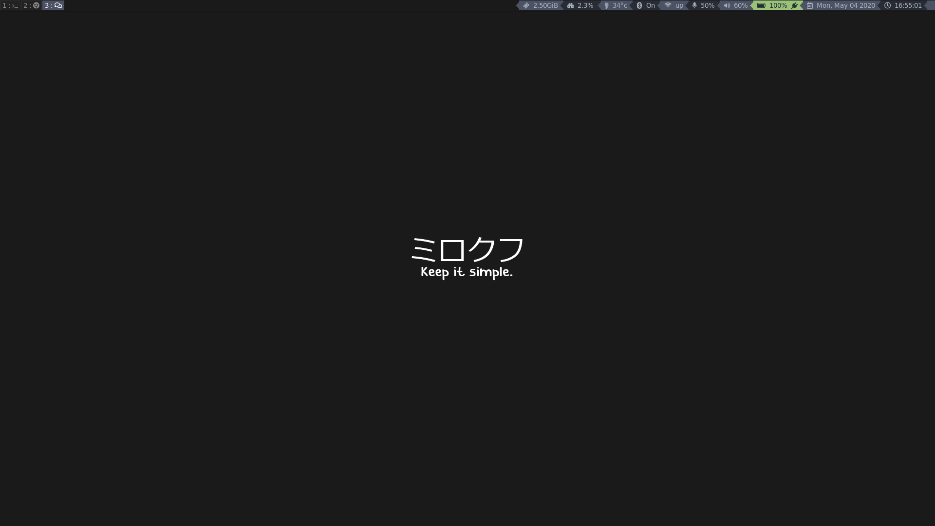
HI, i have a problem im using i3 bumblebee bar and my "⮂" separator is smaller than the block and look bad any solutions of my problem ? :)
 RyRch
on 4 May 2020
RyRch
on 4 May 2020
Related issues
 math0ne
·
3Comments
math0ne
·
3Comments
 fornwall
·
5Comments
fornwall
·
5Comments
 alpertuna
·
5Comments
alpertuna
·
5Comments
 ffernand
·
4Comments
ffernand
·
4Comments
 audioscavenger
·
3Comments
audioscavenger
·
3Comments
Most helpful comment
So hopefully in 1.1 this will be as close to 'fixed' as possible.
Here are some comparisons with Hack (Knack)
current
WIP (v1.1)
@SirDoctors Are you saying you are seeing those gaps with
Hackproper or with the patchedNerd Fonts Knack?@xasx Yes that is _mostly_ true:
Mono variant will always have 'small' icons because of the nature of monospaced they have to be that small to retain the scale or they would become stretched
This is something v1.1 is targeting to fix.. along with some glyph alignment issues, and so far it is at least looking _better_