Neovim-qt: Preview window positioning and colors are all weird
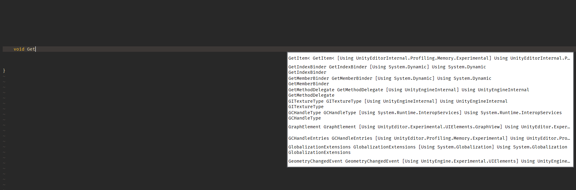
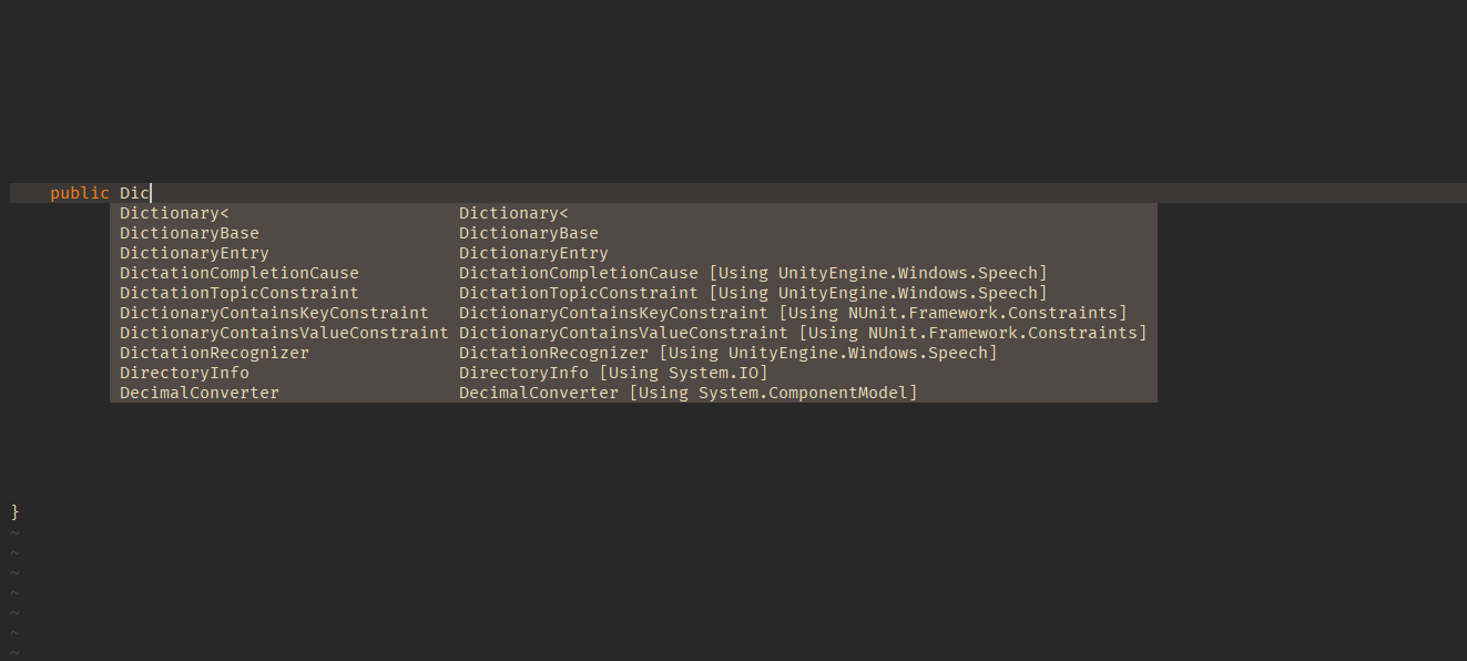
Completion window is not using correct colors on Preview (Using YoucompleteMe)
Also the position is offset
Occurs in 0.2.10 and 0.2.11, Doesn't happen in 0.2.8
 HelloKashif
All 5 comments
It is using a native widget for the completion menu i.e. it is using the default Qt style in your system for the menu that is why the colors are different. As for the positioning it should be similar to regular nvim in the console.
We are missing a CLI option to disable the native menu too.
 equalsraf
on 23 Dec 2018
equalsraf
on 23 Dec 2018
But this wasn't happening in v0.2.8. 0.2.8 was using correct widget and was respecting the color scheme
Seems like a regression in later versions
HelloKashif
on 24 Dec 2018
You can get this behaviour (let Nvim decide the popup stuff) with :GuiPopupmenu 0. Adding this in your ginit.vim should give you this behaviour.
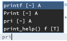
In the following screenshots, I have
- Qt theme : Kvantum KvGlass + ArcDark ;
- Neovim theme : Snow
So anything light is from Neovim, anything dark is a Qt widget
With GuiPopupmenu (the default) :
After :GuiPopupmenu 0 :
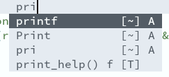
Note that the position is not the same (above or below text here), but I still have something reasonable (this is done while working on a feature branch that only adds a directory tree view, nothing at all about the Popupmenu).
I'll admit that we can work a little bit on alignment of columns and stuff like that, but the positioning and the theming seem fine to me
 gagbo
on 24 Dec 2018
gagbo
on 24 Dec 2018
@s-kashif you can get the previous behaviour back by putting 'GuiPopupmenu 0' in you ginit.vim.
@gagbo thanks I was looking that.
equalsraf
on 24 Dec 2018
@equalsraf and @gagbo Thanks a lot. I'll check
HelloKashif
on 25 Dec 2018
Related issues
gagbo
·
6Comments
 jgehrig
·
8Comments
jgehrig
·
8Comments
 PhilT
·
10Comments
PhilT
·
10Comments
 stu0292
·
3Comments
stu0292
·
3Comments
 gqqnbig
·
7Comments
gqqnbig
·
7Comments
Most helpful comment
You can get this behaviour (let Nvim decide the popup stuff) with
:GuiPopupmenu 0. Adding this in yourginit.vimshould give you this behaviour.In the following screenshots, I have
So anything light is from Neovim, anything dark is a Qt widget
With GuiPopupmenu (the default) :
After
:GuiPopupmenu 0:Note that the position is not the same (above or below text here), but I still have something reasonable (this is done while working on a feature branch that only adds a directory tree view, nothing at all about the Popupmenu).
I'll admit that we can work a little bit on alignment of columns and stuff like that, but the positioning and the theming seem fine to me