Nebular: How can you adapt the styles of nebular components?
I have been trying to adapt the styling of various components without any luck. There are two things I have been trying to do without success. 1) adapt the card-body background color to transparent. 2) adapt the position of a popover (i don't want it to appear exactly in the middle when in 'top' position).
I have tried to create classes and ID's for this but when I place keys for the classes in the scss the components do not change. I am not sure if they are being overwritten or whether I am attempting to access the components incorrectly. I tried to find documentation on how to adapt nebular style components, the documentation is good for how to set up the theme system, but I couldn't find an example of how to adapt it?
example:
<nb-card class="adapted"></nb-card>
scss:
.adapted {
background-color: rgba(0,0,0,0)
}
The above code doesn't change anything.
 stubbsy345
All 6 comments
Hi @stubbsy345, did you have a chance to look at https://akveo.github.io/nebular/docs/guides/theme-system documentation? You can change the styles using appropriate theme variables, for example for cards https://akveo.github.io/nebular/docs/components/card/theme#nbcardcomponent. Hope it helps.
 nnixaa
on 1 Oct 2018
nnixaa
on 1 Oct 2018
Closing as it's been a while.
nnixaa
on 20 Feb 2019
@nnixaa Hi! Documentation is broken. Is there info how to change theme variables (e.g. header color, footer color etc) for specific components?
 idchlife
on 5 Jul 2019
idchlife
on 5 Jul 2019
I want to change certain layout-padding, If I put this variable in theme.scss, It will change all the layout's padding.
How can I set layout-padding for specific layout?
 happyxhw
on 23 Jul 2019
happyxhw
on 23 Jul 2019
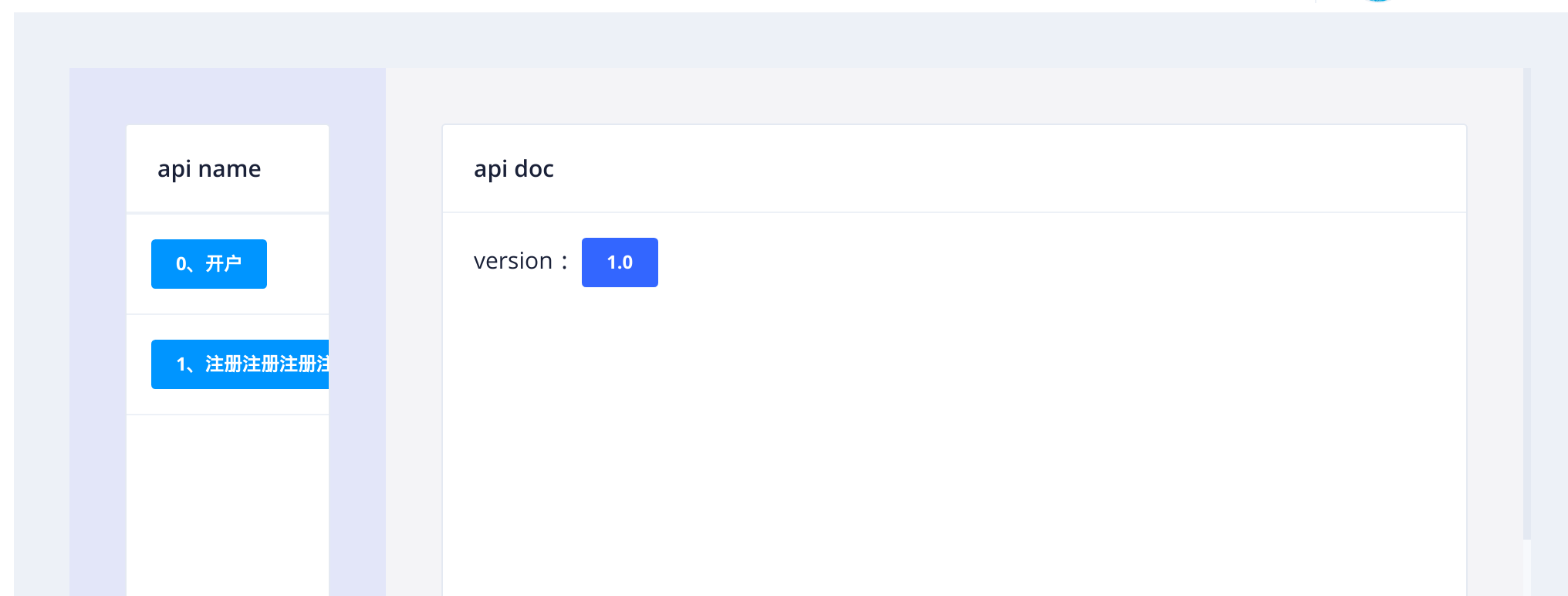
for example:
<nb-layout class="layout">
<nb-layout-column>
<nb-card size="small">
<nb-card-header>
api name
</nb-card-header>
<nb-list>
<nb-list-item *ngFor="let item of apiList; let i = index">
<button nbButton status="info" size="small" (click)="click(item.api_ch_name)">{{ i + '、' + item.api_ch_name }}</button>
</nb-list-item>
</nb-list>
</nb-card>
</nb-layout-column>
<nb-layout-column>
<nb-card size="large">
<nb-card-header>
api doc
</nb-card-header>
<nb-card-body>
<span>version:  </span>
<button nbButton status="primary" size="small"> 1.0 </button>
</nb-card-body>
</nb-card>
</nb-layout-column>
</nb-layout>
happyxhw
on 23 Jul 2019
Hi @happyxhw
If I'm not mistaken, you can style each of your layouts independently by adding a css class to them, kind of this way :
<nb-layout class="my-css-class">
  ...
</nb-layout>
nb-layout.my-css-class {
  ...
}
 alfredott
on 20 Aug 2019
alfredott
on 20 Aug 2019
Related issues
 andredatsch
·
3Comments
andredatsch
·
3Comments
 aqsdc1
·
3Comments
aqsdc1
·
3Comments
 NikhilGangurde
·
3Comments
NikhilGangurde
·
3Comments
 mmezian
·
3Comments
mmezian
·
3Comments
 henry74
·
3Comments
henry74
·
3Comments
Most helpful comment
Hi @happyxhw
If I'm not mistaken, you can style each of your layouts independently by adding a css class to them, kind of this way :