Nativescript: [iOS] Proper safe area support
Tell us about the problem
This aims to serve as an epic issue where to gather and discuss existing safe area problems with NativeScript 4.0, how to resolve them and store beneficial information on the topic.
Related resources:
https://developer.apple.com/ios/human-interface-guidelines/overview/iphone-x/
https://developer.apple.com/videos/play/fall2017/201/
https://developer.apple.com/videos/play/fall2017/801/
https://medium.com/rosberryapps/ios-safe-area-ca10e919526f
Proposed solution:
The iOS guidelines state that content should be constraint to the safe area. All the native iOS UIKit components handle these guidelines out of the box. However, {N} has its own layout system that differs from the iOS one and we should handle this ourselves. We can classify {N} components as two types - content components (those that are meaningful by themselves and show content) and container components (those that are used to contain other components and as layouts, are not meaningful just by themselves). The idea is to have all container components stretch outside the iOS safe area and have all content components lay out in the safe area. This basically means the backgrounds of the container components will be seen to the limits of the screen. Here is a list of the container components:
- ListView (special case*)
- ScrollView (special case*)
- WebView (special case*)
- Repeater
- GridLayout
- StackLayout
- AbsoluteLayout
- DockLayout
- FlexboxLayout
- WrapLayout
special case* - according to guidelines all scrollable containers should scroll their content beyond top/bottom constraint.
Related issues:
- [x] https://github.com/NativeScript/NativeScript/issues/5765
- [x] https://github.com/NativeScript/NativeScript/issues/5774
- [x] https://github.com/NativeScript/NativeScript/issues/5782
- [x] https://github.com/NativeScript/NativeScript/issues/5672
- [x] https://github.com/NativeScript/NativeScript/issues/5855
- [x] https://github.com/NativeScript/nativescript-angular/issues/340
- [ ] https://github.com/NativeScript/NativeScript/issues/4283
- [ ] https://github.com/NativeScript/NativeScript/issues/6300
Action Items:
- [x] @vchimev: Automate templates verification against iPhone 7/8 and iPhone X.
Currently, there are builds only against iPhone 7. TODO: Add verifications for iPhone X.
 vchimev
All 36 comments
__My Observations__
- The
LaunchScreen.storyboardneeds Safe Area support. Right now there's an ugly white bar underneath the home indicator. - ScrollViews no longer respect Safe Areas but did pre {NS} 4.0
- White bottom bar underneath iPhone X home indicator
 hettiger
on 27 Apr 2018
hettiger
on 27 Apr 2018
@hettiger Regarding your first point - the LaunchScreen.storyboard has been updated in the templates. Take a look at this PR - https://github.com/NativeScript/template-master-detail-ng/pull/107
 MartoYankov
on 27 Apr 2018
MartoYankov
on 27 Apr 2018
To make it more obvious what I was talking about in regards of the ScrollView:
I've created a thread with a detailed explanation of the problem on the forums.
Do you want me to open up a separate issue for this?
hettiger
on 30 Apr 2018
@EmilStoychev @NathanWalker shared your awesome landmark example project with me. That is a perfect example of how it works great: ListView respects the safe area when used with an Action Bar. However, if you switch ListView to ScollView, the scrollview sits underneath the action bar:
<ActionBar class="action-bar" backgroundColor="red">
<NavigationButton visibility="collapsed"></NavigationButton>
<GridLayout columns="auto,*,auto" ios:padding="0 10" height="100%" width="100%">
<ActionButton #actionButton ></ActionButton>
<Label col="1" text="National Parks" class="action-bar-label"></Label>
<Image #search col="2" src="~/icons/search.png" class="action-bar-icon" tintColor="#ffffff"></Image>
</GridLayout>
</ActionBar>
<GridLayout height="100%">
<ScrollView>
<StackLayout>
<GridLayout *ngFor="let item of landmarks" class="list-item">
<Image [src]="item.image"></Image>
<Label [text]="item.name" class="item-title"></Label>
</GridLayout>
</StackLayout>
</ScrollView>
If you remove the action bar, even with a gridlayout of height="100%", there is a white bar at the top perfectly respecting the safe area for the status bar. While this is appropriate in some cases, in many it is not: https://cl.ly/rjGi
Apple's recommendations (https://developer.apple.com/videos/play/fall2017/801/) is to incorporate the unsafe areas into your UI where appropriate, like extending image views to the edges of the screen. In the case of this example app, if theres no action bar, its pretty ugly to have that white bar up there. Adding <GridLayout marginTop="-44" > to the top level element takes care of this: https://cl.ly/rkYH
This leaves it up to the developer to handle the unsafe area for content, heres how i handle that in a different app: https://cl.ly/rjxy
I think two things would be great here:
Create a property on any view container (stack, grid, scrollview, listview), something like spanUnderActionBar=true|false and also spanUnderStatusBar=true|false and possibly even spanUnderHomeIndiciator=true|false. so if spanUnderActionBar was true, the container would span under it but retain the 44pt margin on iPhoneX to account for the status bar. if both spanUnderActionBar and spanUnderStatusBar were true, the container would go all the way to the tippy top. If your viewcontainer is a listview or scrollview AND an action bar is present, handle the margin like you do right now with ListView and let it scroll under the action bar. I think that should account for everything! The caveat would be that the developer would need to handle scrollviews or listview that span under the status bar when no action bar is present, but that not a huge deal (see https://cl.ly/rjxy).
Let me know if that helps, or if i can provide any code samples.
BTW @EmilStoychev awesome job on that playground, I know @shiv19 was going for something similar at some point, @shiv19 check it out...download it and run it on iPhone X sim: https://play.nativescript.org/?template=play-ng&id=iDY4kF
 davecoffin
on 22 May 2018
davecoffin
on 22 May 2018
There is nothing epic here. I designed it to be compliant with Apple Design Guidelines out of the box.
Root element spans on the whole screen and its background spans on the whole screen as well. If the content of that root element is scrollable (which means ListView, ScrollView or any element with property scrollableContent=true) then that element is given the whole screen size. If not the element is given the safe area.
The property scrollableContent isn't public because there were cases where a developer would want to span at top but not at bottom so we need to make that property to support true (for top and bottom) as well as top only and bottom only.
Left and right are not an option when in landscape according to Apple docs.
So all the logged bugs are actually the expected behaviors that comply with Apple design guidelines.
To summarize the iPhone-x guide:
Inset essential content to prevent clipping. In general, content should be centered and symmetrically inset so it looks great in any orientation and isn't clipped by corners or the device's sensor housing, or obscured by the indicator for accessing the Home screen. For best results, use standard, system-provided interface elements and Auto Layout to construct your interface. Apps should adhere to the safe area and layout margins defined by UIKit, which ensure appropriate insetting based on the device and context. The safe area also prevents content from underlapping the status bar, navigation bar, toolbar, and tab bar.
 hshristov
on 23 May 2018
hshristov
on 23 May 2018
Firstly, @hshristov, the current solution fulfills the guidelines if we agree that everything below the root of the app is content. However, inspecting Apple's own apps on the iPhone X quickly makes it clear that what the guidelines mean by "content" is undefined. In many cases it appears what is "content" should be determined by the app developer. For example, in the News app the news images stretch to full screen in landscape mode. Such scenarios need a different approach or new API to be handled
@davecoffin Thanks for the input. What, in your opinion, should be the default behavior of these spandUnder.. properties? My current plan is that all of these layout containers should stretch to full screen (under everything) and have a "padding" for their content with the same size as the insets. Basically, this means that by default the layout containers background (color or image) will be full screen, while their contents will lay out in the safe area. For example, this https://cl.ly/rjxy will be possible by default if the top element in the ScrollView is a layout container with background image. However, if the top element is an Image component it will be inset.
MartoYankov
on 23 May 2018
@MartoYankov everything inside Page is content. Again when content is scrollable it will stretch to full screen. By default scrollable content is ListView, RadListView, ScrollView if they are set as a content of the Page. If you want to force the content to be fullscreen - just set scrollableContent=true on the page content.
Messing with Layout paddings won't help at all because you will have to check the visual tree in order to determine when you have to set this paddings and when to remove them.
hshristov
on 23 May 2018
@hshristov This property you describe: scrollableContent=true doesnt appear to do anything. Take a look here:
If scrollableContent="true" would take any root view and extend it to the bounds of the device, that would solve a problem where a dev would like their view to extend to the edges of both the bottom and top of the device. For example, in my login screen pictured above. That SHOULD look like this: https://cl.ly/sLUH
I accomplish that right now by appending a class to the element that sets its margins as
margin-top: -44;
margin-bottom: -34;
This is not ideal for a number of reasons, the most obvious one being devices with notches and the concept of safe areas for content are becoming abundant on both platforms, I would bet money that Apple will release a new phone in September that has their safe areas defined slightly different, aka a smaller notch. Then the class structure will become unwieldy, as there is not even a reliable built in method to get a device type early enough in boot to append appropriate classes.
The properties I mention above would give a dev complete control over where their content spans. If a dev doesnt care about content scrolling under actionbar and tabview for example, they do nothing and their app looks fine. But I like the translucency that comes with those native elements, so I can span under it with spansUnderActionBar. If I have no action bar, for example in my login screen pictured above, I set the properties on that gridlayout to be spansUnderStatusBar and spansUnderHomeIndicator to true, and they would then extend to the edges of the device.
Also, say for example I want a view to extend to the bottom, but its a scrollview and i dont want content to conflict with the status bar, I could JUST set spansUnderHomeIndicator, and then my view would look basically like this: https://cl.ly/sLjv
No reason to do that there, but imagine it was a ScrollView, I didnt have that background image (the whole view would be the Page background which shows under status bar) and I dont want text to scroll on top of the status bar. Then I can have my content scroll beautifully up from the bottom of the device like this: https://cl.ly/sLCp But clip at the top at the appropriate point set by the safe areas defined in UIKit.
A LOT was done to improve iOS frame in 4.0, we have so much more flexibility now. And all this stuff is achievable using my method of applying negative margins to root views, but hardcoding margins will soon become unacceptable, and is already not intuitive for developers. I think my approach would cover everything, I'm excited to go into even more detail with the core team next week!
cc @NathanWalker @shiv19 @DickSmith
davecoffin
on 16 Jun 2018
One more thing worth mentioning: I use this approach for all iOS devices. According to Apple's design guidelines, the status bar should be incorporated into your application wherever possible, and that stands for iPhone X and any other iOS device. So my frame-content class is typically defined like so, in an ios specific scss file:
.frame-content {
margin-top: -20;
&.iphonex {
margin-top: -44;
margin-bottom: -34;
}
}
Now obviously as a dev we need to design our apps to handle status bars in that case, but thats the name of the game. Here's how I do it in one my apps: https://cl.ly/sL4H
When content reaches a point where it may conflict with status bar, I display a blur view which the content scrolls under. And to complete my point, the approach is the same for other devices:
just the margins are different.
davecoffin
on 16 Jun 2018
Hi @davecoffin,
The code that you are using is angular. Are you sure that this GridLayout is in fact a direct child of Page element? In any case I would suggest you try it on a non angular application and check the results.
Now I'm not against such properties. Exactly the opposite. In my previous post I said that scrollableContent=true isn't public because it is not flexible enough. It should be something like scrollableContent="left, top, right, bottom" or any of those. This is up to the application developer.
And but default we make sure that you don't have to do anything in order to get the best UX that comply with Apple guidelines. This means that if there is no action bar scrollable content should go under status bar. If this is the case a solution is to use a blur element (like you did in your app).
There are more rules in the design guidelines but I won't discuss them here.
Most ViewControllers knows how to handle all these details so most of the time all should work out of the box. At least that was my idea. And if this is not good enough we should have the new scrollableContent I was talking about that lets you customize which direction you want to span.
Anyway I hope you could reach a consensus with the team on your next meeting...
hshristov
on 17 Jun 2018
Yes, scrollableContent=true doesn't work. Looking at the code in view.ios.ts it's clear why:
        left = safeOrigin.x;
        width = safeAreaSize.width;

        if (hasChildControllers) {
            // If not inner most extend to fullscreen
            top = fullscreenOrigin.y;
            height = fullscreenSize.height;
        } else if (!scrollable) {
            // If not scrollable dock under safe area
            top = safeOrigin.y;
            height = safeAreaSize.height;
        } else if (navBarHidden) {
            // If scrollable but no navigation bar dock under safe area
            top = safeOrigin.y;
            height = navController ? (fullscreenSize.height - top) : safeAreaSize.height;
        } else {
            // If scrollable and navigation bar extend to fullscreen
            top = fullscreenOrigin.y;
            height = fullscreenSize.height;
        }
That first and last conditions are the only conditions in which top and bottom actually extend to the fullscreen size (when there is a child view controller, or when the root view is "scrollable" and when there is a visible navigation bar). If we have no navigation controller with a visible navigation bar in our app, then Nativescript does not allow the app to go fullscreen.
But it's also worse, because the left and right is always constrained to the safe area, so that when in landscape there are vertical bars on the left and right. I suppose this relates to what @hristoborisov said: "Left and right are not an option when in landscape according to Apple docs", but I see no evidence for this in my reading of the design guidelines and its not how any other applications behave (and even so, these are only design guidelines, not rules that should be interpreted such that they must be strictly applied in every scenario).
I want to have full control over how my content is layed out with respect to safe areas in the (entire) full screen space, but the way that Nativescript currently constrains things is making it very difficult to do anything with the safe area other than the most basic layout.
 speigg
on 27 Jun 2018
speigg
on 27 Jun 2018
I agree with all of that, there are very few scenarios where landscape should have margins on the side. The only one I can think of is a Page with no action bar, no tabview, nothing except scrollable textual content. To illustrate, create a simple app with a tabview, load it in iPhone X sim and turn it landscape. The tabview is padded, forcing the layout into stacked icon and text! In order to achieve this: https://cl.ly/sZID
You need to apply negative margins to left and right sides. This can be done by applying a class of "landscape" for example to the root view, and then adding negative margins on that class. BUT, even that comes with a pitfall which will require even more hackery, on tnsApp.resumeEvent that class is lost, and here is the result: https://cl.ly/sXuj
davecoffin
on 27 Jun 2018
@speigg Here is the quote from the guidelines:
Inset essential content to prevent clipping. In general, content should be centered and symmetrically inset so it looks great in any orientation and isn't clipped by corners or the device's sensor housing, or obscured by the indicator for accessing the Home screen.
In other words you are allowed to do whatever you want but you should keep in mind that people won't be able to interact easily with the content at the bottom/top of the screen.
In the case of @davecoffin we don't layout TabView. TabView and Frame are laid out by the system. We only layout the content inside Page or TabItem based on what space we are given.
As I said before scrollableContent is not powerful enough and it should support more options like left, top, right, bottom so that developer could override our implementation without any hacks. But I did run out of time for 4.0...
hshristov
on 27 Jun 2018
we don't layout TabView. TabView and Frame are laid out by the system.
@hshristov I’m not so sure that this is the case (and it may be a bug) as {N} lays out the root View (whether Frame or TabView or any other kind of {N} View) to be constrained within the safe area. For example, the UIView located at topFrame.nativeView is constrained within the safe area defined by topFrame.viewController.view (note that the former UIView is the subview of the latter). So, the system lays out the root UIViewController’s UIView, but the Frame and TabView nativeViews, which are a subview of the root UIView, are each layed out by NativeScript directly to be within the safe area (in “ui/core/view/view.ios.ts”, layoutView() method). If you were to layout the root View nativeView (the subview of the root UIViewController’s UIView) to the full screen size, and the Page/TabItem Views within the safe area, I think that alone would solve a lot of the problems here (and I think this was the original intention anyways).
Also, I don’t think “scrollableContent” (the name at least) makes sense at all, as full screen apps are not necessarily scrollable. I would prefer to see the concept of “safe areas” exposed directly as a first-class concept in {N}, but if that’s not possible, at least let me make a fullscreen app (without a Frame or TabView) and let me handle the safe area myself.
speigg
on 27 Jun 2018
@speigg Just to clarify, we don't layout the TabView and Frame. This is the reason why the tab bar and the navigation bar are rendered correctly with regards to the safe areas. See this issue screenshots - https://github.com/NativeScript/NativeScript/issues/5774. The code in ui/core/view/view.ios.ts is for UILayoutViewController which is a view controller used to wrap only layout elements that are root.
MartoYankov
on 28 Jun 2018
Yea I was definitely wrong about the TabView layout, the reason my view looks like that is because I have TabView wrapped in a GridLayout. The reason for that is I like to display certain content (like videos, other overlays) on top of the TabView (fullscreen).
Just want to give a shout out to all the smarties working on this specifically @vakrilov @MartoYankov who are working their butts off to address this issue!
davecoffin
on 28 Jun 2018
@MartoYankov ah okay I assumed that @davecoffin had his TabView at the root. And I thought that all the root views were layed out in layoutView method in “ui/core/view/view.ios.ts”, but I suppose that’s not the case for Frame/TabView?
Anyways, I’m not using TabView or Frame, just a GrIdLayout at the root (like @davecoffin), and yet it is contained within the safe area, which seems wrong.
speigg
on 28 Jun 2018
@speigg I'm not hristoborisov but @hshristov. As I said we need to enhance scrollableContent (or whatever the property name is). But currently you have an easy workaround - just add a view controller to your view controller (your root view .viewController property should be populated by us with UILayoutViewController. I know it is not perfect but will allow you to bypass all check and go full screen immediately.
@davecoffin I think you should not wrap Frame or TabView inside other elements. It may work but it is not a supported/tested scenario. A better approach would be to use showModal method which will display over the current page (not sure if this will solve all cases in your scenario but worth a try).
hshristov
on 29 Jun 2018
@speigg I'm not hristoborisov but @hshristov.
Ah, thanks, I corrected it
But currently you have an easy workaround - just add a view controller to your view controller (your root view .viewController property should be populated by us with UILayoutViewController
I did try this, but the problem is that the left and right safe area inset is still applied, so it does not in fact go fullscreen on landscape orientation (for iPhone X). The only workaround I found was to replace the root UILayoutViewController with my own implementation that lays out the rootView in fullscreen (without regard for safe areas).
speigg
on 30 Jun 2018
I found another way to fix this issue in one of my app's. NativeScript 4.0 adds a awesome layoutChanged event. I tie this event on the root element and then change the root's frame if it has the wrong values. :-) Because the layoutChanged is fired on initial build layout and on each of the rotations; it allows me to fix the frame properly no matter when. :-)
 NathanaelA
on 12 Jul 2018
NathanaelA
on 12 Jul 2018
@NathanaelA
That’s awesome news! Do you mind sharing some code?
hettiger
on 12 Jul 2018
Well in my case I needed to eliminate the 20 pixel border; and doing the manual "-20" would break landscape mode. But you can extend this to REDO any broken frame calculations. :grinning:
<Page><SomeRoot layoutChanged="changed">...

function changed(arg) {
if (arg && arg.object && arg.object.nativeViewProtected) {
                var frame = arg.object.nativeViewProtected.frame;
                if (frame.origin.y !== 0) {
                                        // Origin.y would equal 20 here; so eliminate it and then add the missing 20 to the height
                    var newFrame = CGRectMake(0, 0, frame.size.width, frame.size.height + 20);
                    arg.object.nativeViewProtected.frame = newFrame;
                }
            }
}
Will RadListView be supported as well? (It's not on the issue's proposed solution list)
I think using any fixed measures like adding or removing 20px here and there can not be the solution. It would not allow the usage of the new iOS large navigation bar titles. See: https://discourse.nativescript.org/t/actionbar-ios-11-large-title/7658
(RadListView seems to be completely incompatible with large titles atm.)
hettiger
on 23 Sep 2018
@hettiger We are aiming for RadListView and RadSideDrawer to support expanding their non content parts outside the safe area. I will check out the large nav bar titles. I think they will work out of the box with the new implementation.
MartoYankov
on 25 Sep 2018
@hettiger We are aiming for RadListView and RadSideDrawer to support expanding their non content parts outside the safe area. I will check out the large nav bar titles. I think they will work out of the box with the new implementation.
Amazing news. Thank you very much for the update. In the meanwhile I'm using following workaround for large navigation titles:
private subscriptions$ = new Subscription();
private scroll$: Subject<RadListView> = new Subject<RadListView>();

ngOnInit(): void {
    this.requestLayoutOnScroll();
}

ngOnDestroy(): void {
    this.subscriptions$.unsubscribe();
}

onScrolled(args: ListViewScrollEventData): void {
    const radListView = <RadListView>args.object;
    this.scroll$.next(radListView);
}

private requestLayoutOnScroll(): void {
    this.subscriptions$.add(
        this.scroll$.pipe(
            throttleTime(
                1000 / 24,
                undefined,
                { leading: false, trailing: true }
            )
        ).subscribe((radListView) => {
            radListView.requestLayout();
        })
    );
}
Performance is poor but it keeps the RadListView adapting to size changes that take place when scrolling with large navigation titles.
Maybe it helps some other people that want to workaround as well until this issue is fixed.
hettiger
on 25 Sep 2018
In the mean time @MartoYankov, could you weigh in on this: https://cl.ly/567d4056092e
Notice, when in landscape when you navigate and go back, the *tabItem width changes. Switching to portrait and back fixes the layout issue. This is new to iOS 12.
davecoffin
on 25 Sep 2018
@hettiger @davecoffin Thanks for reporting this. I think this might be fixed with the new implementation. We're planning to merge a version of it in master this week, so that it can be tested with the next tag.
MartoYankov
on 26 Sep 2018
You mean all the safe area stuff? That would be awesome...
davecoffin
on 26 Sep 2018
@MartoYankov I just installed next versions to test and my RadListView simply disappeared. Now I have a blank screen ...? The updates are the only changes I've made. Before the updates RadListView showed the items just fine.
"tns-ios": {
      "version": "4.3.0-2018-09-28-125108-01"
    },

"tns-core-modules": "^4.3.0-2018-09-28-182206-01",

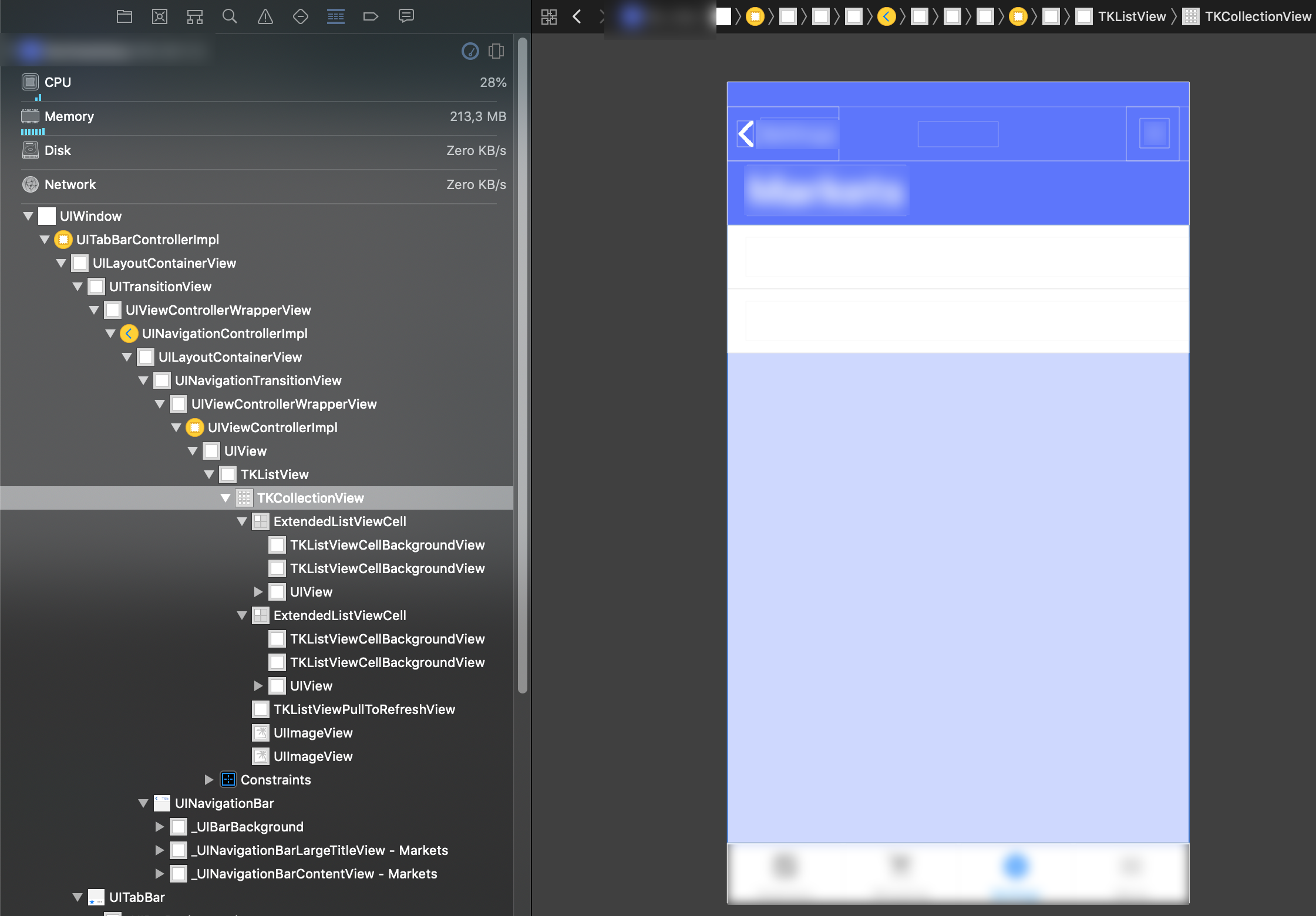

Here are some Screenshots from the View Hierarchy. It's interesting that the ExtendedListViewCell's suppresses the TKListView. (I've tried adding more cells to verify this.)
The root element in this app is a TabView with 4 page router outlets. It's an angular app.
I hope this helps a little @MartoYankov
hettiger
on 29 Sep 2018
Just made a little repo so you can reproduce the issue:
https://github.com/hettiger/RadListView-safe-area-issues/commits/master
(See commit messages for more information)
hettiger
on 29 Sep 2018
@hettiger The ui plugins should behave like before. There is no breaking change for them. RadListView should layout in the safe area. I tested this on iOS 10, and 12 both on device and emulator and can't reproduce the issue with the repo. Is there something else I can try? Also, does it happen if you change RadListView to a simple ListView?
Further, let me clarify that the safe area support that is now in next doesn't automatically affect ui plugins. Each ui component should decide for itself how to handle the safe area constraints. Part of the idea to merge this in next is to start testing and implementing the ui plugins.
MartoYankov
on 1 Oct 2018
Thanks for looking into this @MartoYankov
... can't reproduce the issue with the repo.
I'm not sure why you would not be able to reproduce.
I've just tried reproducing with a fresh clone and I immediately get the white page.
tns --version
# Output: 4.2.4
git clone [email protected]:hettiger/RadListView-safe-area-issues.git
cd RadListView-safe-area-issues
npm i
tns run ios
# ActionBar is visible but content area is empty / white page
git reset HEAD --hard
git checkout 7663114fe1936b72eea0cd5409ecb86a9d4f250d
rm -rf platforms
rm -rf node_modules
npm i
tns run ios
# ActionBar and RadListView both are visible. RadListView content is showing up correctly.
I'm running Xcode Version 10.0 (10A255) on macOS Mojave Version 10.14 (18A391).
Tested with:
- iPhone 6s (Real device)
- iPhone XS Max (Simulator)
Also, does it happen if you change RadListView to a simple ListView?
I've tried ListView on the master branch of my repo. It's showing up correctly. 👍
Further, let me clarify that the safe area support that is now in next doesn't automatically affect ui plugins. Each ui component should decide for itself how to handle the safe area constraints. Part of the idea to merge this in next is to start testing and implementing the ui plugins.
I understand this and it's perfectly fine. I'm glad about the way how you takle this and am really thankful for all the effort you've put into this. This is just some feedback to help improve the next iteration.
hettiger
on 1 Oct 2018
@hettiger The only difference to what I tried is the Mojave version. I tested it on Mojave and I still see the RadListView items. Can you try setting a backgroundColor to the RadListView? In this way we can differentiate between the control not being laid out and the cells not being shown.
MartoYankov
on 1 Oct 2018
@MartoYankov Wow, that's super weird. However:
- I've added background colors
- I've added a »working« branch (»master« is still the failing branch)
- I've made some screenshots
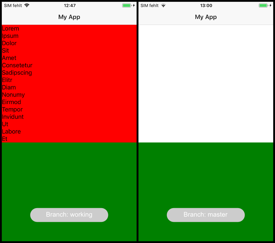
I hope this helps.
hettiger
on 1 Oct 2018
This thread has been automatically locked since there has not been any recent activity after it was closed. Please open a new issue for related bugs.
![lock[bot] picture](https://avatars1.githubusercontent.com/in/6672?v=4&s=40) lock[bot]
on 2 Apr 2020
lock[bot]
on 2 Apr 2020
Related issues
 rLoka
·
3Comments
rLoka
·
3Comments
 dxshindeo
·
3Comments
hshristov
·
3Comments
dxshindeo
·
3Comments
hshristov
·
3Comments
 Leo-lay
·
3Comments
Leo-lay
·
3Comments
 OscarLopezArnaiz
·
3Comments
OscarLopezArnaiz
·
3Comments
Most helpful comment
@hshristov This property you describe: scrollableContent=true doesnt appear to do anything. Take a look here:
https://cl.ly/sM86
If scrollableContent="true" would take any root view and extend it to the bounds of the device, that would solve a problem where a dev would like their view to extend to the edges of both the bottom and top of the device. For example, in my login screen pictured above. That SHOULD look like this: https://cl.ly/sLUH
I accomplish that right now by appending a class to the element that sets its margins as
This is not ideal for a number of reasons, the most obvious one being devices with notches and the concept of safe areas for content are becoming abundant on both platforms, I would bet money that Apple will release a new phone in September that has their safe areas defined slightly different, aka a smaller notch. Then the class structure will become unwieldy, as there is not even a reliable built in method to get a device type early enough in boot to append appropriate classes.
The properties I mention above would give a dev complete control over where their content spans. If a dev doesnt care about content scrolling under actionbar and tabview for example, they do nothing and their app looks fine. But I like the translucency that comes with those native elements, so I can span under it with
spansUnderActionBar. If I have no action bar, for example in my login screen pictured above, I set the properties on that gridlayout to bespansUnderStatusBarandspansUnderHomeIndicatorto true, and they would then extend to the edges of the device.Also, say for example I want a view to extend to the bottom, but its a scrollview and i dont want content to conflict with the status bar, I could JUST set
spansUnderHomeIndicator, and then my view would look basically like this: https://cl.ly/sLjvNo reason to do that there, but imagine it was a ScrollView, I didnt have that background image (the whole view would be the Page background which shows under status bar) and I dont want text to scroll on top of the status bar. Then I can have my content scroll beautifully up from the bottom of the device like this: https://cl.ly/sLCp But clip at the top at the appropriate point set by the safe areas defined in UIKit.
A LOT was done to improve iOS frame in 4.0, we have so much more flexibility now. And all this stuff is achievable using my method of applying negative margins to root views, but hardcoding margins will soon become unacceptable, and is already not intuitive for developers. I think my approach would cover everything, I'm excited to go into even more detail with the core team next week!
cc @NathanWalker @shiv19 @DickSmith