Nativescript: Dialogs: Provide ability to set different color/font style for title
Currently the default label color per styles is applied to both the contents of the dialog and also the title. It will be nice to have ability to specify different colors - one for title and one for the message.
Reason for this is that I want to mimic as closely as possible the default iOS alert style - i.e. bold blue title and black text. From what I see with the current implementation this is not possible.
Want to back this issue? Post a bounty on it! We accept bounties via Bountysource.
 PeterStaev
All 24 comments
Hi @PeterStaev,
Thank you for your suggestion.
One option to change the color of the Label and Button text is to Applying a global CSS style color to Label and Button, which will also affect the style of dialogs.
Regarding that, another option is to use non-fullscreen modal page, which will allow you to style the child components inside it as you wish and to set up the Color and the FontStyle of the text.
 tsonevn
on 21 Mar 2017
tsonevn
on 21 Mar 2017
Hey @tsonevn ,
Both workarounds will not work:
- Changing the
Labelcolor/weight globally will affect both the title and the message. - According to the docs the modal page on iPhone is always displayed full screen.
PeterStaev
on 21 Mar 2017
Hi @PeterStaev,
Does it applicable for you, to create custom CSS selector, which allows setting the specific style for the Dialogs. For example:
Dialog{
color:red;
font-size:24;
}
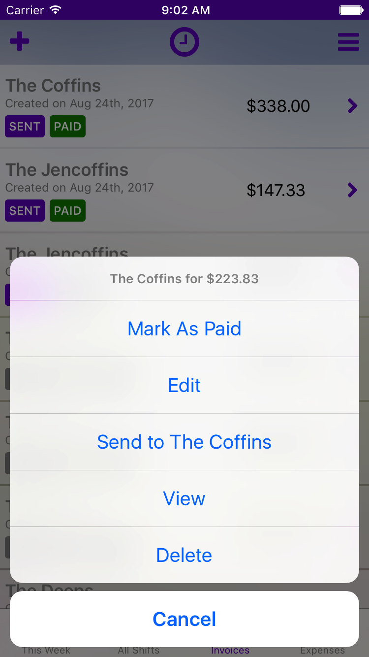
Hi @tsonevn , I've tried putting that style in app.css but seems it does not have any effect (I'm using {N} w/o Angular). Also wont that again style all the text on the dialog? What I want to achieve is when I use this:
dialogs.alert({
     title: "Success",
     message: "Contact Saved!",
     okButtonText: "OK"
});
The "Success" word to be bold/black (or whatever the default iOS style is) while the text "Contact Saved!" to be whatever style I've setup for Label/Dialog. Instead I'm getting this:

Which makes the title indistinguishable from the message.
PeterStaev
on 28 Mar 2017
Hi @PeterStaev.
Excuse me if I was not clear enough,
My question was if it is applicable for you, such a dialog selector to be created in the feature for some of the next NativeScirpt versions.
Regarding that, if I understand you correctly, you would like to change the style for each dialog individually.
tsonevn
on 28 Mar 2017
Aha, ok the selector would make sense as long as it does not style the message label as well.
But how about we extend this in the following way, to give the most flexibility:
- Style applied to both body and title
Dialog {..}
- Style applied to title only
Dialog title {...}
- Style applied to the body only
Dialog body {...}
Since you have to style these in the global app.css; I would go one step farther and recommend that rather than use a hard coded "Dialog" tagname, that you can set the classname of the Dialog during the creation of the dialog. If I have two (or more) dialogs appear in my application; I might want them completely styled differently. I would also make sure each element in the dialog has a generated classname...
.myDialog .button1, .myDialog .button3 {...}
.myDialog .title {...}
 NathanaelA
on 28 Mar 2017
NathanaelA
on 28 Mar 2017
This would be really great for styling a Delete option different from the rest of the options. For example, Delete in this list should be styled differently, like with red bold text (examples of this are in many iOS applications)
 davecoffin
on 25 Aug 2017
davecoffin
on 25 Aug 2017
if Dialog can have some extra property like 'cssClass' which can be set when creating dialog and this class will be added to dialog layout container then it will be very nice feature have.
+1
 bhavincb
on 9 Mar 2018
bhavincb
on 9 Mar 2018
is there any progress on this issue?
 MetaiR
on 4 Dec 2018
MetaiR
on 4 Dec 2018
It would be great to at least have the option to add a "destructive button" that would be red.
 fpaaske
on 19 Dec 2018
fpaaske
on 19 Dec 2018
agreed with @frapaa. would love to leverage this.
 drewcovi
on 2 Jan 2019
drewcovi
on 2 Jan 2019
Any progress or updates on this?
 danielnitu
on 21 Jun 2019
danielnitu
on 21 Jun 2019
Obviously complete CSS control would be ideal. In the mean time we could add an option to use destructiveButtonText as an alternative to cancelButtonText for alert. It would then apply the destructive style (red) on iOS.
 lochstar
on 3 Jul 2019
lochstar
on 3 Jul 2019
+1 for styling options for dialogs
 Izrab
on 4 Sep 2019
Izrab
on 4 Sep 2019
Right now this feature is more important due to the iOs 13 dark mode.
Now by default, without specifing otherwise, in dark mode the Label color is white!, so if we want our texts to be dark we must style the labels, afecting this to the dialogs too.
So we need urgently the ability to distinguish between plain label or dialogs texts.
 Macarthurval
on 5 Oct 2019
Macarthurval
on 5 Oct 2019
I have found that scoping any Button and Label styles to Page leaves the OS's defaults (white label, blue button) in dialogs and menus, which was a good enough solution for us. So if you do Button { color: black } or Label { color: black } anywhere in your CSS, change it to Page Button { color: black }; Page Label { color: black}, and your alerts will be legible in both dark and light mode.
 Mottokrosh
on 29 Oct 2019
Mottokrosh
on 29 Oct 2019
What's the status on this?
 SmailHammour
on 24 Jan 2020
SmailHammour
on 24 Jan 2020
Any update on this?
 vahidvdn
on 12 May 2020
vahidvdn
on 12 May 2020
Right now this feature is more important due to the iOs 13 dark mode.
Now by default, without specifing otherwise, in dark mode the Label color is white!, so if we want our texts to be dark we must style the labels, afecting this to the dialogs too.
So we need urgently the ability to distinguish between plain label or dialogs texts.
A bit off topic but how did you manage to place buttons side by side? I can't find any info on NativeScript.com or anywhere else on how to achieve this layout.
Thank you in advance!
 andrewm-mitchells
on 28 May 2020
andrewm-mitchells
on 28 May 2020
Any workaround or update on this ?
 dtomaszewski
on 23 Aug 2020
dtomaszewski
on 23 Aug 2020
@andrewm-mitchells That is for iOS. As I know, you can't do it on Android.
vahidvdn
on 24 Aug 2020
@vahidvdn @andrewm-mitchells
Try :
confirm({
      title: 'Your title',
      message: 'lorem ipsum,
      cancelButtonText: 'Nope',
      okButtonText: 'Yup'
    })
dtomaszewski
on 24 Aug 2020
If you want full customisation of your dialog you can use nativescript-material-dialogs which allows you to use a custom view in which you can do whatever !
There are a few examples in the vue demo app
 farfromrefug
on 27 Aug 2020
farfromrefug
on 27 Aug 2020
Related issues
 vtisnado
·
3Comments
vtisnado
·
3Comments
 rLoka
·
3Comments
tsonevn
·
3Comments
rLoka
·
3Comments
tsonevn
·
3Comments
 Leo-lay
·
3Comments
Leo-lay
·
3Comments
 OscarLopezArnaiz
·
3Comments
OscarLopezArnaiz
·
3Comments
Most helpful comment
Right now this feature is more important due to the iOs 13 dark mode.

Now by default, without specifing otherwise, in dark mode the Label color is white!, so if we want our texts to be dark we must style the labels, afecting this to the dialogs too.
So we need urgently the ability to distinguish between plain label or dialogs texts.