Nativebase: Checkbox checked icon is not visible when 'color' property is white
I have gone through these following points
- [x] Check latest documentation: https://docs.nativebase.io/
- [x] Check for existing open/closed issues for a possible duplicate before creating a new issue: https://github.com/GeekyAnts/NativeBase/issues
- [x] Use the latest NativeBase release: https://github.com/GeekyAnts/NativeBase/releases
- [x] Check examples from NativeBase KitchenSink https://github.com/GeekyAnts/NativeBase-KitchenSink
- [x] For discussion purpose make use of NativeBase Slack: http://slack.nativebase.io/
- [x] For queries related to theme, check Theme Variables from Docs and live NativeBase Theme Editor http://nativebase.io/customizer/
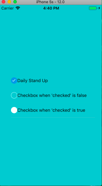
Checkbox check icon is not visible when color property is white.
node: 8.11.2, npm: 5.6.0, react-native:0.56.0, react: 16.4.1, native-base: 2.8.1, xcode: 10.0
Expected behaviour

Actual behaviour
Steps to reproduce
import React, {Component} from 'react';
import {View, Text, StyleSheet, Image} from 'react-native';
import { Container, Content, ListItem, CheckBox, Body } from 'native-base';


class FixCheckbox extends Component {

    static navigationOptions = {
        header: null
    };

    render() {
        return (
            <Container style={styles.container}>
                <Content>
                    <ListItem>
                        <CheckBox checked={true} />
                        <Body>
                            <Text>Daily Stand Up</Text>
                        </Body>
                    </ListItem>

                    <ListItem>
                        <CheckBox checked={true} color='white' />
                        <Body>
                        <Text>Checkbox when 'checked' is false</Text>
                        </Body>
                    </ListItem>
                </Content>
            </Container>
        )
    }
}

export default FixCheckbox;


const styles = StyleSheet.create({
    container: {
        flex: 1,
        backgroundColor: '#00c5cd',
        display: 'flex',
        flexDirection: 'row',
        alignItems: 'center',
        justifyContent: 'center',
        padding: 20,
    }
})
This problem is coming on both Ios and Android.
Checkbox check icon is by default white for all colors. For color property 'white', it becomes invisible.
 madhav1993
👍2
All 4 comments
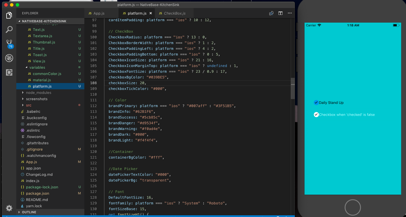
@madhav Refer to Customize section of native-base in docs
https://docs.nativebase.io/Customize.html#Customize
1)eject native-base-theme
2)change color for checkboxTickColor in platform.js/material.js/commoncolor.js within variables folder of native-base-theme
3)Then run the following code snippet in App.js
import React, { Component } from "react";
import { View, Text, StyleSheet, Image } from "react-native";
import {
  Container,
  Content,
  ListItem,
  CheckBox,
  Body,
  StyleProvider,
} from "native-base";
import getTheme from "./native-base-theme/components";
import material from "./native-base-theme/variables/platform";

class FixCheckbox extends Component {
  static navigationOptions = {
    header: null,
  };

  render() {
    return (
      <StyleProvider style={getTheme(material)}>
        <Container style={styles.container}>
          <Content>
            <ListItem>
              <CheckBox checked={true} />
              <Body>
                <Text>Daily Stand Up</Text>
              </Body>
            </ListItem>

            <ListItem>
              <CheckBox checked={true} color="white" />
              <Body>
                <Text>Checkbox when 'checked' is false</Text>
              </Body>
            </ListItem>
          </Content>
        </Container>
      </StyleProvider>
    );
  }
}

export default FixCheckbox;

const styles = StyleSheet.create({
  container: {
    flex: 1,
    backgroundColor: "#00c5cd",
    display: "flex",
    flexDirection: "row",
    alignItems: "center",
    justifyContent: "center",
    padding: 20,
  },
});

 suvenduchhatoi
on 2 Jan 2019
suvenduchhatoi
on 2 Jan 2019
Thank you
madhav1993
on 3 Jan 2019
👍2
Imo, please just expose checkboxTickColor as a prop so we don't have to go through the process of ejecting for a pretty basic customization.
 JoeRoddy
on 23 Mar 2020
JoeRoddy
on 23 Mar 2020
👍2
@JoeRoddy has a good point!
 juanlarra1
on 18 Apr 2020
juanlarra1
on 18 Apr 2020
Was this page helpful?
0 / 5 - 0 ratings
Related issues
 Cotel
·
3Comments
Cotel
·
3Comments
 muthuraman007
·
3Comments
muthuraman007
·
3Comments
 natashache
·
3Comments
natashache
·
3Comments
 chetnadaffodil
·
3Comments
chetnadaffodil
·
3Comments
 sihemhssine
·
3Comments
sihemhssine
·
3Comments
Most helpful comment
Imo, please just expose
checkboxTickColoras a prop so we don't have to go through the process of ejecting for a pretty basic customization.