Mui-datatables: Adding a fe more columns displays incorrectly in a minimised tab
Thank you for solving the previous issue so quickly. We have about 10-15 columns to be displayed with this table and it displays as expected when the browser window is maximised. However if the window is shrunk, the columns stretch out of the MuiPaper component and it adds a scroll to the page.
Expected Behavior
The expected behaviour is that the data table and the paper component have the same width during window resizing.
Current Behavior
The MuiTable expands as columns are added, but the MuiPaper remains the same size
Steps to Reproduce (for bugs)
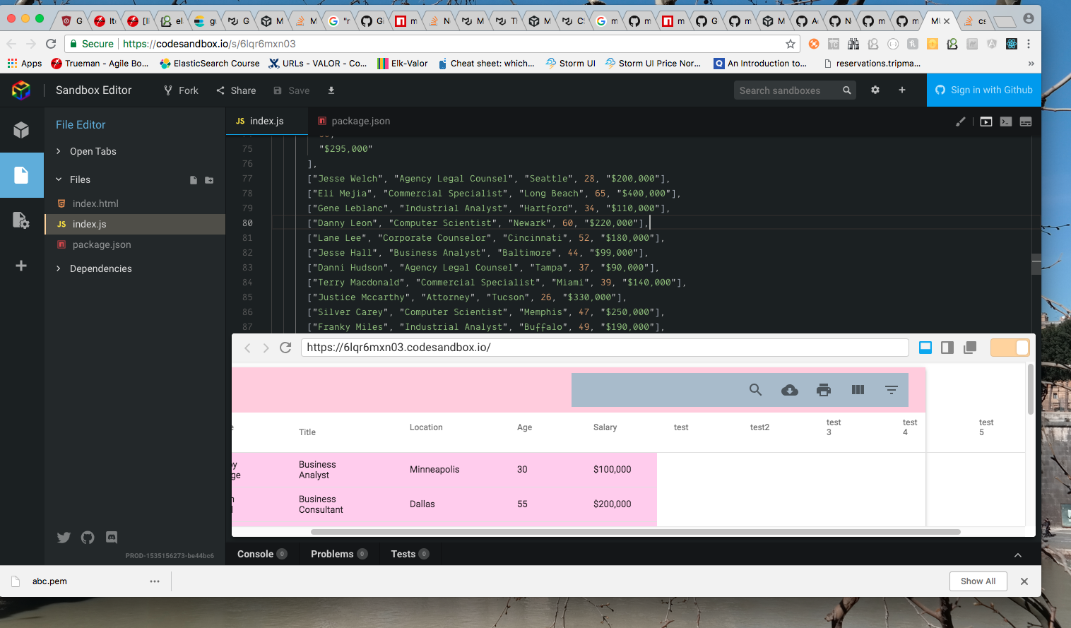
- https://codesandbox.io/s/6lqr6mxn03
- Resize your window so that you dont get data in vertical cells but in horizontal fashion
- Make sure there are more table columns (atleaset 10)
- Observe the scroll bar on the bottom of the page and the overflow of columns beyond the pa;per
Your Environment
| Tech | Version |
|--------------|---------|
| Material-UI | 1.0.0 |
| MUI-datatables | 2.0.0-beta-23 |
| React | 16.3.2 |
| browser | Chrome |
| etc | |
 arpankan
All 12 comments
arpankan
on 27 Aug 2018
For now, try setting the options to this:
responsive: 'scroll'
What needs to be updated is when the responsive mode is set to stacked if the # of columns is large in the desktop view then the scrollbar will need to appear. I'll put this into the backlog but the suggestion above should get you through things for now
 gregnb
on 27 Aug 2018
gregnb
on 27 Aug 2018
@gregnb Thank you 👍 That worked like a charm
arpankan
on 27 Aug 2018
For now, try setting the options to this:
responsive: 'scroll'What needs to be updated is when the responsive mode is set to
stackedif the # of columns is large in the desktop view then the scrollbar will need to appear. I'll put this into the backlog but the suggestion above should get you through things for now
@gregnb I prefer that the paper expand to the size of the table in stacked mode as the table width grows. I'm not sure if the user will know to scroll right for the extra columns otherwise.
 allenjoy123
on 3 Jan 2019
allenjoy123
on 3 Jan 2019
<div style="position: relative;">
This div here which contains the data is missing a 'overflow: scroll;' After the change works perfectly for me!
 metafield
on 6 Mar 2019
metafield
on 6 Mar 2019
merge in this fix from @metafield ! it's the div right below the MUIDataTableFilterList
 dalenhughes
on 25 Apr 2019
dalenhughes
on 25 Apr 2019
@dalenhughes I cannot confirm that this is still an issue in 2.0.0-beta.59. When using responsive: scroll, there is an overflow for small windows/numerous columns. Have you tried the latest package version?
 gabrielliwerant
on 25 Apr 2019
gabrielliwerant
on 25 Apr 2019
Responsive scroll fixes the height so it forces a height scroll but fixes the horizontal scroll. I want the full height with a width scroll only so responsive: scroll doesn’t work
Sent from my iPhone
On Apr 24, 2019, at 8:25 PM, Gabriel Liwerant <[email protected]notifications@github.com> wrote:
@dalenhugheshttps://github.com/dalenhughes I cannot confirm that this is still an issue in 2.0.0-beta.59. When using responsive: scroll, there is an overflow for small windows/numerous columns. Have you tried the latest package version?
—
You are receiving this because you were mentioned.
Reply to this email directly, view it on GitHubhttps://github.com/gregnb/mui-datatables/issues/170#issuecomment-486506284, or mute the threadhttps://github.com/notifications/unsubscribe-auth/ACUNL5TYSX5KJOU37UL5KC3PSEQCVANCNFSM4FRYOQLQ.
dalenhughes
on 25 Apr 2019
@dalenhughes You can fix that by overriding the max-height with a value of none. See instructions here for custom styling: https://github.com/gregnb/mui-datatables#customize-styling.
gabrielliwerant
on 26 Apr 2019
Closing, as I believe this issue is solvable through existing options and/or custom styling.
gabrielliwerant
on 24 May 2019
Hello,
I am having a similar issue where I have many columns in the table and when I make the screen smaller the table does not shrink unless I remove columns. On the other hand when I extend the screen to xl and up its keeps growing with the screen size. I'm trying to get the table rows to always remain in one line and when the window shrinks the table shrinks along with it and the horizontal scroll increases. Thanks in advance!
 snsheth55
on 14 Aug 2019
snsheth55
on 14 Aug 2019
Hello @snsheth55. I think I need more information about this, as I'm not sure what you mean by "get the table rows to always remain in one line." Feel free to open a new issue with a minimal codesandbox example and perhaps a screenshot showing what you are trying to achieve.
gabrielliwerant
on 14 Aug 2019
Related issues
 alexanderwhatley
·
4Comments
alexanderwhatley
·
4Comments
 weltix
·
3Comments
weltix
·
3Comments
 harryluo91
·
3Comments
harryluo91
·
3Comments
 kylane
·
3Comments
kylane
·
3Comments
 gangakrishh
·
3Comments
gangakrishh
·
3Comments