Mudlet: Trigger patterns take up too much space in Mudlet 3.20
Brief summary of issue / Description of requested feature:
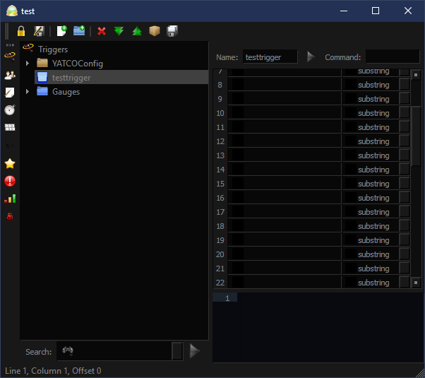
The new feature of allowing the space displaying trigger patterns is a great one, however the default minimum size of displaying 13-15 pattern lines is way, way too much. A minimum of 5-7 patterns displayed would be much, much easier to work with. As it currently stands, it restricts the coding space far too much for it to be comfortable.
Steps to reproduce the issue / Reasons for adding feature:
- Current pattern space is way too large for a comfortable working environment.
- Because I value my sanity.
- Because how many trigger patterns do you really want to see for 90% of triggers?
Error output / Expected result of feature
New working space would be resizable to show minimum of 5-7 pattern lines.
Extra information, such as Mudlet version, operating system and ideas for how to solve / implement:
Windows 10 Home, Mudlet 3.20.1
 Eraene
All 6 comments
I'd be happier myself with the minimum at one line. Was there any reason it had to be a much higher number showing as a minimum?
 Nyyrazzilyss
on 13 May 2019
Nyyrazzilyss
on 13 May 2019
I believe sizing it too small would not be possible due to the complications it would cause with the sound and fire length trigger options, but perhaps with the option to collapse those extra options areas, allowances could be made? I'm not sure, but I would definitely be fine with it being resizable to one pattern, if it were possible to.
Eraene
on 13 May 2019
The design was intended so that the controls to the right of the trigger items would disappear at the point when the splitter would just about to start encroaching on the minimum space that they needed.
However users of ultra-high resolution (macOS retina, or so-called 4K) displays are reporting that things are not working like that for them - because they are seeing a lot of trigger item lines. Would you say that was the case for you @Eraene ?
FTR After moving the splitter the control to show/hide those controls should be capable of overriding the result the size of the splitter is causing - and IIRC the show/hide action will only happen again if the splitter is moved...
 SlySven
on 16 May 2019
SlySven
on 16 May 2019
It's the same thing I mentioned - the new default for how many trigger lines are visible is too much. The old default of 5ish seems to have worked well.
 vadi2
on 16 May 2019
vadi2
on 16 May 2019
@SlySven
I'm seeing two separate issues. As Vadi said, the new default for displaying trigger lines is too much.
The second is that if I click the button to hide the trigger controls and then touch the splitter, the controls are brought back again. I don't understand why this is necessary, if I just want to use the splitter to change how many lines are displayed. If I hide the controls, that means I don't want to see them because I don't need them. I should then be able to move the splitter into the space those controls would normally occupy if I want, but clicking to bring back the controls would automatically move the splitter out of the occupied space. Would that work?
For reference, take a look at this editor window. It's resized to the smallest size possible. The space trigger lines take up (along with the vertical splitter's left side minimum) is loads of wasted space, IMO.
Eraene
on 22 May 2019
I think I am close to nailing the vertical splitter on the right hand side spacing issues now - just want to test on one more OS platform locally (32-bit Windoze 7). Will review what is happening to the left hand side with the horizontal splitter afterwards.
SlySven
on 29 May 2019
Related issues
vadi2
·
7Comments
 Kebap
·
5Comments
Kebap
·
5Comments
 macjabeth
·
7Comments
vadi2
·
8Comments
Kebap
·
7Comments
macjabeth
·
7Comments
vadi2
·
8Comments
Kebap
·
7Comments
Most helpful comment
@SlySven
I'm seeing two separate issues. As Vadi said, the new default for displaying trigger lines is too much.
The second is that if I click the button to hide the trigger controls and then touch the splitter, the controls are brought back again. I don't understand why this is necessary, if I just want to use the splitter to change how many lines are displayed. If I hide the controls, that means I don't want to see them because I don't need them. I should then be able to move the splitter into the space those controls would normally occupy if I want, but clicking to bring back the controls would automatically move the splitter out of the occupied space. Would that work?
For reference, take a look at this editor window. It's resized to the smallest size possible. The space trigger lines take up (along with the vertical splitter's left side minimum) is loads of wasted space, IMO.
