Mu: Style suggestion: Differentiate more the active tab
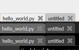
I don't know if this happens to anybody else, but every time I have two tabs open I keep wrongly thinking that the active tab is the one with the darker shade.
Of course, a darker tab usually means it is not the selected tab, but I think my brain gets confused because the selected tab has the same colour as the rest of the window, and so the one that is more visible to me is the other one.
The other themes highlight the tab with a lighter shade, this problem doesn't happen to me when using those, only with the default theme:
 carlosperate
All 7 comments
@ZanderBrown ???
 ntoll
on 11 Jul 2018
ntoll
on 11 Jul 2018
@ntoll we can easily change the colour but what would @carlosperate be looking for?
 ZanderBrown
on 11 Jul 2018
ZanderBrown
on 11 Jul 2018
Thanks Zander! I'm not too bother as long as its different than the background colour and lighter than an inactive tab. Would a lighter shade of grey from the background colour be distinguishable enough?
You are pretty good with these things, so I trust your judgement here.
carlosperate
on 11 Jul 2018
Thanks for your support!
Not quite sure where to go with this one, the shades are pretty close already.
Looking at the other themes and my comments I intended to use the border colour:
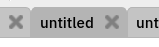
but that would darken not lighten
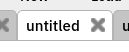
The pure white approach might go nicely with the white text area:
Or a lighter form of the focus colour:
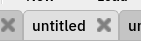
I'm largely in favour of the 3rd
ZanderBrown
on 11 Jul 2018
I'm with you @ZanderBrown on number 3.
I dunno about you, but this feels like choosing wallpaper... ;-)
ntoll
on 11 Jul 2018
Number 3 sounds like a winner, thanks Zander!
carlosperate
on 11 Jul 2018
Thanks Zander and Nicholas! It's subtle, but it makes a big difference :)
carlosperate
on 12 Jul 2018
Related issues
 mkarikom
·
5Comments
mkarikom
·
5Comments
 dannystaple
·
5Comments
dannystaple
·
5Comments
 Franci85
·
4Comments
Franci85
·
4Comments
 martinohanlon
·
9Comments
martinohanlon
·
9Comments
 the-stanely
·
7Comments
the-stanely
·
7Comments
Most helpful comment
I'm with you @ZanderBrown on number 3.
I dunno about you, but this feels like choosing wallpaper... ;-)