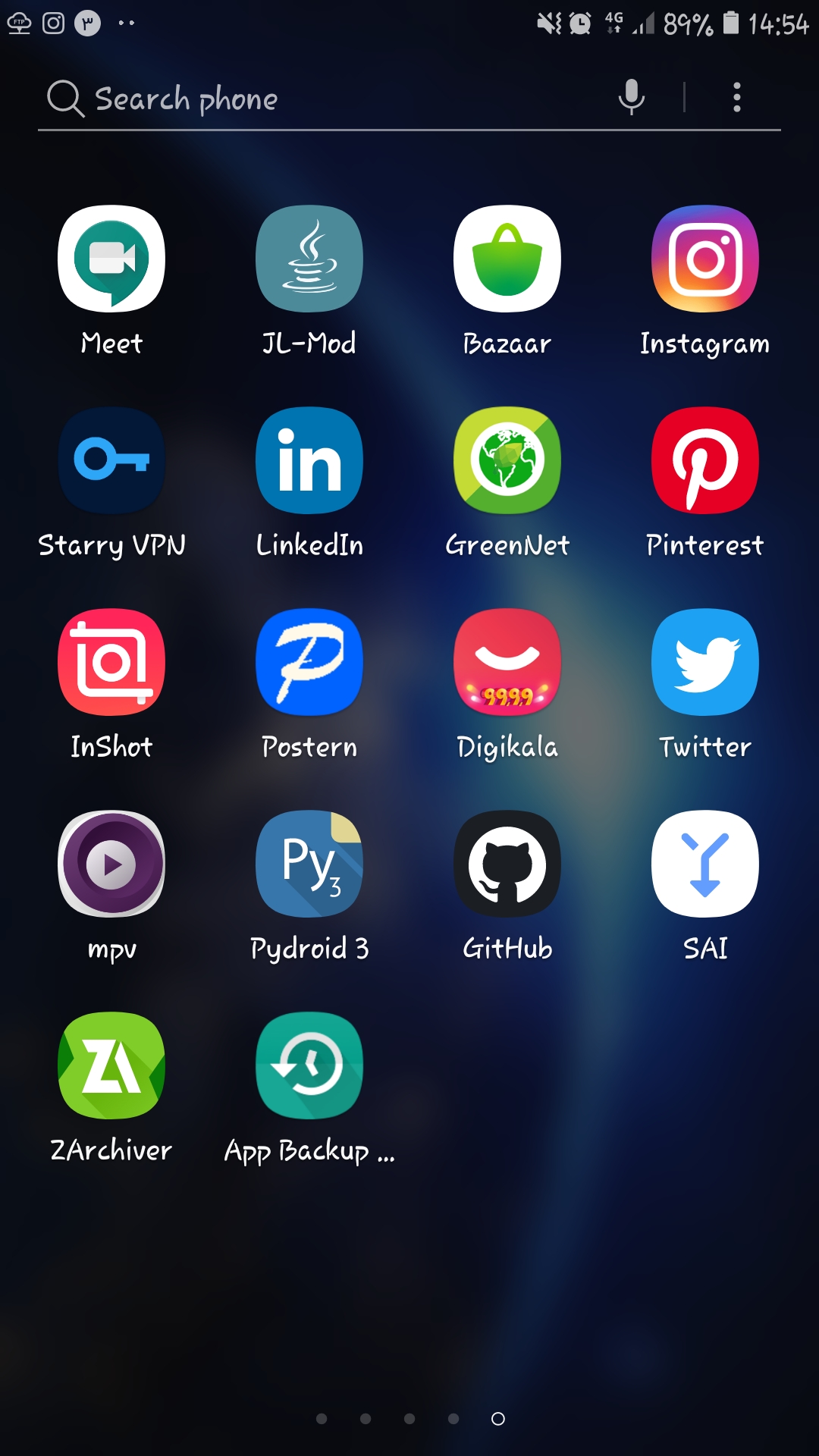
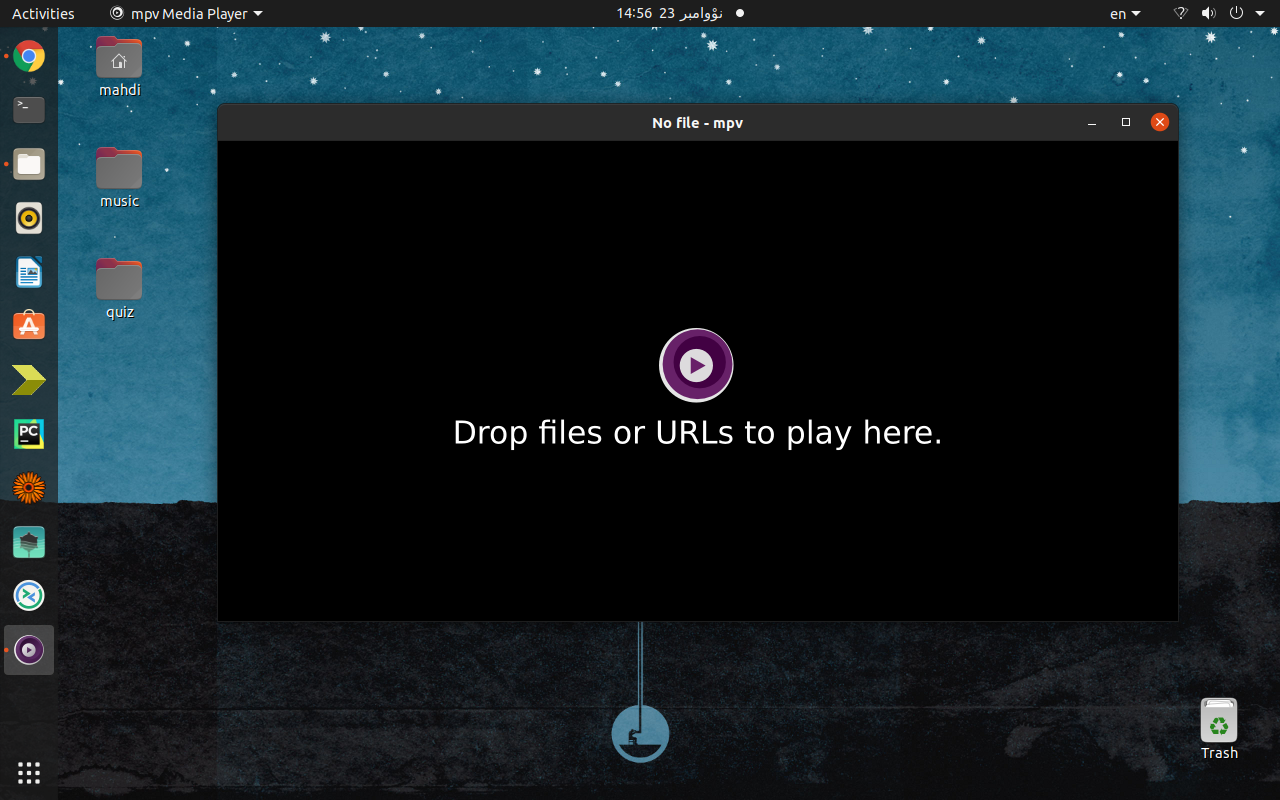
I think your logo and icon is unprofessional and does not look good between other apps in my apps list.
To me, app icon is very important factor to install and use it.
All 25 comments
Personally I disagree, but do feel free to suggest a different one, and then convince everyone else that your icon is nicer than the current one. Till then though, closing.
if you think mpv's icon is bad, just wait until you see any GNU software.
Agree, so I've done some concepts. Would also be nice with some media file icons.

What is more professional about these?
Really wondering about that because the current logo was done by a professional designer and donated to mpv, iirc.
Agree, so I've done some concepts. Would also be nice with some media file icons.
To me, the first and second logo on the third row looks good.
What is more professional about these?
Really wondering about that because the current logo was done by a professional designer and donated to mpv, iirc.
Does it have to be professional? It's a triangle in some circles with the dullest color scheme ever, which makes mpv look dated. Was it designed 15 years ago?
What is more professional about these?
Really wondering about that because the current logo was done by a professional designer and donated to mpv, iirc.


Just look how your icon looks between some other applications. For example it has gradients and it seems the designer tried to make it 3D. It's like a donut which has a tiny triangle inside. But modern logos are flat or they may have a little shadow. Your logo reminds me windows 7 or windows vista :P
Bad English :P
If people for some reason are in love with the current icon, something like this could work.

For example it has gradients
as does the instagram icon, and the Bazaar icon, and many of the icons in oe-d's suggestions.
Just because it's not a flat design infinite shadow two-tone flavour of the month thing doesn't mean it's bad.
Oh I should add, yes I think all of your submissions so far have been less than stellar (either rip-offs of other logos, like the blatantly just white to black replaced YouTube logo, or just random shapes with random colours with no grasp on composition), and using a font this hideous in your day to day computing automatically should disqualify you from being taken seriously in any graphic design conversation.
Agreeing on an icon is never going to be possible. That being said, it is true that the mpv logo uses gradients/3d while the current trend is flat. Whether or not mpv logo should adhere to current design trends is a question on its own IMO.
That being said, I do think the mpv colors are both nice and unique. So if someone told me "modernize the mpv logo", my immediate choice would be to keep the colors (and the general, possibly exact - shape) and flatten the gradients.
But not one asked me to do that, and I'm also not a designer.
It's not just the flat gradient, I think round icons seem to be falling out of fashion as well.
Either way, fine with me.
But I've never understood the primary color, to be honest. Not that it's bad, but I think this was likely a shot at some variant of Tyrian purple, and I've never understood the link to any multimedia tech here, but maybe I am just missing something.
i already said what has to be said here #7806
i don't see a reason to change our icon. especially not since our 'brand' is becoming more and more of a household name.
... imo if the icon should be modernised we should at least pick up all the current unique characteristics of the icon, like the none cantered ring(s) and the shades of purple.
If people for some reason are in love with the current icon, something like this could work.
I don't think this is the way to go forward.
You can't just throw 100 different logos --- basically all permutations --- into an issue and hope one will stick. That's also not how "professional design" works. Present one (and maybe one variation) and try your luck with it.
I must admit though that I (subjectively) dislike every of your submissions so far. Especially all of these in the first post. I also don't understand why we should rate mpv's logo and optimize it to a selection of random Android applications within an environment that was obviously styled by the user (why would anyone use such a hideous font?). I absolutely feel no desire to adhere/adjust to the smartphone-app-style fad of #currentyear.
Also keep in mind that when we change to a certain design style of your choice (e.g. material design) then there will be a line of Windows/macOS/KDE/whatever users that complain about the icon not fitting into their design style. Why is your choice of design style more important than theirs?
Whether or not mpv logo should adhere to current design trends is a question on its own IMO.
Amen. As I understand it, the gist of the issue is that you equate "professional" with "indistinguishable from the current corporate trend on mobile devices"?
Well, by that definition, then sure, I agree that the mpv logo is not professional. But I also don't particularly care.
At the end of the day, mpv is not a professional project. For many of our users, that's a good thing. If you want something professional, why not use your smartphone's built-in video player? Surely it has one. Or is that suddenly too professional?
For example it has gradients
as does the instagram icon, and the Bazaar icon, and many of the icons in oe-d's suggestions.
Just because it's not a flat design infinite shadow two-tone flavour of the month thing doesn't mean it's bad.
Oh I should add, yes I think all of your submissions so far have been less than stellar (either rip-offs of other logos, like the blatantly just white to black replaced YouTube logo, or just random shapes with random colours with no grasp on composition), and using a font this hideous in your day to day computing automatically should disqualify you from being taken seriously in any graphic design conversation.
Bazaar and Instagram icons have gradients. Yes! But what makes them look more modern is that they are simple! (I myself hate all Instagram logos)
Yes because it doesn't have infinite shadow it doesn't mean it is bad. I exactly said why it is not good. (Because of 3D donut shaped) And i should add that it is a little complex.
When i said shadow, i meant shadows which are not very sensible like Chrome icon.
I didn't agree with all of oe-d's submissions. I didn't send them surely!
The Rosemary font got 5 star between samsung users and its Persian is great. However, your opinion is respectful.
If people for some reason are in love with the current icon, something like this could work.
I don't think this is the way to go forward.
You can't just throw 100 different logos --- basically all permutations --- into an issue and hope one will stick. That's also not how "professional design" works. Present one (and maybe one variation) and try your luck with it.I must admit though that I (subjectively) dislike every of your submissions so far. Especially all of these in the first post. I also don't understand why we should rate mpv's logo and optimize it to a selection of random Android applications within an environment that was obviously styled by the user (why would anyone use such a hideous font?). I absolutely feel no desire to adhere/adjust to the smartphone-app-style fad of #currentyear.
Also keep in mind that when we change to a certain design style of your choice (e.g. material design) then there will be a line of Windows/macOS/KDE/whatever users that complain about the icon not fitting into their design style. Why is your choice of design style more important than theirs?
I also sent a screenshot of my laptop. Not just of my android phone!!!!!
And i didn't say "Hey guys make my phone UI look better."! I sent that just to compare your icon with some modern icons or logos. Yes i put your app in my launcher between some good-looking apps. I styled it. I could put it between some shitty icons and compare yours with them. But what would be the point! (Bad English again :( ).
What i try to say is before installing your app, i expected that it is an old and dated app. I found out how good it is when i had to install it.
What i try to say is before installing your app, i expected that it is an old and dated app. I found out how good it is when i had to install it.
quite superficial, judging a book by its cover.
What i try to say is before installing your app, i expected that it is an old and dated app. I found out how good it is when i had to install it.
quite superficial, judging a book by its cover.
Yes
And there are a lot of people judging like this, unfortunately.
And there are a lot of people judging like this, sadly.
I fail to see how this is our problem to solve.
And there are a lot of people judging like this, sadly.
I fail to see how this is our problem to solve.
😂
Did you ever hear anything about "feedback"?
Did you ever hear anything about "feedback"?
Sure, and here's mine: Choosing software based on its logo is dumb. Feel free to forward to it to everybody else who you think it's relevant for.
Did you ever hear anything about "feedback"?
Sure, and here's mine: Choosing software based on its logo is dumb. Feel free to forward to it to everybody else who you think it's relevant for.
Good luck! 😉
mpv's icon has always seemed ugly. I dont see why it shouldnt be improved if some one wants to.
you should understand that 'improved' is a completely subjective matter at a certain point.
Most helpful comment
if you think mpv's icon is bad, just wait until you see any GNU software.