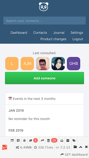
Monica: Mobile view of new dashboard is broken
The new dashboard design (released with version 1.6.0) is not only not mobile friendly, but also breaks the layout:
Issues:
- Avatars are overflowing (and too big)
- Avatars with profile pictures are not shown
- Misplaced "Add someone" button
- Content layout is too narrow for 2 column setup (see statistics container) -> would be better to use single column setup for mobile view
 erdmenchen
All 6 comments
I also have experienced this. On the iPhone SE it doesn't try to do two columns, but it is still very broken.
 tbirrell
on 9 Feb 2018
tbirrell
on 9 Feb 2018
+1 mobile layout is broken, i want to use Monica on the go 90% of the time
 jarradh
on 9 May 2018
jarradh
on 9 May 2018
This is still an issue on Monica Version: 2.11.2 and Safari 12.0.1
 pqhf5kd
on 22 Jan 2019
pqhf5kd
on 22 Jan 2019
Hi @djaiss.
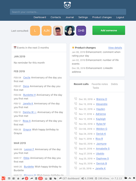
As the problem is still there I dug a little bit and it seems that the problem is around flexbox (without wrap) with last consulted contacts.
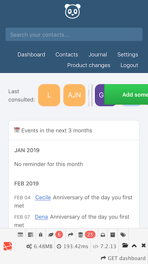
Here are some screenshots.
iPhone:
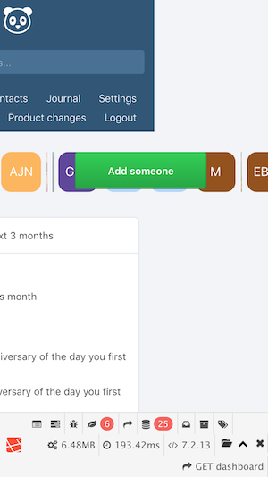
iPhone (the page scrolls horizontally 😥 ):
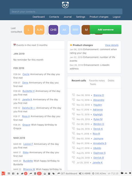
iPad
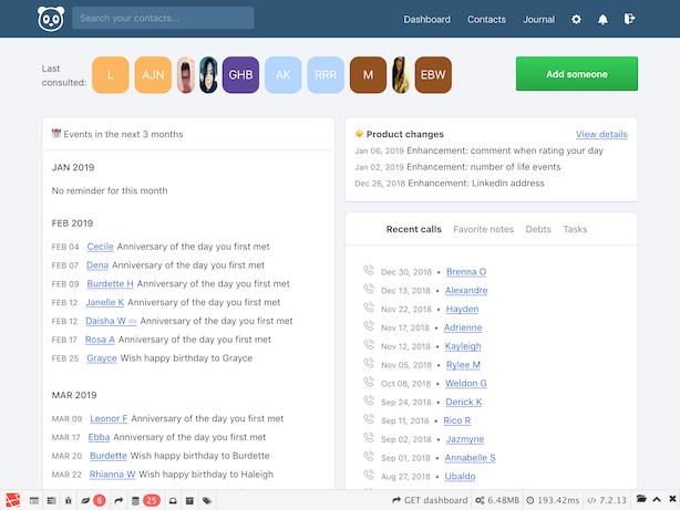
iPad (landscape):
I spent a couple of hours playing with the layout and trying to show all last consulted contacts, but there were problems with a unification of the layout between mobile, tablet and desktop.
Finally, I propose to abandon flexbox and replace it with div with overflow: hidden and make avatars a floatable divs. And also organize "Last consulted" block in one column on mobiles. This will result in following:
iPhone:
iPad:
iPad (landscape):
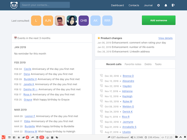
Also, this solution fixes the issue with squeezed avatar images.
What do you think about this?
 Bounz
on 27 Jan 2019
Bounz
on 27 Jan 2019
I'm experiencing this too. I think the fix from @Bounz may just do it
 igbanam
on 30 Jan 2019
igbanam
on 30 Jan 2019
Fixed by #2374
 asbiin
on 9 Feb 2019
asbiin
on 9 Feb 2019
Related issues
 cynddl
·
3Comments
cynddl
·
3Comments
 xorgnz
·
3Comments
xorgnz
·
3Comments
 stralsi
·
4Comments
erdmenchen
·
4Comments
stralsi
·
4Comments
erdmenchen
·
4Comments
 TheGP
·
3Comments
TheGP
·
3Comments
Most helpful comment
Hi @djaiss.

As the problem is still there I dug a little bit and it seems that the problem is around flexbox (without wrap) with last consulted contacts.
Here are some screenshots.
iPhone:
iPhone (the page scrolls horizontally 😥 ):

iPad

iPad (landscape):

I spent a couple of hours playing with the layout and trying to show all last consulted contacts, but there were problems with a unification of the layout between mobile, tablet and desktop.

Finally, I propose to abandon flexbox and replace it with div with
overflow: hiddenand make avatars a floatable divs. And also organize "Last consulted" block in one column on mobiles. This will result in following:iPhone:
iPad:

iPad (landscape):

Also, this solution fixes the issue with squeezed avatar images.
What do you think about this?