Monero-gui: Intuitive node symbols
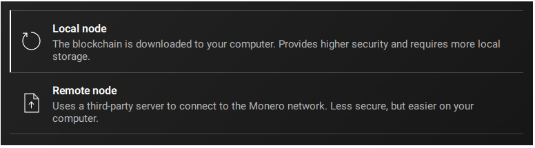
Local node symbol: "Reload page"???
Remote node symbol: "Paper with arrow"???
More intuitive:
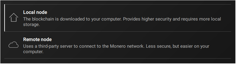
 Realchacal
All 17 comments
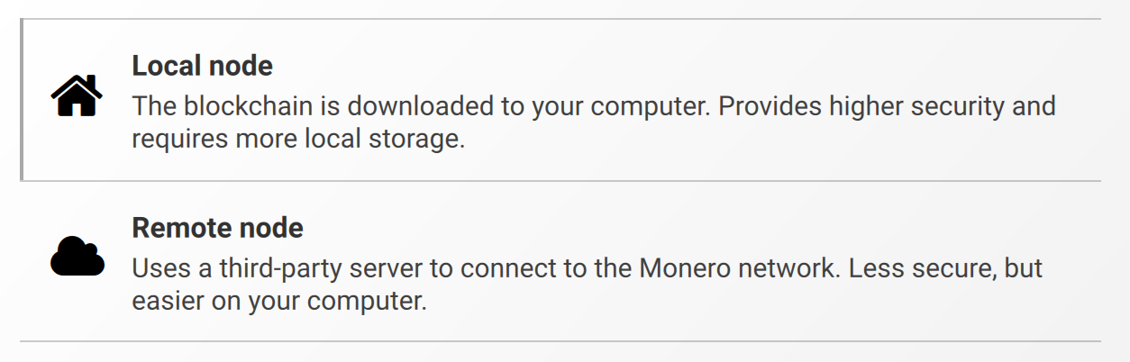
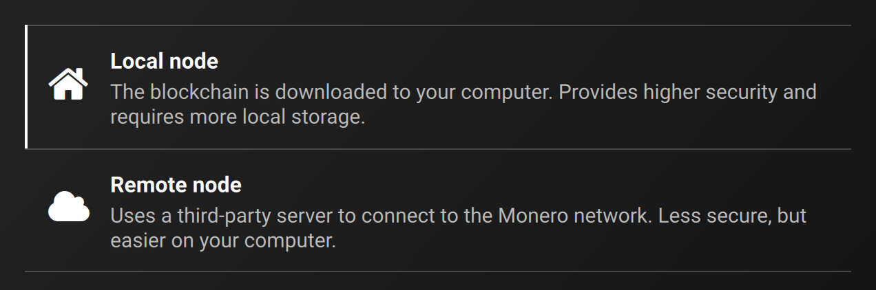
Opinion?
 selsta
on 25 Jul 2019
selsta
on 25 Jul 2019
@selsta ULTRA NICE!!! IMO your cloud just seems a LITTLE BIT too fat (needs shrinking in height), but that's a SMALL detail :)
We should ask @GBKS for his opinion, to make sure the symbols fit GUI-wide.
Realchacal
on 25 Jul 2019
Not sure where these white icons are coming from. I had designed icons for this a while back that I assumed we used (but maybe someone changed them, which is also cool). Here are the ones I came up with (this is a screen that's also in Zeplin and my Github repo). There are several more of these larger, orange icons that are used in the onboarding flow (see here).
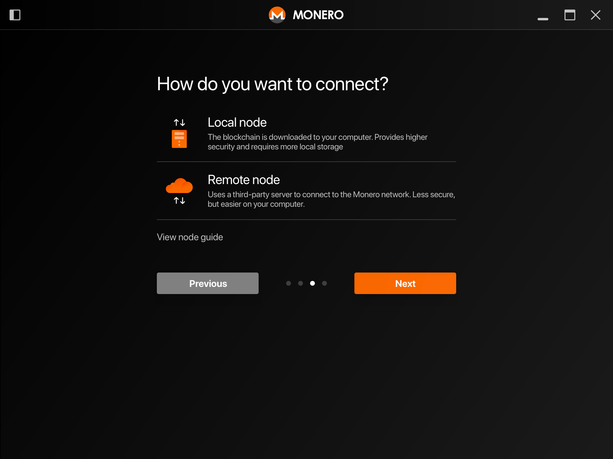
 GBKS
on 25 Jul 2019
GBKS
on 25 Jul 2019
Not sure where these white icons are coming from.
They are on the left middle side here, but I don’t know what they were originally intended for.
selsta
on 25 Jul 2019
- Nice to see that you already had the idea with the cloud, @GBKS !!
- @selsta see the cloud from @GBKS? That's a healthy cloud!
- But double arrows NOT good. They don't add any value, just make it more complex.
- @GBKS your local node symbol is technically more correct, but the house symbol actually gives the better impression at a glance.
I'd go with @selsta's house and @GBKS's cloud (without arrows). Color: I'd go with white or very bright gray.
Realchacal
on 25 Jul 2019
@GBKS Can you upload just the cloud icon alone to the icons page? The white arrows don’t play well together with the white theme.
selsta
on 25 Jul 2019
@selsta sorry, I was just wondering how those white icons made it in the interface, because we used to have the orange ones in there. Maybe it was changed when the white theme was added. Can we use different icons for the dark and white themes? That would be ideal.
@Realchacal not sure I agree about the icons not adding value. Please also keep in mind that these icons are part of a family of larger icons you can see here. They are meant to match in style, visual weight, color treatments, etc. I'd like to avoid doing per-icon adjustments that result in things don't matching overall (obviously a balance of both of these approaches, the whole context vs. consistency thing). What icon would you use for the bootstrapped mode (called "Recommended" in this mockup)? A smaller house?
GBKS
on 25 Jul 2019
Yes, a different icon for each theme would work.
selsta
on 25 Jul 2019
@GBKS I TOTALLY get the corporate design thing! That's why I dropped your name here. :)
I didn't had the mode selection window on my mind when making my proposal. Thanks.
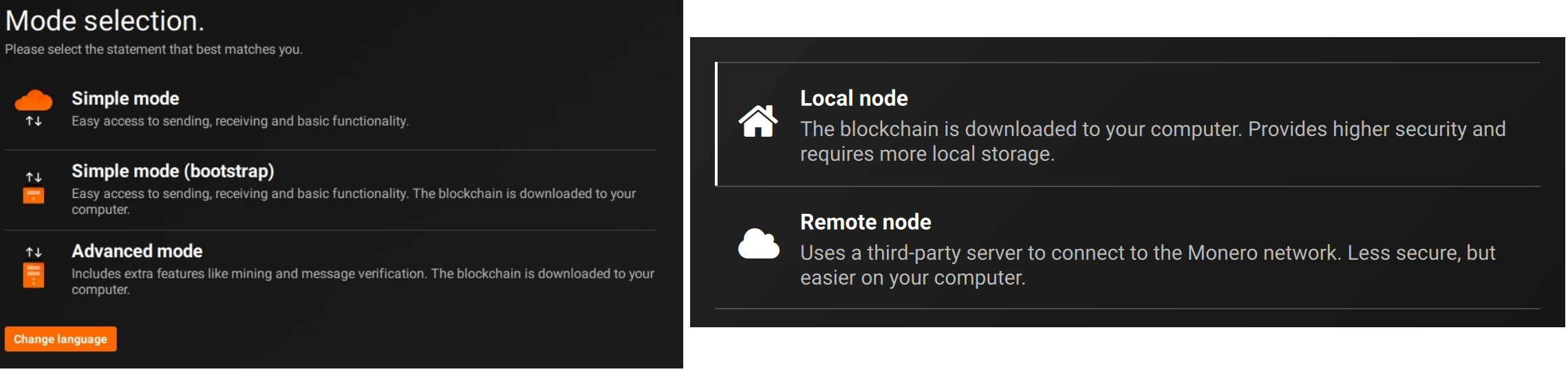
Your symbols are nice and they are technically more correct. But @selsta's are more intuitive. (A house symbol stands for YOUR house - while a computer symbol can stand for your computer or any other computer/server. And a computer symbol isn't recognized as quickly as a house symbol.)
Bootstrap mode I'd go with something like this:


I think the symbols should be white to match the text beside them (not the button below them). But if not possible because of corporate design, it's ok!
Realchacal
on 25 Jul 2019
@GBKS
I was just wondering how those white icons made it in the interface...
I assume that was because the orange ones had too much visual weight (color and size) to be integrated into the settings!
Do they have too much visual weight for that, @GBKS?
Realchacal
on 25 Jul 2019
This issue should wait for #2320 and #2321.
Realchacal
on 26 Jul 2019
The diagonal strike-through line instantly makes me think that it's not allowed (or disabled), like the way it's used in street signs.
If we want to use the old orange icons, I created white versions and put them on Zeplin (here).
Regarding the visual weight, I had reduced the icons in the settings page by 50% in size to accommodate for that.
Can you maybe explain what you mean by corporate design? I can't tell if you're trolling or not, and what non-corporate design would be if you're not. Either way is fine, just want to know what you mean.
GBKS
on 1 Aug 2019
If we want to use the old orange icons, I created white versions and put them on Zeplin (here).
They look great! Let's use them! A million times better than what we have right now.
Just for the record: Now we'll be using the same icon for "Advanced mode" as for "Local node", and the same icon for "Simple mode" as for "Remote node".
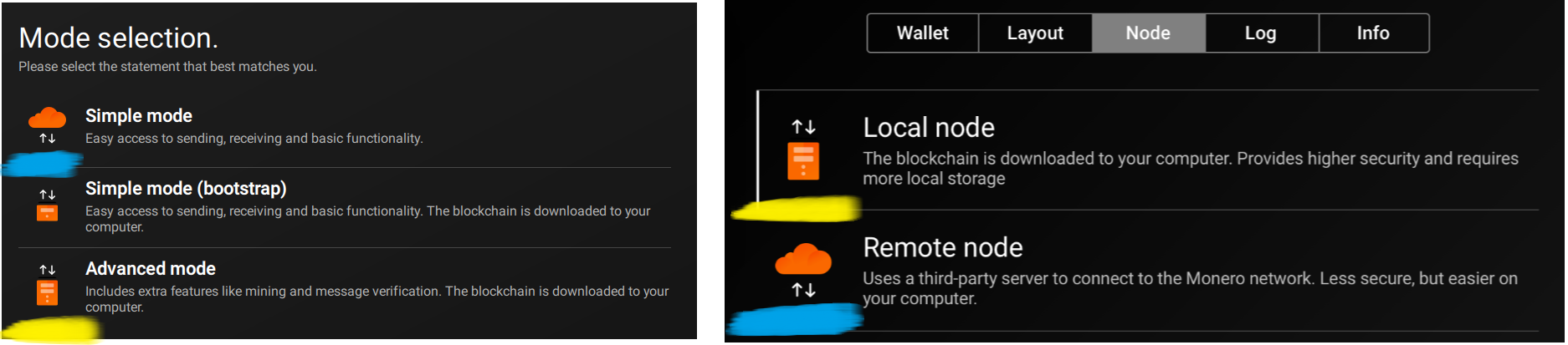
That's messy. But the problem is NOT the (new) icons in the settings! They are excellent! The problem is our UNLOGICAL MODES, WHICH BUNDLE THINGS THAT DON'T BELONG TOGETHER, WHICH NEEDS FIXING: #2320.
Can you maybe explain what you mean by corporate design? I can't tell if you're trolling or not.
No, I was not trolling! (Never on GitHub.) I was just using the term "corporate design" in a wrong way. Normally, "corporate design" refers to the design that a company uses across all its products and websites and letters and everything. And I transferred that term to our GUI project, which was wrong, since obviously our GUI project is not a company. Next time I'm gonna use "consistent design language" instead of "corporate design".
Realchacal
on 1 Aug 2019
I openend #2351 for now.
@GBKS, I kinda agree with @Realchacal, using the same icon for “Advanced mode” and “Local node” isn’t perfect and I think the colored icons don’t fit on the node settings page (they do fit into the mode selection page).
selsta
on 14 Aug 2019
Cool. Consistent icons help people recognize things more easily. We could create monotone versions of the colored ones for the settings page to avoid a visual clash.
The benefit of some more visual icons is that they can then also be used on the website. This was very handy in my landing page mock-ups.
Anyhow, let's decide on something and move forward. I'm good either way.
GBKS
on 15 Aug 2019
- For the node settings both variants are great. I'd prefer @selsta's variant for now.
- The mode selection page is where I see a problem. A noob wonders: "Why is the cloud a symbol for simplicity?! Why is a computer a symbol for Advanced?! What am I missing here??" (--> proposed solution: #2320)
Realchacal
on 15 Aug 2019
Closing this because #2351. (I wonder why it wasn't auto-closed, though.)
Realchacal
on 4 Sep 2019
Related issues
 weiglt
·
4Comments
weiglt
·
4Comments
 GreatWhiteMuffloN
·
8Comments
GreatWhiteMuffloN
·
8Comments
 blackvalyrian
·
4Comments
Realchacal
·
9Comments
blackvalyrian
·
4Comments
Realchacal
·
9Comments
 snaggen
·
9Comments
snaggen
·
9Comments
Most helpful comment
Opinion?