Monero-gui: 4 proposals to make the `Account` page more intuitive
[Updated]
1.

- "Account" can be misinterpreted as "user account" / "user profile". Calling it "Accounts" would improve that a little bit.
2.
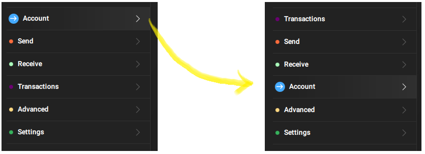
- Using multiple accounts is optional, sending and receiving is not. This should be reflected by the menu order. (You wouldn't put
Advancedat the top, right?)
3.+4.
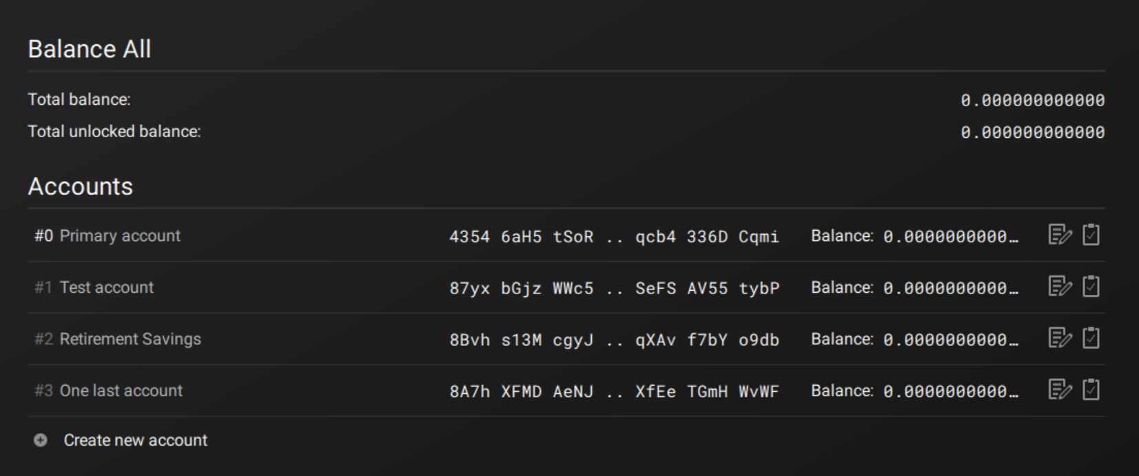
- What is "Balance All"?
- "Total unlocked balance" should be removed for the same reasons as in #2298.
- "Balance" in each row is bad
- Shortening the balance with
...to replace just 2 zeros is bad - The edit icon and the copy icon have unintuitive positions
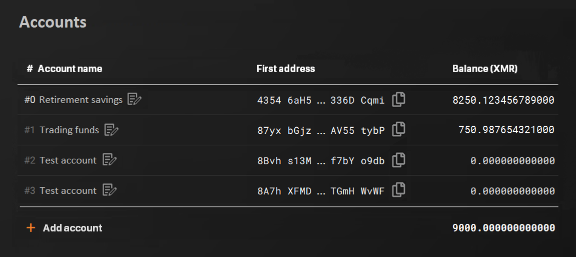
- Showing one address per account leads to misconceptions for new users. They may think:
- _"Ah, in Monero an account is an address!"_
- _"Ah, every account has exactly one address!"_
- _"Ah, every account has one account number!"_
Solution: Introduce a header line to explain a little bit.
+ Create new accountsounds like the account doesn't exist yet - but it does, it's just not shown.

 Realchacal
All 11 comments
I agree with all your points, except with hiding addresses of accounts. After seeing them many times, you start to remember which address refers to each account, and this improves security.
 rating89us
on 23 Jul 2019
rating89us
on 23 Jul 2019
I appreciate the feedback.
 selsta
on 23 Jul 2019
selsta
on 23 Jul 2019
Updated! Feedback integrated! Thx.
Realchacal
on 29 Jul 2019
Proposal 3. and 4. looks good, I will try to implement it.
Regarding the sidebar I will implement concept #1 from @GBKS which you can find here: https://www.reddit.com/r/Monero/comments/c23zxn/feedback_request_ideas_for_improving_how_multiple/
selsta
on 29 Aug 2019
@GBKS #1 brings tears to my eyes! (Sorry!) I totally understand his intention, but:
- "
AccountaboveWallet" in the menu is so misleading (wrong hierarchy)! And thenAccountsbelowWalletadds confusion. - the GUI gets visually more complex while all those normies don't even use multiple accounts
Alternative proposal:
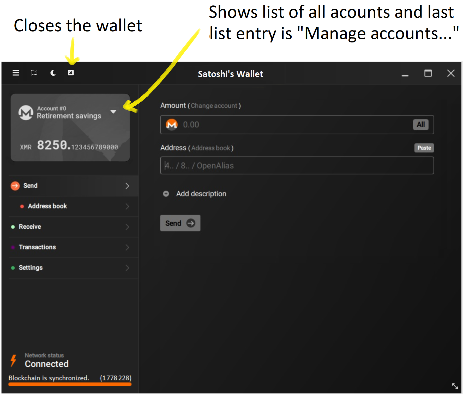
(Ignore the changes from #2298, #2304, #2325, #2339.)
Realchacal
on 30 Aug 2019
I’ll have to think about it. What about making the whole Account #0 Retirement Savings area clickable and this brings you to the account page?
selsta
on 30 Aug 2019
THAT WOULD BE INCREDIBLY NICE! It simplifies visually, it doesn't bother average users who don't use multiple accounts, it reduces potential account hierarchy misinterpretation, it still allows 1-click access to Accounts, and it can't get any more intuitive than clicking on the account to change the account!
My only requirement would be:
- The user somehow must be able to see that he can click on it! Maybe change something when the mouse is hovering (text color / text underlining / rectangle around the area or something). Or show the same icon as in the menu:

Realchacal
on 30 Aug 2019
Great discussion here. I agree with the detail improvements in the accounts page, but disagree about the accounts/wallet hierarchy.
Underneath wallet, we find accounts, address book (used in all items underneath account), settings (+ subitems) and advanced (+ subitems).
Underneath account, we find send, receive, and transactions.
I think it's important to be clear about this and label things appropriately. I'd also argue that generally interfaces are not more intuitive because there's less in them, but because they do a better job at explaining what's going on - so in this case I'm not concerned about the complexity. It's problematic when you're hiding a whole top-level feature underneath a pretty thin arrow in the corner of another element and rely on a hover-state for people to discover it. Obvious is better here.
I'm also not sold on the "normies don't use accounts" argument. It's a very new feature in the GUI, we don't have analytics, so we just don't know how how people want to use it (let me know if you have some info on this). Maybe people love it if we just treat it like a real, useful feature?
And a small note, I find that the grey logo looks disabled. I'd make it colored. Or maybe it can be grey while syncing, and colored when ready to transact?
Love the discussions. It's a great place when you're discussing such details, it means a lot of bigger things are in good shape.
 GBKS
on 30 Aug 2019
GBKS
on 30 Aug 2019
It's problematic when you're hiding a whole top-level feature underneath a pretty thin arrow
- it's not more or less hidden than any other menu item:

According to your proposal we would have Account above Wallet. This is confusing because it reflects the wrong hierarchy. And as if that was not confusing enough, your proposal also has Accounts below Wallet.
We don't need to introduce a separate section Wallet because the whole window already is related to the wallet, which hopefully soon will be reflected by the wallet name in the title bar (#2325):

let me know if you have some info on this
I just started a small poll:
https://www.reddit.com/r/Monero/comments/cxesm4/poll_to_find_out_if_the_monero_gui_should_be/
And a small note, I find that the grey logo looks disabled.
It doesn't look disabled to me but if it looks disabled to you, it probably also looks disabled to others so we should change it!
Realchacal
on 30 Aug 2019
@GBKS what you're aiming at is ABSOLUTELY right! But IMO it would require a much deeper redesign like #2367.
Realchacal
on 30 Aug 2019
Closing this because it's bullshit compared to #2367.
Realchacal
on 4 Sep 2019
Related issues
 yakitorifoodie
·
7Comments
yakitorifoodie
·
7Comments
 weiglt
·
4Comments
weiglt
·
4Comments
 sanecito
·
7Comments
sanecito
·
7Comments
 GreatWhiteMuffloN
·
8Comments
GreatWhiteMuffloN
·
8Comments
 cdiv1e12
·
10Comments
cdiv1e12
·
10Comments
Most helpful comment
Updated! Feedback integrated! Thx.