Monero-gui: [WIP] Restyle wizards to black-theme
As the title says.
Fixes #746
+enhancement
ideas/to-do's
< knueffelbund> Is it possible to pick up the language from the OS setting?
< knueffelbund> Just as a default, but it could help some people avoid using this super long  menu.
 cdiv1e12
All 12 comments
Language selection screen:


The globe rotates slowly. The menu is triggered by pressing 'Languages'.
cdiv1e12
on 22 Jul 2018
Very nice!
 ghost
on 25 Jul 2018
ghost
on 25 Jul 2018
Home screen:

cdiv1e12
on 5 Aug 2018
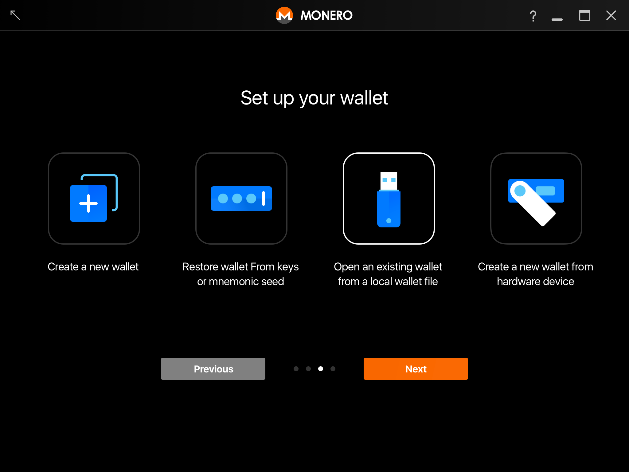
Here's my current exploration for these icons. I'm talking to rehrar and tficharmers about some details (mostly color related), and also running it past some other designers I know to get an outside perspective. All feedback appreciated, as always.
 GBKS
on 6 Aug 2018
GBKS
on 6 Aug 2018
@ GBKS I like the Create a new wallet symbol you came with up since it's more descriptive of the action
but I prefer the old style in general tbh.
 Leza89
on 27 Oct 2018
Leza89
on 27 Oct 2018
@Leza89 thanks for the feedback. What do you like better about the old style?
GBKS
on 27 Oct 2018
It doesn't look "modernized" - in general I don't like the new simplified designs. i.e.:
http://d5vf6134d8ffdnfp1qv4rv3l.wpengine.netdna-cdn.com/wp-content/uploads/04a-windows-os-logos.jpg
In chronological order:
1985: Ohgodwhy
1992-1994: too simple and flat
1995-2000: ok-ish
2001-2005: good
2006-2008: nice
2009-2012: nice
current: too simple and flat
(next: Ohgodwhy? ^^)
I guess I don't like the lack of a third color within the icon's borders and the mnemonic seed symbol looks quite similar to ledger and usb sticks. What's that supposed to represent?
Edit: And probably the introduction of a secondary main color
old: orange; Most active buttons are white or orange, outline is orange, whilst I consider white to be neutral
your design: orange and blue (and white).. Button outline is white so rather neutral; The descriptive element of the button is an intense blue. When I think of it this is probably the biggest reason - Take your design, invert the colors and tell me what feels more compelling for you:
Leza89
on 27 Oct 2018
I like the language selection screen, but I believe the languages should be shown in alphabetic order.
The home screen looks nice, from the two images shared in the issue I prefer the _first one_. I have a couple things to say about both, but first things first: how are these designs going to work with the discussion ongoing on #1846? If we're going to have a screen between the Language selection and the Setup your wallet then it would also be nice to have a proposal for this new screen.
Design from @xmrdsc
I think we could use different icons for Create a new wallet. A light bulb always comes up to me as "idea" instead of calling to the action of creation; I personally prefer the plus icon from the second design. Another one that could use a different icon is Open a wallet from file, I think it's too similar to the hardware wallet icon. File is usually represented by a _folder_ or a floppy disk. Maybe something like this, but with the Monero logo stamp on the paper.
I also think the Language selection button on the welcome screen could be bigger, more similar to like what is in the second design.
Design from @GBKS
The icon for Restore from keys or mnemonic really makes me think about LastPass button. The colors would probably have to be worked on as well, but you already mentioned that yourself so it's good. Same as the first design, I think Open a wallet from file should be something other than the USB stick.
I like Previous / Next buttons at the end although there's not really a "next" since the user has to click in one of the icons to actually proceed. I think the Previous button could also show the title of the previous screen (e.g. Previous: Select wallet mode)
 vp1111
on 9 Jan 2019
vp1111
on 9 Jan 2019
Here's an updated design based on the Reddit and IRC discussions. It uses the new icons in orange as requested, with an updated "Restore from file" icon (folder vs. USB stick).
However, I made them smaller and changed the layout from the horizontal list with big icons, to a vertical list with smaller icons and more text (a layout we already use for node selection). Having more text vs. just a short label makes it easier to explain what each options means, which will hopefully reduce confusion (text in the design is not final, I'd need help getting that perfect).
What do you think?
GBKS
on 14 Jan 2019
@GBKS I like it!
Up on zeplin?
cdiv1e12
on 14 Jan 2019
@xmrdsc it is now - see here. Icons should be exportable in 1x (60x60px) and 2x (120x120px).
One more note that I did not adjust the saturation. Since the icons are smaller than in the previous layout, they are visually not as overwhelming. But let me know if there are still any other changes you'd like to see.
GBKS
on 14 Jan 2019
Cheers. See #1909 for PR.
cdiv1e12
on 18 Jan 2019
Related issues
 snaggen
·
9Comments
snaggen
·
9Comments
 keatond
·
10Comments
keatond
·
10Comments
 Starmute
·
8Comments
Starmute
·
8Comments
 weiglt
·
4Comments
weiglt
·
4Comments
 brainscar
·
8Comments
brainscar
·
8Comments
Most helpful comment
Language selection screen:
The globe rotates slowly. The menu is triggered by pressing 'Languages'.